
 TEAM SOLUTIONS
 WORKFLOW SOLUTIONS



 REVIEW TOOL
 PROJECT MANAGEMENT
 TOOLS & INTEGRATIONS
 CLIENT INTERVIEWS




Post is also avalible in:


Last updated: July 2026
Marketing is not made for the weak. Especially if this is digital marketing and you have your own website to maintain. They used to say that the internet never forgets, but for smaller businesses, that wasn’t a huge problem. Unless you go viral, most won’t even know you were there.
However, over the last year, as AI is fully replacing traditional search engines (no matter how hard some resist), this phrase has changed a little. AI never forgets; rather, it punishes you for mistakes in ways you didn’t know were possible. And that adds to the digital marketing complexity a lot. Why am I talking about this? Well, because today, kids, I’m going to tell you the story of the epic highs and lows of website making and my experience with it.
The project that showed the problem
A single feature page launch showed us exactly how broken our website review process was. Listen, what’s the worst that can happen after a website went live with a mistake? A colleague (or multiple) will point it out? A friendly user will point it out? A not-so-friendly user will complain about misleading information? An AI overview will pick it up and treat it as the truth? Pick your poison.
Sure, these describe completely different mistakes that you’re sure may not happen to you at all. I remember being like that too… Until that one day that changed it all.

You see, as a marketing person, you have to sometimes explain notions that you, yourself, are very average in. Nevertheless, you have to take this topic, dissect it into those core “cool stuff” concepts, and present them. The problem is that you still don’t understand what it is. And for our team, it was a development-facing feature that changed the entire trajectory of how we sign off on websites.
The task was to make a feature page about this great thing that developers would love, because it makes their work easy; they don’t need to set up much, but the outcome looks like a very professional and almost impossible task achieved in the snap of the fingers. The sound of snapping fingers was, in fact, from my desk when I was trying to make all the corrections in an hour and approve it with three different people who don’t have access to the development environment. Twice.
The cost of it all
If there are still any doubts about what happened, let me tell you plainly: we had to redo the entire feature page two times, well after publishing it. Yes, you’ve heard it correctly. We have reviewed and released the same page three times. And solely because we got lucky with the reviewers who gave their feedback at the first possible instance, the entire process took us just a month. A mere 31 days to finalize a page that consists of 4 static and 1 interactive block, it’s really not that much… For reference, now we can do 3-4 in the same amount of time.
Now imagine you’re not that lucky with your reviewers. Each step of the process takes 3-4 days to approve, and then you’re left with a mountain of corrections that have to be done by the end of the week to start the new approval cycle on Monday.
What we (and you) probably did wrong
There is a reason why some website review processes last longer than others, and with us, there were four very big and obvious mistakes:
We Were Never Proofing the Website
The main issue with website proofing for us was that we were never proofing a website. Sometimes, it was a screenshot of a fracture of a block with a red line around an element that was wrong.
Sometimes it was a snapshot of a page, saved into a PDF. That’s not bad, you might think; at least Adobe allows you to annotate. Wrong! 10% of the page wasn’t there because of the natural split between PDF pages, so we’d lose lines of text or watch an element get cut in half just because it landed on a page break.
The third option was the best one; you just export the website as a JPEG and put it into an online proofing tool, praying that the quality is good enough for everybody to be able to see the text. And then spend the next 3 business days trying to zoom in so it looks like a website page. But at least, it didn’t have missing parts or cropped feedback.

We could never approve interactive elements
Another issue with this was that we were never able to approve the interactive elements, buttons, and different outputs. A screenshot doesn’t know what happens when you hover over a card, or what a dropdown looks like open instead of closed, or whether a form actually submits instead of just sitting there looking pretty. Everything felt like a visual, not a page. We were approving what a website looked like frozen in time, not what it actually did once someone touched it.
And because none of that could be judged from a static export, another person had to go through all the buttons, animations, and outputs separately, by hand, clicking every single element on the live site to confirm it actually worked. Not a fun task, and not a fast one either. It didn’t help that this always happened after the “official” approval was already done, so it felt less like QA and more like finding out, at the worst possible moment, that the thing everyone just signed off on was quietly broken. And something always failed. So every other week, I spent half an hour writing a sad email explaining why the launch was delayed again.
Feedback lived in three different places at once
Every format we used for website proofing became its own separate feedback channel. You see, having three different website “formats” meant that we would also automatically have three website feedback sources. We had some markups in the tool, a bit more from the PDF, and then a bunch more in private chats and some in groups.
So, what we usually ended up doing was that I took a screenshot of each piece of feedback there was and then put it into a Google document as a checklist. And every time a change was made, I came back to that document and checked off another thing. Pretty convenient, but a nightmare to put together and barely functioning. Like that laptop that has been defying the laws of physics for a few years by still functioning.

Reviewers couldn’t track what had already changed
We also had no way to show reviewers what had changed since their last round of notes. And my favourite part of the entire process is the “Oh, did you change what I asked you to do two iterations ago?” I know you don’t mean harm, and I understand that the change was little and almost invisible, but I spent two hours on it, and it’s very visible to me.
But that’s what’s bound to happen when you get approvals from people with a ton of work of their own, and there’s no reminder of how the page used to look. And sending both options is not an option, unless you put the big bold “outdated” sign all over the page, like a sad watermark.

Why we finally decided to fix this
Before the feature page incident, this entire process was an inconvenience. Some just wanted to get on with it and didn’t really pay much attention to what was on the page. Others didn’t have enough credentials to access it, so they either asked for a static version or didn’t look at it after it went live.
However, after the feature page incident, incorrect information was displayed live for some time, and AI picking up on it almost immediately; there was a consensus that something had to be done with it. At first, we decided to look outward for plugins, additional tools, or API bridges for the website to load inside a proofing tool.
But then (pretty quickly actually), we understood that the answer was right in front of us. We already had a proofing tool in our command, multiple clients that needed that in their workflow, and our own internal motivation to have a way to do website review. So, we decided that rather than look for it, we should build.
What is website proofing?
Website proofing is reviewing a live or staged website across desktop, tablet, and mobile before it goes public, with comments pinned to the exact spot on the page. It replaces screenshots, PDFs, and email threads with one place to see, click through, and approve the site as it will actually work.
A tool that does that is called a website review (or proofing) tool. It’s a centralized platform that allows you to review and markup websites or their specific pages interactively. That means you can click buttons, view animations, and navigate the site while still being able to leave pinned comments.
So, now, instead of going through the loops of exporting and sending out a static website, I can just enter its URL, add the email addresses of all the people who need to approve, and click send. Or even easier, I just copy the link and send it into the group chat, and now everyone can say what they think about a page I spent two days on!
There are already a few website proofing tools on the market, some built specifically for websites (BugHerd, Pastel), and some general online proofing tools with website proofing added on, like PageProof. But none of them existed inside our own workflow when we needed one most. So we decided to go the easier way and built one instead.

How website proofing solved each of these problems
And this website proofing tool did a great job solving a bunch of our internal mishaps, so we decided that it worked well enough to present it to you. And to not make any unsubstantiated claims, let me show you how a website review tool made our lives much easier.
If this sounds familiar, it’s because it’s a higher-stakes version of a problem we’ve written about before: why traditional review keeps costing creative teams time. Screenshots and email chains are slow no matter what you’re approving.
What a website review tool should have
After living through the different flavors of “website proofing,” I’ve got opinions about what separates a real proofing tool from a workaround wearing a proofing tool’s clothes. For me, it has always been about how quickly it is to send it into review and how easily others can access it. So, here’s what I’d consider non-negotiable, from someone who’s tested every wrong way to do this first:
- Loads the actual live or staged page, not a screenshot, PDF, or JPEG export of it
- Lets you switch between desktop, tablet, and mobile views without opening three separate tabs
- Lets you click buttons, trigger animations, and navigate to linked pages
- Pins comments to the exact spot on the page instead of scattering them
- Tracks versions, so nobody re-flags something you already fixed two rounds ago
- Works off one shareable link, so anyone can weigh in, whether they have dev credentials or not
- Produces a final report of what was approved, and by whom, so there’s an actual paper trail when someone asks
If a tool can’t check most of these boxes, you’re honestly proofing a rumor of a website. And that’s not a good place to be.
Who definitely needs a website proofing tool
But not every team needs this. If you’re a solo developer shipping your own portfolio site, godspeed, you probably don’t need your mom pinning comments on your hero section. But if more than one person has to sign off before a page goes live, and especially if some of those people don’t have a developer’s patience for staging environments, this is for you. So, if you are:
- Marketing and/or creative team launching or refreshing a site
- Anyone who’s ever been asked “have you made those changes from November?” by a reviewer with zero memory of what the page looks like
- Teams where legal, a manager, or another department needs to sign off before anything goes live, and can’t be expected to have access to a dev environment
- Agencies handing a finished site to a client who wants one clean, exportable record of what was actually approved
- Dev teams who are tired of being the only people who can open the staging link, and would very much like to stop getting feedback on their interactive blocks after they’re on production
If you read that list and nodded at more than one, you already know why we built this. That is your wake-up call to rethink your whole web design workflow.
Bottom line
Soo, you might be wondering why I’ve spent this much time and this many words on my own approval nightmares. It’s a fair question. The short answer is that this is Approval Studio’s story, not a hypothetical one. We didn’t research this problem from the outside. We lived inside it, redid the same page three times, kept a Google Doc as our source of truth because nothing else was reliable enough, and got asked “did you change it, btw?” more times than I’m willing to admit in writing.
So we built our own website proofing feature to fix that, tested it internally on our own launches until we actually trusted it (not just hoped it would work), and now we’re ready to let more people use it. If you’d rather skip writing your own version of this story, just paste a website link into our tool and you’ll never have to explain a broken button to your manager after launch again.
Never launch a broken page again
Try now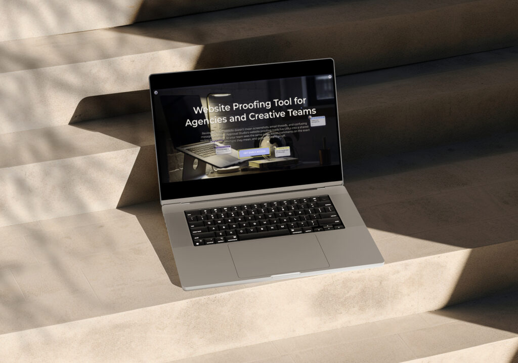
Screens shown are illustrative. Final interface may vary.
