 TEAM SOLUTIONS
 WORKFLOW SOLUTIONS


 REVIEW TOOL
 PROJECT MANAGEMENT
 TOOLS & INTEGRATIONS
 CLIENT INTERVIEWS


Sometimes I get really perplexed by some rookie mistakes made by big brands who rule the market of branding strategy for years. Well, what can I say – even the greats have their bad days. This phrase may be a point of justification for the companies who have decades of experience in graphic design or marketing strategy but still are featured in our article today.
So, we are here to take a look at the worst branding and marketing ideas born by the leaders of the world market brands. You may say, “Design is too intimate and personal” or “Design is too subjective”, but come on, guys 🙂 When the company spends more than 200 million dollars for rebranding and then presents nothing but ‘meh’, or when almost all billboards in the city show the image of Hitler, then it’s time to reconsider some things. Intrigued? I know you are.
Disclaimer: Approval Studio does not approve of any ads that other people can find offensive. This article was created for educational purposes to make designers aware of mistakes made by some big brands.
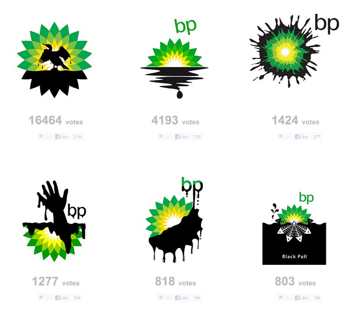
British Petroleum – 211 million dollars for the logo
If you do not know how to waste almost the fourth part of one billion dollars, then you may ask BP to help you.
To be serious, their rebranding is not that bad. I must say that rebranding was successful because the company went away from its trivial logo. The old logo with the shield looked obsolete and outdated even in the 2000s. If I did not know the company, I would say it is some football or soccer club logo.
You can find this rebranding both in the best and worst compilations. I do not know why, but the company’s deals went really bad, creating a set of failures until 2010. That year the biggest ecological catastrophe happened – Deepwater Horizon. After this piece of news, the whole internet started joking about BP and its logo. Users suggested new alternative variants of a logo connected to the catastrophe. Logotype with the cormorant in the oil won first place.
JCPenney – Hitler, Sieg Heil, and kettle
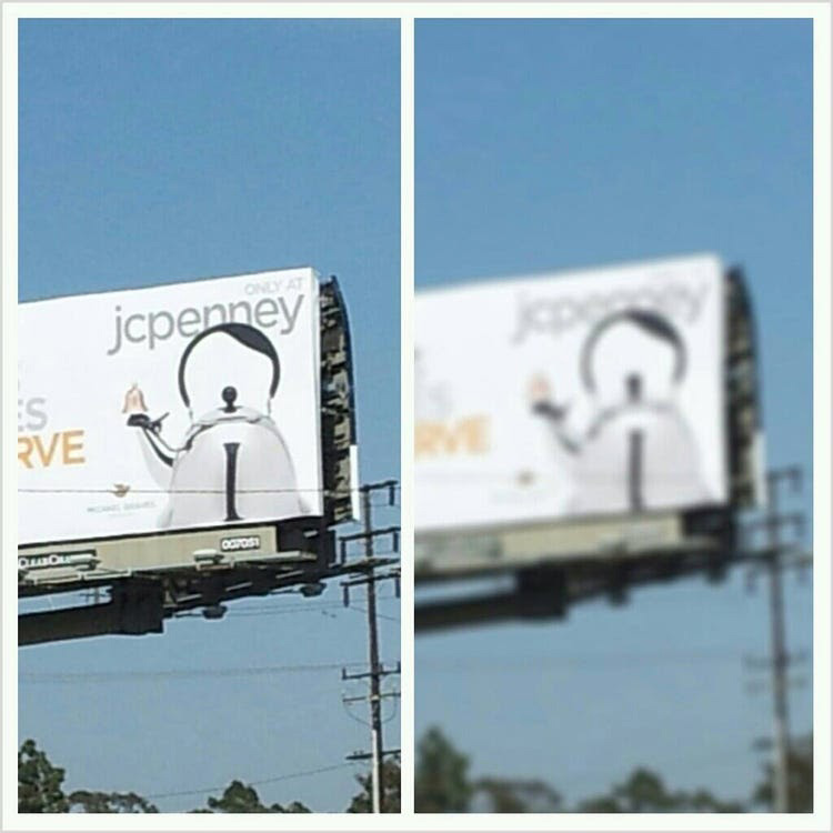
Well, well, well…What is the first question that comes to your mind? My sounds like, ‘How could possibly no one notice this similarity in such a big company (90k employees)?” That’s funny to have such a brand identity.
Anyway, the teapot bears a striking resemblance to Adolf Hitler – the bell spout shows a sieg heil gesture, the lid is crowned with a mustache, and the pen follows the outlines of the dictator’s hairstyle. It is not so noticeable up close, but when looking at the billboard from afar, the image of Hitler is clearly visible. Considering that billboards are designed to be glanced at from a certain distance, it didn’t work out well.
I am not sure if this was planned – I bet it wasn’t – but the company received tons of complaints. Thus, they were forced to get rid of all pieces of this ad campaign. HOWEVER, these kettles became a hot trend after the scandal. Now you think whether this was a bad branding idea…
McDonald’s – I’d hit it!
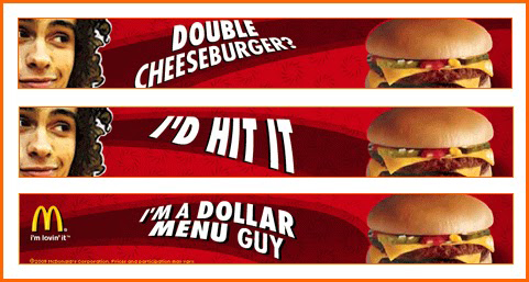
Is it a new part of American Pie or the biggest fast-food brand? No doubt that is a very loud and provocative slogan that does its job – attracts attention. However, is this a level of a multi-millionaire company?
The advertisement was released in 2005, and McDonald’s tried to ride the “hype train” and stay in trend. The ad consisted of three parts with different provocative phrases said by some teenagers. Unfortunately, no one explained to McDonald’s that using modern jargon everywhere is not going to bring 50-years old guys in suits, who rule the company, any closer to youngsters.
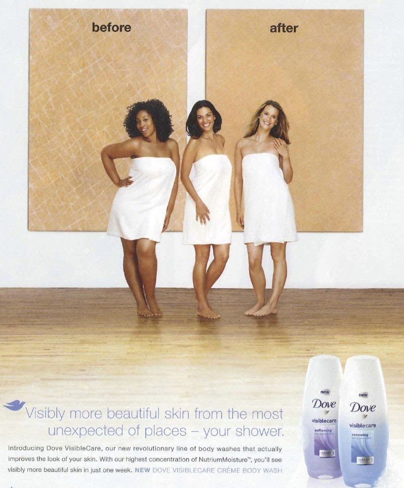
Dove – racist body wash
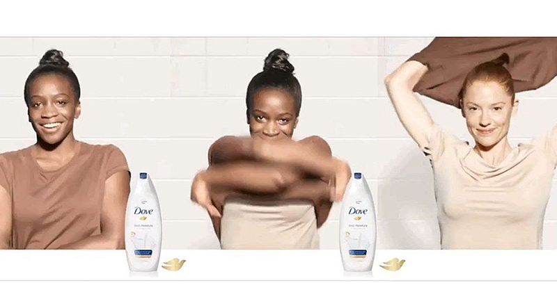
As you may know, Dove is Unilever’s strong brand. I do not know who was responsible for the marketing plan in the company at the time, but that human being may ignite a war and lose brand value.
In 2017, Dove launched their new ad campaign for the recent body wash. As the company said, they wanted to show “the diversity of real beauty.” Not surprisingly, an ad where a black woman turns into a white woman after using a Dove product is not that suitable to show the diversity of beauty.
This was a big failure by Unilever and its Dove unique brand strategy. As expected, they apologized afterward, but the flow of hate towards the company did not stop. All happened because Dove had failed once more before in 2011 when they released their ad about “Before\After” using the product.
As for me, I think that Unilever and Dove did not intend to make any racist ads. But come on 🙂 Do you not need to ask anyone’s point of view before releasing the ad? I am pretty sure that at least one human being in the whole company would say that you need to change the approach. Why wasn’t it changed? We can only wonder.
GAP – WordArt that costs $100 million!
Another company spent nearly $100 million on the changing visual identity of the logo. The original emblem of the clothing brand, which has been in use for over 20 years, is a blue rectangle with the word GAP inscribed in white capital letters. The company’s brand name is written in black and white on the new logo, and only behind the last letter is a small blue square visible.
On October 4, a new logo developed by Laird and partners was presented to the public on the website of the Gap clothing chain. However, the successful brand faced only negative reactions from fans, who left several thousand judgmental comments on Facebook.
The company’s management admitted that they made a mistake by choosing the “wrong project”. At the same time, GAP representatives noted that it was an “important lesson” for them.
Dr.Pepper – a drink that is not for women
In 2011, employees of Dr. Pepper found that men ignored diet drinks considering them feminine, which led to an ill-conceived ad for a 10-calorie soda. In a TV commercial, a brutal macho on the run blows up everything around him, portraying an action hero, and then speaks into the camera: “Hey, young ladies! Do you like the movie? Of course not, because it is for men. “
What do you think was going to blow up next? Internet. Of course, all people blamed the company that their marketing campaigns were sexist and built on stereotypes – directors somehow decided that girls do not like action movies and target customers are men. Maybe they thought it was some kind of a great move of reverse psychology or something – women are going to buy the specific product because of some protest, and yadda yadda… I don’t know. There must be some pitch behind it as you can hardly call it an accident, yet I can’t find any logical explanation.
What happened next? Dr.Pepper lost maaaany clients. Hardly the best reverse psychology thing ever.
What should you learn from these ad campaigns?
Always proof your visuals
Do you want to be seen as a racist or nazi? Well, I do not think so. You want to be a consistent brand. So, you need to go through multiple revisions before releasing your ad. If you see one sense in your video or poster, people may see something different. Unnerving someone may not even be your intent, but it’s totally your fault if you did not pay attention to every possible scenario or reaction.
You may use some proofing tools like Approval Studio to avoid mistakes and gather feedback efficiently. Thus, you will not be trapped in such situations as Dove or JCPenney. Approval Studio will keep you away from such situations and let you keep track of everything happening around the project. It is complicated to build a company’s image for years, but it appears to be so easy to ruin it in seconds.
Keep track of events going on in the world
One of the examples – British Petroleum – was launched not at the best time for it. I am not sure whether there would be the right time, but you need to be aware of what is going on in our world. It is not only for conflicts but for trends and well.
Some ideas may appear extremely outdated for the target audience. Some trendy ideas may not match the company’s image. For example, McDonald’s is about being one of the best and tasty food brands globally, but not about memes and teenage hype.
As for the conflicts and discrimination, you should be extremely careful. It is easy to hurt your customers’ feelings but extremely complicated to get their loyalty back. The modern world is sensitive, and you need to understand it.
