 TEAM SOLUTIONS
 WORKFLOW SOLUTIONS


 REVIEW TOOL
 PROJECT MANAGEMENT
 TOOLS & INTEGRATIONS
 CLIENT INTERVIEWS


Have you ever found yourself standing at a crossroads in the supermarket when you didn’t know what product to choose? Both probably had approximately the same ingredients, and similar prices, and the quality was on the same level too. Most likely, you choose a product based on its appearance. How come?
Seldom can someone explain why they choose to get something nicer. However, throughout the years people have wondered why we are attracted to beautiful things. There are various answers: associations that arise after looking at colors combined in a certain way. Some think it’s the speed of processing of images that fit certain criteria. Maybe, it is even genetic memory that makes pictures appeal to us even though the reason why stays unknown to our conscious mind. But why all this beauty talk all of a sudden?
Subjective or Objective?
Well, a skilled designer should recognize what makes things attractive and refine their work to suit the tastes and requirements of the mass market. Of course, it is believed by most that beauty is subjective. The same can be said about the reasons why people consider certain things beautiful. I may think that a meadow with daisies is beautiful because I love daisies. My coworkers’ reasons may vary drastically. Matthew, for example, thinks that it’s pretty because the image feels calm and soothing. Someone may not like the sight of meadows at all. The funny thing about a designer is that it’s a person who can present this meadow in a way each of us will enjoy.
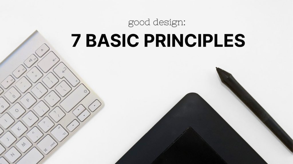
To do so, it is more important that a designer understands the principles of good design — that’s besides knowing what appeals to a certain group of people. Those rules form a skeleton that can then be improved by considering the mood, cultural intricacies, company requirements, and audience. The seven principles of design are unity, proportion, contrast, movement, emphasis, rhythm, and white space. Let’s look into each of these and discover how they work.
Unity
Unity in graphic design is the foundation of visual impact and appeal. It ensures the smooth blending of an artwork’s components into one coherent image. Ensuring artwork’s unity means arranging elements in a way that will not seem alien or out of place. Let’s look at an example to demonstrate it better.
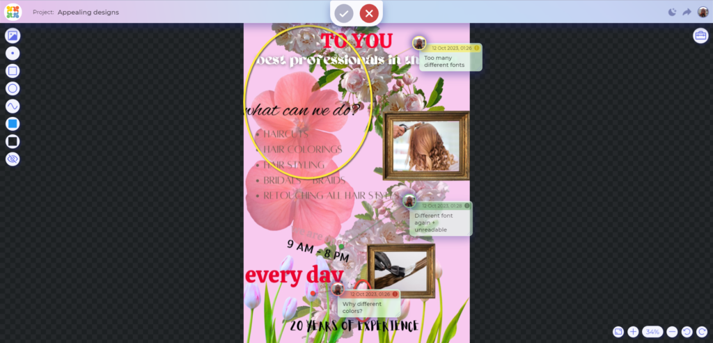
There is sure a lot happening in this picture. We see many funky fonts, flowers, colors, and more. What we don’t see, though, is unity in different elements. Surely, all those elements are nice, but they create a little sense of chaos. Here the principle of unity comes in handy. It is advisable to use fewer elements tied together than many different objects that might look pretty separately from each other but have no connection when put together. And it’s not only about fonts: you should apply the same principle when working with colors, shapes, pictures, etc. The closer your elements are contextually, the better.
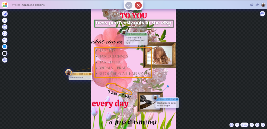
And if you wish to leave comments about the possible changes in your artwork like you’ve just seen, check out Approval Studio. It allows users to mark up their assets in four different ways and various colors. Reviewing the assets in a comfortable and correct way is a crucial step in ensuring their quality, so if you feel like it’s something that you or your team require, sign up for a demo!
Proportion
Proportion is a principle of design that shows relationships between objects using size and placement. Every component in your design has a specific purpose and relation to other elements. And you can simply reflect this purpose if you stick to the proportion concept. Usually, designers use mathematical concepts like thirds, halves, and grids to create perfect proportion. However, a perfectly unbalanced picture that sticks to its imperfections is still perfectly proportioned. Similarly, a few nicely proportioned elements don’t make your artwork perfect.
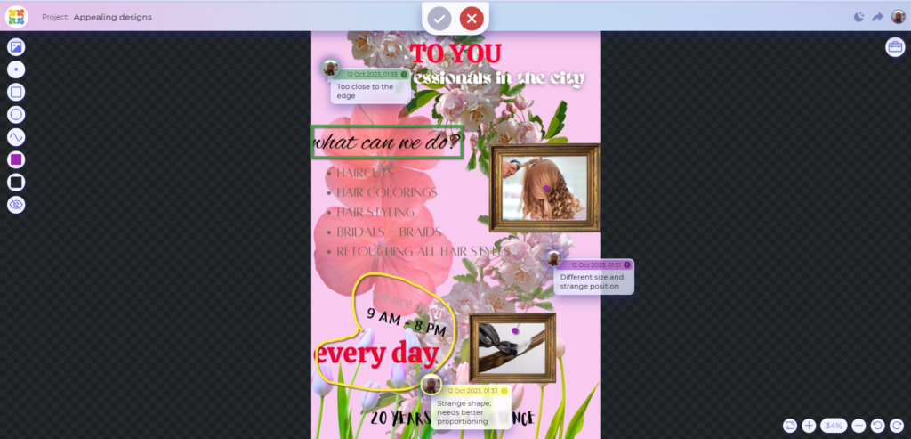
And it is visible in our example. Look at this nicely positioned title. Furthermore, the blossom clusters are also nicely arranged in relation to each other. However, it doesn’t do the asset any good. One of the reasons for that is badly proportioned images of haircuts that seem extra. Proportion should be applied to all the elements of the artwork similarly to actually improve it.
Emphasis
The principle of emphasis is useful for the focal point in artwork. Emphasis is essentially the use of color, size, position, weight, and other elements to draw attention to the primary message of an artwork. However, usage of this principle should always be under the other rules. For example, it is possible to emphasize a headline with a funky font. However, without applying unity, it can be really difficult to make it seem like it wasn’t a mistake.
Let’s once again come back to the picture we had. Its problem is that it has too many emphases. Should we focus on the title? Do we need to focus on one of the lines written in a cool font? Should it be the pictures? And overall, it is not even clear what is this poster’s purpose. Are they selling hair? Are they selling hair products? Or is it a hairdresser’s? To prevent users from such questions, designers should maintain a hierarchy. With the correct use of sizes and fonts it will emphasize the correct parts in a certain scale.
Movement
Movement is the technique of directing the viewer’s eye through a visual composition.
Various design elements can contribute to this perception of movement. Lines, for example, can be used to guide the eye in a particular direction. Curved or diagonal lines often imply movement, energy, or a sense of flow. Arrows and other directional cues are also effective tools for indicating the intended movement of the eye. The movement principle of design is sometimes seen as a supplement to emphasis. Creating special shapes to guide the viewer’s eye and create a unique experience.
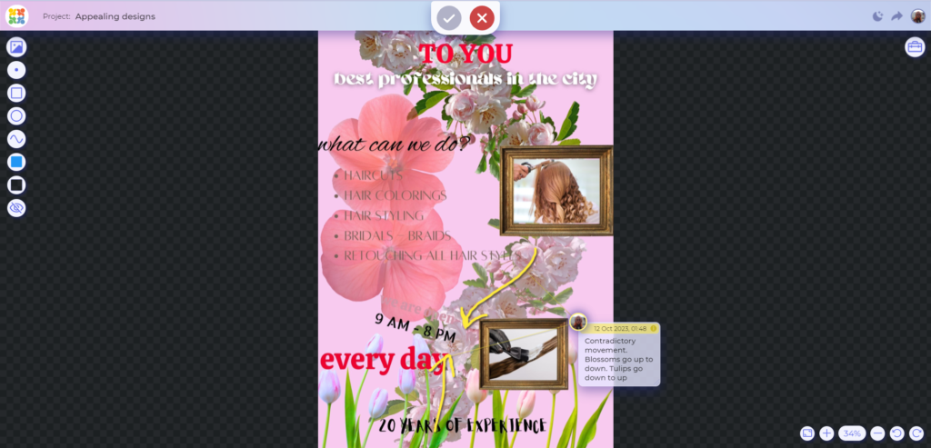
In this picture, there are two elements or lines that create a sense of movement and direction. The first one is that tulips on the bottom make the eyes move up to see some important information. And the blossom cluster creates this kind of a pilon that we use to smoothly move through the picture. However, those two elements contradict each other. That’s why when including movement in artwork, a designer should think of its purpose and how it correlates with other parts of the asset.
Rhythm
Rhythm or repetition is a principle of design that helps to make the picture more consistent and easier to read. However, rhythm is not only about the repetition of the elements in the same size on the same level. Rhythm can use the same picture with little alterations like the gradual change of size, placement of elements, or change of perspective. When following a certain rhythm in artwork, it becomes much easier to emphasize elements. As they acquire a certain spark but still feel linked to the other parts.
This picture looks nice because it follows the principles I’ve just described. The viewer knows exactly what the focal point is but doesn’t look out of place because it follows a certain rhythm that is relatively easy to follow.
Contrast
The contrast principle of design revolves around the strategic use of differences (color, size, shape, texture, or font) to create a vibrant image that captures attention and guides the viewer’s gaze. Moreover, contrast is crucial for readability and accessibility. A stark contrast between text and its background ensures that the content is easily read well.
Color contrast is, perhaps, the most immediately noticeable form. And it is painfully noticeable that in our example this kind of contrast hardly even exists. Some parts are outright unreadable. However, when fixing these kinds of mistakes it is crucial to remember all the other principles we’ve already discussed. Blue text will surely look contrasting, but will it have any sense of unity or rhythm with the rest of the asset?
White Space
White space, also known as negative space, is an often underestimated yet crucial aspect of design. It refers to the empty or unused space between and around elements in a design. Contrary to what the name suggests, it doesn’t have to be white. You can use any color or even a pattern. White space is vital for providing breathing room to the design, improving readability, and creating a sense of balance and sophistication.
Too often, designers may feel compelled to fill every inch of a canvas or layout, fearing empty spaces will look incomplete. However, effective use of white space can actually enhance the overall visual impact of the design. It allows the audience’s eyes to rest and focus on the essential elements, avoiding visual clutter and confusion. Additionally, it gives a sense of elegance to the picture.
Final Result
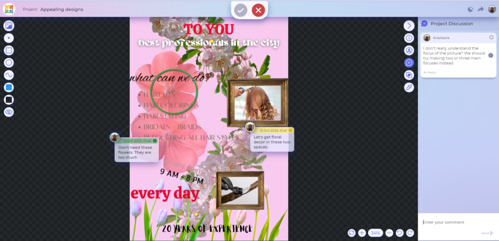
After scrutinizing all the principles described above and taking into account all the comments left in the Review Tool we’ve come up with the second version. It managed to follow (almost) all the principles mentioned but still save some character of its own.
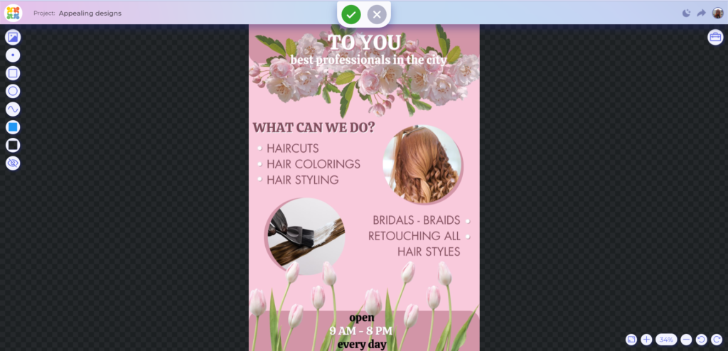
So, what is the main takeaway? Though all these principles need to be followed to ensure assets’ readability and cohesiveness, they are not set in stone. They will surely help you to create an image that will be more cohesive and professional. However, character is as important as those principles. As a novice, you should stick to all of the rules and only then add character. However, experienced designers can afford to experiment with those principles, allowing this kind of chaos and absurdity to make the image more eye-catching and unique.
Whoever you are, it is always good to come back to the roots. And if you need a reminder of how the principles of graphic design work – you can always come back to this article. And if you need sound software that will help you in online proofing, Approval Studio will be of help!
