 TEAM SOLUTIONS
 WORKFLOW SOLUTIONS


 REVIEW TOOL
 PROJECT MANAGEMENT
 TOOLS & INTEGRATIONS
 CLIENT INTERVIEWS


Post is also avalible in:
![]()
![]()
![]()
Last Updated: October 2025
As we get ready to go trick-or-treating in the evening, one thought still bothers me: how come so many terrible designs make it to production? I mean, there are many really poor choices (that were obviously made by someone not really either competent or caring) that get to the public display and simply become memes. Why?
The issues these designs have are just overlooked in the review process. I mean, it is possible they are created like this on purpose just to put some smiles on people’s faces – that definitely happened to me as I’ve spent a small eternity searching for poor Halloween designs for you guys and had a lot of fun. But seeing some of them, all you can do is ask something like… “seriously?”. Anyways, now I am ready to share some with you.
As you probably remember, we made a Christmas article where we fixed poor Christmas designs using Approval Studio – our artwork review tool that helps check out the final version of the mockup and make sure it complies with all the requirements. Some silly mistakes do slip through sometimes; nothing too dire about that. Yet, fixing them is still essential, and that’s what our tool aims to do. And would have done it if some of these designers had had the possibility to use it. That is why I strongly recommend you giving Approval Studio a try – it’s free!
So, here we go with some examples of hilarious Halloween designs and how we fixed them together with our awesome Mary Cobe. A small disclaimer – we do not own any designs displayed here, and the whole point of the article is just to have fun with them. Go!
Let’s get spoy, ok?
When you are creating some sort of a poster, signboard, or basically anything that requires adding text, it is important to make sure that the writing is readable. It will basically be the main point of today’s blog entry, so I think I have to emphasize it in the beginning. Make. It. Readable.
Still, it is very obvious how something that makes sense in your head is a complete disaster for someone else when they look at it. Needless to say, this sign makes everybody a little confused.
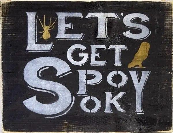
Getting spooky is a total blast, but getting spoy is something rather vague. To put things back on track, I uploaded the board (or whatever it is) to our design review tool and left a comment for Mary.
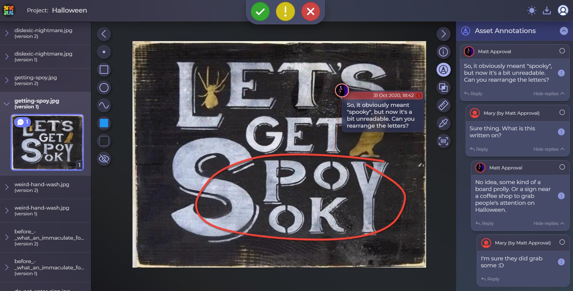
Review tool and chat-a-like discussions in Approval Studio can be really helpful. See the result for yourself in our compare tool next to the original picture.
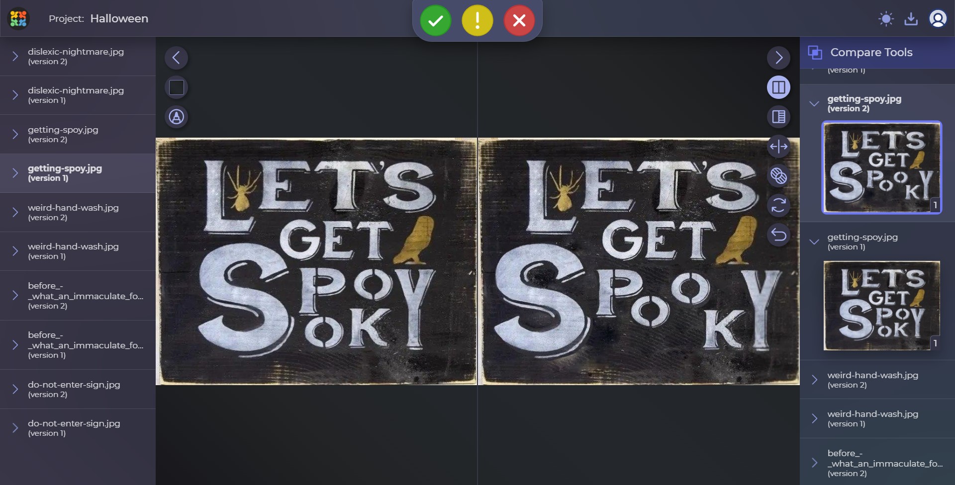
The matter is in O’s.
Pumpkin hand wash
Many brands are more than willing to use such holidays as Halloween to showcase their products. Naturally, such things as a pumpkin handwash would be a blast while everyone is still in the festive mood – but I’m not really sure about this one.
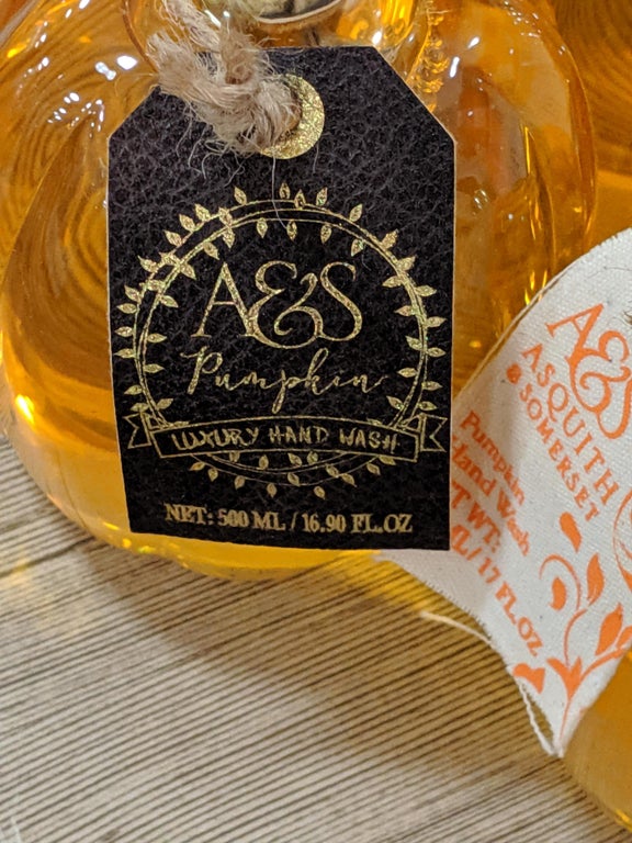
On the one hand, this thing is hilarious because many people would probably still buy it just for fun. On the other one, though, it is hard to believe that someone could overlook how much their “A&S” inscription reminds of “ASS”.
Certainly, this could be done on purpose to make people laugh and buy the product, but we will never know for sure unless you know someone who works at that company. If you do – drop us a line in the comments. I’m really curious.
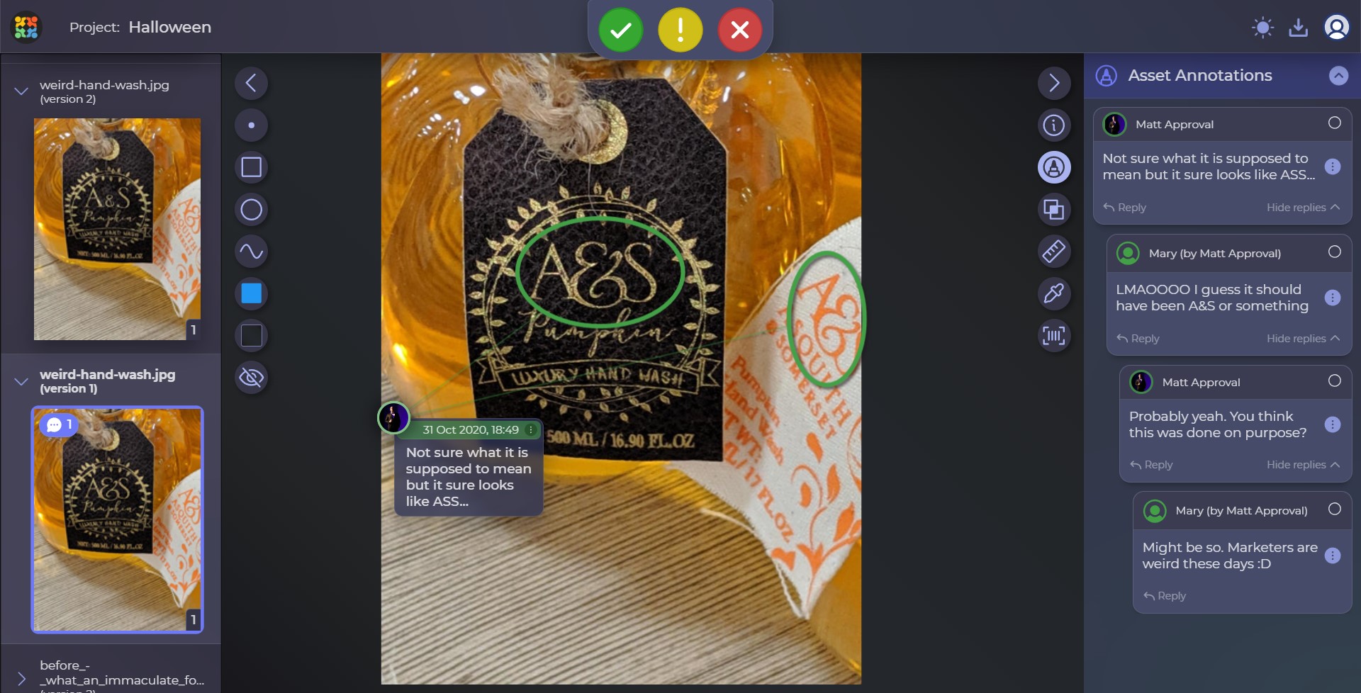
I mean… that’s just weird. Here’s how it could look after the fixes and some serious considerations over your brand book:
The branding should connect with people at all levels, but please don’t take these words too literally…
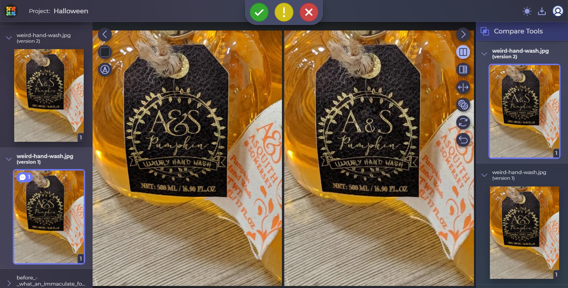
Just a desperate mistake
We know, Halloween is the time when you have to put out a lot of spooky stuff as quickly as possible. People need decorations for the outside of the house, inside of the house, car, office, cat feeder…Things get heated quickly. However, it doesn’t mean that you shouldn’t review your design before sending it to print:
CDNDY is our favorite treat in autumn, too, and it’s super underrated. However, I believe something called candy is more popular and that’s what most people will be asking for on Halloween. So, let’s help our candy eaters get what they want!
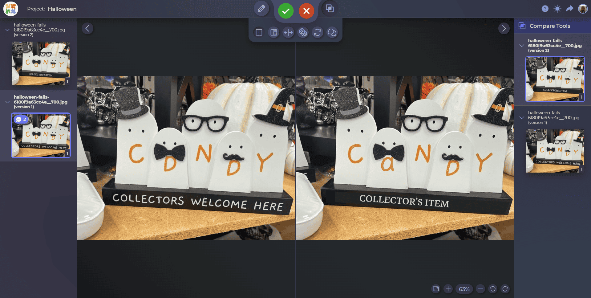
This is yet another cautionary tale about why you should always thoroughly check what you’re about to mass-produce and send to shops all over the country. You can simply look at them, show them to your friends, mom, or dad. Or, you can keep your job’s confidentiality and use a review tool.
Dyslexic horror
This one is probably the weirdest, and I would take a bold guess and say that the problem is not bad design. We will probably never know how it was supposed to look because the author failed to create a nice printable PDF, the fonts weren’t set up, or they used an older version of the software at the place where it was printed. I don’t know. Yet, it creates a new problem – who on earth would still use this?
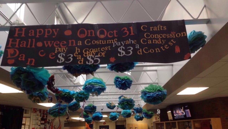
Can I please unsee it somehow?
It might be that the school administration decided that it was some kind of a funny joke – you know, the banner is as spooky as the festivity, it sets up the right mood. And indeed, seeing something like this, you want to run away somewhere safe.
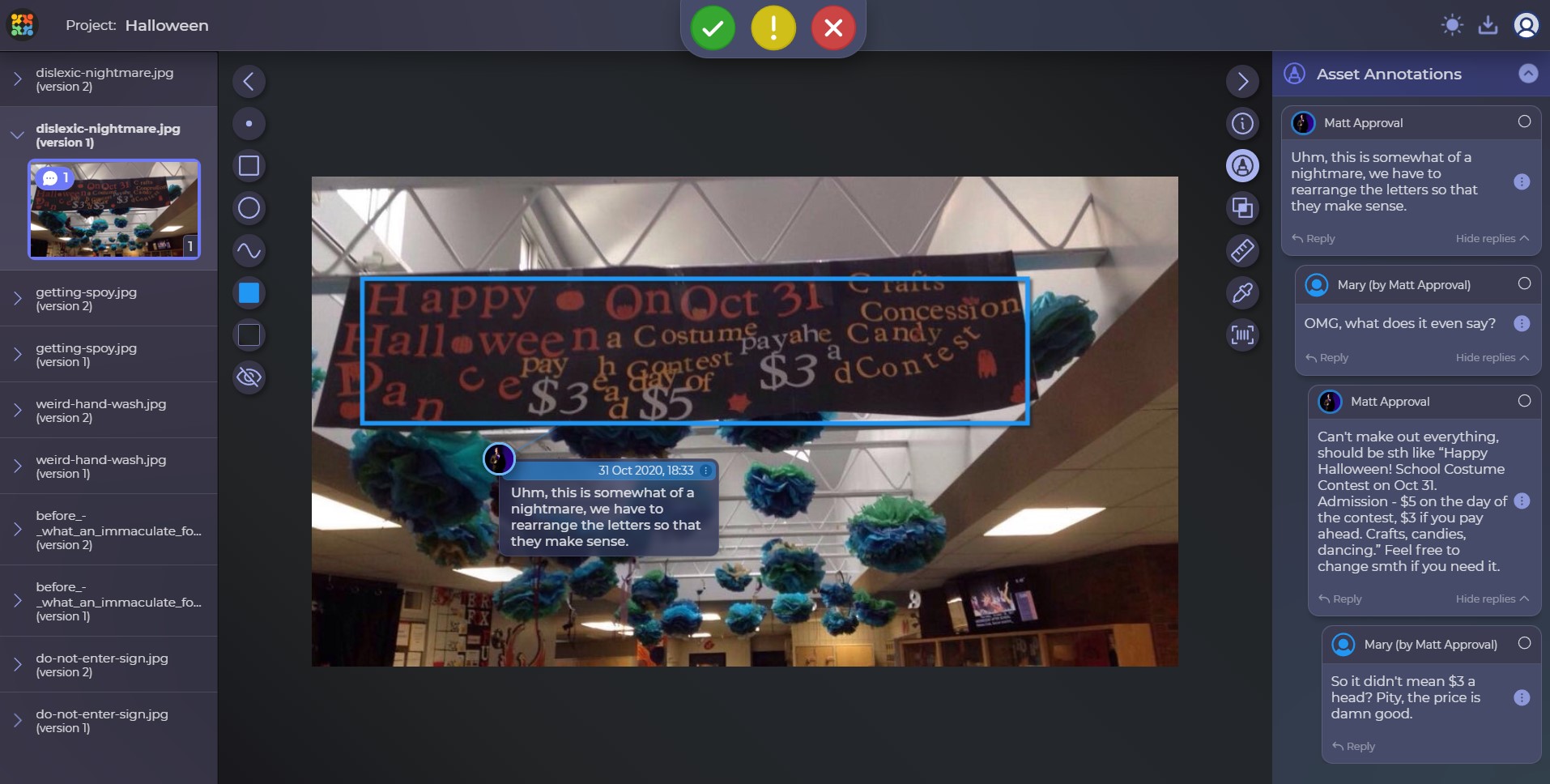
First, they teach you to read; then, they make you hate reading. Mary’s variation of this creepy banner that originally offers us heads $3 each looks like this:
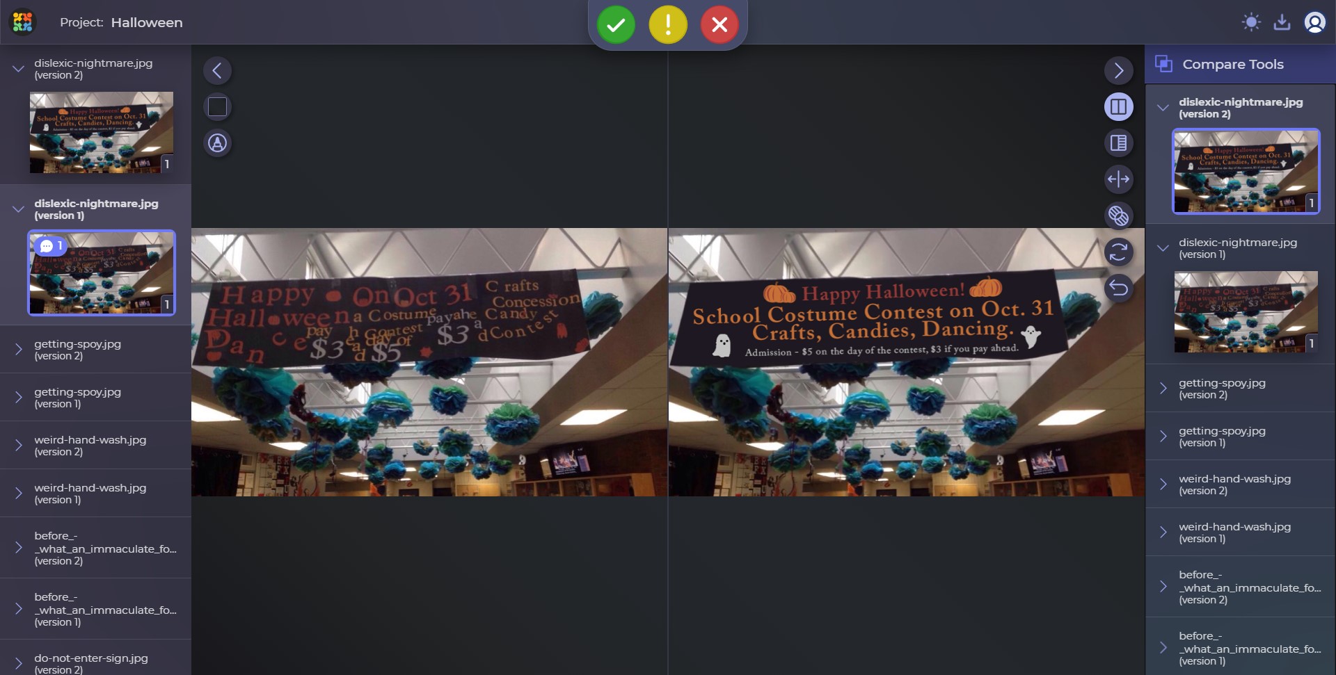
It’s a pity, the price of $3 a head was really good!
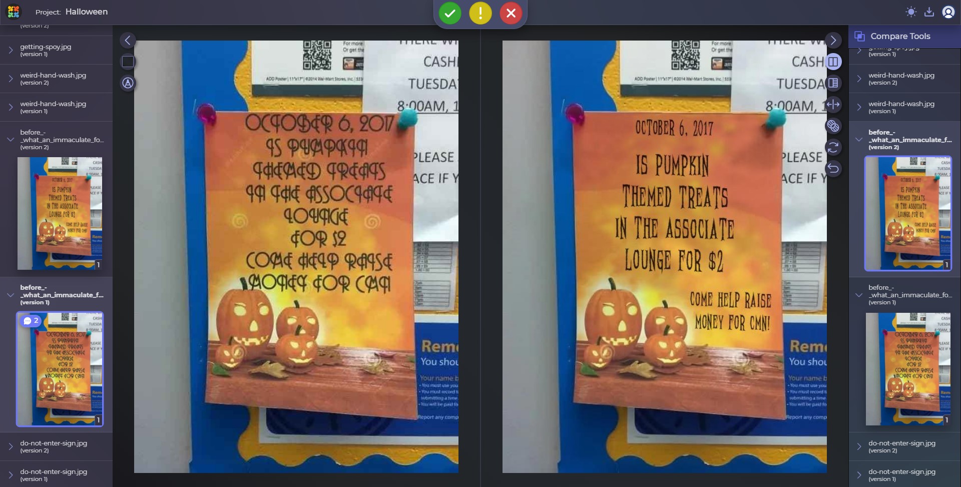
Immaculate font choice
The right fonts seem to be very hard to choose these days. However, the person behind this layout certainly understood the assignment of making it as scary as possible. Well done! We were petrified as we tried to read into it and not to pay attention to the watermarks printed together with the stock image with pumpkins… but let’s focus on the writing in the first place.
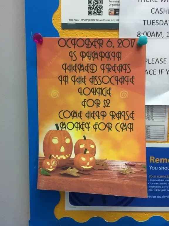
The poster itself seems to have been done for some charity or a project that needed raising money, and I truly hope that the goal was achieved. But hey, next time you people need a poster, at least make sure the font you are using is readable or something. We’ve had difficulties with this Halloween design for sure.
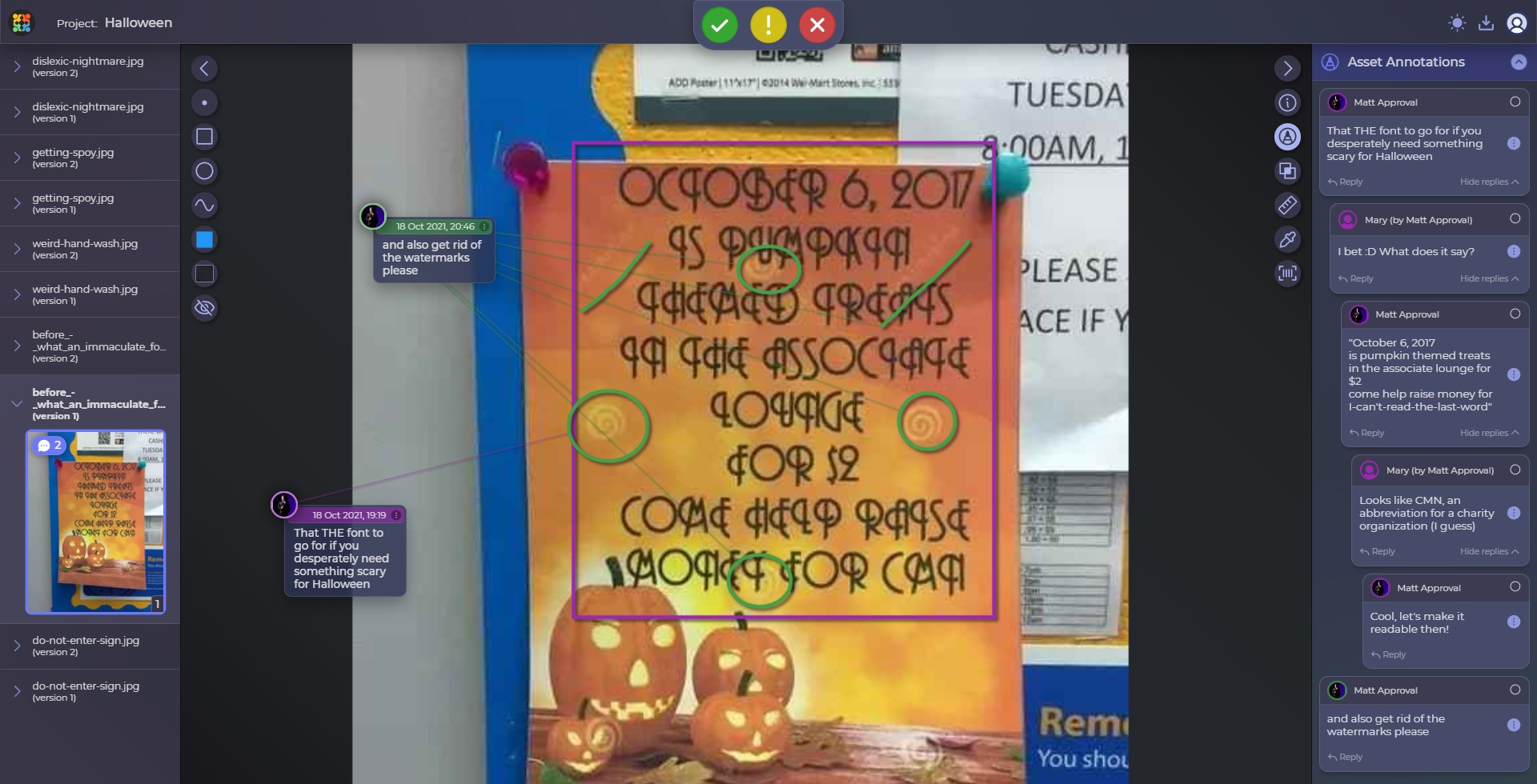
Now here’s a slightly more readable rendition in comparison with the old one. We would surely change the whole poster and create a new one, but that would not match the point of this article, so here it is with a spooky but readable font:
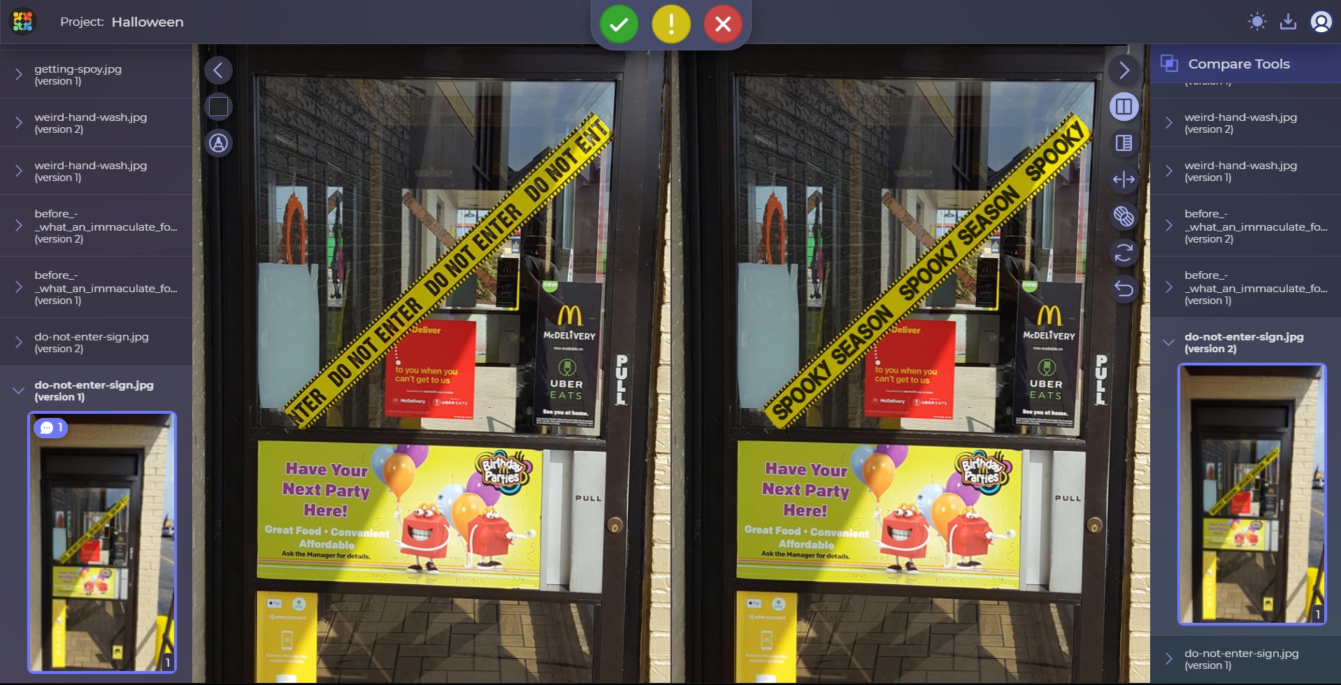
The Barricade Tape
Halloween decorations might become weirder and weirder as time goes on: many people take it as a contest in creativity (or laziness) and make it their duty to add some festive mood to their places. Businesses are not an exception. Here’s one that, instead of inviting people over on Halloween, decided to make them doubt if the party place actually works:
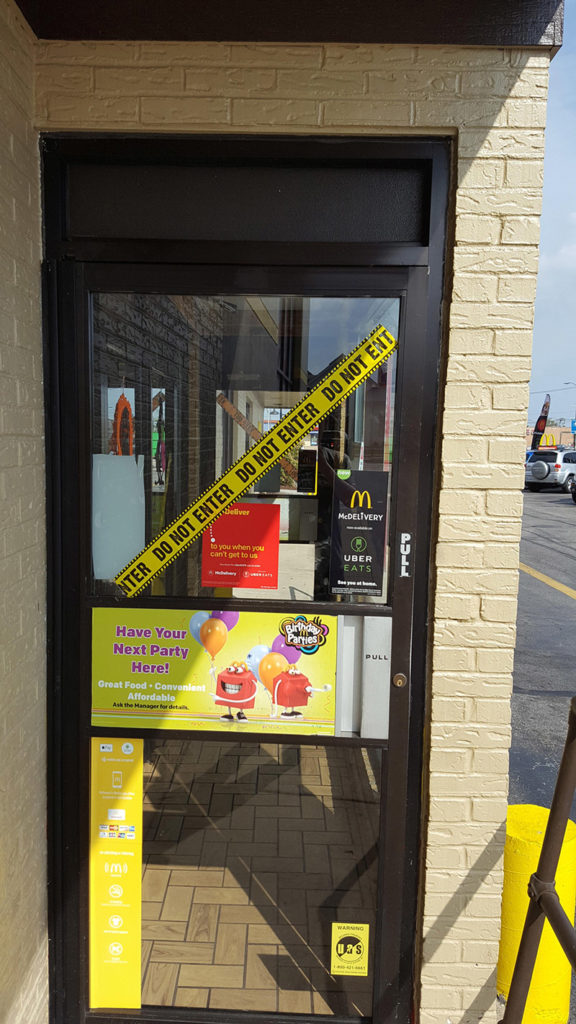
It really had us doubting for a second — and, honestly, the rest of the ads that the door is riddled with are not helping either. We would change that too, but since it’s a Halloween article, we’ll leave it as scary as it was but for one small detail.
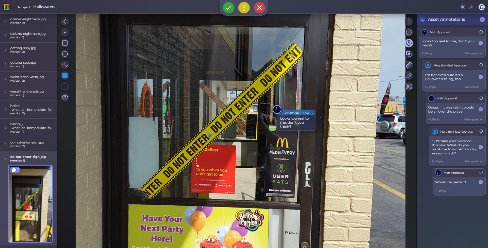
A simple change of the text written on it was in order. I bet you can buy something like that as soon as the stores get filled with decorations and stuff. Let us know if you get one, we put it on our sprint meeting room door 😀
Final Thoughts
Ladies and gentlemen, please review your designs before production! That’s probably as important as the rest of the workflow because it will determine whether your product will be praised or laughed at. And, surely, there’s nothing wrong with some good laughs during a holiday, but it’s vital to keep them the good-hearted, not mocking ones. That is why our artwork review and approval software is always ready to help you – what you should do is just drop us a line. All jokes aside, poor design review can create problems more serious than a couple of memes, and it is always great to be ready and avoid them. You can also get a free personal demo with our project manager – he is always happy to chat with you.
And while you still think whether it’s worth it or not, here’s a link with other weird Halloween designs where we found our today’s candidates. Have some fun, and we’ll fix some of them next year. Maybe.
Happy Halloween and stay spoy… ok?
