 TEAM SOLUTIONS
 WORKFLOW SOLUTIONS


 REVIEW TOOL
 PROJECT MANAGEMENT
 TOOLS & INTEGRATIONS
 CLIENT INTERVIEWS


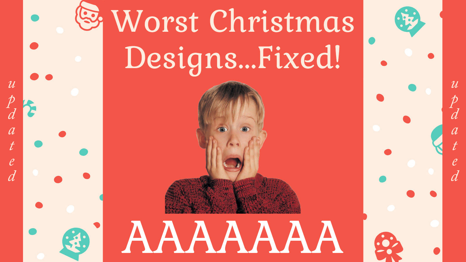

Ho-ho-ho!
Christmas artwork workflow patrol’s here.
As the most wonderful time of the year is approaching and everybody is getting busy choosing presents, decorating their Christmas trees, and standing beneath the mistletoe hoping for a kiss, we are not allowed to sleep.
Within the whole design history, there were many ups and downs when it came to Christmas. Some artworks evoke that one warm and festive feeling and some just stand there in the corner as an example of how you should not do, really. Thankfully, with the help of the Internet community, they get transformed into memes pretty quickly, and we might find another source of amusement during our lunch breaks at the office. Neat!
That being said, we’ve been going around 9gag archives and different subreddits to check on the most miserable Christmas designs that needed fixing and found the three we thought needed it the most. Mary and I decided to rework them just for a bit of additional fun. Naturally, the job involved a solid bit of online proofing. Shall we show the result to you?
I bet we shall. Enjoy!
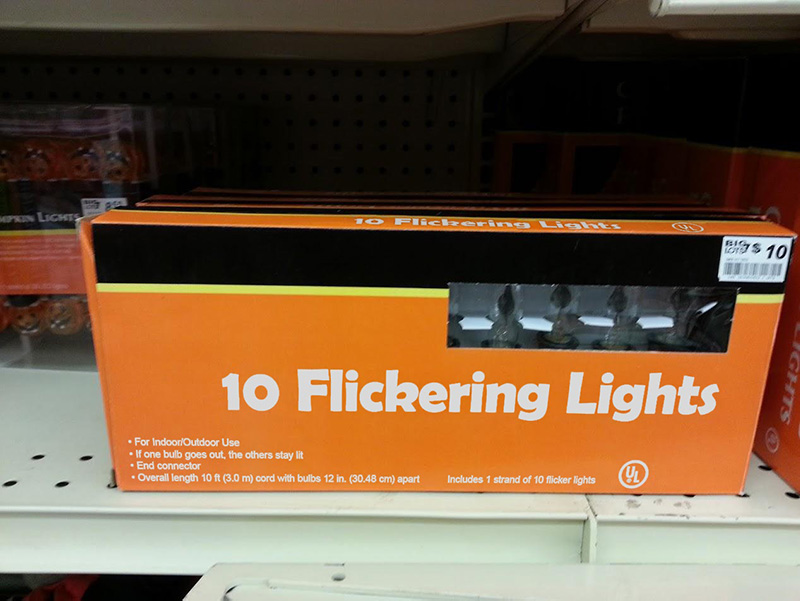
10 Inappropriate Lights
This is the one that has become a pretty famous meme over the last several years. To be honest, this package design would be the one I’d gladly add to college and university guidebooks as a great example of a thing that should not be. The inscription would say: “Younglings, remember: kerning is important!”.
However, I bet it would not be fair to the original designer because I don’t believe you could do that accidentally. My take: it was a well-thought trolling of the client who happened to be too impatient. Or nosy. Or bossy. Or everything at the same time. How else can you make flickering lights suggest such inappropriate things to you?
Thankfully, we managed to fix the issue with the help of our artwork approval system, Approval Studio, and provide our designer with all necessary edit suggestions. The texts that are hardly visible on this package were added as reference documents.
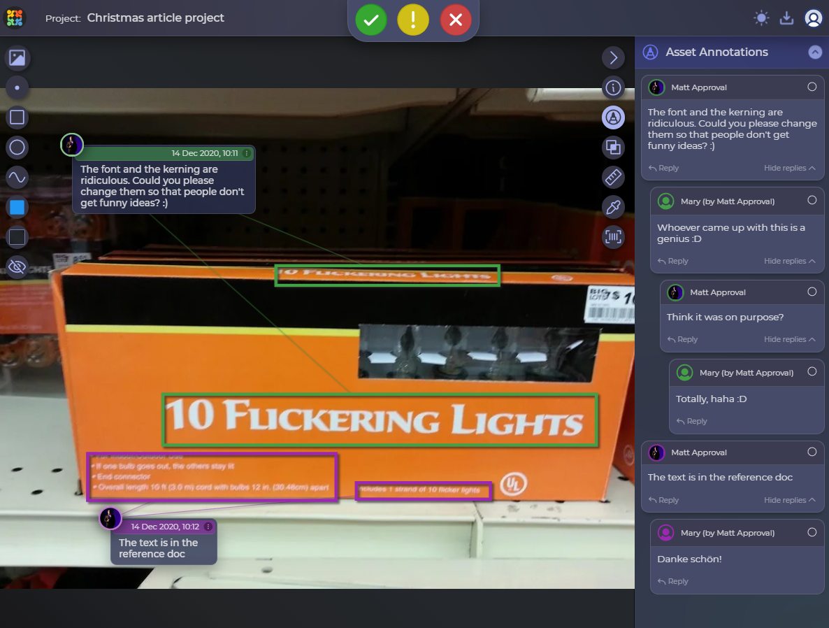
Basically, we did not do much here, just changed the font, its kerning and made the word “flickering” look like what it was supposed to initially. Here’s the mockup of our final version, and it surely doesn’t swear at anyone.
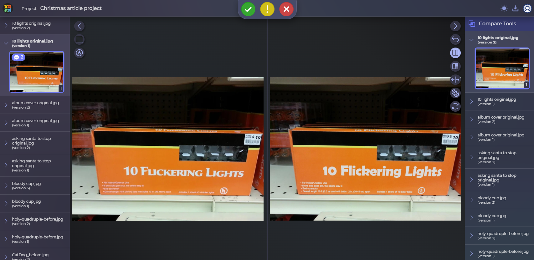
P.S. We did not want to make the whole unfolded package since we do not know how the original looks, so, basically, we made only what we could see. Here are two versions in our artwork software’s compare mode in case you wanted to see both of them:
Would you like to review artwork in the same fashion as we did? We are willing to share our experience with you for free!
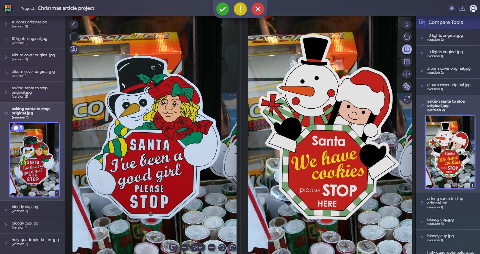
Asking Santa to Stop
Uhm… the creators didn’t really think about what associations this seemingly friendly sign might arouse. Everybody wants Santa to stop near their homes to treat him with some milk and cookies, but hey! You might want to be a bit more specific about that and not end it mid-sentence. Otherwise, questions will be asked. My questions are: who approved this? And what digital asset management software did they use?
I will not criticize the illustration itself (although I do not really like it, to be honest), but the inscription makes me fall into a stupor, wondering what’s the meaning of all this. I thought I was the only one who was confused by the message, but folks on the Internet decided the sign was giving pretty sinister ideas as well. We definitely needed to fix it, so we uploaded the pic to our digital asset library.
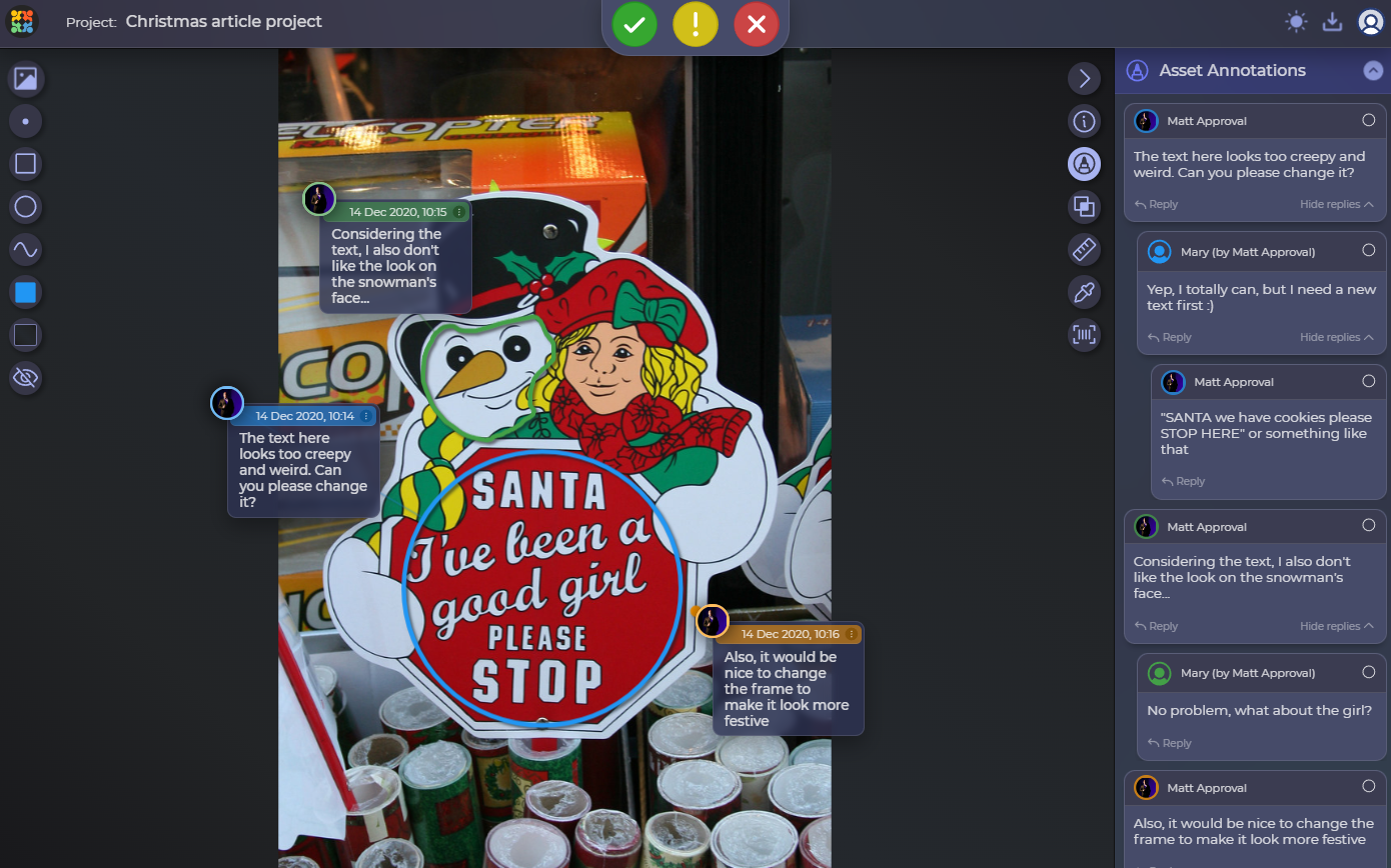
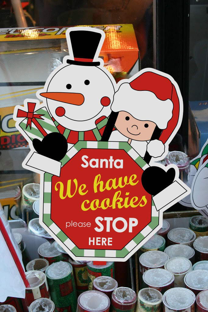
After all the reviews, there you have it – a totally innocent and welcoming Christmas sign, not the one that could scare any reindeer off. And the snowman looks much friendlier!
And here’s the comparison in Approval Studio’s compare mode:
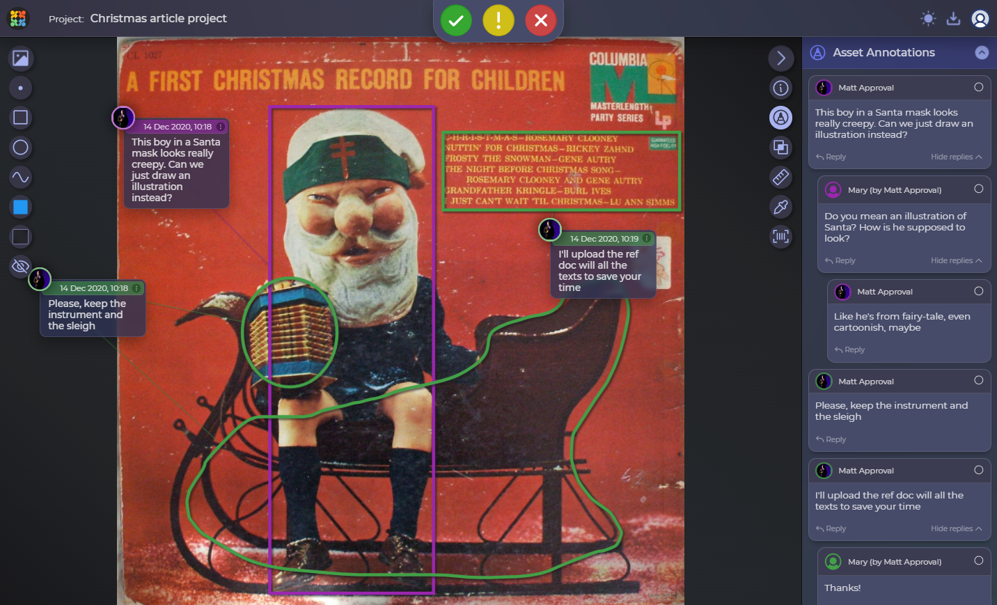
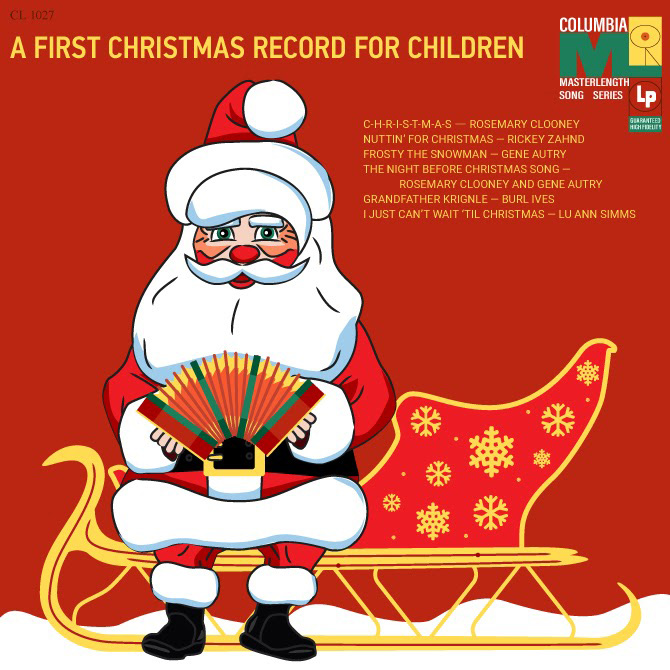
Creepy Album Cover
So, the last one came to us from the far 1958 (or 57, different sources give different info). It is called A First Christmas Record For Children and, basically, is a Christmas song compilation by various artists. The very name suggests to us that it was purposed for kids, and it is not a bad bunch of songs, after all. However, as usual, there’s one big OOOOOPSIE connected with the art approval.
Several variants of the cover include different shots of a boy on a sleigh and a Santa Claus mask. In the first variant, the mask was lying near the boy, but in the second, he decided to put it on. The result is what you might call mildly disturbing and creepy – as if the mask wasn’t frustrating enough on its own account. If I ever have kids, I would rather not show them this one if I don’t want them scared. One more piece of evidence is that online proofing for designers is highly important.
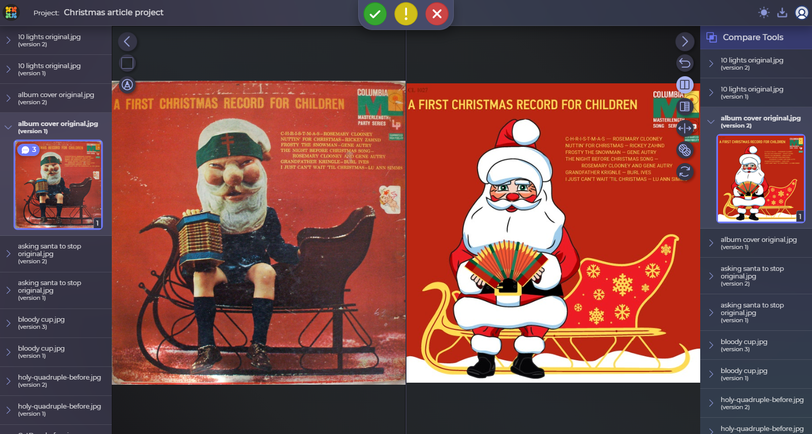
We are not sure what was the cause of it – the late 50s trends (why, though?), the lack of materials to work with, or just a very… let’s say, peculiar designer’s approach. My point is that the mask can scare the hell out of everyone due to how mismatched it looks on a small boy’s head and how grotesque and unfriendly Santa’s head looks. We decided to take our shot on the cover, and here’s what our ideas looked like:
Thanks to our designer, we now have a whole different image. We decided to replace the boy with an artwork of Santa and make it look a bit more festive. Hope the kids would like that one better!
In case you were wondering, here’s a side-by-side comparison in our Approval Studio compare tool:
Also, as a bonus, our designer toyed with the element placement and fonts a bit so that it matched the new style better, and here’s what he came up with:
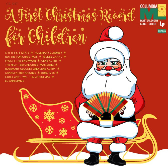
Which of our two variants is better, what do you think?
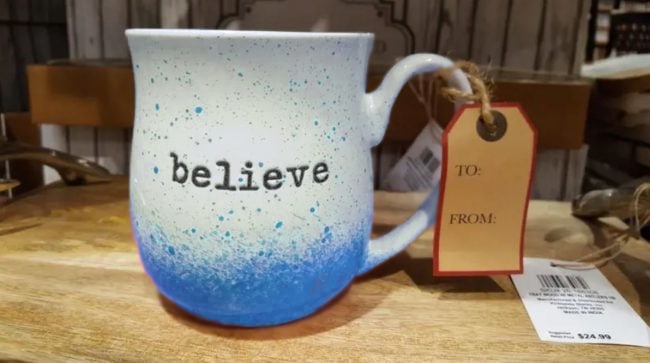
Murderous Cup
A variety of cool Christmas presents is totally uncanny, but I can almost guarantee that everybody loves cups. Cups mean coffee or tea, which keep you warm on chilly winter evenings. They are part of the coziness while you are watching Home Alone for the millionth time. But can this be cozy?
Well, it probably can, as this design is not as terrible as all the previous ones. Still, the color choice does not calm me – I guess I find it rather disturbing as the red reminds me of blood. Seriously, I feel like it could easily be Hannibal Lecter’s or Dexter’s cup. Needs fixing!
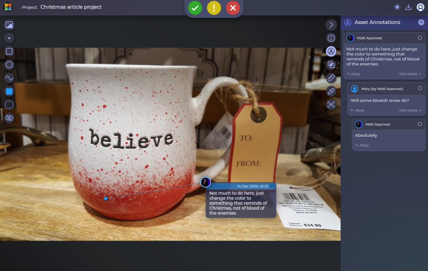
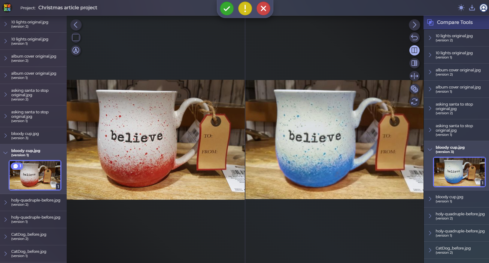
Mary exchanged the colors and turned the red into the blue – reminds of snow rather than blood and looks overall much more festive. I’d drink some tea to that!
And here are two versions side by side:
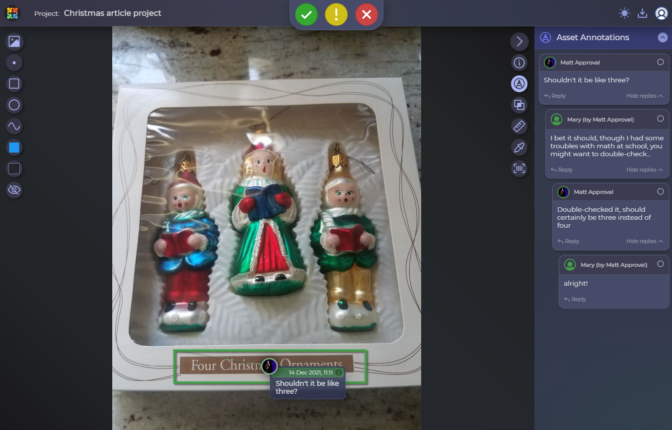
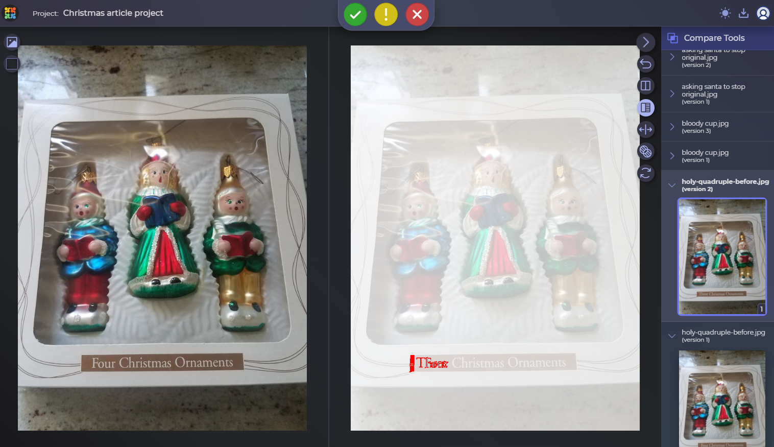
Holy Quadruple
There are many mistakes in design that are a bit more subtle and easy to miss, such as our next entry. Here, the mistake only is with the text applied to the packaging of Christmas ornaments, and something tells me that the designers of this one did not use the design proofing tool at all.
Not that much to fix here, though, so I’ll keep my comments brief while you check out our little debate in mathematics.
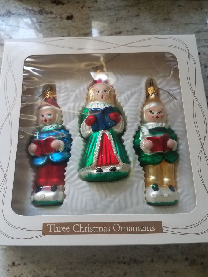
Here’s the changed version, not much going on here.
And here’s a comparison of the two. Since the difference is a little more subtle than usual, I decided to show it to you via our difference marker in compare modes.
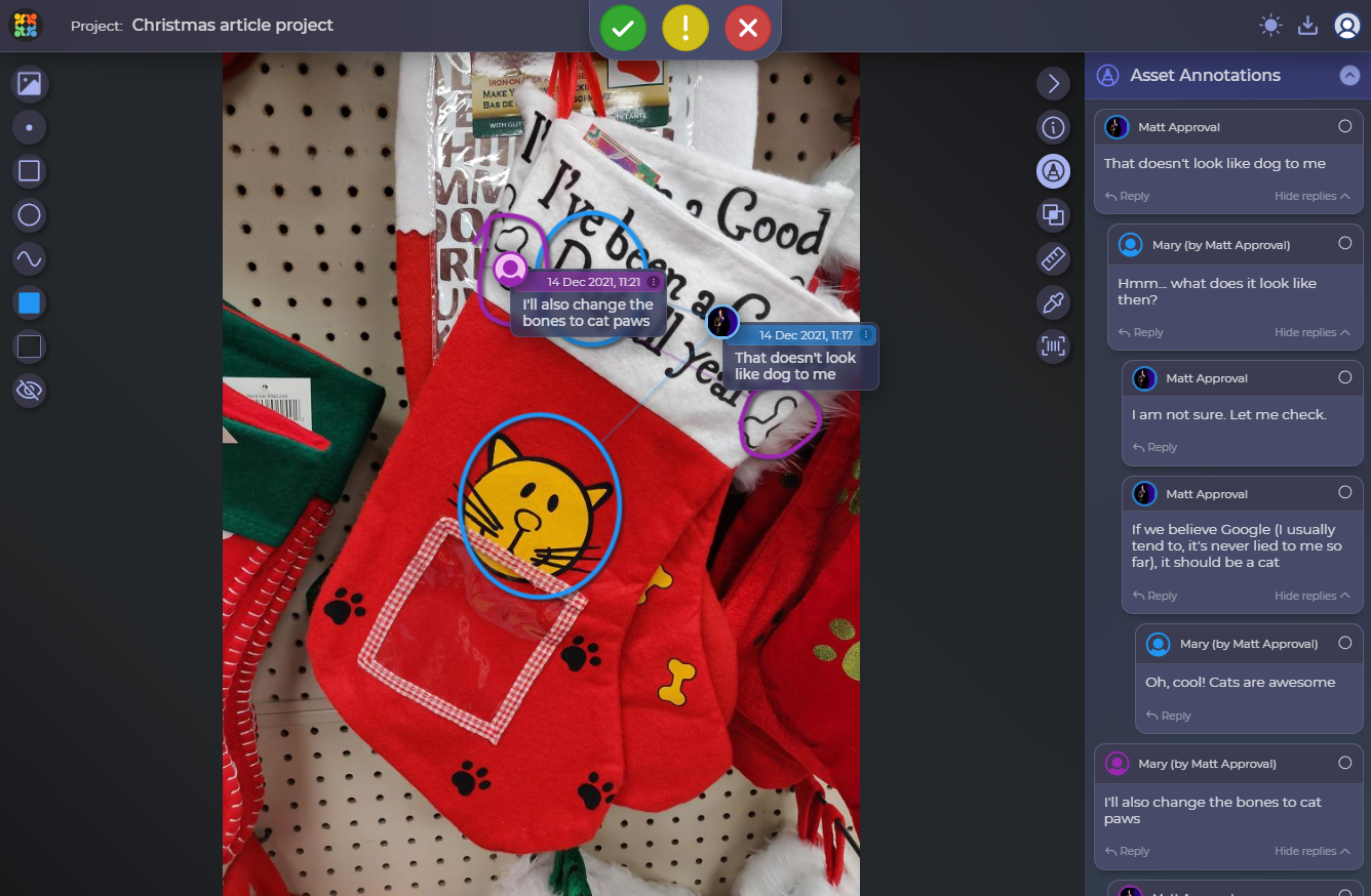
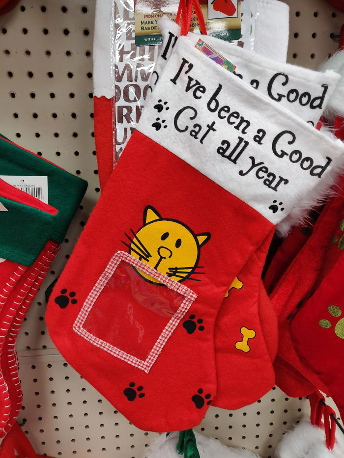
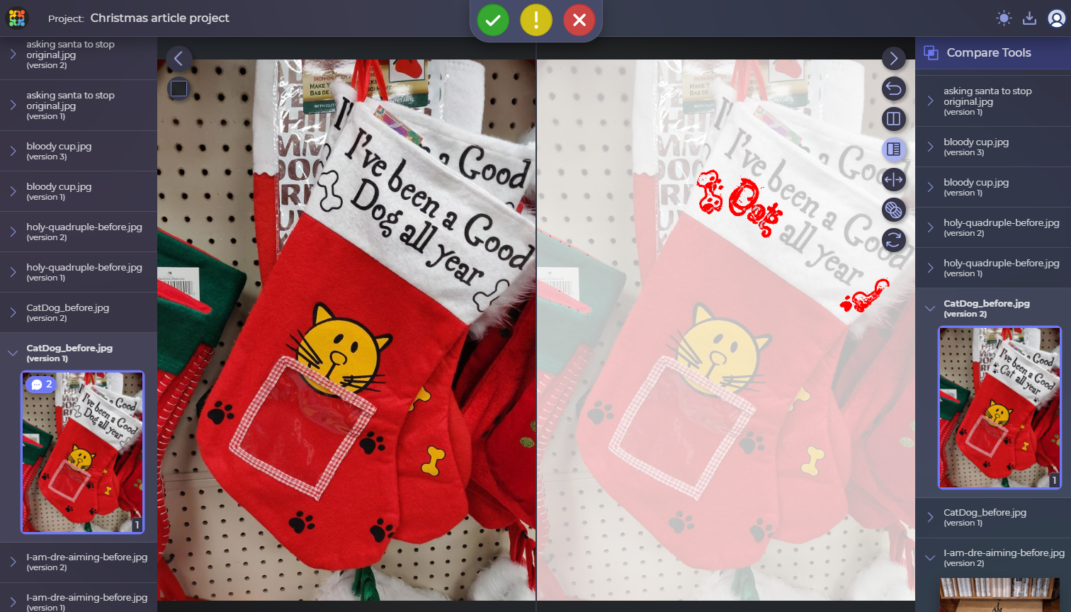
CatDog
Yet another funny printing mistake that needs a little tweaking (not that it can possibly make any difference to your lovely pet, but still). CatDog was one of my favorite cartoons ever, though I doubt that this design was created to honor the character.
Guess just as well as all of them, this designer just missed out on good design review software. Well, here we are to help them out and fix it so that the perfectionists in us sleep well at night.
In general, that was a rather fun fix with slightly more to it than just text.
The changes here are not really in the center of your attention at once, so here’s our little difference highlighter in compare mode to show you around:
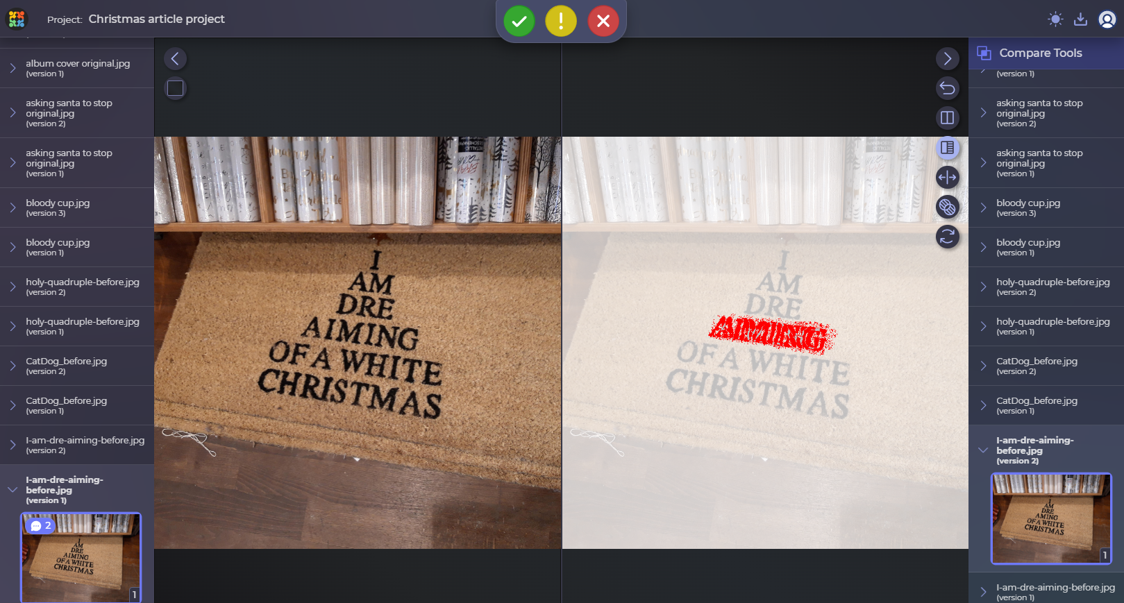
Dr. Dre’s Doormat
Is there anyone out there enjoying some old-school legendary rap artists? This Christmas doormat design seems like it would belong to Dr. Dre himself, though I have no idea why he would take shots at Christmas.
In all seriousness, though, I can appreciate the idea of the text looking like a Christmas tree with a star above. I do not know why anyone would put it on their doormat (if that is a doormat), but the concept kinda works. Though, the spelling mistake is still confusing.
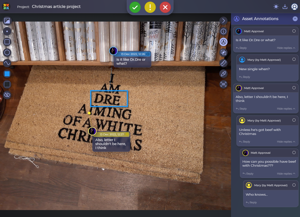
We thought of rephrasing the whole thing to make it more readable or getting rid of the Christmas-tree structure, but it wasn’t working for us, so we decided to go the simplest way: just get rid of the confusing letter.
Our online review tool comparison regime would show you all the tiniest details: even though only one letter was cut, the rest of the line had to be shifted to align it with the rest of the text. Here’s how it looks in our side-by-side comparison:
Final Thoughts
So, although we might become a pretty decent team of reindeer should the festivities begin, we do not carry Santa’s sleighs. What we carry is the message to all designers out there – always have your work approved before you put it out to the market and use online proofing tools to do it. Otherwise, it might catch a great deal of attention, but it won’t be the exact attention you needed. If you are still wondering how you can do it, ask us – Approval Studio has all the answers you are looking for! And, what is most important, don’t forget to have a good laugh with your nearest and dearest in this wonderful season!
Merry Christmas, and a Happy New Year to everyone!
