TEAM SOLUTIONS
 WORKFLOW SOLUTIONS


 REVIEW TOOL
 PROJECT MANAGEMENT
 TOOLS & INTEGRATIONS
 CLIENT INTERVIEWS


Post is also avalible in:
![]()
![]()
![]()
2000: Cerulean
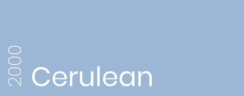
Pantone 15-4020 I #9BB7D4
The first-ever color of the year became the pale light blue Cerulean that was also called the “color of the millennium.” It was chosen to bring a sense of tranquility and peace to the whole new era. As you will be able to see, there are quite a few blue shades and hues in this color of the year overview.
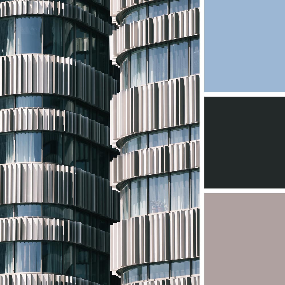
Cerulean color palette | Photo by Pierre Châtel-Innocenti
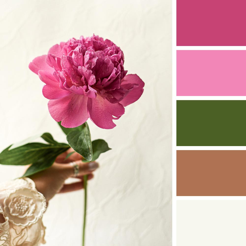
2001: Fuchsia Rose
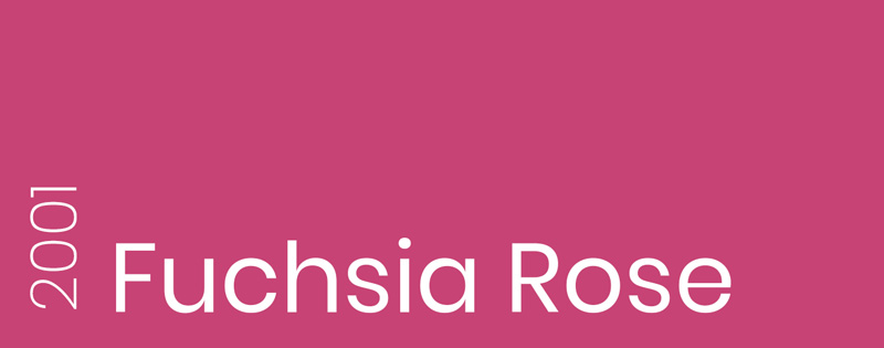
Pantone 17-2031 | #C74375
Right after the blue calmness, Pantone experts brought the opposite into 2001. Fuchsia Rose is a sleek pink color that can be viewed as delicate and glowing but not as still as Cerulean.
Fuchsia Rose color palette | Photo by Raspopova Marina
2002: True Red

Pantone 19-1664 | #BF1932
“Let’s bring up the intensity!” – this is what Pantone Color Institute might have thought when choosing daring True Red as the color of 2002. Indeed, dark red represents recklessness and boldness, and it is as strong as any other classic color.
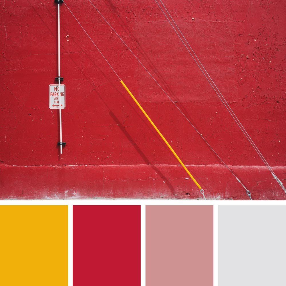
True Red color palette | Photo by Chris Adams
2003: Aqua Sky
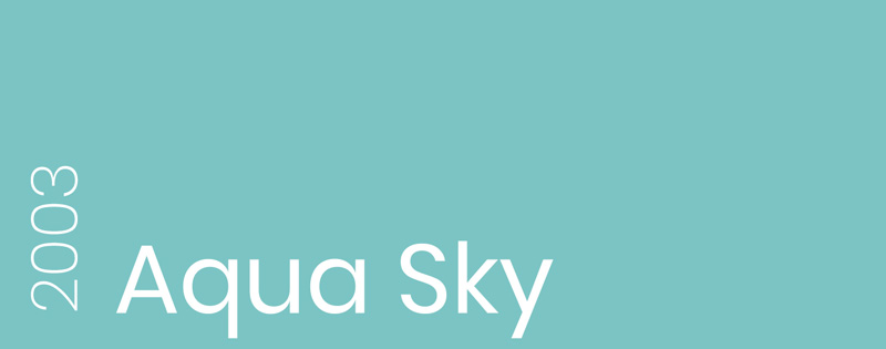
Pantone 14-4811 | #7BC4C4
Pantone did a 180 by choosing an Aqua Sky for 2003. A cool shade of the blue-green color represents serenity and clearness. Actually, Pantone experts were maintaining a proper balance between reds and blues during these 4 years.
Aqua Sky color palette | Photo by Linus Nylund
2004: Tigerlily

Pantone 17-1456 | #E2583E
Being influenced by the gorgeous flower called Tigerlily, Pantone struck again with the warm hue. 2004 was meant to be passionate, exotic, and luminous, just like the blooming flower.
Tigerlily color palette | Photo by Marek Piwnicki
2005: Blue Turquoise
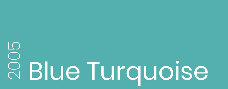
Pantone 15-5217 | #53B0AE
The traditional color of the dream sea. Maybe Pantone Color Institute workers desperately wanted to go on a vacation somewhere nice. I think we can all agree that Blue Turquoise was a kind wish for everyone to be calm and well-rested in 2005.
Blue Turquoise color palette | Photo by Bogdan Dada
2006: Sand Dollar
Pantone 13-1106 | #DECDBE
Even though the color of 2006 can remind us of mesmerizing deserts and beaches, it has an underlined meaning to it. 2006 was the year of the subprime mortgage crisis in the USA, and Sand Dollar was an appropriate representation of the economy back then.
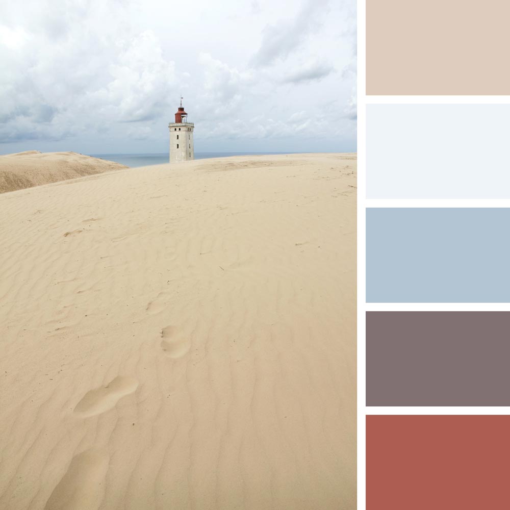
Sand Dollar color palette | Photo by Tomas Eidsvold
2007: Chili Pepper
Pantone 19-1557 | #9B1B30
I wonder if the Pantone was under the influence of the Red Hot Chili Pepper band back in 2007… Just like their songs, the color of deep red is adventurous, spicy, and expressive. Chilly Pepper is also a statement color that could represent personal or national ambitions.
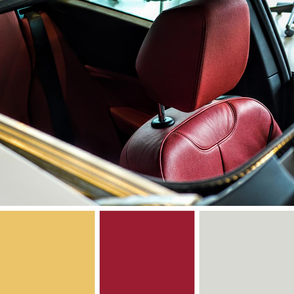
Chili Pepper color palette | Photo by Obi Onyeador
2008: Blue Iris
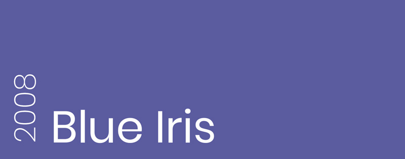
Pantone 18-3943 | #5A5B9F
Blue Iris combines two important colors: the calming blue and the mystical purple. Pantone might have thought that it made a wonderful mixture for providing the needed reassurance and excitement in a fast-paced world.
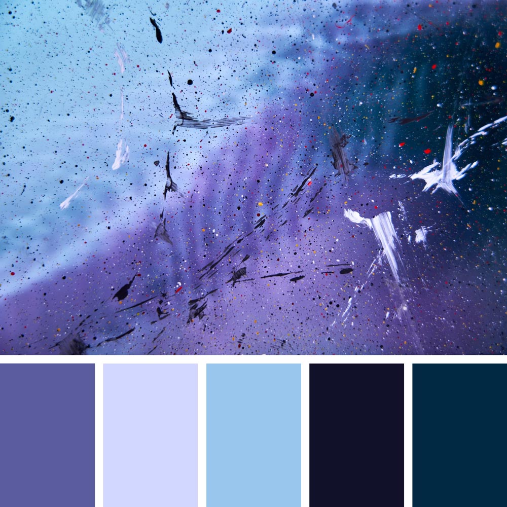
Blue Iris color palette | Artwork by Jr Korpa
2009: Mimosa
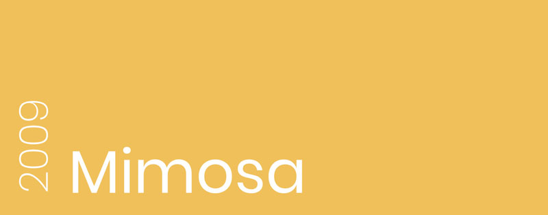
Pantone 14-0848 | #F0C05A
The first yellow color of the year perfectly fits 2009 – Mimosa sparks optimism and encouragement. With another complicated economic situation, Pantone wanted to give a little hope to everyone.
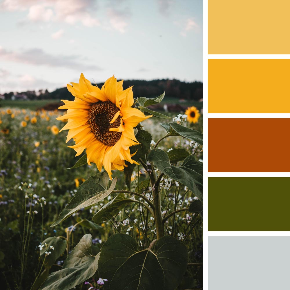
Mimosa color palette | Photo by Matthias Oberholzer
2010: Turquoise
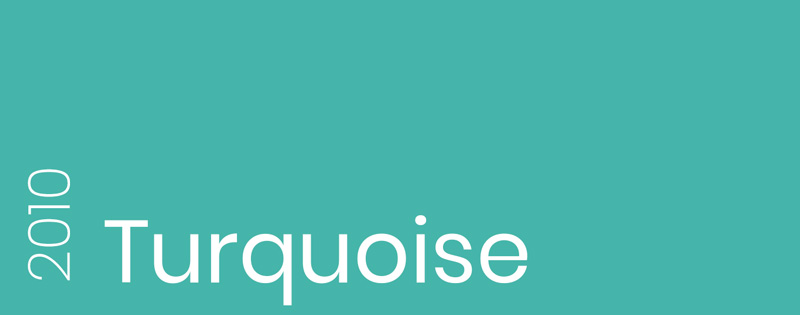
Pantone 15-5519 | #45B5AA | Pantone Announcement
Turquoise is a younger sister of the 2005 Blue Turquoise color. With a deeper greenish tint, the color of 2010 provides a tropical escape for people. Turquoise is also considered a universally healing color as well as a protective talisman.
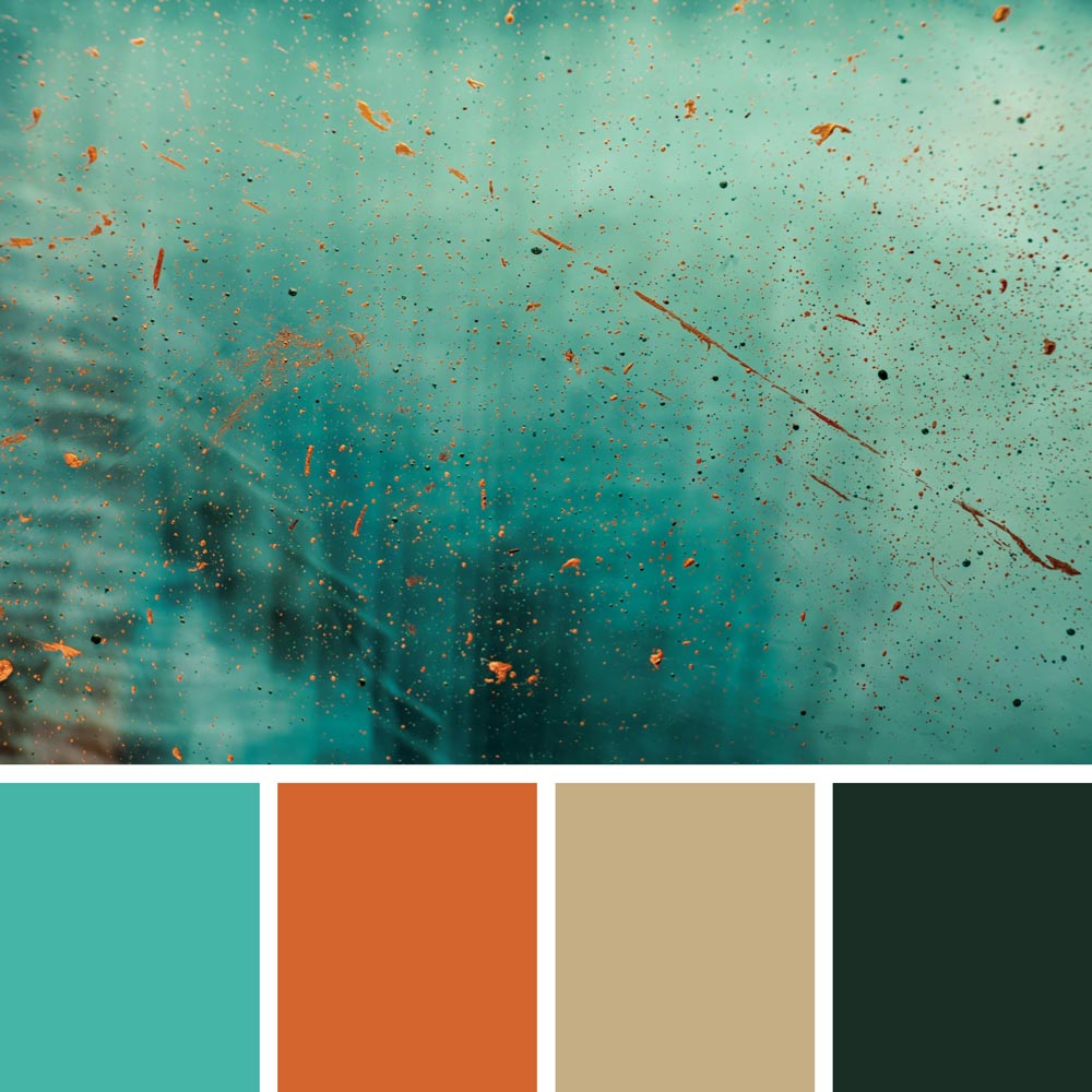
Turquoise color palette | Artwork by Jr Korpa
2011: Honeysuckle
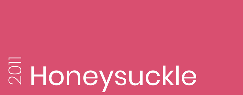
Pantone 18-2120 | #D94F70 | Pantone Announcement
Pantone chose Honeysuckle as the color of 2011 for its encouraging and uplifting qualities. A perfect choice to battle the sadness. Also, this dynamic reddish pink can be reminiscent of cheerful summer days.
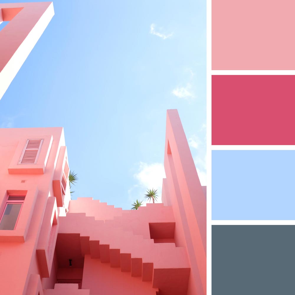
Honeysuckle color palette | Photo by Beasty Design
2012: Tangerine Tango
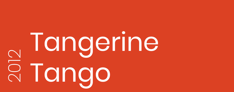
Pantone 17-1463 | #DD4124 | Pantone Announcement
A passionate orange hue as the color of 2012 was meant to continue the encouraging mood of 2011. Tangerine Tango provides a vibrant and radiating feel that helps start the new year with the full battery of enthusiasm.
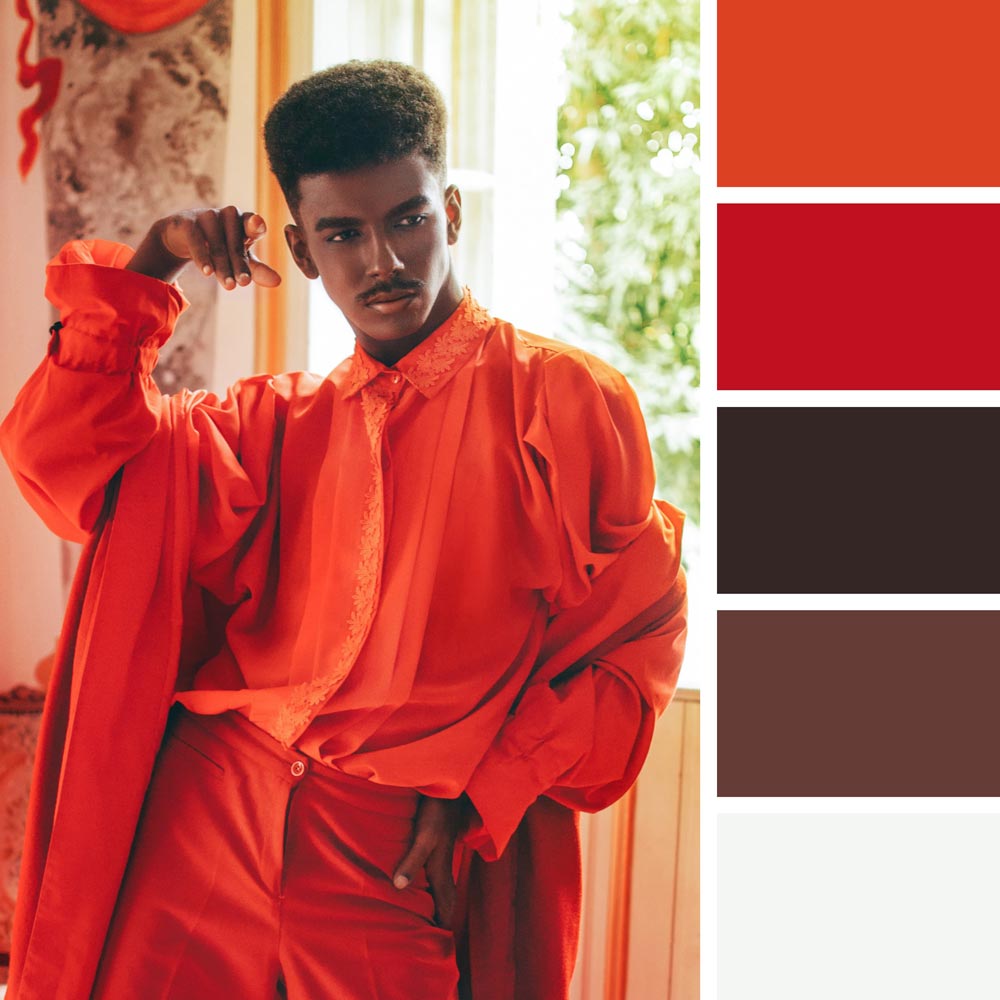
Tangerine Tango color palette | Photo by Rafael Cerqueira
2013: Emerald

Pantone 17-5641 | #009473 | Pantone Announcement
The color of 2013 became a luscious green called Emerald. It was chosen to maintain a healthy balance and harmony in the upcoming year. Emerald is rich and indulgently sophisticated, just like the well-known gemstone.
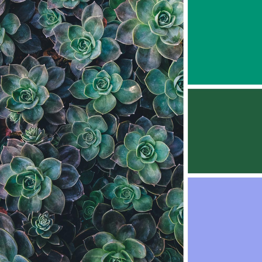
Emerald color palette | Photo by Annie Spratt
2014: Radiant Orchid
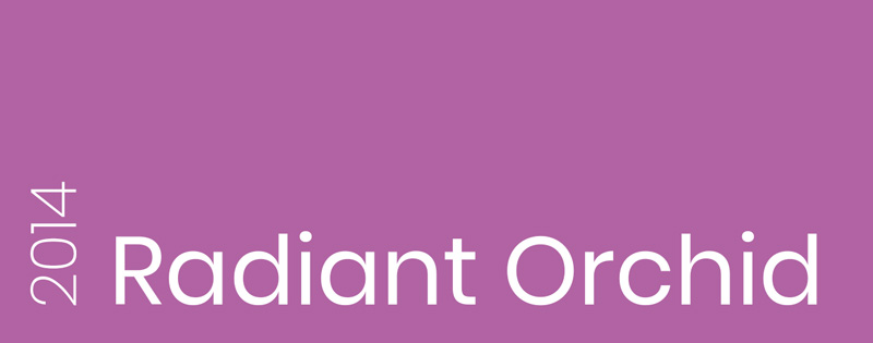
Pantone 18-3224 | #B163A3 | Pantone Announcement
Pantone experts started 2014 with an expressive boost of energy. Combining both cool and warm undertones, Radiant Orchid strikes as a confident and hospitable color. At the same time, the exotic purple is not at all overpowering.
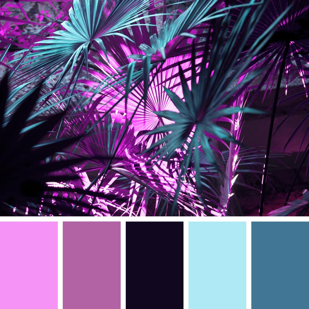
Radiant Orchid color palette | Photo by Eduardo Cano
2015: Marsala
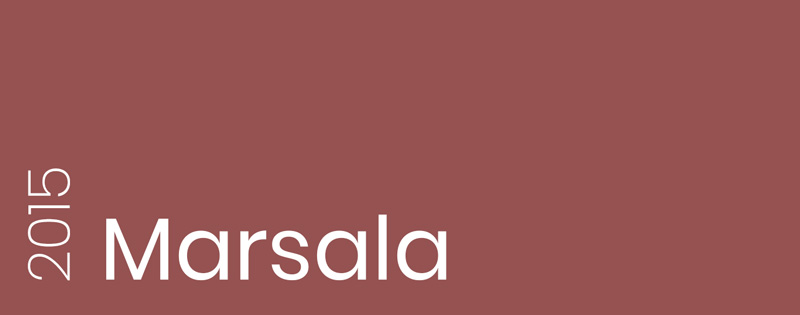
Pantone 18-1438 | #955251 | Pantone Announcement
The fulfilling earthy tone of robust color seemed a clear solution for 2015. It encourages us to step back and enrich our bodies and souls. Marsala represents a nurturing base for creativity and experimentation and a glass of fortified wine with underlying hints of luxury.
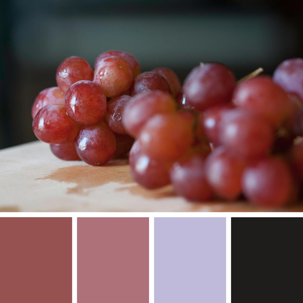
Marsala color palette | Photo by Jene Yeo
2016: Serenity & Rose Quartz
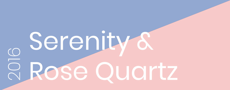
Pantone 15-3913 | #92A8D1 & Pantone 13-1520 | #F7CAC9 | Pantone Announcement
In 2016, Pantone presented us with the first-ever mixture of two colors: the airy blue and the gentle pink. The blending of the Serenity and Rose Quartz was meant to depict the fluidity of opposites and their inner connection to remove the gender stereotypes.
Serenity & Rose Quartz color palette | Photo by Diego Hernandez
2017: Greenery

Pantone 15-0343 | #88B04B | Pantone Announcement
A rejuvenating green was an obvious response to a growing technological obsession of society. Greenery illustrated the new beginning and the human need for nature and the great beyond outside. The need to rest, take a deep breath, and reflect.
Greenery color palette | Photo by Flummox Raccoon
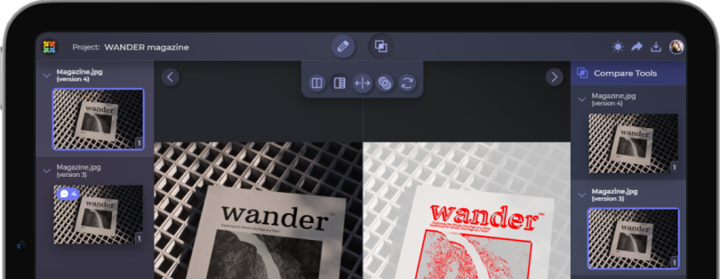
And that was not the only awesome thing to happen in 2017, of course. In that year of growing technologies, we established Approval Studio. If you are new here, Approval Studio is an online proofing software for designers and creative agencies. It provides all the great tools for fast and painless design approval: on-image annotation, comparison modes, task tracking, and so much more. If you want to make sure you’ve got your colors right according to the client’s requirements – it is a tool just for you.
2018: Ultra Violet

Pantone 18-3838 | #5F4B8B | Pantone Announcement
Ultra Violet symbolizes all things mysterious and inventive. In 2018, when the world desperately wanted to explore new horizons, Pantone chose dark purple to promote self-expression, ingenuity, and mindfulness.
Ultra Violet color palette | Photo by Adam Gonzales
2019: Living Coral
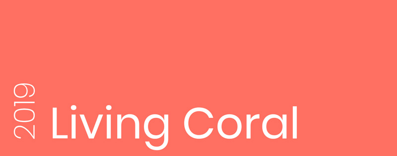
Pantone 16-1546 | #FF6F61 | Pantone Announcement
With the rising attention to social media, Pantone experts bring another warm pink color into the family. Living Coral expresses both soothing comfort and stimulating energy – two aspects that social media’s presence used to have in our lives.
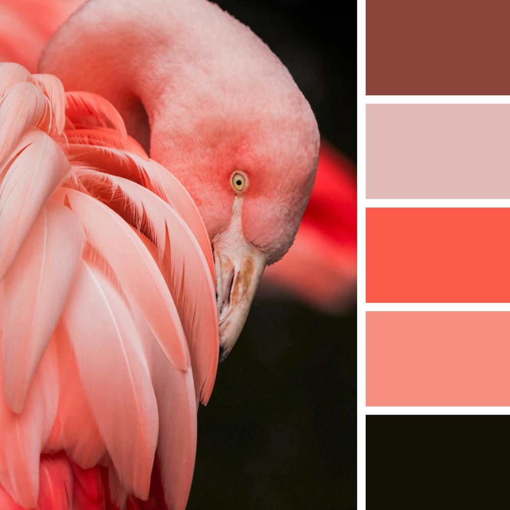
Living Coral color palette | Photo by Gwen Weustink
2020: Classic Blue
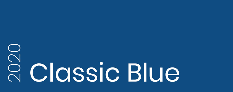
Pantone 19-4052 | #0F4C81 | Pantone Announcement
Pantone started a brand new decade with the rich dark blue hue. Classic Blue sparks confidence, peacefulness, and reflection. A dependable foundation for building resilience and strength in 2020. Well, the world definitely did slow down in 2020, so that was a true prophecy.

Classic Blue color palette | Photo by Fabrizio Conti
2021: Ultimate Gray & Illuminating
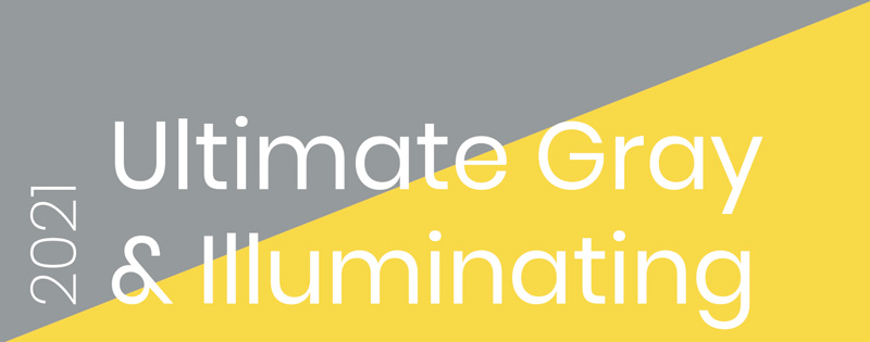
Pantone 17-5104 | #959A9C & Pantone 13-0647 | #F8D948 | Pantone Announcement
Pantone chose another powerful duo of concrete gray and bright yellow. After an extremely world-changing year, the evoking need for stability and hope was indisputable in 2021. Ultimate Gray and Illuminating present a union of rock-solid optimism.
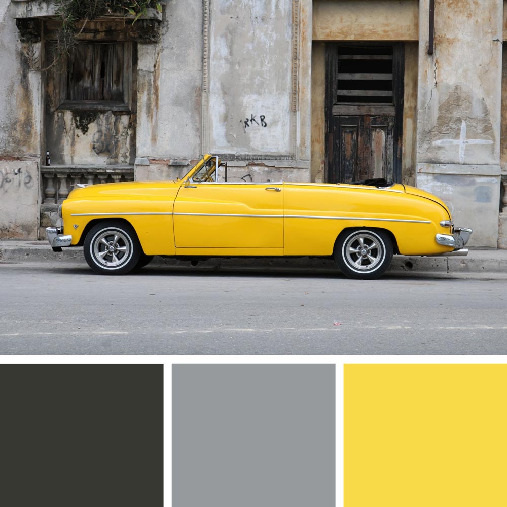
Ultimate Gray & Illuminating | Photo by Joris Visser
2022: Very Peri
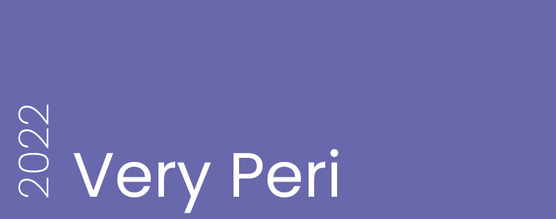
Pantone 17-3938 | #6968AC | Pantone Announcement
Lavender, lilac, cornflower, or maybe periwinkle? Very Peri, the color of 2022, is probably flower-inspired and in a way transmits this elegantly blooming creativity into the new year. As a matter of fact, this is the first time Pantone Institute created a brand new color specifically for the color of the year program, connecting rich blue and violet-red hues into a calming purple. A true inspiration in action!
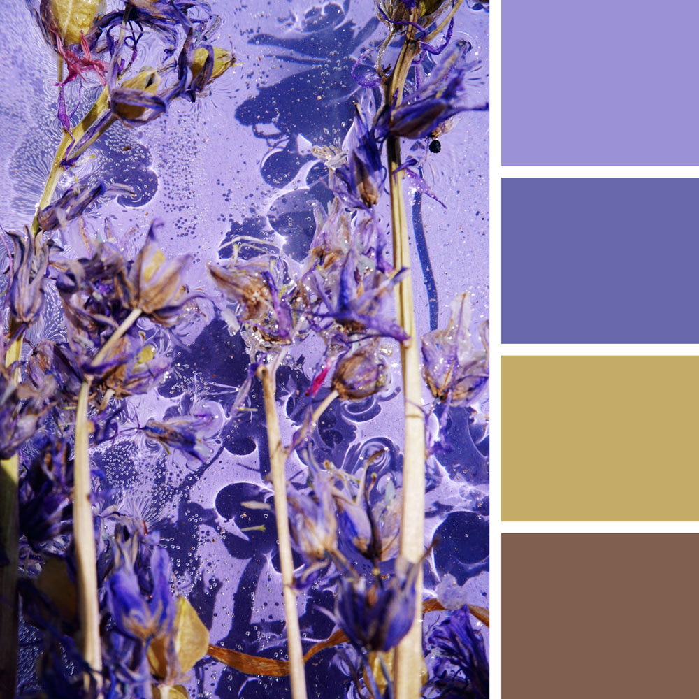
Very Peri | Photo by Kokokara
2023: Viva Magenta
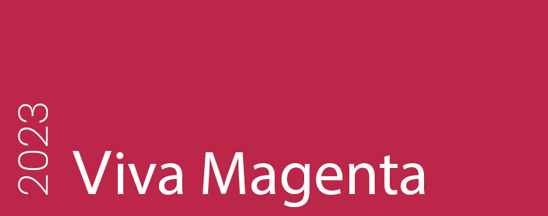
Pantone 18-1750 | #BB2649 | Pantone Announcement
Viva Magenta, the color of 2023, is strikingly bold and powerful. As Pantone experts have mentioned, this is the strongest color derived from natural cochineal dye, which inspired our choice of picture and color palette. Pulsating red works perfectly with earthy tones and is great for highlighting bravery and strength much present in today’s world.
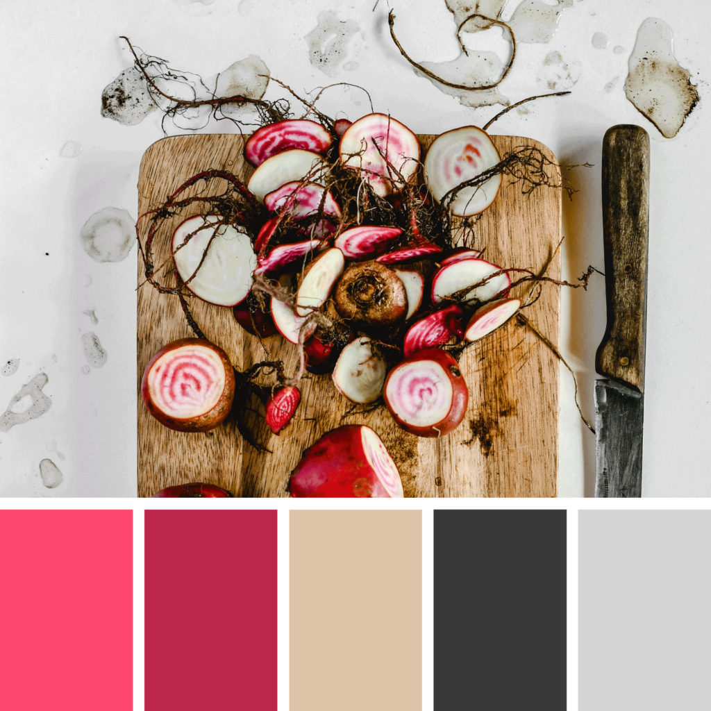
Viva Magenta | Photo by Eva Bronzini
2024: Peach Fuzz
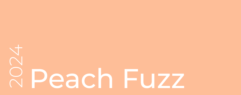
Pantone 13-1023 | #FEBE98 | Pantone Announcement
Warm and cozy, Pantone’s “Peach Fuzz” for 2024 embodies kindness and caring for self and others. It radiates a gentle charm that evokes a sense of nostalgia and a desire for peace in a sincere embrace. A soft and inviting color that pairs well with darker tones is suitable for various applications, from fashion and interior design to graphic design, adding a touch of warmth and subtle brightness to various visuals.
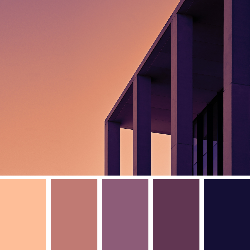
Peach Fuzz | Photo by Paulina Milde-Jachowska
2025: Mocha Mousse
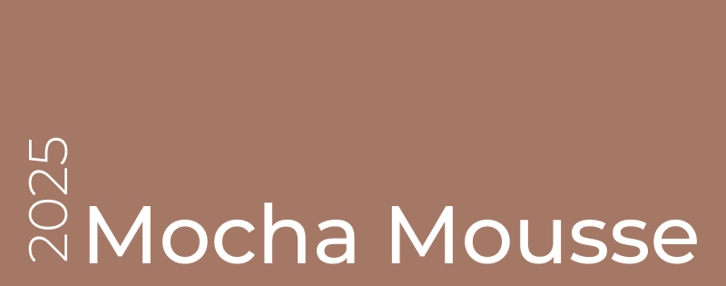
Pantone 17-1230 | #A57865 | Pantone Announcement
Warm and indulgent, PANTONE 17-1230 Mocha Mousse combines sensorial richness with timeless elegance. Inspired by cacao and coffee, this versatile brown offers comfort, harmony, and a touch of luxury to designs, encouraging simple pleasures and shared moments.
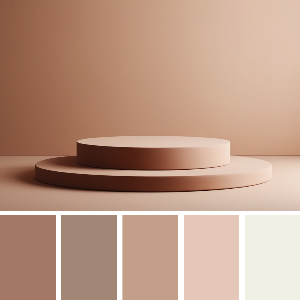
Mocha Mousse | Photo by Oleksandra Kotsiuk
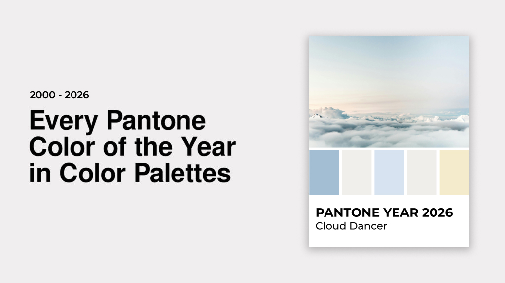
2026: Cloud Dancer

Pantone 11-4201 | #F0EFEB | Pantone Announcement
Soft, airy, and serene, PANTONE 11-4201 Cloud Dancer embodies calm and clarity in a bustling world. Inspired by the quiet elegance of untouched snow and gentle clouds, this versatile white brings a sense of peace, balance, and fresh beginnings to any design. Cloud Dancer encourages mindfulness, creativity, and moments of reflection offering space to breathe, dream, and create with simplicity and sophistication.
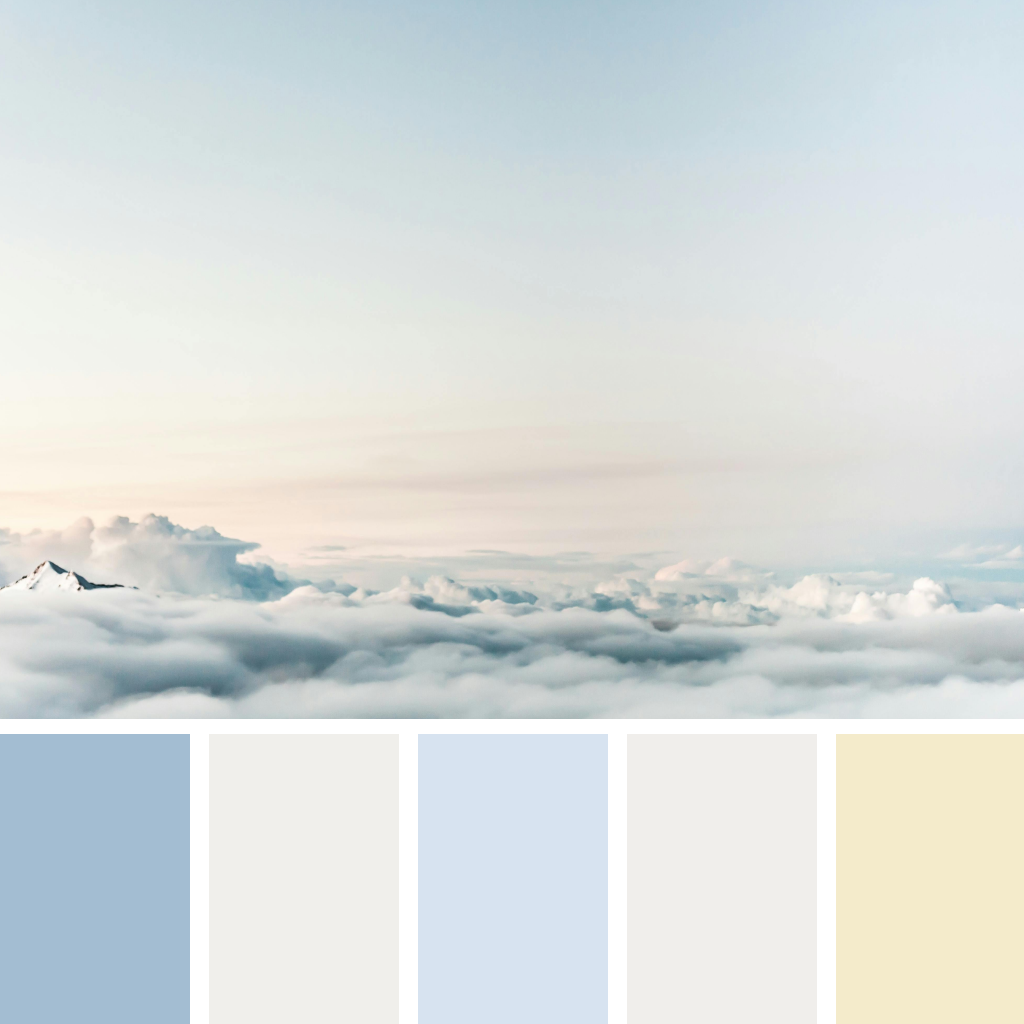
Cloud Dancer | Photo by Snapwise