TEAM SOLUTIONS
 WORKFLOW SOLUTIONS


 REVIEW TOOL
 PROJECT MANAGEMENT
 TOOLS & INTEGRATIONS
 CLIENT INTERVIEWS


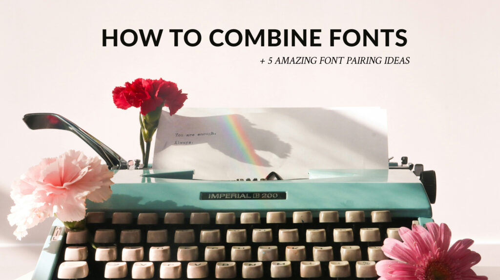

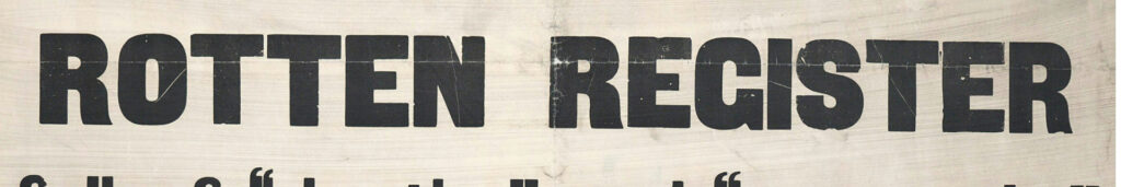
Once, I decided to look at really bad poster designs because I was bored and needed some fun in my life. And while there were a lot of problems with those, one thing that stood out to me in each one was this soul-wrenching use of fonts. Sometimes, you could not even read the text, not even to mention a lack of aesthetic value. Of course, such “Graphic Design is my passion” artworks are an exaggeration. However, I’ve found myself wondering how you really pair a few fonts together. I’ve discovered the answer, so if you are interested, welcome!
In this article, we will discuss three topics needed to grasp the basics of typeface choosing: font superfamilies, what to consider when pairing fonts, and a few specific fonts that work well together.
Superfamily
No, I am not talking about the Incredibles (I wish). The thing is that, as every aspect of our life, fonts have many categories. There are many different types of fonts according to how they look, the period of history, and how they are used. However, knowing each classification is optional in understanding how to use those fonts together. We will discuss only the most important ones that matter the most.
Serif
Ultimately, what word serif means, is the name of those strokes that you can see at the end or beginning of the letters in specific fonts. However, this word is a name for all fonts with those distinguishable embellishments. For example, Times New Roman, which we all remember from university times, is a serif font. The main distinction of such fonts is their sophistication in nature while still being acceptable for great masses of text.

Sans-serif
If you’ve studied French at some point in your life and remember it until now, this font nature is already clear to you. Why? Well, sans is “without” in French, so logically, sans serif means without serifs. These fonts do not have any strokes on them, making them look common, simple, and easy to read. Arial, which I love to use, is a sans-serif font.
Slab-serif
Unfortunately, french learners will not be able to decode this one that easily, so I’ll try to help you with that. Slab or slab serif is a lovechild of the two previous superfamilies, meaning it is easy to read and looks simple. However, it has a slight tint of aristocracy from serif, which is the usage of strokes. The difference is, though, that the slab’s strokes are much less noticeable and match the overall style and direction of the letter, Garamond being a fantastic example of that.
Script/Handwriting
Evidently, from the name, this font superfamily is all about typefaces that look like handwriting. It is split into two similar parts, so not everyone considers them as individual superfamilies. So, what are those parts? Script fonts get inspiration from calligraphy, offering a more chick look. While Handwriting font is all about easy-to-read but funky fonts that look like someone quickly wrote it. Excellent examples of those are Caveat for script and Comic Sans for Handwriting.

Display
This is the superfamily of mostly decorative fonts mainly used for headlines. They look sophisticated and modern. However, the second you start using them for the main body text, they lose all their appeal. An excellent example of decorative font is Impact or Didot, which is used by Vogue.
Things to consider
However, all those things I’ve just mentioned are simply theory, and they say nothing about what we actually need to consider when choosing a font for your brand, packaging, website, or other. Yes, it is a great advantage to know about it as it greatly helps to understand how the font compatibility system works. But there are more things to consider. And we’ll talk about them.
Superfamily
We were not talking about superfamilies for so long not to include them in this list. You see, conventional wisdom suggests that, in most cases, the fonts from one superfamily go together the best. They complement each other, and after playing with weight, case, and size, you can achieve a fantastic combination, not having spent years scrolling through the available fonts.

However, this is not obligatory, as sometimes opposites attach, and fonts taken from two opposite superfamilies can look the part for your purpose.
Purpose
Speaking of which, another crucial thing to consider here is the purpose of your text. You need to understand why, on earth, you need that second font in your artwork. Is it because you want to emphasize a text block on your poster about the next sale? Or maybe you want to add a subcategory to the existing title? Or, perhaps you need a typeface suitable for a body of text to be skimmed and without problems? Each case would require a different font, as you can easily find something in Display superfamily for highlighting, but it won’t work for long texts. So, beware, and think carefully about this before all else.

Mood
The next crucial category is, of course, mood. Have you ever wondered why people have Comic Sans so much? Well, the reason is its misuse. The childish, fun font used for a warning sign does strike as a stupid decision. Some fonts are dreamy and soft, while others are sharper and stricter. And you have to take that into account. Yes, there will be cases when combining the two will work; however, those cases have to be justified by the concept, mood of the artwork, and overall design that doesn’t make them stick out like a sore thumb.
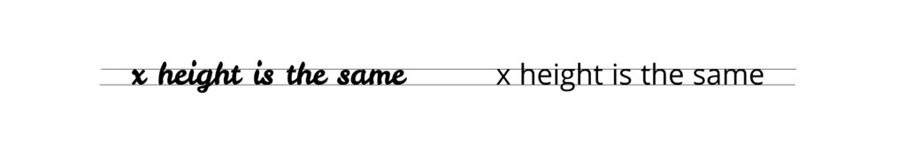
X-height
Another rule of successful font pairing is the x-height rule. Basically, it says that the fonts with the same (or similar) x-heights go well together. While this rule is valid, it still has to work in combination with other rules, as it is not enough to simply look at a single letter to get a perfect combination. It is better to use this rule to override the existing ideas after already choosing a few fonts that seem eligible.
Contrast
If you’ve read our article on design principles, you may remember that contrast was one of the most important things there. When it comes to fonts, the rule stays the same. Contrast is the one thing that catches the eye of the passerby. Having a couple of fonts that are too similar next to each other will just create a black spot in your vision, and you will slide through it.
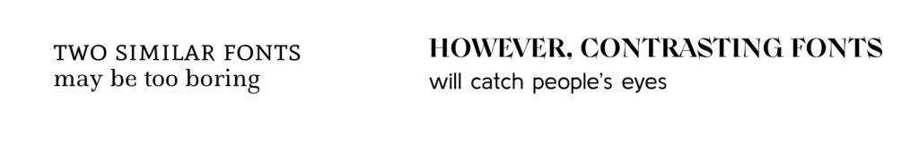
However, having two different fonts with a similar mood will work. I mentioned that opposites attach when I was talking about superfamilies. I mean, serif and sans serif combo has become an undying classic because of how good they look together. So, experiment! Use a sans serif for your heading and move on to contrastive Handwriting for sub-headings. Let your creative flair fly and express yourself via fonts!
Do not overdo
However, (there is always a, however, isn’t it) Be careful. This rule applies to both the number of fonts in your artwork and funky fonts. It is considered best to use up to two or three fonts per work, as it overloads your system. The same goes for fabulous Display or Handwritten fonts. A poster where everything is written in a wacky font, even if it’s an advertisement for a children’s amusement park, will be perceived poorly.
Make sure your fonts of choice follow all the principles


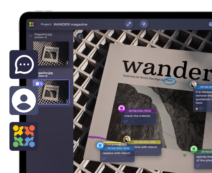
Review and annotate designs in Approval Studio
Start a Free TrialFont combinations to try
Lilita One + Libre Franklin
This one may be a perfect example of how well contrast works when pairing fonts. Having a considerable weight, Lilita One does draw your attention to itself, and it is clear which part of the text is to be emphasized. While a simple sans-serif font complements the message without being too obnoxious. This combo will look lovely on logos and posters where most of the info is in the heading.

Montserrat Alternates + Raleway
In this case, contrasting parties focus not only on the weight but also on a superfamily. Montserrat Alternates is a display font that would look ridiculous as a main body of text. However, as a heading, it works fantastically, giving an exciting look to the whole artwork. Raleway complements it; being quite a simple font, it does not conflict with Montserrat’s playfulness and allows one to enjoy it.

Playfair Display + Oswald
This combination is my favorite Playfair display font pairing as it plays on the contrast between superfamilies. Besides that, the two fonts are highly similar to each other. However, strokes that are indigenous to the serif font family instantly make the font much more enjoyable. Another fascinating part of this combo is Oswald’s weight, which makes up for its lack in Playfair but is not too obnoxious to get all the attention. However, contrary to the two previous fonts, this will only work for small bodies of text, as Oswald will be much more difficult to read in huge amounts.

Jaques Fracois + Montserrat
This is the ultimate font combo that will look good everywhere. A classic combination of serif and sans that will work for all purposes, from logos to articles. This rule will apply to all similar combinations of such superfamilies, so if this one is up your alley but something is still a little off, don’t hesitate to use this formula with other typefaces.

Prosto One + Pt sans caption
The last combination for today looks the most modern out of all, thanks to a compelling usage of Prosto One. The font’s weight and sharp style add to the overall look of the combo, making it seem high-tech. However, the softer nature of PT sans caption smoothes the edges and makes it easier to comprehend as a whole. What’s even better is that this combo’s usage is almost endless, as well as the previous one, specifically for the reason mentioned above.

Final thoughts
As with any design decision, choosing a font is a highly individual task, requiring many design briefings and a personal approach to each client, business, and task. However, knowing the basics of good font combinations and the little theory behind them may help this dreadful task become more effortless. And when it finally comes to proofing your artwork, Approval Studio will have your back!