 TEAM SOLUTIONS
 WORKFLOW SOLUTIONS


 REVIEW TOOL
 PROJECT MANAGEMENT
 TOOLS & INTEGRATIONS
 CLIENT INTERVIEWS


Post is also avalible in:
![]()
![]()
![]()
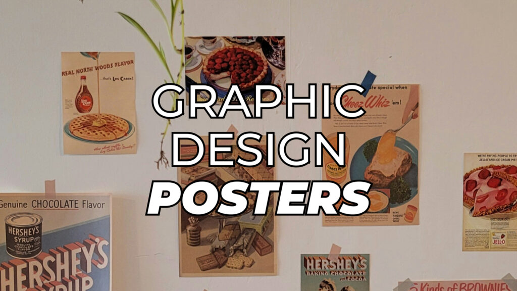
Buildings’ walls, teenagers’ rooms, and hospital hallways are all perfect habitats for such things as posters. In a world full of endless scrolling and clip thinking, there’s something rebelliously effective about a static image. Recall the cinema ones, which may have been the sole reason you decided to see the movie at all. Or the music event one, which made you text your friends about the tickets. And let’s not forget about your room, which at some point had at least one small poster representing your personal tastes.
In this article, we’ll discuss all the aspects of a poster as a graphic design product. It also includes different types of posters, their purpose, and key elements of their composition.
Poster as a Notion
To put it simply, a poster is a big sheet of paper with some stuff on it. It’s a form of immediate visual communication. This means that a poster must be seen and remembered in around 3 seconds. What makes this aspect important is that posters usually compete for attention in busy environments – subway stations, bulletin boards, crowded spaces, and our human tendency to tune out visual spaces.
So if you want your message to reach people, you need to masterfully fit everything important in one visual space. And that’s where we’ll talk about each specific element of poster design.
Essential Elements of Poster Design
Honestly, there is no magic formula for a perfect poster – it all goes down to the basics of graphic design. And in order to compose your design well, you have to consider the following elements:
Hierarchy and layout
If you want your poster to guide the viewer’s eye naturally through the design, composition is crucial. Be mindful of margins and the way you place your visual elements or text fields. The important information must be obvious and lead from the headline to the details smoothly.
- The headline needs maximum visual impact because it carries your main message. This is what viewers will see from a distance or while moving quickly past.
- Supporting info (subheadings, key details, etc.) should be visually subordinate to your headline but still prominent enough for someone who’s stopped to look. They provide context.
- Details such as dates, locations, and contact information are for engaged viewers who are already interested. They should be legible but not competing with more important elements.
The goal is to attract, interest, and deliver your message to a passerby without them having trouble navigating the poster.
Typography
Properly selected fonts are no joke. Your choice can set the tone of the poster with just the simple use of serifs. Especially this concerns the headline, which usually becomes one of the main visuals on the poster.
- Follow the golden rule of not more than 2-3 different fonts. You don’t want to overcomplicate your design, do you?
- Fancy fonts are pretty and catchy, but in reasonable amounts. Leave something unusual for the headline and a sans-serif font for details, so that people don’t hurt their eyes while reading.
- Experiment with font weight and size to create emphasis and hierarchy. Make sure they are legible from a distance.
Basically, to catch people’s attention, you need to make your words look as good as they sound (or even better!).
And if you ever need to approve your choice of fonts or any other design aspect, don’t fall victim to an endless email chain. You can easily upload your poster into an online proofing tool, like Approval Studio, and get a link to an external review in a few clicks. The intuitive interface will serve as a perfect place for a live discussion of annotations and version comparison.
In short, pick your type wisely, test it thoroughly, and make feedback a smooth part of your design process.
Color theory
Ah, the world’s best emotional manipulator – color. This versatile instrument helps you not only make the design look pretty but also evoke certain feelings. The color theory knowledge will help you understand how colors interact and how you can use them in design to your advantage.
- Keep a limited color palette to keep the design cohesive. Same as with the fonts – overkill distracts.
- Use color schemes to set the right mood. If you’re looking for something more dynamic, use the complementary scheme. And if it’s something rather solemn, go for a monochromic or analogue one.
- Color is a great way to add emphasis, so keep the brightest ones for the main elements.
For posters, color contrast equals readability. Even if you pick a perfect pair of fonts, the yellow text on a white background will seem invisible from afar. Don’t steal away your own voice.
Visual elements
According to research, the human brain processes visual information 60,000 times faster than text. And that’s why photos, illustrations, and vectors are great elements to add to your poster.
- Lines, arrows, and icons can help guide the viewer through the poster’s information and help digest it better.
- Make sure your poster’s visual elements are high quality to avoid those nasty pixels on the final product. Blurry images instantly make your design feel unprofessional, no matter how great the layout is.
- Choose illustrations that complement the tone of your message and the overall style of your poster.
Generally speaking, though, don’t overdo this. Keep in mind that every visual element should earn its place on your poster. If it’s just “filling space,” it probably doesn’t need to be there. Visual clutter can distract from your message instead of enhancing it.
White space
Last but not least, the white or negative space of your poster is as much of an element as a headline or a photo is. In simple terms, the white space is like oxygen that helps your design breathe. Done well, it provides the design elements with personal space and can make them stand out.
- Consider micro white space, which is the distance between letters, words, and lines. If you neglect this aspect, your text becomes unreadable – either too cramped up or too loose and hard to follow.
- Macro white space is also a thing. It includes the gaps between sections and at your poster’s edges. So, create visual groups and avoid cluttering the margins.
White space helps put all the necessary commas in your design. In other words, it serves as a logical pause between different blocks of information, so the viewer doesn’t get confused.

How Poster Design Works: Case Studies
Movie poster
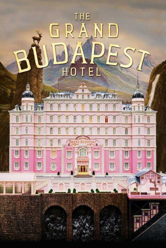
Wes Anderson’s 2014 movie The Grand Budapest Hotel caught my attention because of its painting-like poster. It’s a great example of the art of visual storytelling, which sets the tone for the film before you even see the trailer.
The central placement of the fictional Hotel immediately draws attention. And Anderson’s renowned symmetrical layout and pastel color palette create a whimsical, almost dreamlike vibe. It looks like a dollhouse, which adds to the fictional narrative of the film.
Speaking of details, the stylized title font commands attention and fits the vintage, luxurious theme. And that’s it, actually, as the poster’s main focus is set on the imagery. Most movies do, though. Only sometimes they also include such information as cast, release date, awards, production team and etc.
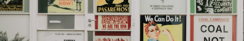
Social/Political poster
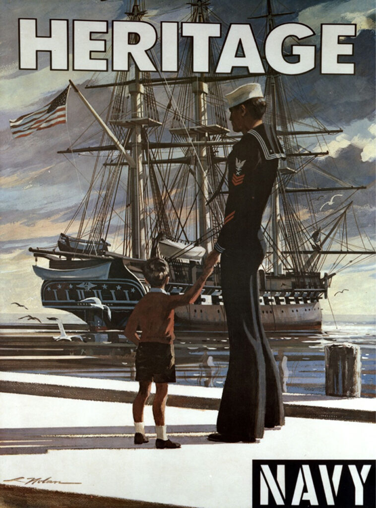
Another example of the minimal use of text and heavy visual focus is this navy recruitment poster. The realistic painting done in muted, solemn colors calls to tradition and seriousness. In the centre of it is a young sailor and a boy, gazing at the glorious historic ship – a romanticized service.
The word “Heritage” dominates the composition in bold, straightforward lettering that conveys strength and reliability, exactly what military recruitment needs. Together with the imagery, it creates a narrative about legacy and the continuation of service. Very well, Uncle Sam.
Informative poster
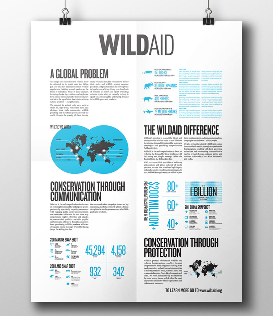
Source: Behance Hugo Ugaz
The layout uses a clean column-based grid, which allows the viewer to scan the information smoothly. That’s the negative space at work. Moreover, not all the info is in text — we can spot infographics, charts, and numbers that improve the engagement. Talking about the text itself, a strong sans-serif font in headers with supporting body text makes it easy to follow and creates a clear hierarchy.
Overall, the poster looks like it was taken from an encyclopedia. The minimalistic style makes it look more professional and reliable. It’s cool how the designer used the color blue – the one of the Earth – as the highlight color of the poster. Chef’s kiss.
Event poster
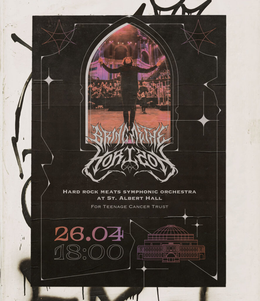
Source: Behance Kateryna Bilak
The Bring Me The Horizon Symphonical Orchestra concert poster concept looks exactly like it sounds. The dark, gothic aesthetic goes great with the hard rock/heavy metal genre. The color palette of blacks, purples, and metallic tones reinforces the sophisticated yet edgy vibe appropriate for a symphonic rock crossover event.
As for the hierarchy, the information flow works well, too. First, you’re drawn to the dramatic image, then the band name, then the practical details. The band name uses an elaborate, metal-inspired font that fans will recognize and appreciate, while the essential details (venue, cause, date, time) remain clearly readable in simpler fonts. This is the poster you will have no chance ignoring in the wild.
Hiring campaign poster
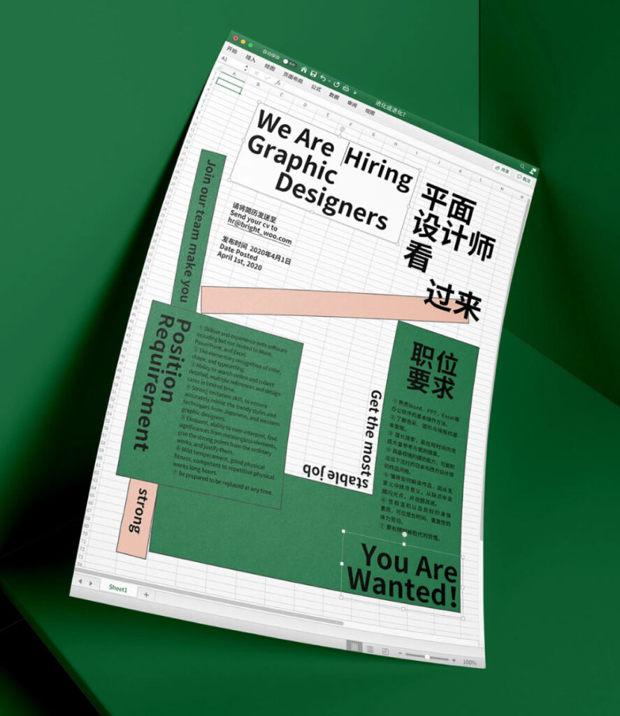
Source: Behance Bright Woo
This one stands out thanks to its clever use of an Excel sheet as a layout, which is unexpected and eye-catching, especially for a design job ad. Despite the unconventional layout, the hierarchy is clear. The main headline (We Are Hiring Graphic Designers) grabs attention first, followed by secondary text with instructions and qualifications.
I find this design genius, as every element supports the idea of turning a boring tool into something expressive. Shapes and blocks of color guide the eye, providing structure and balance to what could have been a chaotic layout. The use of bold fonts, various font sizes, and both Chinese and English typography keeps it dynamic and attracts the bilingual audience. The style is fresh, creative, and playful, which will certainly catch the targeted candidates’ attention.
Common Poster Design Mistakes to Avoid
It’s only human to make mistakes – ain’t it the way we truly learn by? Having a little guide might help, though. And here are five common faux pas to avoid on your path to a great poster design:
- Text overkill. Back at uni, I had one professor who’d drown his PowerPoint slides in paragraphs of text. Should I admit my eyes were naturally wandering away from the screen way too often? If your audience needs to read a wall of text just to understand what’s going on, they’ll probably ignore it entirely. Posters should communicate at a glance.
- Visual clutter. Every element should serve a purpose, remember? Just like with too much text, visual clutter can turn your poster into an eye-hurting mess. Ask yourself: Does this image, icon, or texture help communicate my message? If not, let it go.
- Poor contrast. Don’t let your text play hide and seek, blending with the background: readability always loses this game. This goes beyond just text – all your design elements need some definition. To check it, step back from your poster or squint at it. Your contrast needs work if you can’t immediately read the most important information.
- Viewing distance. A poster that looks perfect on your computer screen might be completely unreadable from six feet away. To avoid this problem, get to know where your poster will end up and size your text enough to be readable.
- Target audience. Having a message to share is great. But you have to consider who you want to share it with. Consider your audience’s age, interests, cultural background, and where they’ll encounter your poster. Ideally, your design choices should speak directly to your intended viewers, not just reflect your personal taste.
Final Thoughts
After all the advice you’ve read here, it may sound weird, but great poster design isn’t about following some rigid rules. That’s creatives we’re talking about, not some mathematicians. Still, there is some science to design as well, and using creative tools smartly can help you serve your message properly. Different situations require different approaches, and the poster that works for one event would be a silly choice for another.
All you really need to know is what exactly you’re doing. Ask yourself what you want your audience to know, feel, and do after seeing that poster. And then, backed up by the basic science of color, hierarchy, and typography, let those answers guide every design choice. Most importantly, never forget to have fun in the process! Now, go paint your poster.
