TEAM SOLUTIONS
 WORKFLOW SOLUTIONS


 REVIEW TOOL
 PROJECT MANAGEMENT
 TOOLS & INTEGRATIONS
 CLIENT INTERVIEWS


Hey there!
Imagine you have a great graphic design project in mind or a stunning illustration idea. Everything works out lovely; the client liked the concept, you’ve done and approved a sketch, and you’ve started to work more in detail on the project.
Unfortunately, somewhere in the middle of your creative process, you realize that you haven’t thought about the colors or color schemes that would accentuate your idea, leaving this decision till the very end. It’s the exact place where this article comes in handy!
You can find 2, 3, and 4 color combinations down below inspired by the gorgeous projects, starting from photography and ending in product design. I think it is a great way to illustrate the color combos in use and enlarge your visual library. Feel free to use them in your work, and we would love it if you could share your result with us.
Apart from just giving you so much desired inspiration, I would also like to add some fundamentals of color theory. I know, I know, the theory is boring but bear with me. IMHO, it’s crucial to understand color mixing rules and use them to create your color palettes and combinations. A famous saying says: “Give a man a fish, and you feed him for a day. Teach a man to fish, and…”. Duh, you know the rest. That was so unoriginal; I apologize. Anyway, the point is, after some theory and practice, the skills of making color palettes and differentiating great color combinations would ease your life as a creative.
Basic Color Theory
Before we start discussing the color harmonies and making cool color combinations, I would like to get back to the color theory. Understanding how the color wheel works and what it consists of is the first step to making the right choices when selecting your project colors.
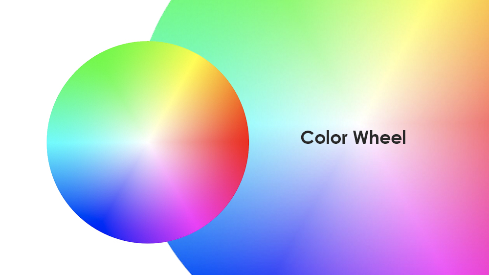
The color wheel is a conceptual scheme that organizes the colors around the circle. In this system, hues are arranged to illustrate connections between primary, secondary, and tertiary colors. To add a bit of clarity:
- Primary colors – are the main colors on the color wheel, and they are a starting point for combining all other colors.
- Secondary colors – are the colors that are created by mixing two primary colors.
- Tertiary colors – are the colors that are created by mixing one primary and one secondary color.
Depending on the medium used to transmit the color (light or pigment), there are two main color models: RGB and CMYK.
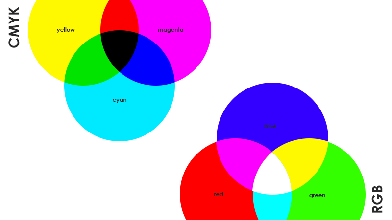
- RGB – is a color model of light, meaning that if you add all of the colors together, you will get white light. The RGB model’s primary colors are Red, Green, and Blue, and secondary colors are Cyan, Magenta, and Yellow. This color model is usually used in screen-based graphics, for example, web design.
- CMYK – is a color model of pigment, meaning that pigment reflects some colors while absorbing others. If you mix all colors, you’ll get nearly black (that’s why you need to add extra black pigment). For the CMYK color model, the primary colors are Cyan, Magenta, Yellow; meanwhile, the secondary colors are Red, Green, and Blue. CMYK is best-used if you are working with printed assets, paintings, packaging, etc.
Have you noticed any correlation between the two models? The primary colors of one are the secondary colors of the other. We get this parallel because the color wheel is the same only the mediums differ, resulting in different primary and secondary colors. Logically, the tertiary colors for both models are the same: azure, violet, rose, orange, chartreuse, spring green. (Source: Primary Colors of Light and Pigment)
Color Harmonies (Schemes)
Now we know what a color wheel is, and it’s a convenient tool when creating color combinations that are considered pleasant and matching. Indeed, the harmony of the colors is a subjective topic. Because of the variety of color models and more modern systems, this cannot be perceived as an absolute truth, rather a widely accepted practice and a set of guiding rules.
Having trouble deciding on the color palettes?


Approval Studio offers real-time discussions on the asset – debate all you like.
Start a Free TrialSo, сolor harmony or scheme is a harmonious (unexpectedly, I know) color combination. There are several major types: analogous, monochromatic, complementary, split complementary, triadic, tetradic, and square.
Monochromatic
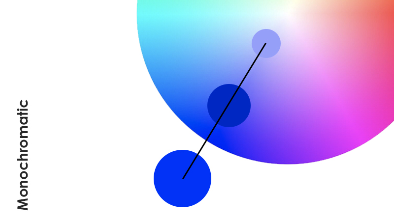
Monochromatic color harmony is usually considered the easiest one as it uses one color or hue. To create a monochromatic color scheme, you need to choose your preferred color and populate the color palette with its tones, shades, or tints. I can assure you that this color harmony works most of the time because of its cleanliness and simplicity.
Analogous
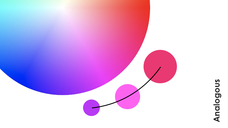
Analogous color harmony consists of several colors (usually three) near one another on the color wheel. For example, this can be a combination of orange, yellow, red, or magenta, purple, and blue. Whatever the colors you chose, you can also play with saturation. However, it’s important to remember that all colors should have enough contrast between one another.
Complementary
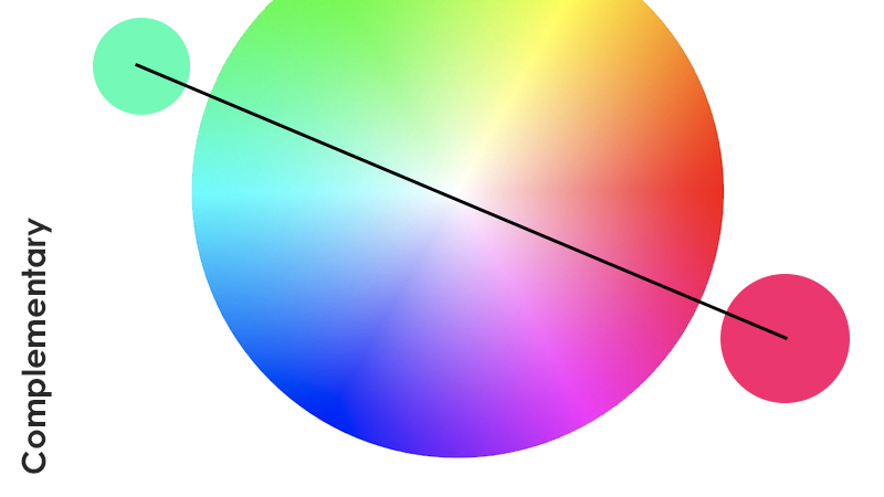
The most well-known color harmony so far is the complementary one. The combination of opposite colors in the color wheels creates a vibrant pair that should be used with caution. What are some examples of complementary colors? Red and Cyan, Magenta and Green, Orange and Blue, etc.
Split Complementary
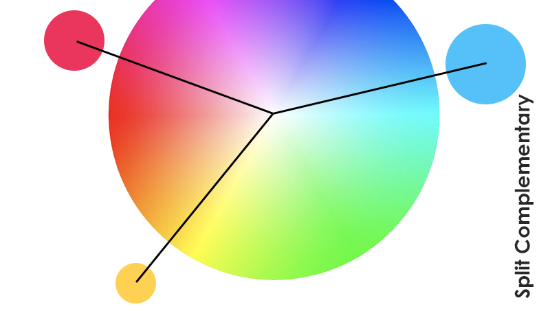
Let’s take the complementary harmony a bit further and divide one of the colors into the two. What do I mean? The split-complementary color scheme consists of your main color and two colors that are neighboring the complement. However, it’s crucial to keep those two analogous colors of the “split” at the same distance from the opposite color. A new variation of the complementary color palette is relatively less intense and achieves a more considerable diversity.
Triadic
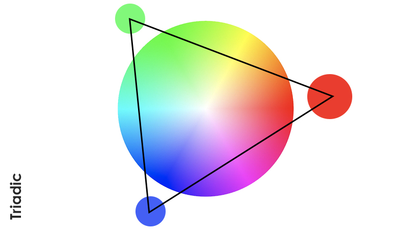
Another color harmony that consists of three colors is Triadic. In this scheme, colors are evenly spaced that visually creates a perfect triangle. Be careful, though: this combination can include all three primary colors together that are pretty noticeable and powerful. Even though this color harmony looks tricky, it provides less contrast than complementary colors with the help of +1 color.
Tetradic and Square
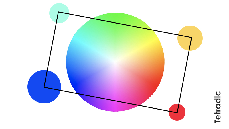
Tetradic color harmony is also called ‘Double Complementary.’ It consists of 4 colors (2 complementary pairs) forming a rectangle on the color wheel. Some artists separately distinguish the Square harmony, where the colors are equally spaced. Both of these color schemes should be handled carefully because the more colors there are, the harder it’s to control or balance them.
Resources
All of that theory can be quite overwhelming, especially when trying to put it to practice. Thankfully, there are many resources available for you to ease some of the first struggles. I had to dig into my design “precious savings” for these:
- Online primary color mixer – CMY and RGB
- Color system builder with accessibility in mind – ColorBox
- Apply your color palettes to the UI – Color Tool
- AI color generator based on your preferences – Khroma
- Overly descriptive color palettes for fun exploration – Colors.lol
- Color picker with all sort of useful info about the hues – Coolors Color Picker
- Three color gradient generator – ColorSpace Gradient
- Collection of background gradients – WebGradients
- Online game to practice color harmonies – Method of Action
Color Combination Inspiration
“What are some interesting color combinations?” you might ask. Well, there are a plethora of them. However, having no limits to the ways of combining color can be both encouraging (“Yay, I have an endless source of ideas!”) and frustrating (“How do I know that this isn’t the worst color combination?”). For that reason, many artists and designers (me included) can go on a bit of a stroll on Behance alley to find some inspiration.
I hope the following mood boards will give you a much-needed stimulus in the right direction. All projects are from different art and design spheres: illustration, graphic design, interior design, photography, etc. Please, don’t hesitate to follow the links to artists’ Behance profiles and give them some love!
2 Colors Combinations
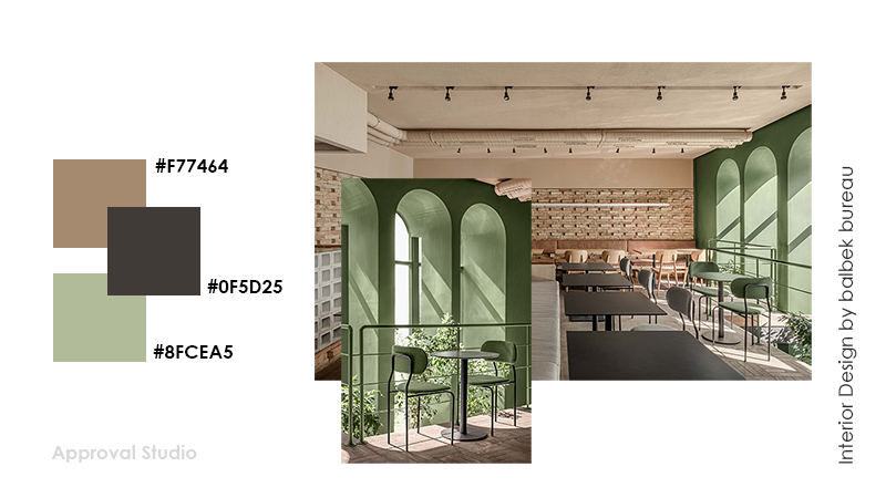
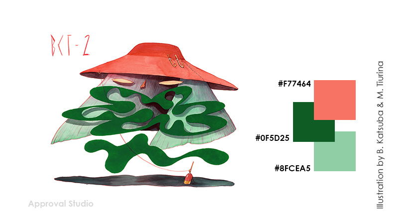
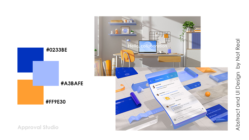
3 Colors Combinations
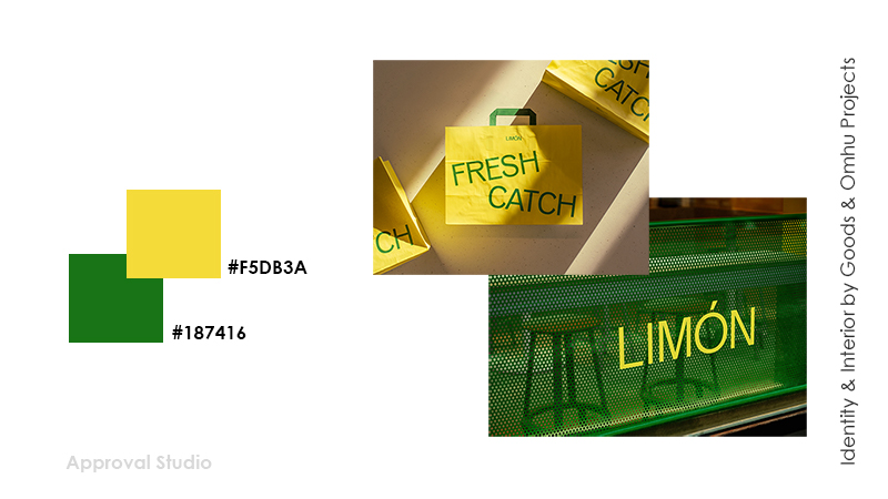
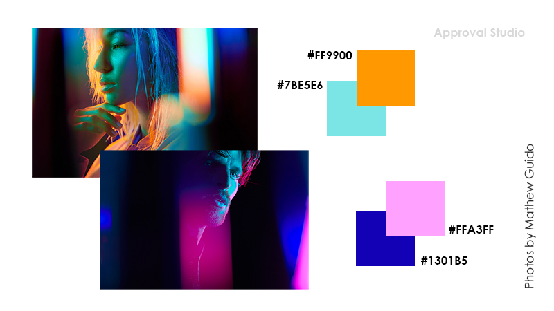
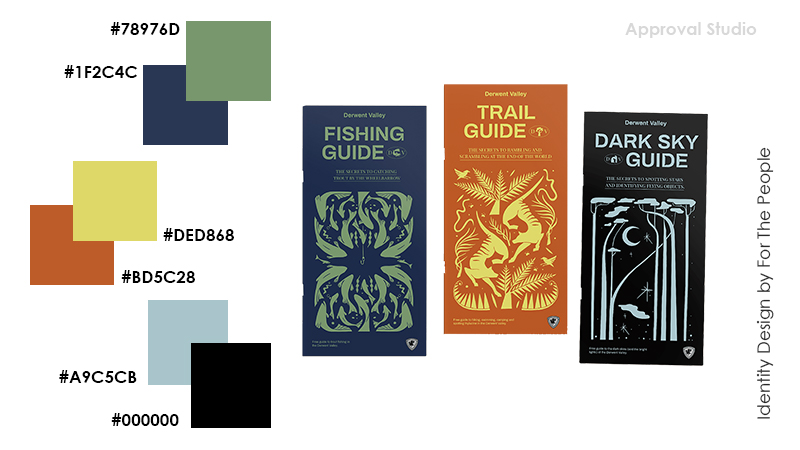
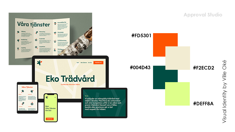
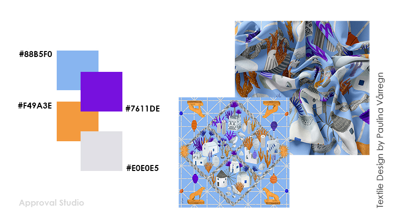
4 Colors Combinations
For even more color inspiration, check our article where we’ve compiled two decades of Pantone color of the year in color palettes with free downloadables.
Final Thoughts
Well, the color choosing process for your design projects won’t be much of a hassle now but rather something that you look forward to. Even though color theory and color harmonies can be tricky initially, it most definitely gets easier with practice. Most importantly, I hope that the scope of knowledge, resources, and inspiration in this article will be helpful and useful for you throughout your art and design career.
Have a great day!