 TEAM SOLUTIONS
 WORKFLOW SOLUTIONS


 REVIEW TOOL
 PROJECT MANAGEMENT
 TOOLS & INTEGRATIONS
 CLIENT INTERVIEWS


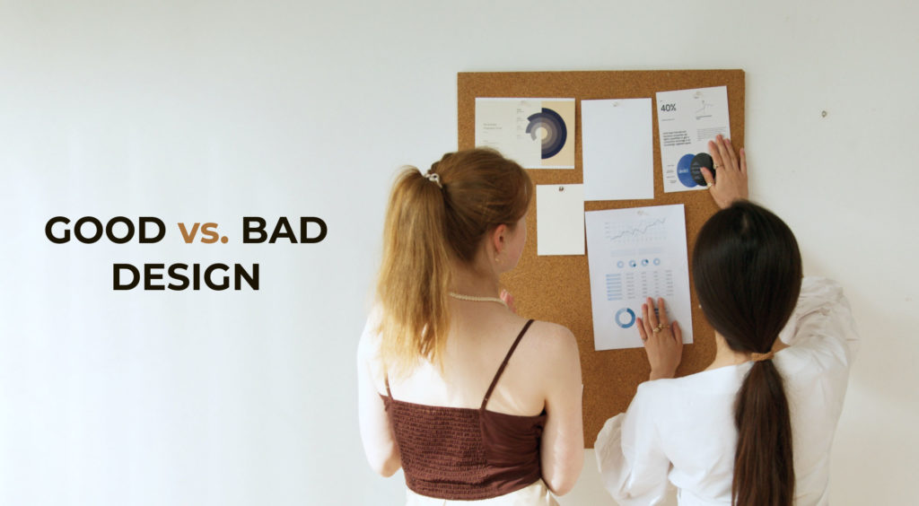

How to know if your graphic design is good or bad? Honestly, it’s hard to count all the times people have discussed this topic. Maybe critical design review is irrelevant at all, and everything is much more straightforward than we try to make it — if you like how the design looks, it’s fine, right?
Well, it’s not only that. The personal attitude is biased and subjective, which is insufficient to make the design good. Realistically, it should involve specific components, not something abstract or entirely taste-dependent. Besides, this is an industry where time does not stand still. New trends appear, and styles change. You need to go with this flow and apply different approaches that might be necessary. More than your personal opinion is required to assess the design fully. But what is enough?
In short, good design fulfills a particular purpose, namely, resolving a client’s business problem. It is a crucial aspect of any business, as it helps to attract customers, convey information effectively, and solve problems in a visually appealing way. While personal taste and sense of beauty are subjective, there are objective aspects of design that can be kinda… checked? This is especially important in graphic design, which is often the focus of design annotation tools like Approval Studio.
Factors to Evaluate Design
So, sitting here and thinking about all this, I was trying to figure out some principles and objective design aspects that can be evaluated and improved upon to help a business succeed. Considering certain objective factors might help creatives with their work. What are these factors? I scratched my head and compiled a little list.
Preparation

A massive part of a designer’s job is understanding their target audience well and compiling a detailed creative brief. Design research is often overlooked as designers focus only on what design looks like, which leads to a shallow understanding of the people for whom it is intended. Having this kind of thinking goes against the user-centric nature of the design.
Hence, proper preparation is essential to good design. This involves conducting thorough market research to understand the needs and desires of the target audience and how the products or services we create will help them. What we need is to gather specific numbers and facts to inform the design process and compile a design brief. Good graphic design is based on this solid foundation of research and data, which helps to ensure that it effectively meets the needs of the client and the target audience.
On the contrary, bad design often ignores the importance of preparation and is based solely on intuition and personal taste. Without a thorough understanding of the target market and the goals of the design, it is difficult for the creatives to solve the client’s problems and meet their needs effectively.
Functionality

What are the functions of graphic design? As I might’ve mentioned, a design must fulfill many functions besides looking cool. Developing and creating graphic objects is one of the areas of visual creativity that allows you to solve some critical business issues. So, what are the functions that a good design needs to complete?
- Standing out. The design adds distinctive external features to differentiate itself from countless similar objects and things made by companies operating in the same field. Standing out is what grabs the customer’s attention.
- Providing information. Many graphic design products (for example, logos, book illustrations, instructions using drawings, etc.) are designed to convey to the potential consumer of the product or brand some vital information, such as the brand’s name, what it stands for, its purpose, etc.
- Emotional interaction. While created with the help of images, various colors, and techniques, graphic design can evoke specific associations. It will help you to form an image in your mind and link objects to the surrounding world. Such emotional response makes you remember the brand and persuades the customer to take action — buy the product.
Bad product design will fail to grab the customer’s attention or be unclear and not self-explanatory. Without functionality, a design is unlikely to achieve its intended purpose and may even turn customers away. The objects made using graphic design become less effective and sought-after, failing your contact with the primary audience.
Visual Aesthetics

Let’s be honest. The understanding of beauty and design aesthetics is different for everyone. The sense of beauty, like the sense of humor, is purely subjective — every person to their taste. Who’s to decide what to do then? Well, it’s you. However, there’s something to pay attention to.
A good design must look awesome, whatever its functions are. This is essentially the job — make something cool for whatever purpose you need, and strike a balance between being visually appealing and able to perform. An aesthetically pleasing design can help attract the customer’s attention and create a positive impression. Add functionality to the mix, and you’re good to go conquer the marketing world.
On the other hand, bad design may ignore possible improvements in favor of aesthetics or vice versa. A design that is overly focused on aesthetics may be visually appealing but not truly effective. Similarly, a design solely focused on functionality may not look good and may struggle to attract and retain the customer’s attention. So, how do you get away from two sharp sword edges?
Surely, the best solution is to keep a balance between beauty and effectiveness. Among many examples of good design, we can check the design of the Google search engine. The company has the largest audience imaginable. The tastes of its users are extremely diverse and often contradictory. But at the same time, the company manages to create pleasant modern interfaces and improve the logo from year to year, while the financial indicators do not suffer from this. Funny, right?
Innovation

The word “creative” has long become familiar and even, funnily enough, boring to people all over the world. Creativity has become that artistic component of branding, design, and advertising that allows designers to make something bright and memorable and share their exciting new ideas. Creativity helps to solve very complex problems and find non-standard solutions.
In search of new shapes, colors, and textures, designers want to impress us, surprise us, and sometimes even lead us into a stupor on purpose. I honestly can’t stress enough that I’m not all about boring rules and functionality only — design experiments that give us a chance to touch some artsy and innovative solutions absolutely delight me.
However, there’s some objectivity to it too. Good innovative design brings new and original ideas to the table, building on the existing approaches. By introducing innovative ideas, good design can stand out from the competition and capture the customer’s attention. However, ensuring that the innovation serves a purpose and helps improve the design’s functionality is essential. Innovation only for the sake of surprise and audience shock might be good art, but it’s certainly…
…bad design. To avoid it, striking balance yet again is vital. Being too much or too drastic with your innovative solutions is a risky gamble, while mild changes might fail to highlight how you are different. That choice depends solely on the situation and purpose you’re after; this is where you need to tread carefully. However, I think it’s much worse when you do not bring anything new to the table and steal what was created before than when you get over the top with your crazy ideas.
Trends & Styles

We live in fast-paced times, which is reflected in many spheres of life, including design. Design trends reveal the modern spirit, reflecting our values and aspirations. New styles and trends emerge every year. Some disappear very quickly, while others remain relevant for much longer. Sticking to trends is not 100% a must, as some projects might need some more old-fashioned approach, but trendy stuff is always a great instrument to consider.
In that regard, a great graphic design pays attention to current trends and incorporates them when appropriate while also following a style that is meant to be effective now and in the future. Trends can capture customers’ attention and make a design feel fresh and modern. However, it is vital to use them in a way that is relevant and appropriate for the project rather than simply following them for the sake of being up-to-date with 2023 graphic design trends.
Bad design, on the other hand, may ignore trends completely or incorporate an unfitting style. Ignoring trends can make a design feel out of place, and even if it captures the audience’s attention solely because of its oddity, it’s not always in a good way. It may not resonate with people, dooming your product and making it the weird one that nobody wants to buy.
Placement

Every day we come across hundreds of advertisements, branded products, and visual communication. Graphic design is a broad concept that affects almost all areas of our lives, both in the real and digital worlds. However, the principles and rules by which the design is created for various environments (for instance, a billboard on the street or advertising on social networks) will be completely different.
Good design considers this and makes the best out of the specific location where the design will be used. The great thing about creating visuals is that your brainchild can be anything in the world — a banner, a movie poster, a book cover, and a gazillion other things. By considering the design placement, you can tailor it to fit the context where it’s used and ensure it is most effective at achieving its purpose.
On the other hand, bad design ignores placement and purpose, using the same design piece everywhere without regard for its intended location. Ignoring placement can prevent a design from effectively reaching its target audience and may even be confusing or misleading if used in the wrong context.
How To Assess Design?

In most cases, a product is created for a group of people, and such a group should be relatively of similar age, financial status, area of residence, hobbies, interests, etc. In this case, their taste preferences will be somewhat similar, and a designer can really create a product design that will appeal to his consumers. But there are countless such groups and taste preferences. This is why there are no perfect ready-made solutions in design. Measuring design effectiveness can be challenging, as no universal approach can be applied to all situations. However, challenging does not mean impossible.
One way to measure the various aspects of design is to use a design review tool like Approval Studio. These tools allow you to consider every possible design aspect before it goes to production by collecting design feedback from your clients and teammates. By evaluating your design with an online proofing tool, you can identify areas for improvement and make changes to create more effective designs.
More so, Approval Studio is an excellent design project management app for any creative agency and can help with easy design collaboration on graphic files. The program allows you to compare old and new designs and work with versions swiftly and accurately. It automates boring and ever-lost emails and saves your resources to let you enjoy finer things in life, like air balloons and pizza.
Apart from knowing how to give design feedback, another way to measure design effectiveness is to track key performance indicators (KPIs) related to the design. For example, if the design is intended to increase sales, you can track metrics such as conversion rate or average order value to see how well the design meets this goal. By monitoring relevant KPIs, you can better understand how the design impacts the business and whether it meets its intended objectives.
But — spoiler alert! — this data might not be enough to make correct judgments about the quality of design because there are billions of factors that influence user behavior on the web which are impossible to measure (which category of users clicked more willingly, what elements on the page with the banner distracted/attracted users’ attention, what mood these people were in, etc.). So, you should definitely use the KPIs, but keep in mind that they are not a panacea.
Conclusion
It is only fair to recognize that personal taste and vision of graphic design aesthetics are subjective and can vary from person to person. However, there are objective aspects of good or bad design that can be evaluated and improved upon to help a business succeed. By considering factors such as preparation, functionality, visual aesthetics, innovation, trends and styles, and placement, it is possible to create a good design examples that resonate with customers and achieves its goal.
We would love to hear your thoughts on this topic and learn about your experiences with good and bad graphic design. What do you believe makes design effective, and how do you measure it? Please share your insights and ideas with us. And if you need help with your design review and approval process and want to get rid of damn emails — you know where to click.
