Color theory has proven to be one of the most complicated and tangled things to learn. What makes it that complex is the mixture of science and art seasoned with a sprinkle of traditions that makes the whole thing even harder to understand fully. It’s common to get trapped in the rabbit hole of searching for the correct information and end up reading the color studies for several hours. This is literally what has happened to me.
The modern color theory, which we will discuss in this article, is usually not what you’ve been taught at school. The overwhelmingly large number of people had learned that Red, Blue, and Yellow are the primary colors, that you cannot get these three by mixing other colors, and so on. This, in fact, is all misinformation and would undermine your design skills.
Color Perception and Color Wheel
Let’s start from the very beginning. What is color? Color is the way we perceive reality through our eyes and brain. White light consists of a wide range of wavelengths (Ultraviolet, Infrared, Radio waves, and so on), and a small section of this range is visible light, the one that humans can perceive with the naked eye. This spectrum is what we call color.
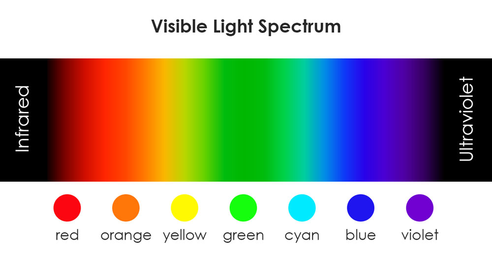
In order to see color, we use – totally unexpectedly! – our eyes. The structure of our eye, which is responsible for color, consists of color detectors called cones. These cones usually have three types of photopigments (or less if you are color blind) – red, green, and blue. But how come we can see any other color that is not red, green, or blue? Our fascinating brains do all the math for us. Looking at the lemon, the waves reflected off that lemon are neither green nor red but something in between. The reflection makes some red and some green cones fire which signals to our brain that “O, my, this must be a mixture of two,” and we see yellow. The same thing happens if you see something between blue and green, say the cloudless summer sky, which is cyan. (Source: How Humans See In Color)
What about magenta? We can see this color, but it’s not in the visible light spectrum. Does magenta even exist? Well, technically, no. Magenta is a color that doesn’t have its own wavelength. Once again, our brain does all of the calculations for us. For example, you see fuchsia (plant), and some of your blue and some of the red cones in your eyes react, signaling that the color we get is something in the middle. However, if we look at the spectrum, this ‘something’ between red and blue should technically be green; yet, the green cones aren’t reacting. This confusion creates a little puzzle for our mind, and, to safely navigate the world, it creates a new color – magenta.
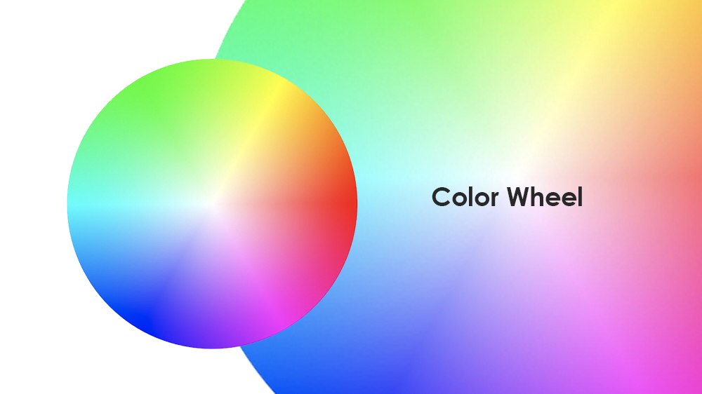
As a result, humans created a color wheel that closes a circle (literally). It illustrates the whole range of colors that our brain can come up with better than a line of wavelengths. The color wheel also shows the relationship between primary, secondary, and tertiary colors. What are those, you might ask?
- Primary colors – are the colors that create almost all of the other colors while combining.
- Secondary colors – are the colors that are created by mixing primary colors.
- Tertiary colors – are the colors that are created by combining primary and secondary colors. They are also known as intermediate colors.
To clarify, the modern color theory doesn’t fully support the idea of primary, secondary, tertiary colors. However, we believe that it is essential to explain these notions as they are used as a way to simplify the understanding of color, leaving out the nuances. The color wheel has proven to be a handy system to practice the color harmonies and the color palettes, but it obviously has its limitations.
Primary Color Models
As I’ve already mentioned, many of us have been taught the wrong primary colors, namely red, yellow, blue. What was also omitted is that there are actually two primary color models depending on the medium that is used. The first one is the Additive (Light) Color Model, and the second is the Subtractive (Pigment) Color Model.
Additive (Light) Color Model (also known as RGB):
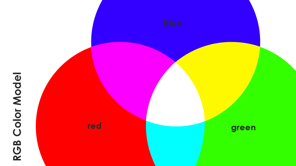
The Additive (Light) Color Model includes three primary colors: Red, Green, and Blue (RGB). This color model is used by light sources such as screens and monitors. Basically, RGB is a color model of light because it creates color by adding light, hence additive. If you combine all colors, you get white, and if you have a complete absence of light, you get black. Using different proportions of Red, Green, and Blue, a human brain can see various colors. It’s best to use the RGB Color Model if you are working with monitor-based graphics, web design, etc.
Subtractive (Pigment) Color Model (also known as CMYK):
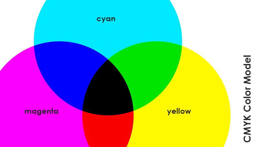
The Subtractive (Pigment) Color Model’s primary colors are Cyan, Magenta, and Yellow (CMY). Pigment creates color by absorbing some light wavelengths and reflecting the others. That’s why it’s called subtractive. The base for primary colors is white, and to achieve the true black color, we must add pure Black (K) to the mixture. This makes the CMYK color model widely used in printing as colors are reflected off the surface (canvas, paper, etc.). If you are working in packaging design or anything related to printing, your work should be done in the CMYK Color Model.
For an illustrative example, you can watch the videos that show you the mixing process of both RGB and CMYK color models.
These two-color models are closely related. Cyan absorbs red light and reflects blue and green; Magenta absorbs green light and reflects red and blue; Yellow absorbs blue light and reflects red and green. That’s why you can see that the RGB Model’s primary colors are the secondary colors of the CMYK Model and the other way around. (Source: Primary Colors of Light and Pigment)
If you happen to have many misunderstandings with your clients or teammates about colors and color modes in your design projects, we have a perfect solution for you! Approval Studio is an online proofing tool that helps with design approval. It offers a vast number of features, from on-image annotations to four automated comparison modes.
Other Color Properties
Cool and Warm Colors
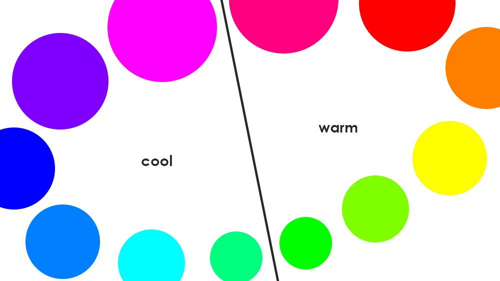
Traditionally, all of the colors are roughly divided into cool and warm colors. Simply divide the color wheel in half, and you will get reds, oranges, yellows as warm colors, and blues, greens, purples as cool colors. This is a simplified explanation of the color temperatures that works perfectly fine in the day-to-day world. However, I would like to address some crucial nuances for artists and designers and are usually overlooked.
As defined in modern color theory: “Warm colors are hues of yellow, orange, and red that contain no visible blue or green. Cool colors are hues of blue and green that contain no visible yellow or red. Warmer colors are closer to red-orange, and cooler colors are closer to green-blue.” This definition implies that colors are not so easily divided into cool and warm. Some might argue that greens and purples are both cool and warm colors.
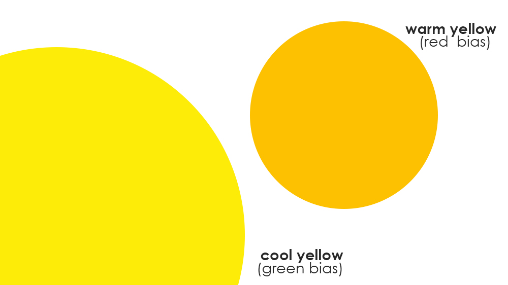
We will take this issue a step further and state that all colors have both cool and warm counterparts. Yes, there are cool reds and warm blues. Let me explain, yellow is customarily considered a warm color, but at the same time, there can be both cool and warm undertones (also known as biases) of the same yellow. If you look at these two yellows, you can see that one is cool with greenish bias, and the other is warm with reddish bias. The same thing applies to all the colors, erasing the imprecise division between cool and warm colors.
For more in-depth info, you can check Michael Townsend’s article on why color temperature is relative.
Hue, Tint, Shade, Tone
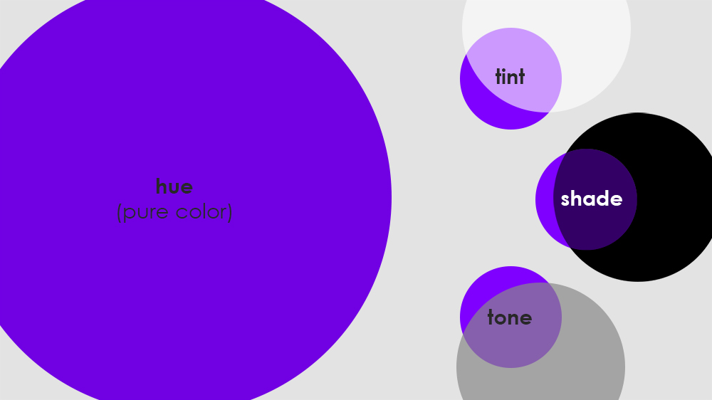
- Hue is another word for color, and some call it a pure color (with no additives).
- Tint is a mixture of a certain hue with white. Tins are lighter and more translucent.
- Shade is a mixture of a specific hue with black. Shades are darker and deeper.
- Tone is a mixture of a particular hue with gray. Tones are the desaturated hues.
Munsell Color System
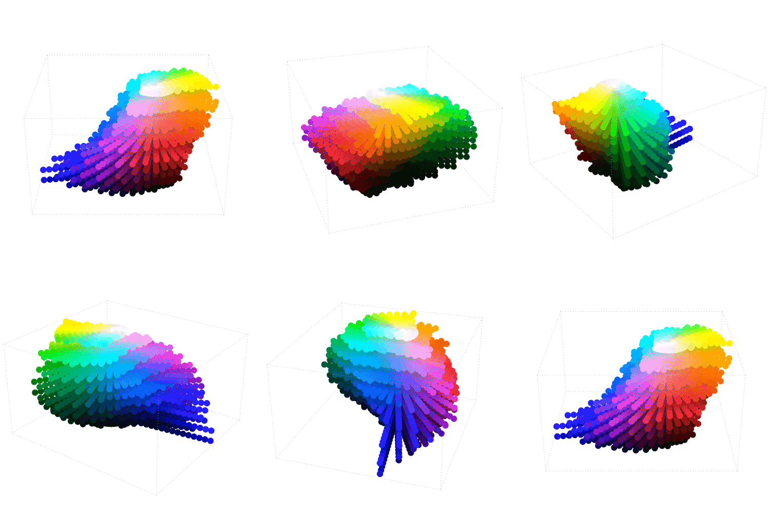
The article on modern color theory wouldn’t be complete without mentioning the Munsell Color System. The Munsell Color System is a more complex structure to the previously discussed RGB and CMYK color models. It was the first one that put color in the three-dimensional space. It also triggered the creation of other models such as CIELAB and CIECAM02 that are technologically developed and highly precise.
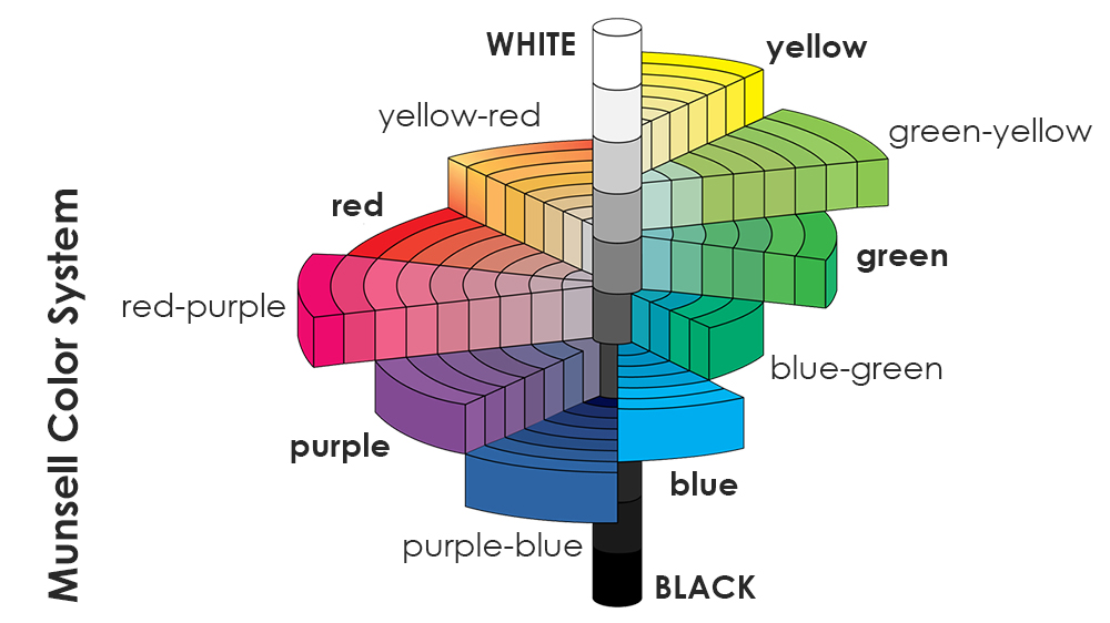
Munsell Color System is based on the three parameters:
- Hue – the color name
- Value – its lightness or darkness
- Chroma – its purity or difference from neutral gray
The colors are organized in a so-called Tree. The vertical “trunk” of the tree is the value, and it goes from white to black, creating a range of grays. The horizontal “brunches” are the chroma, starting from the gray and moving further away to the pure color hues. The Munsell Color System includes five primary colors (Yellow, Green, Blue, Purple, and Red) and five secondary colors (Yellow-Red, Greenish-Yellow, Blue-Green, Purplish-Blue, Reddish-Purple).
Final Thoughts
As you could see, some parts of the color theory are quite heavy on physics and science, unraveling the very base of what color is and how we see it. Other aspects are more related to art, and the practices developed to mix colors and create color schemes. The indefinite line between these two sides generates a lot of misconceptions and false information.
As creatives, we cannot omit this general knowledge, although we don’t have to know all of the nerdy details and mathematical formulas about color (unless you want to, of course). However, I think it’s crucial to understand the basics of how it works. Let’s embrace the complexity of color and use it to our advantage!

 TEAM SOLUTIONS
 WORKFLOW SOLUTIONS


 REVIEW TOOL
 PROJECT MANAGEMENT
 TOOLS & INTEGRATIONS
 CLIENT INTERVIEWS


