 TEAM SOLUTIONS
 WORKFLOW SOLUTIONS


 REVIEW TOOL
 PROJECT MANAGEMENT
 TOOLS & INTEGRATIONS
 CLIENT INTERVIEWS


As you know, we at Approval Studio are trying hard to keep in contact with our clients and the broader design community to try and understand its pains better. Research on packaging design always proves very interesting, as there is almost no universal agreement on everything, except for maybe the most common issues.
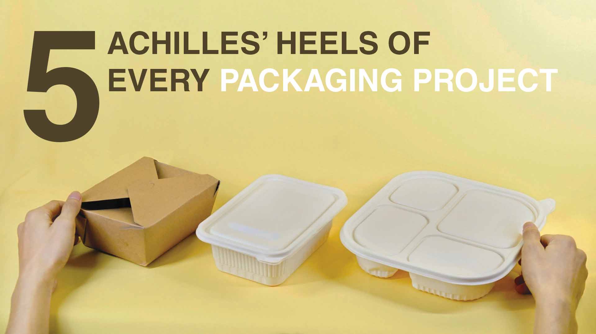
Every packaging for products is great in its own unique way, but the problems the creators face in their production process are roughly the same. Drawing some conclusions from our talk with clients, we have tried to systematize the most typical issues. Hence, here we go with five Achilles’ heels of every packaging project.
I hope this article will be helpful if you want to check yourself before adding a fresh artwork to your portfolio or sending it to a publisher. No need? Well, at least you can laugh at our witty out-of-context comments.
Table of contents:
Project Concept VS Final Product
This one is undoubtedly the most annoying if you ask me. Compliance of the packaging design concept with the result is usually the first thing I hear when I ask people about the issues they face in production, so it’s only fair to put it here first. Let’s look at the chart below from our research to see what I mean:
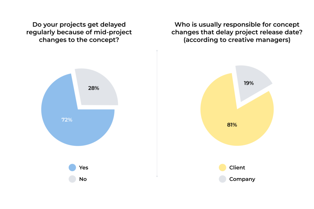
72% of creatives who took part in our questionnaire told me that their projects get delayed regularly because of the changes to the initial concept. Why does that happen? The explanation is simple: people love to disagree, and while the client can imagine certain things one way, the agency might have something totally different in mind.
To avoid that misunderstanding, the brief and everything that follows must be precise. “The color that conveys the naturalness of the ingredients” in the illustrations is fluorescent green. “Unique color solution for each SKU” is pretty darn vague to get it right without reference. Does “refined lettering” mean some elegant font solution, or will simple italics suffice? I know that it won’t, but the clients might think otherwise 😀
When the visualization project does not match the description, the question arises: was it the PR or brand manager who screwed up the release, or did the studio fail to work out the stated concept? Or was the idea too unclear? Or was it the client who wanted to change everything mid-project?
Creative managers tend to think that the latter is the most common reason, but regardless, you have to make things right from the start and be as specific as possible so that all you’ve agreed upon is fixed somewhere. In this case, specially designed software will do you much better than a piece of paper. Even if the concept changes still catch you two days before the deadline, you’ll have some bulletproof arguments about why it’ll cost your client extra.
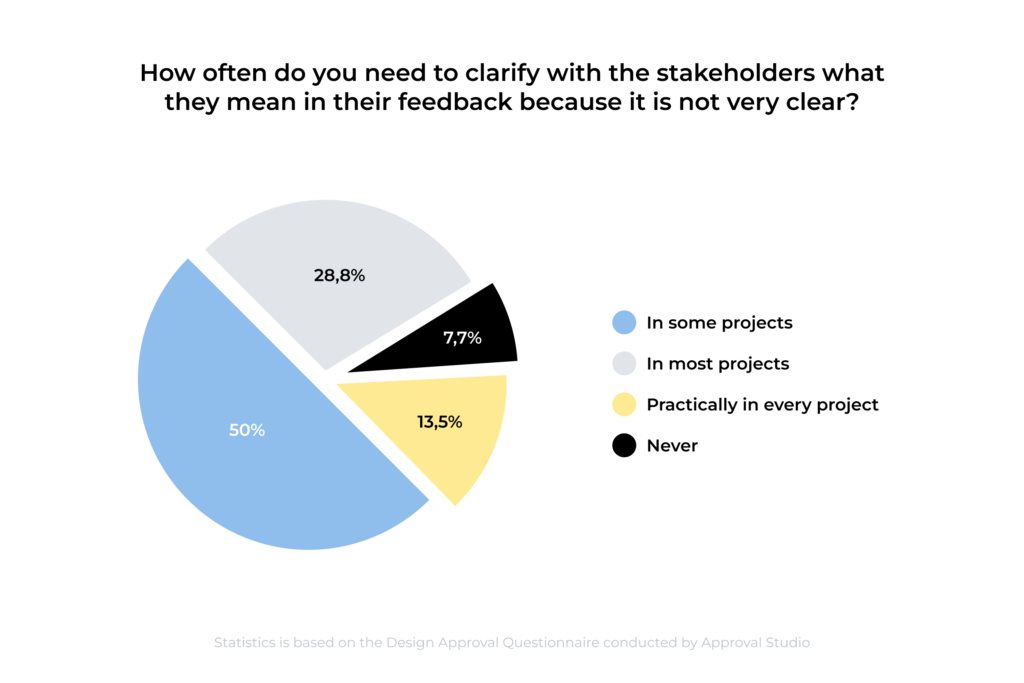
Meanwhile, any disagreement and change that arises mid-project will increase the need for precise feedback. Its absence often facilitates change to the initial concept that was unnecessary or makes designers clarify and waste time. Only 7.7% of creatives never encounter such problems, and that’s quite a mess, to be honest.
If you want to avoid such situations, I highly recommend checking our design review tool, Approval Studio. It will help you see your project through from the initial concept to a successful packaging approval, be in control of all changes and feedback, and even fight the issues I will discuss further on.
Understanding the Product Usage Scenario
Packaging is a functional thing, and knowing its context of use is imperative to make it efficient. We discussed it with our clients, and they emphasized the importance of clearly understanding their package’s future. However, sometimes, both creators of concepts and authors of commercial works tend to pay insufficient attention to the product’s life scenario.
The creative team must investigate the cost of production, the package’s life after the purchase, and the reality of the calculations at the very beginning. The process might seem tedious, but some questions need answering.
Where will the product be sold? How will it look beside its competitors on the store shelves? Does it fit the range and look unique at the same time? Is the purpose or benefit of the product reflected in the packaging? Is this reflection necessary? What would the buyer do with the packaging after the product is used? Is the package reusable? Will it fit conveniently at home if yes, and what could it be used for? Is it easy enough to dispose of it if it’s not reusable? Is it eco-friendly? How does the cost of the packaging influence the price of the product in both cases? Does it remain reasonable? What does…
Okay, with considerable effort, I’ll stop myself here. This list could go on and on; there are countless questions you can ask yourself. Usually, specialists have a standard set of those or something in their packaging design process. If you do not pay much attention to these, you might as well try.
Graphic Relevance and Font Solutions

Packaging design is an endless search for balance between graphics, the density of the package, quality of printed informational content, and reading comfort. Here are five essential rules of the work with different types of packaging that can help you to improve your design:
- Composition. Before starting the layout, put all the elements in front of you to have complete eye contact with all parts of your concept. Does anything look out of place, excessive, or downright weird? Are there any unnecessary elements that you personally like but which do not fit in the context? Do not be afraid to ditch something if you think it spoils the view.
- Space. Do not strive to fill every free spot with anything at any cost. A successful label is a result of the balance between free and occupied space. Considering how many people love minimalism these days, you should be extra careful about this.
- Proportions. Remember that the elements look different on screen and paper, so print a draft before publishing the artwork to check how it looks in real life and whether everything is intelligible.
- The hierarchy of perception. Arrange the elements in a logical order according to your customer’s demands. Usually, the most comfortable hierarchy is attention grabber > the brand’s name > the product’s name > the product’s description.
- Text. Do not be afraid of cutting down on the text amount if the layout requires it. If you explain to the customer in detail why exactly you need it and how the artwork will benefit from it, there shouldn’t be any problems.
Double-Checking for Oddities

When it comes to product packaging design, the devil is in the details – in errors, typos, or meanings behind the composition elements that you could’ve missed. They are in the anatomical inaccuracies in the illustrations, metaphors that do not work, random ambiguities, points of view, readability of the text, and many other things left to the imagination of the end consumer of your product. Always proof the validity of each visual decision and never neglect to double-check.
Here’s a brief story for you, young reader, to showcase why it’s necessary. A couple of weeks ago, I went to a newly opened bakery not far from my home to check out what excellent crusty bread they had. I didn’t really bother to look at the logo over the entrance. Still, when I paid for my delicious multigrain loaf and got out of the shop, I noticed that the baker’s minimalistic hat on the logo quite distinctively resembled a male penis.
Now, I’ve seen my share of stupid suggestive designs, so it wasn’t something I was surprised about. Was it intentional or not? I don’t know for sure, but this is the first thing I remember when I think about that bakery: the package with an odd hat. Was it funny? Somewhat, yes. Does it make the branding better? Nope, not at all. More so, they could have easily avoided it all with the proper packaging design review.
Unpredictability of the Audience’s Reaction

Yes, even if you put your concept through the wringer of million scenarios, there are still some reactions and situations you cannot predict. Regardless of how irritating some of them might be, you must be ready for them, and the more you understand the context, the less unpredictable the audience’s reactions will be.
Once going live, your project immediately faces the biased-minded commentators or comes across meticulous trolling or corrosive critics. Criticism is an inevitable part even of the biggest and most successful projects. Can it be annoying? Yes. Does that fully define the success of your product package design? It shouldn’t if you’ve worked it through well. Just treat bad reactions with humor, and you will do just fine.
Conclusion
The issues you can encounter when you create packaging design are numerous. That’s probably the beauty of it — creating something new, you will have to overcome various problems in the process, like it or not. But all the more rewarding becomes the result! Anyway, I hope this little guide will become helpful for you, and you’ll know all the danger spots before going to your next packaging project. Don’t forget to use some packaging design software like Approval Studio, and cheers!
