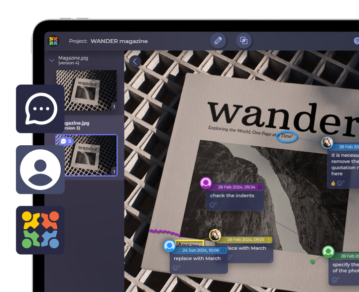
TEAM SOLUTIONS
 WORKFLOW SOLUTIONS


 REVIEW TOOL
 PROJECT MANAGEMENT
 TOOLS & INTEGRATIONS
 CLIENT INTERVIEWS


Post is also avalible in:
![]()
![]()
![]()
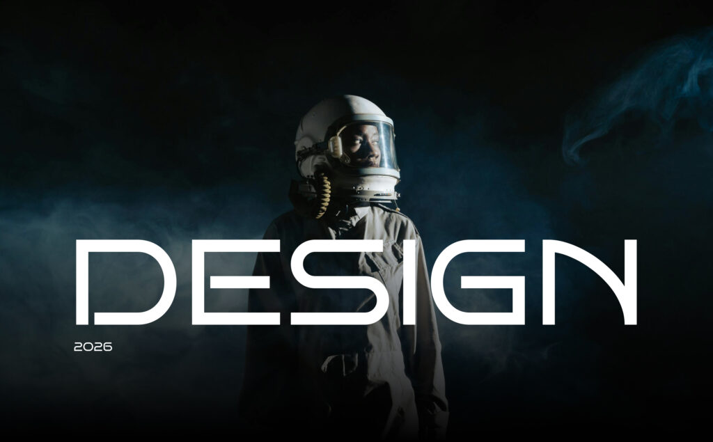
If design in 2026 had a map, it wouldn’t look like a timeline. It would look like a solar system.
Trends no longer line up neatly, replacing each other year after year. Instead, they form planets, self-contained worlds with their own atmosphere, gravity, and logic. Each one pulls designers in a different direction.
Rather than moving forward in a straight line, designers orbit these worlds. Some planets are fueled by artificial intelligence and movement, while others are driven by nostalgia, imperfection, or subtle emotional details. Designers move from planet to planet, choosing where they want to land, what they want to explore further, and what will remain distant and unexplored for now.
Let’s travel through the design solar system of 2026, a universe of creative planets that shape how interfaces, brands, and digital experiences look and feel today, not as predictions, but as environments that you can enter, explore, and build within.
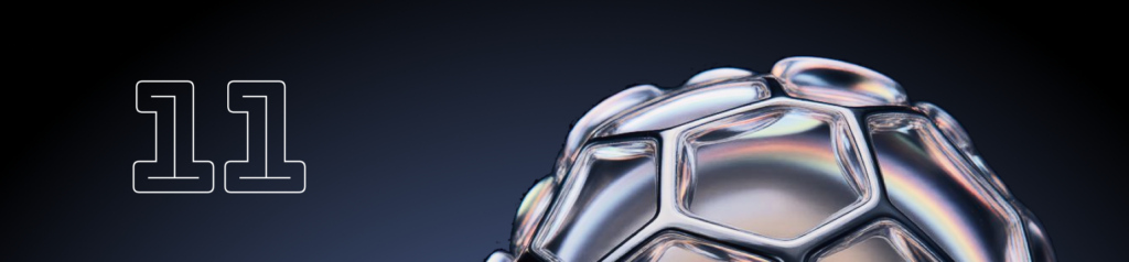
1 Planet GLASSORA. Where everything turns to glass
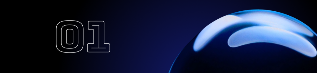
Well, let’s begin our cosmic journey with the planet GLASSORA, a world where almost everything is slowly turning into glass. Interfaces here feel built from light rather than matter, embracing the principles of glassmorphism. Frosted panels, blurred backgrounds, translucent layers, and soft shadows create depth through opacity and layering, rather than relying on heavy 3D or aggressive motion. Gradients behave like ambient light, while subtle reflections and highlights give surfaces a clear glass-like presence. Motion remains minimal and controlled, with slow transitions and restrained micro-interactions that support clarity rather than demanding attention. On Glassora, design grows quieter and lighter, focusing on transparency, precision, and visual calm as the foundation of modern digital aesthetics.
See visual references: glass-effect
2 Planet GLOWRIA. Glow, don’t show
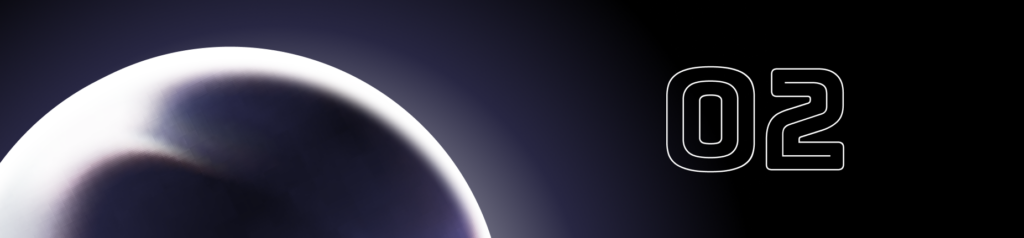
Glowria is a planet that is impossible to miss from afar. It doesn’t flash or explode with motion; it simply glows. A steady, calm light wraps its surface, hinting at depth long before you land. On Glowria, WebGL feels less like technology and more like an atmosphere. Soft spatial layers, diffused lighting, gentle reflections, and barely-there shadows shape environments that breathe instead of perform. Locals say flat design still exists on Glowria, but only in the shadows. If something doesn’t glow at least a little, it probably isn’t native to the planet.
Visual references: glow-driven web design
3 Planet RETRONIA. Retro vibes, modern eyes
On the horizon, warm hues and familiar geometric patterns stretch across rolling landscapes. This is Planet Retronia, a world where retro design looks back to move forward. Its skies are painted with vintage gradients, sun-bleached textures, and playful nods to past decades, from neon ’80s shapes to muted ’70s tones. Typography, icons, and illustrations evoke a retro aesthetic while remaining clean and approachable. Retronia invites designers to celebrate memory, emotion, and heritage in digital spaces, showing that past styles can feel fresh and inspiring when framed in a contemporary context.
Visual references: retro‑inspired design
4 Planet BRUTARA. Punk & Grunge Design
Do you see something raw and intimidating on the horizon? That’s Brutala, the planet that brings a touch of rebellion and grit into the otherwise smooth, glassy universe of interfaces. Rooted in the spirit of brutalism, its landscapes are jagged and textured, with distressed forms, rough edges, and muted earthy colours dominating every surface. Layouts feel chaotic yet alive, elements overlap unpredictably, and spacing breaks all conventions. Motion is minimal or jerky, following instinct rather than rules, giving the planet a distinctly human pulse. On Grungeon, boldness and spontaneity rule; every texture and mark carries attitude, and conformity does not exist.
Visual references: brutalist & grunge web design
Lost in a chaotic
design orbit?

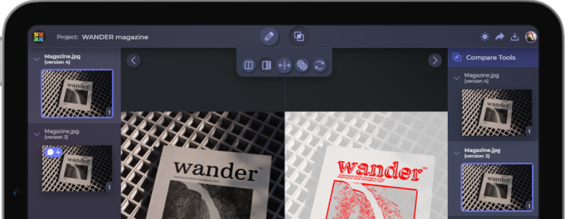
Manage projects, track revisions, collect feedback, and approve designs without killing creative momentum.
Start a Free Trial5 Planet NAÏVA. Doodles, Play, and Emotion
Naïva is a planet as clean and open as a blank page in a sketchbook, where imperfection reigns and emotion guides every stroke. Here, design is playful, spontaneous, and sincere, allowing you to feel like a child again and explore without worrying about rules or perfection. Lines wobble, shapes are slightly off, and colours sometimes defy logic, yet everything feels alive and personal. Elements interact gently, sketches appear unexpectedly, and movement is guided by intuition rather than strict structure. On Naïva, creativity is emotional, freedom is essential, and the joy of expression outweighs precision.
Visual references: naïve, doodle‑play web design
6 Planet TRINKETTA. Where every detail matters
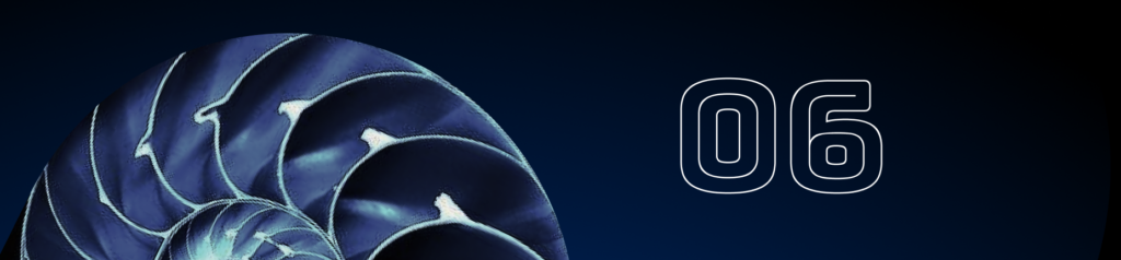
Remember when you used to collect little treasures, such as shells, coins, or tiny trinkets, as a child? That feeling comes alive on Planet Trinketta, a world where design transforms objects into stories and every piece reflects its owner’s personality. Its landscapes resemble carefully curated collections, blending still life and scrapbook aesthetics, with grids and layouts guiding the eye through emotional and tactile details. Here, arranging, layering, and highlighting small items becomes a language of identity. Trinketta is celebrated across the creative universe, inspiring lifestyle, fashion, and wellness brands to create designs that feel personal, intimate, and full of charm.
Visual references: trinket‑inspired design
7 Planet GRADIENTIS. Flowing Colours, Seamless Spaces
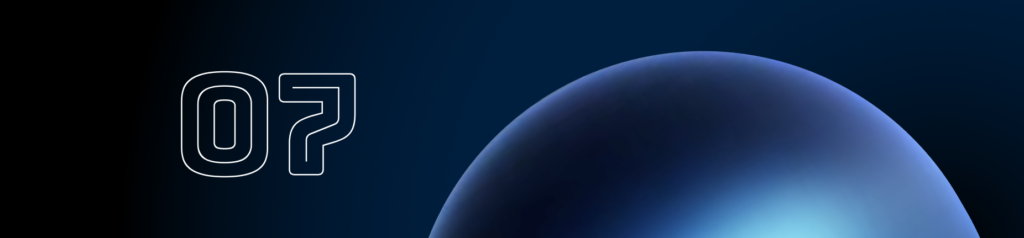
On the horizon, smooth, flowing colours stretch as far as the eye can see. This is Gradientis, one of the oldest and most prominent planets in the design system, where colour flows like liquid, connecting everything it touches. Soft transitions, layered gradients, and subtle shifts in tone shape its vast landscapes. Gradients here are not merely decorative but structural, guiding movement, highlighting key areas, and creating a sense of rhythm. Micro-interactions and gentle motion blend with the colours, making the planet feel alive and immersive. Gradient inspires other planets, providing the foundation for many visual trends that designers continually explore. smooth transitions
Visual references: gradient‑driven design
8 Planet BLUEPRINT. A universe drawn to detail
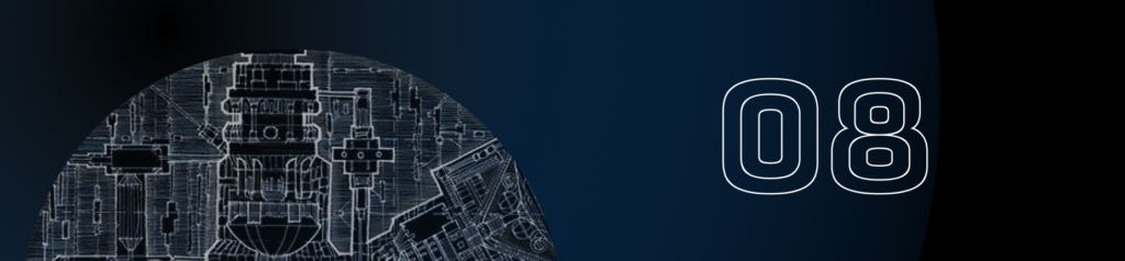
Complex architectural cities and mechanical landscapes loom on the horizon. This is Planet Blueprint, a rapidly expanding world dominated by a trend toward technical, over-explained design. Every structure, object, and surface is meticulously marked, measured, and deconstructed like a blueprint. Buildings resemble unfolded diagrams, streets look like mechanical blueprints, and even the most minor details carry purpose and individuality. Over-explanation has become an aesthetic, transforming ordinary objects into engineered, iconic creations.
Visual references: blueprint‑inspired design
9 Planet ACIDORA. Acidcore Energy
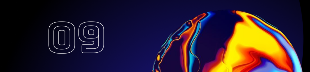
On our journey, some places are safe, while others are wild and a little dangerous, yet always striking. One of these is Planet Acidora, a world that attracts with its electric colours and bold, chaotic design. Acidcore here is never subtle or minimal; it is hyper-saturated, fluorescent, and unapologetically vibrant. Landscapes pulse with neon colors, glitch effects, jagged typography, and warped shapes. Motion is frenetic, backgrounds shift unpredictably, and every corner screams energy and rebellion. Designers push saturation, contrast, and unexpected combinations to the edge, creating experiences that feel alive, intense, and unforgettable.
Visual references: acidcore & neon design
10 Planet OBSERVIA. Where precision rules the universe
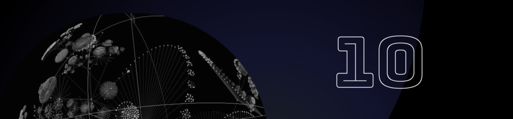
After the chaotic energy of planets like Asidora, the journey leads to Planet Observia, a world of order, control, and precision. Here, every surface and structure resembles security systems, video surveillance, biometric overlays, and modular grids. High-contrast minimalist palettes, stark alignments, and timestamp-like patterns dominate the landscape, creating a sense of alertness and structure. Observvia is a stabilising force in the design universe, combining conceptual clarity with cultural relevance, giving explorers a sense of control amidst chaos.
Visual references: surveillance design
11 Planet Generativa. Generative & Dynamic Systems
On Planet Generativa, design never stands still; every element evolves in tandem with the system. AI-driven and algorithmically generated graphics, patterns, and layouts adapt in real time to the user, context, or even the time of day. Backgrounds generate endless textures, components rearrange themselves fluidly, and images are created or transformed dynamically with every interaction. Designers set rules, constraints, and boundaries, while the algorithms produce countless variations. Visitors quickly learn that on Generativa, adaptability is mandatory and evolution is constant, making every moment a new visual experience.
Visual references: generative design
12 Planet Typoria. Where fonts have power
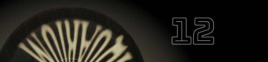
Letters rise like monuments on the horizon, and flowing type spreads across the landscape like banners. This is Planet Typoria, where fonts take pride of place, and each character emphasises the world around them. The typographic design here is expressive, dynamic and emotional, transforming text into mood, personality and narrative at the same time. As designers increasingly realise its value, Typoria has gained popularity, finding itself alongside other creative planets as a place where type is not just functional, but also celebrated as a central element of design.
Visual references: expressive typography
Summary
As we orbit the planets of 2026, it becomes clear that design is no longer linear or predictable. Each world offers its own rules, aesthetics, and experiences, inviting creators to explore, experiment, and draw inspiration. From the glowing landscapes of Glowria to the chaotic energy of Acidora and the expressive fonts of Typoria, this solar system reminds us that creativity thrives in diversity. In 2026, designers are not just following trends; they are navigating entire worlds.