 TEAM SOLUTIONS
 WORKFLOW SOLUTIONS


 REVIEW TOOL
 PROJECT MANAGEMENT
 TOOLS & INTEGRATIONS
 CLIENT INTERVIEWS


Packaging design is probably one of the most complicated branches of the design industry — that is if there are any easy ones at all. With all of its complicated steps, techniques, and nuances to consider, it can be really challenging at times, but all of that makes it even more rewarding when you see the result.
We’ve discussed the packaging process and its main steps in one of our recent articles, but surely that general scheme differs greatly from project to project, from designer to designer. That is why the next logical step was to scratch up the chin very meaningfully and launch another Creative Talks campaign asking design specialists from all over the world what they think! The questions that interested us at Approval Studio were:
- What are the most and the least favorite things about packaging design for you personally?
- Could you please share your packaging design process? What are some challenges that you might have encountered during this process?
- In your experience, what are some of the most common mistakes while designing packaging? Do you have any tips for beginners?
We’ve received so many in-depth replies that we couldn’t just make it one article and had to split it into two parts — you can check out Part II right here. If that’s your first time on our blog, we have a lot of Creative Talks entries that discuss important design questions with industry experts. For example, things you shouldn’t do working with designers and differences between formal design education or being trained on your own (Part I and Part II).
With that being said, let’s roll! (and also rock)
Stef Hamerlinck – Branding Specialist
Stef Hamerlinck’s Blog and Behance
I love translating a brand identity to an actual product and thinking about how it will stand out on the shelf (or wherever it will live). Seeing and feeling the product in your hands in real life is just such an amazing thing. What I don’t like about packaging design is the infinite amount of ‘little’ details and text that have to be fine-tuned at the end. I usually try to outsource that final part.
I usually have quite a lengthy strategic process before I do any design. Making sure you understand the consumer, the category (and competitors), and the company is key to crafting a packaging design that works for the brand. After strategy I usually start with the brand identity first, looking at things like logo, color, typography, etc… In that case, I’m already considering the packaging as well. Once the brand identity is final, I usually start with the product title and front of the packaging. Getting that “hero image” right is key. Very often I look for interesting graphical devices that will easily stand out. Here’s a big tip: ZOOM OUT. Zoom out as often as you can. Turn your head, squint your eyes.
Remember, a consumer walks in the aisle and is not paying attention. You need a show-stopper. Another key element to packaging design is not just thinking about the graphic design but also about the bottle shape, the texture, the way it opens, etc.
One of the most common mistakes I see is not taking into consideration the category codes. If all competitors have a blue color, you might have to have something similar because people might not recognize you as “milk” if you break too many codes. The trick is to find the balance between standing out but still belonging to the category — you don’t want people to think you are a shampoo when you are selling beer. Another big mistake I see is focusing too much on little details or communicating verbally and not enough on the overall look. Very often consumers do not read the full pack or even stop to check. So you need to be very clear about what makes you special in a visual way.
If you are a beginner, the biggest tip I can give you is to go to the supermarket and observe different categories and packaging designs. Look at the color blocks, the different styles — how are they influencing you? Most designers are obsessed with packaging design as with the thing that lives in design books. That’s awesome, but don’t forget you are helping companies to sell stuff.
We at Approval Studio too believe that packaging design has to be real and practical to perform its function and sell the product. That is why we have developed a proofing tool that would help designers to make sure everything is done according to the brief from packaging style to technicalities such as distance between layout elements and barcode. If you need a way to track every detail and compare how your ideas develop with every edit from a client, you might want to give our design review software a try.
Lung-Hao Chiang – Art Director & Graphic Designer
Lung-Hao Chiang’s Behance
I like the precise product strategy and pure packaging design. I try to be as intuitive as possible in the packaging design and don’t invest too much information that has nothing to do with the brand and product appeals so that consumers can clearly receive the message or story that the packaging design wants to convey.
What I don’t like is a product with too much information. Too much information will make the packaging design lack focus. It is easy for brands and designers to put too much information in the communication process to tell how great their products are. It’s good, but it’s too greedy. In fact, consumers don’t have so much time to read all the details of the packaging design in the process of buying goods, so it should be simple and condensed. Less is more.
In the process of packaging design, I tend to filter information and find the core or the most resonant key points of consumers among the many contents that the brand wants to convey. That is because usually, brands are eager to communicate with consumers about how good and attractive they are. However, for consumers, it’s like a date with someone we meet for the first time. We still don’t know each other. If the other person over-introduces themselves and talks only about their interests and life, you will have no interest in what they said and leave as soon as possible because you’ll think they are an arrogant person.
The challenge in the design process lies in understanding the consumer market, sales site, and product culture. For example, certain colors and patterns represent different meanings in certain cultures, some kinds of packaging are the most space-saving, others are convenient for sales staff to use and operate. These details need to be carefully considered in the process of packaging design. I hope that my packaging design is not only beautiful, but more importantly, it can effectively communicate and sell. A beautiful packaging design is great, but it’s just part of the job for a designer. It’s the happiest thing for me to create good sales or get praise from consumers.
Too much pursuit of beauty or design performance can make you forget that the task of packaging design is to let consumers choose your product, rather than simply making cool work. Cool packaging design does not mean that it will be used by consumers. Making it look great is just the designer’s self-satisfaction and conceit, and consumers must always be placed in the most important position in design thinking.
Put aside the books and the instructive teachings of those design masters, actually go to the store or department store to see which packaging design makes you excited, which products sell well, and think about what makes them sell well. The theories and cases in the class are the information that was sorted for you and is only living in the past. For the current or future market, or for the consumer’s thinking, going to the store is the most accurate experience because, in addition to being a designer, you are also a consumer. Your usual consumer experience is an exercise in packaging design. Stay curious and continue to create. Don’t rush to get approval or any significant design results. These exercises cost your time, but they will eventually pay off in your design work in some form or experience in the future, so let’s work hard together! Cheers!
Ali Ozden at Universal Favourite – Design Director
Universal Favourite’s Website and Instagram
I’d say the best part and the worst part are probably the same thing! The challenge of packaging is the worst part as you have to consider the structure as well as the graphic design. Finding a solution to that is the most enjoyable part because when it all comes together it tends to be a nice brand experience.
We will often start with our brand and find interesting references that relate to it. For example, if the brand is about being open, then we will find interesting ways of being open in reference to packaging. Sometimes we work with an external packaging manufacturer, like Think Packaging in New Zealand. If we work with them we will share some ideas about how the structure might work and they will come back to us with some interesting way of applying those ideas to a structure. Once we receive the dielines, we will then start the graphic language. It’s a layering process, you start with an idea, you build on it with some structure and then you build on that with graphic design and branding.
My advice for everyone is to keep it simple! Trying to do too much is the most common mistake while designing packaging. Remember that function equals form and it’s not a superfluous graphic design exercise, it’s an exercise in function and it needs to be easy to use and comprehend. I feel that designers try to do too much and don’t really take in the medium. For example, consider the bottle and the paper stock, the feeling of that is already enough. You are enhancing those elements as opposed to trying to do something new.
Johnny Hu – Graphic Designer
Johnny Hu’s Behance and Instagram
It always surprises me when I get to see the final product with my own eyes, no matter good or bad. Packaging design is not just about graphic design, you need to think about the materials, printing method, and cost really carefully, each part affects the result significantly. I would say I enjoy the process a lot even though it always comes with endless technical issues. I also hate that there are always some problems I would never expect to happen. If you really love trouble (I do), packaging design is the way to go.
I usually will check with my clients about their budget and the MOQ they expect in advance. The cost changes dramatically via different ways of printing and the quantity. Then I will start with deciding the materials first, for example, what kind of paper might suit the values/spirits of the product, what message the material could express to consumers without much design on it. Graphic design is always the last step I will make. And one thing I really care about in packaging design is that people usually throw it away immediately after receiving the product, so either I would try to choose some eco-friendly material (e.g. FSC certified paper or compostable plastic), or to keep the packaging very simple that people might want to keep it as a decoration or for other uses.
I am really bad at spatial concepts actually so it is always hard for me to know if the design I see from the computer is alright or not. So it has happened to me so many times that where I put the text or design on won’t work when the packaging is done, and I always realize it right before sending it to print. But I would say the biggest challenge is that each material has its own character, so you have to know them very well in order for them not to ruin your wonderful idea. To become a good packaging designer, you will need lots of failure experience from which you can learn and still remain creative not to be restricted with the materials too much.
Without much experience, you might feel confused about how to start a packaging design because it is not WYSIWYG, and beginners would usually end up playing it conservatively. It is not a mistake, but you should be aware that it will restrict your imagination for the time being. It is always good to consult with your printers if you have any technical concerns, don’t be afraid to ask them. Think about packaging design as designing a new game, you need to stay creative and also very logical at the same time, only with imagination will not work. I think that is why packaging design is so charming!
David Racchi at Walk with David – Branding & Design Agency
Walk with David’s Behance & Website
June 1st was the date of the highly anticipated opening of Raffles Europejski Warsaw.
Dating back to 1857, the neo-renaissance palace was being restored to its pre-war glory over the last four years.
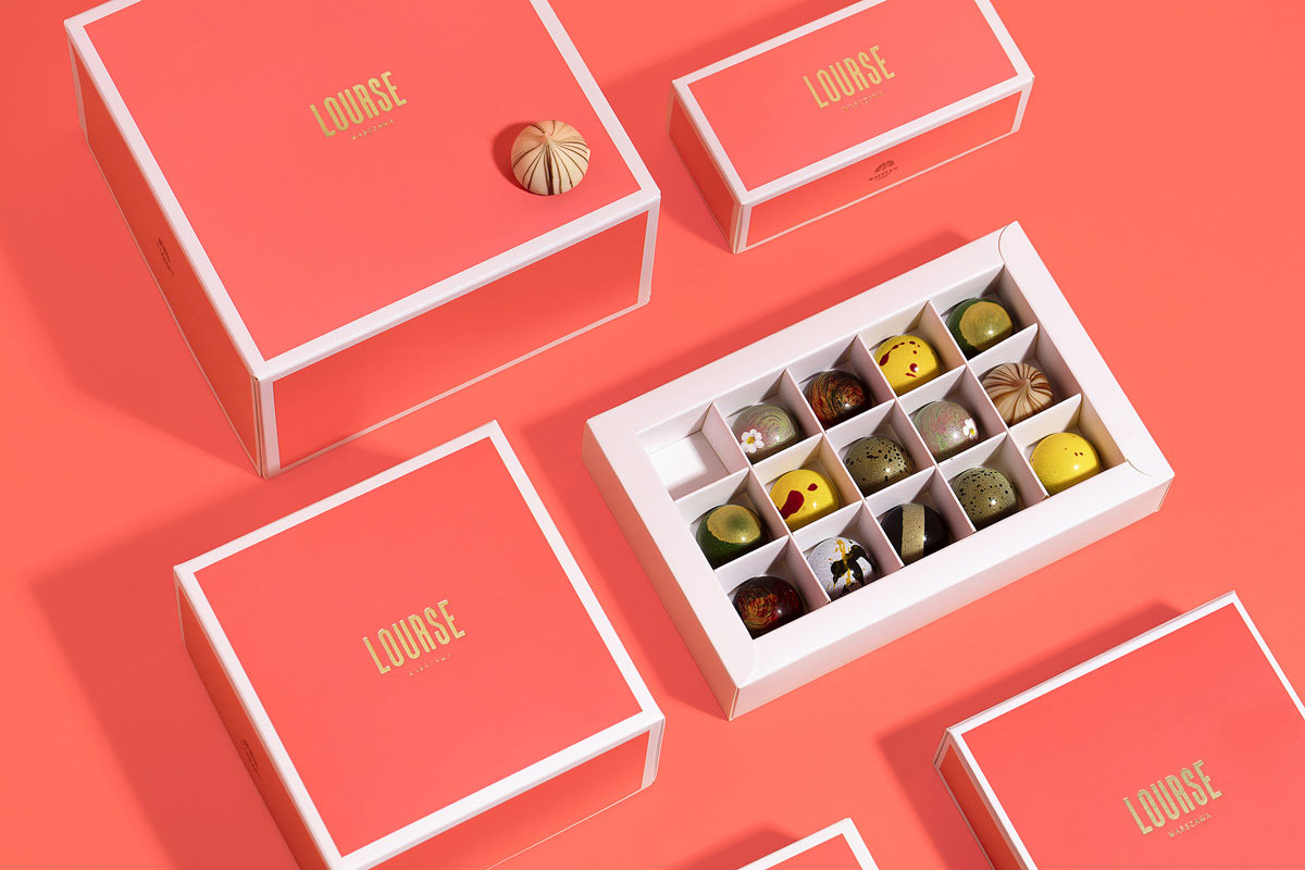
We were commissioned to create the identity for 4 venues found within the Food and Beverage section of Raffles Europejski Hotel Warsaw. They included The Longbar, The Humidor, The Europejski Grill, and Lourse Patisserie Warsaw. Our brief was simple: to create an iconic branding that transmitted the feeling of tradition, luxury with a hint of homage toward the original Lourse patisserie, which existed almost a century ago. We designed a wide range of beautiful packaging and also created a personalized iconic color for Lourse. All the packaging was treated like jewelry boxes that incase beautiful assortments of cakes, sweets, macaroons, etc.
Designing packaging for such projects, you will always come up against many obstacles ranging from concept, budgets, functionality, etc. Our goal is always the same, to tackle the project’s obstacles and create a functional design that meets both our clients and our own expectations.
Our process is always tied to finding a story that enhances the project’s appeal. Once we have found the narrative then our journey starts in terms of designing particular packs, graphics, and copies. Our main challenge is to create packaging that speaks to the viewer in an emotive way that draws you in to take a second look. We always make mistakes, but we try to predict them very early on in the process; it usually comes with research and early trials. For beginners, I would note that when you are designing any form of packaging you should always take into consideration what budget you have because that can dictate the materials you can use, the printing process, and also the packing’s functionality.
Isaac LeFever – Art Director & Illustrator
Isaac LeFever’s Website and Instagram
My favorite thing about packaging is making something tangible – something people will hold in their hands, and, ideally, something that will show up in a lot of places like store shelves, advertisements, people’s homes. You’re given a great opportunity as a packaging designer to get in front of a lot of eyes. Another cool thing about the medium is that it can be very materials-driven. You have the option of so many substrates, papers, printing techniques, and finishes. There’s a lot of room for creativity in that respect.
My least favorite thing about packaging design would be the common disconnect between what the client wants and what they can afford. Plenty of companies would love to have letter pressing or metallic foiling. However, when the manufacturing quote comes in, it often doesn’t align with what they had budgeted for. This can force a lot of compromises. My job then becomes working to find ways to make the design work feel upscale in lieu of higher budget printing.
With any design project, my first job is to understand the client and their product. Further, I need to understand their target demographic. Whose attention are they trying to get? What are they trying to communicate to that customer? If it’s an old product looking for a packaging refresh, we need to identify what the previous packaging was not excelling at. Whose attention was it not grabbing? How can we improve upon that? You take that information and find ways to create a design language around their goals. Is this an approachable, affordable product for everyday use? Or is it an ultra-luxury item with a high price tag? There are different visual cues and conventions associated with those things.
I think a common pitfall is rushing towards the finish line before gathering critical information. It’s very important early on in a project to really hammer out the important details. Exactly what information needs to be on the packaging? Are there any laws requiring specific warnings or regulatory icons? Do we know for sure what volume this beverage will be sold in? That sort of details.
Another big mistake in packaging design is not being mindful of pack-out — the actual phase in the process where a human being will have to take the product and physically assemble it together into the packaging as intended. The handwork involved in that process is expensive. You want to make it as easy and efficient to do as possible, so you need to design with that in mind. Managing inventory for several parts of the packaging such as inserts, boxes, and stickers is also a complicated job. And it gets worse if there are several SKUs involved. You need to be vigilant to keep practicality in mind when coming up with this stuff.
Maud Passini – Graphic Designer and Illustrator
Maud Passini’s Website and Behance
My favorite thing is definitely to be able to hold a beautiful object that was thoughtfully designed after the project is over. Much of what we do mostly lives in the digital world or is sometimes printed, but packaging is not only 3D but can also live as decorative objects, and be a vector to show off a brand’s visual identity. The hardest thing about them is physical and financial constraints! Obviously, you want to use the most beautiful materials and techniques, but it’s not always available for brands with a limited budget. I always say that constraints can really encourage creativity and resourcefulness, though!
Packagings for a brand have to reflect the identity that we’ve established. We will ask the client what they want to express, what their mission is, which audience they’re targeting, how people will stumble across their packaging, and many more things. We then do several concepts, which we present as mockups, so the client has a really good visual idea of what we’re envisioning. We try to offer a variety of options that allow for different budgets and production techniques, but also that convey a slightly different idea, style, or meaning. The biggest challenge is always to bring our ideas to life, production-wise. There are so many factors that come into play, but fortunately, with experience and great manufacturers, it works out!
Packagings live in the 3D world, so it’s incredibly important to test out what the actual object will look like in real life. For example, you should always check if there’s continuity of the design on different sides, how several packages will look next to each other, what it looks like in context, etc.
Final thoughts
Well, first, of course, I would like to thank each and every person who agreed to work with us on this fascinating topic. You guys are so cool! With your invaluable insight, we all have an opportunity to learn a bit more about the packaging process and how important every single detail is.
Searching for inspiration from existing designs and making yours functional in the first place is something I will surely think about a lot. Every packaging must have its own identity, own purpose, and it doesn’t necessarily mean making it as flamboyant as eye-striking as you can. I guess it is all about working smarter and thinking a couple of steps ahead.
If you want to get even more context on the matter of packaging design, you are more than welcome to check out Part II of this article and read through the experiences of even more amazing designers.
Thank you for sticking with us and cheers!
