 TEAM SOLUTIONS
 WORKFLOW SOLUTIONS


 REVIEW TOOL
 PROJECT MANAGEMENT
 TOOLS & INTEGRATIONS
 CLIENT INTERVIEWS


Post is also avalible in:
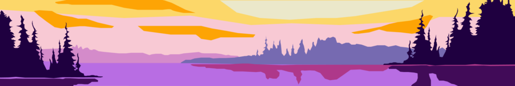
![]()
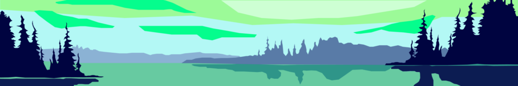
![]()
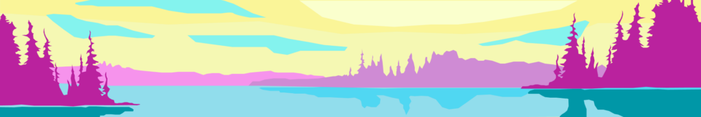
![]()
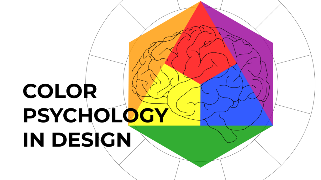
Ever wondered why certain designs just make you feel a certain way? Make you subconsciously relax or enhance your appetite? Apparently, it’s not a coincidence – it’s all about colors. They’re not there just to make things pretty; in the right hands, they can literally influence your emotions.
Colors have the power to shape our perceptions and behaviors without us even realizing it. A warm, inviting yellow can make a space feel cozy and cheerful, while a cool, serene blue can create a sense of calm and trust. These effects are rooted in our psychology and can be harnessed to create more effective designs.
For designers, understanding the psychology of colors is like having a secret weapon. Want to create a sense of urgency? Use red. Trying to give a peaceful eco-friendly vibe? Green is the answer. This emotional impact can change how users interact with your design, whether it’s a website, a product package, or a brand logo. A thoughtful color palette can guide users’ experiences, influence their decisions, and reinforce your brand’s message.
By selecting colors that align with your design goals and resonate with your audience, you can create visuals that are not only aesthetically pleasing but also deeply engaging. Be cautious, though, as some colors might have different cultural significance depending on the region. Getting to know all the intricacies of color psychology, you’ll learn how to incorporate colors into your projects mindfully and make your designs truly thought-provoking.
For starters, we’ll look into such important thing as color theory.
Color Theory
In a nutshell, color theory helps us make sense of how colors interact and how they can be used effectively in design. Here, we’ll look into the basics of this notion, but if you’d like to learn more details, then check out the full article dedicated to the topic.
At its core, color theory is a wheel, a circular diagram that organazies the colors based on their relationships with one another. Basically, there are primary, secondary and tertiary colors.
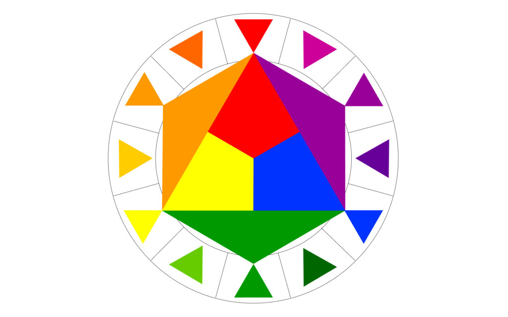
Primary colors. Red, yellow and blue. These are unique individuals and cannot be created by mixing other colors. On the contrary, primary ones serve as the basis of creating all others.

Secondary colors. The offspring of the primary ones. These are green (blue+yellow), orange (yellow+red), and purple (red+blue).
Tertiary colors. Logically, the combinations of two previous ones, such as red-orange or blue-green. These colors offer additional variety and complexity.
Now that we’ve dealt with colors, how about creating a palette? Some of them are a match made in heaven and some… well, in hell. So, have a quick glimpse at color schemes, which are the guides to color combination:
Complementary scheme. Uses colors that are opposite each other on the color wheel, such as red and green or yellow and purple. This scheme lets you create high contrast and vibrant visuals, making it ideal for drawing attention.
Analogous scheme. Uses colors that are next to each other on the color wheel, like blue-to-green, or red-orange-yellow. This creates a harmonious and cohesive look, adding to a sense of balance.
Monochromatic scheme. One is the loneliest number you’ll ever do. This scheme is based around one color, including its shades, tints, and tones. For instance, with a green core you can use sage, olive and kale green. This approach is all about sophistication and unity.

Triadic scheme. Three colors evenly spaced around the color wheel is what a triadic scheme means. For example, take orange, green, and purple. This choice gives you both contrast and color harmony, resulting in a balanced palette.
Split-complementary scheme. Here, we combine one base color with two colors that are adjacent to its complementary color on the color wheel. For example, if the base color is blue, the split-complementary colors would be red-orange and yellow-orange.

Each scheme offers a different way to use color creatively, according to the mood you need to convey. Now, what about the colors themselves? What are the hidden meanings behind each of them?
Meaning of Colors
Everybody has a favorite color, but why do we resonate with them so much? Apparently, our choice of color can provide some insights into our personalities. From the very beginning of our existence, humanity has viewed colors as symbols. Yellow signified the warmth of the sun and fire, red reminded of flames and blood, warning of danger, while blue was the color of clear sky and water, making you feel at peace. White is for the cleanliness and bright light, and black is for the darkness and possible hazards lurking in it. These are the basic associations which later on gained more meaning, with the invention of color dye. Now the colors were about social status as well. So, what have we got in the end?
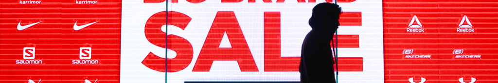
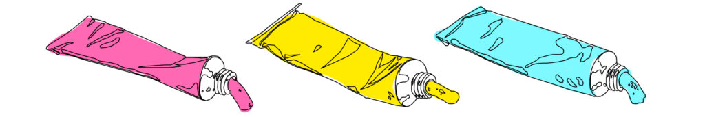
Red. As we figured that the primal association here is blood and fire, red is about passion and energy. Speaking of blood, red heightens its pressure, which connects it to feelings of strength, anger, passion, or love. The latter one was associated with red by 68% of almost 5,000 people from 30 different countries in a survey conveyed in 2020. Red is bright and catches attention easily, which makes it seem powerful and, at the same time, is used in many traffic signs to mark danger. Take the traffic lights, for instance. Or, red is the color of a big sale.
Blue. If red is heat, then blue is cool: it lowers blood pressure and stress. This historically noble color is the epitome of trustworthiness and stability. If you look at the flag of the United Nations, you’ll discover it’s the color of peace as well. Because people find blue to be soothing, nurses and medical workers tend to choose this color when it comes to their attire. In the previously mentioned survey, over 30% connected blue to relief. However, “feeling blue” has nothing to do with calmness, huh? This is also a stereotypical color of sadness.

Yellow. And yellow is the color of joy! At least more than half of the participants of the survey decided so. The golden color of stars, youth and warmth, yellow shines the brightest and is the most luminous. As well as being optimistic, yellow has a great influence on the concentration process. Don’t overdo it, though, as too much yellow can cause anxiety and overstimulation. Be careful! – cautionary signs also tend to be yellow, just like the middle color of the traffic lights.

Green. And here’s the third one, which allows you to cross the road safely. Unlike “red flags”, green is approving and reassuring, providing you with freedom and calling to action. Almost 40% of the survey resulted in connecting green to the feeling of contentment. Go touch grass, you hear them say. This color is also widely associated with something healthy and natural, adding to its eco-friendly charms.

Purple. Uncommon in nature, purple has become a symbol of extravagance, wealth, and even royalty due to its dye being extremely costly. The appeal also lies in the fact that purple combines both blue’s reliability and red’s power. On the flip side, people perceive it as mysterious and spiritual, which makes this color often associated with wisdom and even magic. It provokes imagination, which consequently stimulates creativity and inspiration. Going back to the survey, 25% linked purple to pleasure.

Black. One more powerful and mysterious color, black is about sophistication, prestige, and authority. Mostly. Because, on the other hand, black is mournful and intimidating. It’s either solid and formal or disheartening and depressing. Here, the contrast strikes between fancy tuxedos and funeral attires, judge gowns and criminals’ disguises. Black is what we see when there’s no light, which adds up to its double nature, awakening the primal fear of whatever lurks behind and opposing it to the light or good. Half of the survey participants connected black to sadness.

White. Purity and excellence is the definition of white. It’s an empty canvas, a spotless dish and pure snow. White hotel bed sheets and doctor’s attires carry the feeling of cleanliness, freshness, and sterility. If black is darkness, white is light, just like yin and yang. It’s the color of innocence and holiness, as well as it is of simplicity and emptiness. And over 40% of people linked white to the feeling of relief. Guess it’s no coincidence that most pills are white.

And if you ever need to review and approve your design projects, making sure they’re all of the right color, try out Approval Studio. With the help of our project management software, you can annotate in any shape and color, or communicate throughout the process by means of a built-in live discussion. And that’s only a few of the whole pack of collaboration tools and other convenient features we’ve prepared for you.
Cultural Significance of Colors
Going international is like skating on thin ice, as every culture has its own values and symbols, which must be considered if you want to succeed. Respect and be respected. And speaking of colors, though they mostly carry similar associations worldwide, there are interesting differences to consider.
As mentioned previously, black may be viewed as the color of mourning. People wear black or dark attires to Western culture funerals, showing their despair and respect for the deceased. However, in some Asian cultures, such as Chinese, Muslim, and Hindu, the traditional color for such occasions is white, which is the complete opposite.

While Chinese Red Dragon symbolizes happiness, luck, and prosperity, Indian brides wear red wedding gowns as a sign of purity. Western countries see it more as a symbol of danger, power, or love, as seen in Valentine’s Day decorations. And if you combine red with green, it’ll result in Christmas decorations.
Continuing on green, this is the national color of Ireland that symbolizes luck. For Mexicans, green is the color of independence, while South Americans link it to death. And if a Chinese man wears a green hat, it might be a sign of his wife cheating on him. However, in Islamic cultures, green holds significant religious meaning and is considered a sacred color.

According to this, colors not only enhance aesthetics but also convey deep-rooted meanings and emotions that vary from one culture to another. By being mindful of these cultural differences, designers and marketers can create more impactful and respectful visual content that resonates with diverse audiences.
Color Use in Industries
Colors play a pivotal role across various industries, influencing emotions, behaviors, and decision-making processes. Here’s a peek into some of them:
Colors in Marketing and Branding. Studies have shown that exposure to red can increase heart rate and metabolism, creating a sense of urgency and affecting your appetite. Red YouTube’s button calls to click on the video and consume content. Similarly, you can notice how most fast-food giants use red as their main color, such as Coca-Cola, McDonald’s, KFC and so on. By the same logic, blue reduces appetite, which is a to-go for dieting design. And the children’s television network Nickelodeon uses orange to create a sense of fun and excitement, appealing to its young audience.

Colors in Web Design. In web design, colors are crucial for enhancing user experience and usability. Blue is often used for its association with trust and reliability, making it a common choice for corporate and financial websites. For example, Facebook and LinkedIn use blue to convey trustworthiness and professionalism. Warm colors like orange and yellow can create a sense of warmth and excitement, encouraging user interaction and engagement. E-commerce websites often use these colors to highlight call-to-action buttons and promotions.
Colors in Interior Design. Researchers have noticed that the blue color in offices improves overall productivity. The previously mentioned stimulating effect of yellow makes it the right choice for learning environments. And green, due to its calming and refreshing qualities, is usually used in designs to make people feel comfortable. Hospitals and wellness centers also use green to create a soothing atmosphere for patients and clients.

Colors in Product Design. The grocery chain uses green to emphasize its commitment to organic and natural products, aligning with health-conscious consumers. It’s fascinating how the human brain can fall for the trick and choose a green-colored product over a red one, despite them being the same thing but different package. However, bright and vibrant colors like red, orange, and yellow can create excitement and encourage impulsive buying behavior. Retailers use these colors in store displays to attract customers and promote sales.
Current color trends
One more crucial aspect when it comes to the choice of color is its relevance to the current trends. Yes, you wanna keep it unique, and yes, you wanna snatch a piece of the overall appeal. The year 2024 has already passed its equator, so let’s see what’s grabbed the limelight in terms of colors in design.
Muted and Earthy tones. Colors like terracotta, olive green and muted browns are gaining popularity due to their sophisticated “eco” appeal. Having a sense of nature, they radiate sustainability, which connects with a growing trend towards mindfulness and environmentalism. IKEA, for instance, includes muted and earthy tones in their furniture and home decor, such as natural wood, deep blues, greens, and beige textiles.

Vivid and bold. Electric blue, vibrant yellow, and tyrian purple convey youthfulness, optimism and creativity. These and similar dynamic colors are usually used for color clashing, resulting in high contrasts and captivating palettes. Take a look at Spotify Wrapped designs, for example. The combination of hot pink, neon green and blue creates a sense of excitement and celebration, which aligns with the energetic and playful nature of music discovery.
Soft pastels. Lavender, baby blue, and apricot are the colors that have soothing effects and provide you with a sense of comfort and calmness, which is a nice change in the hectic reality of the modern world. You can find these colors in Apple’s device design, for example. Peach Fuzz, by the way, is the Pantone color of the year.

Gradients. Yeah, they’re still there. Gradients give you an illusion of movement, making the design appear more dynamic and three-dimensional. They’ve become a widely popular choice among graphic designers who use them for branding and logo creation, the most prominent example being the Instagram logo.

Conclusion
Colors do more than just look good — they can actually change how we feel and act. The tool gets powerful only if you know how to use it properly. Knowledge of color theory and respect for cultural significance helps you not just to choose a hue but to craft an experience. Whether it’s making people hungry at McDonald’s with all that red, building trust on LinkedIn with its blue, or creating a calm vibe in a hospital with green, colors have a huge impact. Knowing how to use colors smartly can make a big difference in how people interact with brands, websites, products, and spaces. The mere aesthetic function of color is just the tip of the iceberg: what lies beneath is decision influence and guidance, tied up with specific message delivery. So, next time you see a clever use of color, you’ll know there’s some serious psychology at play!
