 TEAM SOLUTIONS
 WORKFLOW SOLUTIONS


 REVIEW TOOL
 PROJECT MANAGEMENT
 TOOLS & INTEGRATIONS
 CLIENT INTERVIEWS


Post is also avalible in:
![]()
![]()
![]()
American culture is very diverse and has many different symbolic, even iconic elements. A big part of this symbolism is created by numerous brands that are glued to the very image of the US forever. McDonald’s, Apple, Microsoft, Google, Mastercard, Amazon and many others are only a small part of a crazy-long list.
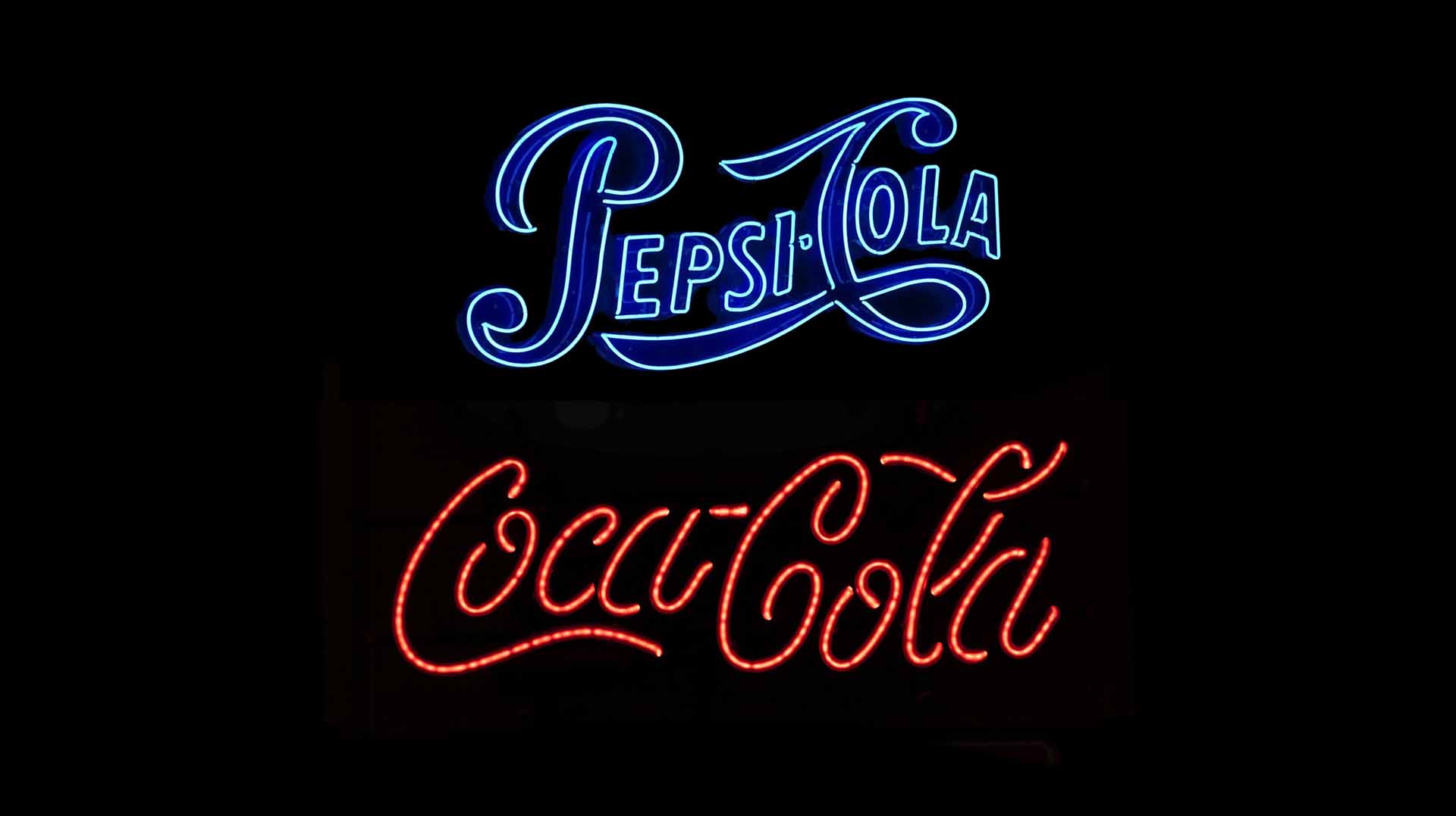
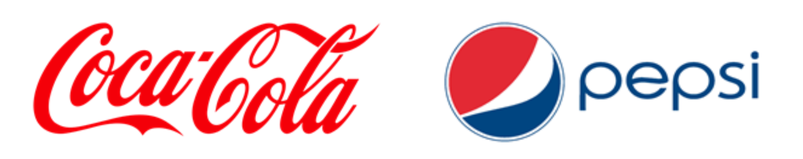
However, there are two companies whose competition has become one of the biggest brand rivalries in history. It has been called many names like “Fizzy drinks war” or “Soda war”. And to my ear, these are good names for Coca-Cola vs Pepsi battle.
For more than 100 years of history, two Colas became multi-billion companies selling millions of drinks worldwide every day. Although Coca-Cola has a greater market capitalization ($200 billions against $171 billion in 2019), Pepsi has a better turnover ($63 billion against Coke’s $42 billion). Impressive numbers, right? Well, they definitely would be much smaller if it wasn’t for effective branding strategies.
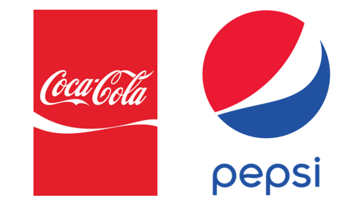
Some might say that Pepsi changed their logo more times than Steph Curry scored his 3-pointers in the last NBA season, while Coca-Cola has always remained faithful to their initial design. I can agree only to a certain extent: it’s true that Pepsi applied more drastic changes to their logotype with the flow of time, but the Reds weren’t always the same either.
A small reminder before we start: if you want to be able to track the logo change history of your company, annotate artwork, and compare the versions that you have at hand, you should definitely check out our Approval Studio online proofing tool. Our AI-powered compare modes won’t leave a chance for the edits to slip your attention!
The Beginnings (1886-1893)

Weird enough, Coca-Cola has begun as an experimental substitute for morphine drug and later was registered as medicine by John Pemberton, confederate colonel of American Civil War. In 1886, after the focus shifted to a soda drink, Pemberton’s friend – Frank Robinson, a bookkeeper – developed the first logo that looked like a plain text. Coca-Cola was the first name he ever suggested, supposing that two C’s would look great together. Back then, he probably couldn’t even imagine, how right he was.
Pepsi logo history has a somewhat similar background. In 1893, a pharmacist Caleb Bradham developed a soda formula he initially called “Brad’s Drink” – that was the original name for Pepsi. The logo looked more interesting, although it was developed several years later than that of Coke’s. Bradham was quite proud of his drink, that, as he claimed, boosted the energy level and helped the digestion.
First Classics (1887-1898)
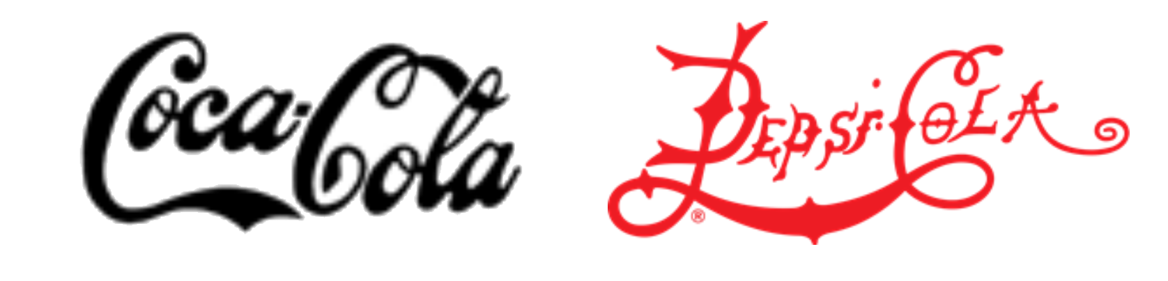
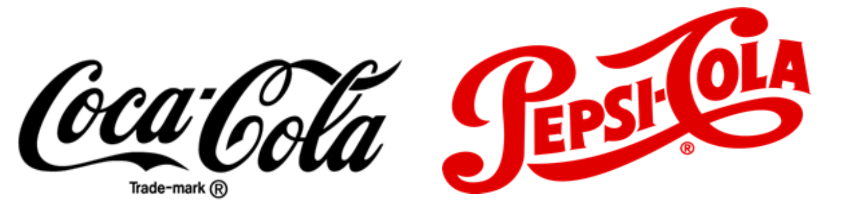
Coca-Cola’s popularity was growing rapidly, and it was a high-time to create a logo that would be instantly recognizable. Pemberton fell back on Frank Robinson’s creativity once again: the bookkeeper had mastered the skills of script drawing. Basically, the two used Spencerian script that was a standard American handwriting style in the late 19th – early 20th century.
Therefore, on 16 June 1887, the famous logo appeared in a newspaper ad for the first time. This logo Coca-Cola created became one of the most iconic images in the worlds more than 100 years later.
Caleb Bradham saw Coke’s success, and, naturally, wanted to follow. The first step was to change the name, the second – to work on the logo. A curious thing – a word “Pepsi” means digestion from ancient Greek. I am not sure whether Bradham thought of this or not, but digestion can hardly be the first word that comes to mind when you see this version of the logo.
Anyway, the first major step in changing the brand’s identity occurred on 28 August 1898.
Experiments (1890-1905)
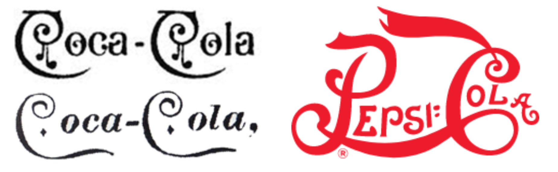
Soon after the first design was developed, the Coca-Cola logo history continued as the company changed its owner. Asa Candler, a druggist, bought the third part of rights for the formula – Pemberton shared the rest among his son and his co-partners. In 1898, Candler bought their shares as well and became the sole owner of the drink. He established the “Coca-Cola Company” in 1892, getting his trademark sign a year later.
Before that happened, the original logo was constantly experimented on. Because the trademark was not yet officially registered, various designs appeared in various products like the “note” version for calendars from 1891 (above) or the version with diamonds from 1892 (below).
As for Pepsi, it was trademarked in 1903. It seemed that Bradham realized that the initial design looked a bit rough. In 1905, he initiated the first redesign that made the font bolder, catchier, and more legible. Thanks to that, Pepsi started gaining more and more popularity.
Trademark Registered (1905-1906)
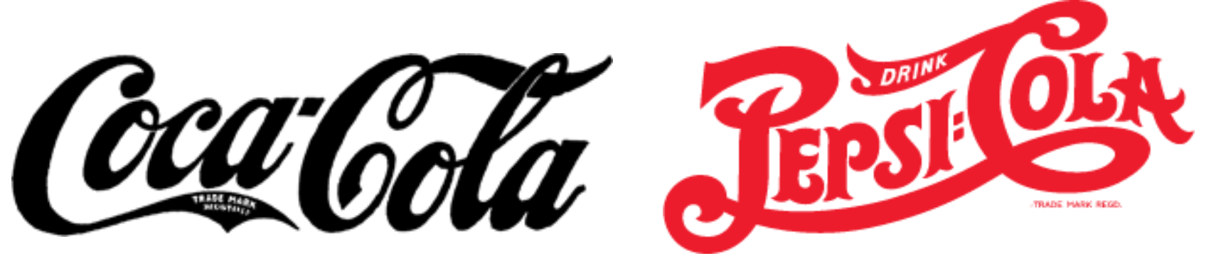
In 1905, the Pepsi competitor drink’s logo was established with the sign “trademark registered” on the tail of the first letter “C”. The script became more consistent and refined, comparing to the one of 1887. The brand development made Coca-Cola logo one of the most recognized in America by that time. According to Andrew Smith and his “Encyclopedia of Junk Food and Fast Food”, the company’s revenues at that time topped at $400,000 annually. Such a success forced Coca-Cola to exclude cocaine from the recipe.
Pepsi-Cola logo went through one more revision that was very similar to the one of Coke – the one in the patent office. A more consistent script, trademark sign added, and also “Drink” inscription on the top tail of letter “C” (appeared on Coke’s logo from time to time as well). Yet, despite the fast development, Pepsi managed to sell nearly 20,000 gallons of syrup per year at that time, while Coca-Cola’s sales were nearly 14 times higher.
Owners’ Change (1940s)
Coca-Cola continued its brand development and was bought in 1919 for $25 million by investor group. Yet, the logo mostly remained the same. In the 40s, the company made the font a bit thinner and put the trade-mark sign below the brand name. The sign designations were changed a few times, ending up with the one you see above.
Pepsi’s journey was a bit more complicated. The company went bankrupt in 1923 because of Bradham’s unsuccessful investments in sugar. Several investors tried to revive the brand, but it did not happen until 1931 when Pepsi was bought by Loft Candy Co. Charles G. Guth. Interesting fact: during that time, directors offered Coca-Cola to buy Pepsi thrice, but the offer was declined each time.
Despite all odds, Pepsi-Cola company survived the Great Depression and launched a powerful radio advertising campaign, which helped double the company’s income between 1936-1938. Pepsi became an international company, making the product global. The massive advertising campaign of Walter Mack, the new Pepsi’s president, included skywriting, comic book ads, and etc, and proved effective.
In the 1940s, the logo went through slight changes with most decorative ornaments gone. After this redesign, it resembled the Coca-Cola logo as much as ever.
Post-War Globalization (1950s)
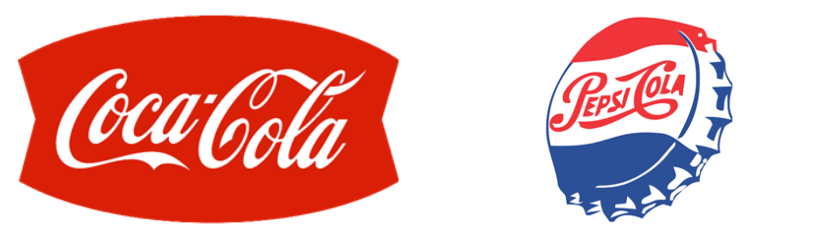
In 1958 Coca-Cola introduced a “fishtail logo”. With the company growth, this shape was convenient to use for street signs and in cafes and restaurants. Apart from that, the company settled the red, white, and blue palette as their main colour combination. That made the brand even more recognizable than before, although it had already acquired the status of an American icon.
Pepsi-Cola had to catch up, and, apparently, decided to use a tactic completely opposite from the one they used before. 1950 was the point when they introduced what will later become a “Pepsi Globe” – a logo placed on the bottle camp. That was the first time since Brad’s Drink (Pepsi original name) when they returned a blue colour, particularly because of the post-war splash of patriotic feelings in America. This new logo Pepsi started to develop later brought them lots of success.
Establishing New Tendencies (1960s)
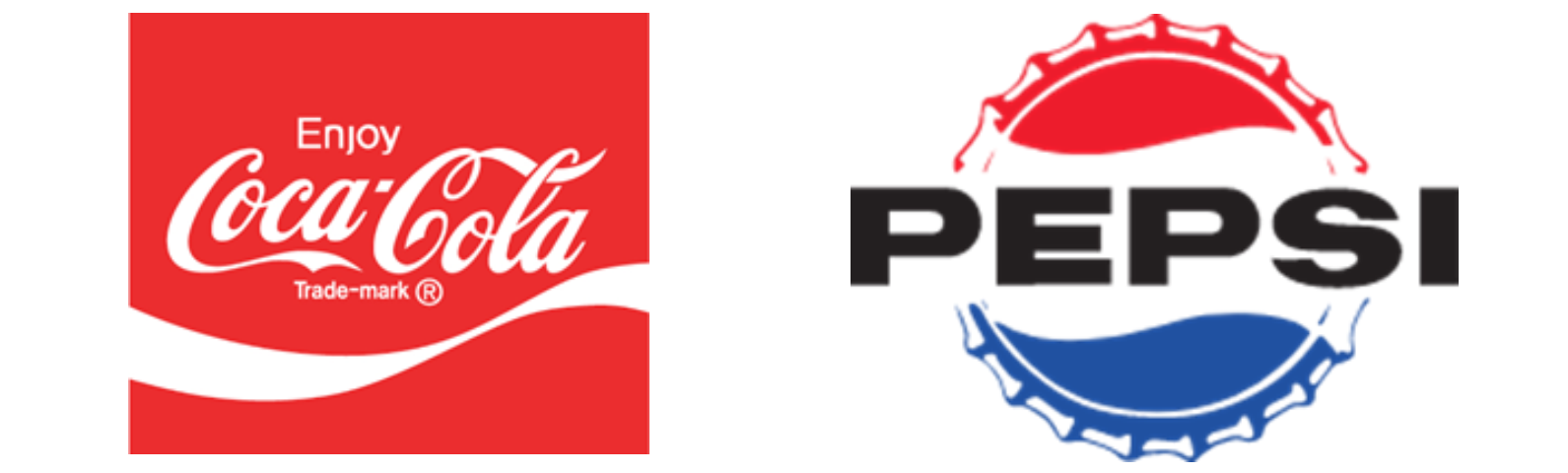
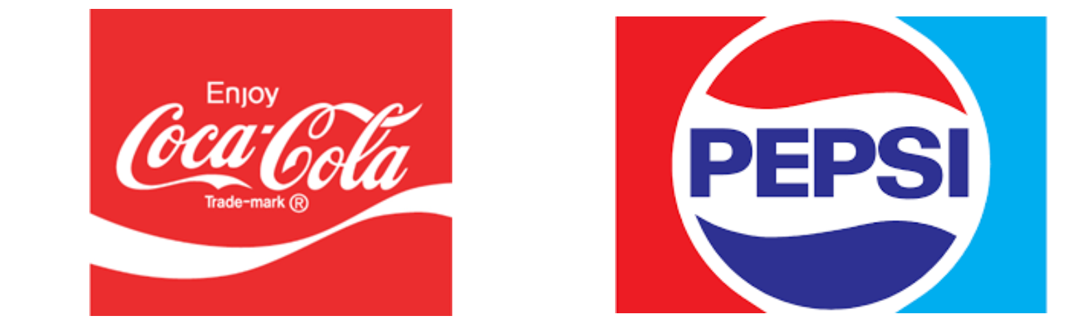
In the late 60s, Coca-Cola develops one more historic design solution introducing the wave. It instantly became one of the most prominent features in the new design and was printed everywhere starting with can and ending with billboards. The word “drink” was switched to “enjoy” – one more marker of how the company was trying to show their superiority over competitors.
Pepsi continued differentiating themselves from their rivals – a tendency that has lived up to the modern times. In 1962, the company dropped the “Cola” part and turned the bottle camp to the front side, making it look symmetrical. The brand name style was changed to a far more simplistic Sans Serif font, all caps. Around that time, Pepsi tried to focus on Baby Boomers and made a new “Pepsi Generation” slogan, trying to make their brand more popular among the youth.
Cola Wars (1970s)
As Coca-Cola was ruling the market, they did not need to change its brand identity again. The wave logo cemented the recognition and became one more iconic design element.
Pepsi, on the other hand, needed to boost their influence as the previous logo effect vaporized quickly. Searching for modern solutions, in 1973 they came up with a minimalistic idea of a bottle cap with the brand name fully inside it. Also, the designers added one more sky-blue color to the framing box.
Apart from that, Pepsi created a “Pepsi Challenge” – a blindfolded test where participants tried Pepsi and Coca-Cola and had to determine which drink they liked better. It heated the market and significantly increased Pepsi’s revenues – most testers preferred Pepsi over Cola.
New Coke and Pepsi Dominance (1980s)
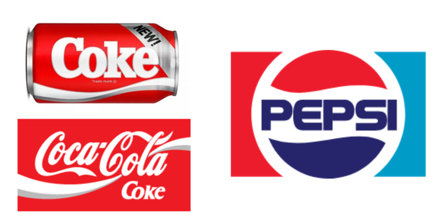
After the “Pepsi Challenge” and logo modernization, Pepsi led the market, and Coca-Cola had to respond. In 1985, they decided to introduce a new formula called “New! Coke” which meant also a new logo instead of the usual Coca-Cola symbol – thick Slab Serif font with a traditional wave underneath.
Although the tests have shown that New Coke’s taste was supposed to be better than that of both Pepsi and Cola, the customers were unsatisfied and even boycotted the drink demanding to go back to the original taste. That also meant a return to the original logo design, although, in order not to acknowledge the experiment as completely failed, Coca-Cola kept “Coke” inscription under the logo for some time. Gradually, it was replaced by the word “Classic” in 1987.
Pepsi continued the policy of youth appeal. As the victory in Cola Wars was in their pocket, they did not apply too drastic changes to their logo – only a little modernization of a typeface in 1987 was enough. In the meantime, the company was attracting youth idols to become their official faces – Michael Jackson and David Bowie among others.
Nostalgia VS Further Modernization (1990s)
Weird enough, the New Coke experiment proved efficient in the long run, though not quite like Coca-Cola executives had expected. After the backlash of nostalgic consumers, Cola returned their traditional formula, cementing the sense of community among the people who stood up for a traditional taste – Santa Claus and polar bears commercials did their thing.
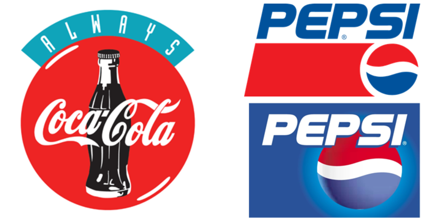
Seeing that, in 1993 the company brought up a circular logo they once used in the 50s for diners and cafes, adding the word “always” above it. Together with Christmas-themed ads with polar bears, it made Coca-Cola a traditional family brand.
Pepsi started losing its positions again and went through two rebrands. In 1991, the company separated the brand name from Pepsi Globe and changed the font to Italic Slant in pursuit of modernization (though this variant actually heavily reminds me of a Polish flag…). The company went even further in 1998 and changed the background to blue, toying with the rest of the colors and trying to add more dimension to the icon.
Adding Dynamics (the 2000s)
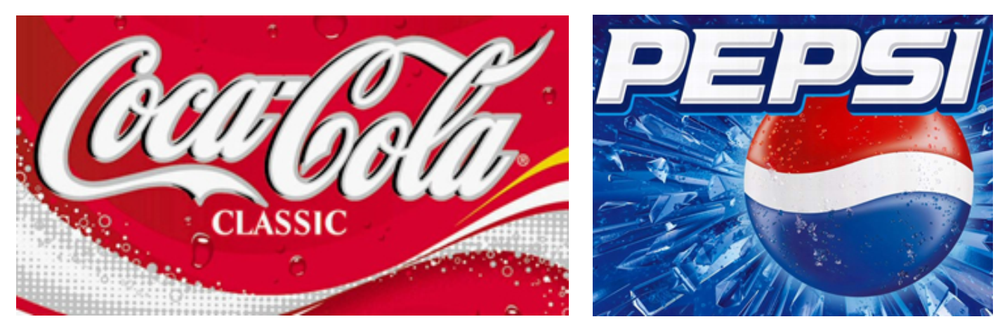
With the new century knocking on the door, both companies tried to add more graphical content to their logos. In 2002, Coca-Cola started using a more dynamic design for their wave, adding yellow colour to their traditional white-and-red palette. They also added small water droplets to make their logo more visual.
At nearly the same time, Pepsi made their logo more 3D-like, and, instead of water droplets, decided to add ice to the background. Together with already traditional blue colour, it added the effect of coolness.
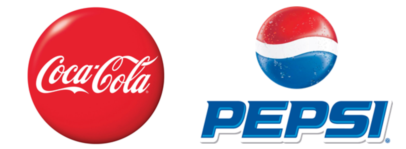
The companies did not stop at that. Their logos had many variations, such as a 2007 red Coca-Cola disc or 2006 minimalistic version of Pepsi Globe with a company name beneath it. At that time, Pepsi was leading the market again, although the competition between Coke vs Pepsi products was fierce.
Modern Times and Minimalism (the 2010s)
With global trends changing faster than new iPhone versions were released, companies decided not to limit themselves in their creative decisions. Both had several logo versions at a time, though Coca-Cola, as a traditional brand. remained faithful to its roots and started using their brand name colored red.
Pepsi, on the other hand, went through a drastic rebranding again, changing their font to a very thin Sans Serif and setting the globe to the left side. The brand solidified its positions as a youth brand and continued to move their marketing campaigns in that direction.
With minimalism becoming a major trend in the 2010s, both companies looked for other ways to simplify their logos. Coke returned the wave, although this time it was not dynamic and stuck only to white colour on the red background. Pepsi took away the line over the Globe and made it more prominent, putting the brand name beneath it (again).
Conclusion
As we can see, both companies had strikingly different campaigns and ways of their brand development, including their logo design strategies. While Coca-Cola remained faithful to traditions, Pepsi has become a teenager brand. The most curious thing is that the question about who’s more popular remains unanswered – Cola might be more recognizable, but everyone says that Pepsi tastes better…or not? Let us know which one you prefer in the comments below!
