 TEAM SOLUTIONS
 WORKFLOW SOLUTIONS


 REVIEW TOOL
 PROJECT MANAGEMENT
 TOOLS & INTEGRATIONS
 CLIENT INTERVIEWS


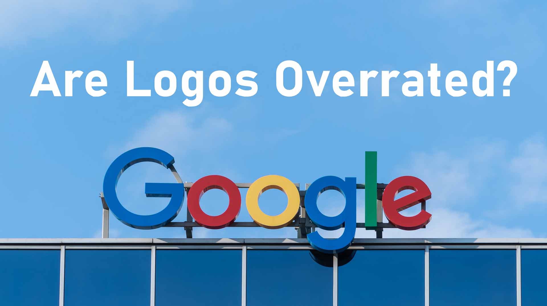

Michael Bierut – a graphic designer of such projects as Verizon, Billboard, museumofsex, and many more, thinks that logos are overrated. The only thing makes it great. Which one? Let’s discuss this.
What is a logo in the modern world? It is the face of a company. Some of them are great, like Nike swoosh, Unilever’s or Puma’s 100% recognizable logos. And some of them are being forgotten a second after you saw it. However, each logo belongs to one of three categories
The Wordmark
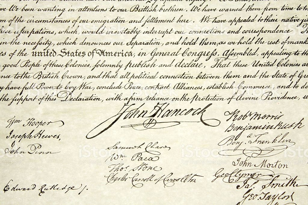
It is the easiest one. We all know this type of logo because it contains only letters. Basically, it is a signature and even your signature may be a wordmark. It can look like John Hancock’s handwritten messy text.
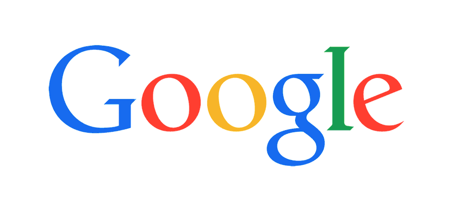
It can be a clean, proportional, and harmonic Google or FedEx logo.
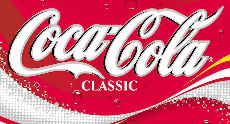
Or it can look like the Coca-Cola logo that represents some heritage and old customs.
Pictorial
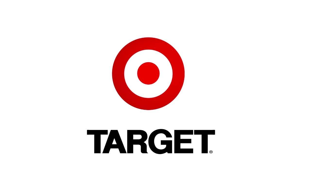
This type of logo is a picture that makes us think of a company name. You see the picture and identify what it depicts. Apple’s logo is basically a bitten apple. Target – retail company- has a logo with what? Right! With a target on!
These are two examples of a direct pictorial logo.
Sometimes, designers have logos working indirectly. Lacoste is the example (Crocodile is on the logo but Lacoste is the creator’s second name).
Abstract Iconography
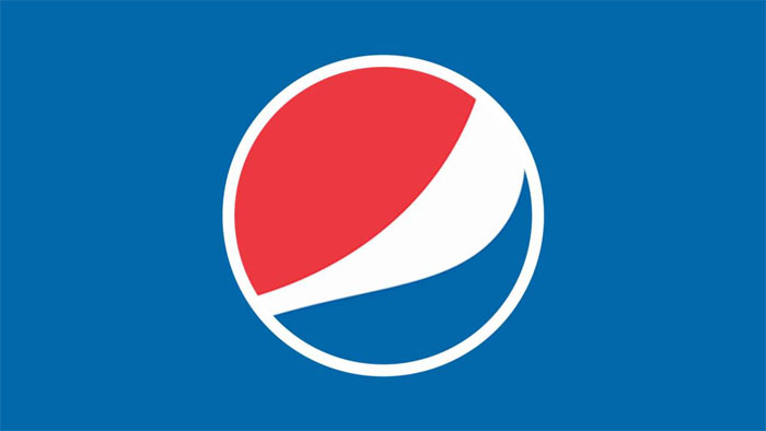
This is the most beloved way of logo creating. It has nothing to do with the name because the logo appears to be some abstract drawing that later gets engraved in people’s minds. Nike, Pepsi, and Chase are perfect examples.
Many clients come and say that they want something like Nike swoosh but it does not appear just due to certain logic or pattern. It is just a work of fiction. What is more, the Nike logo was not the same as it is now. So to say, it was not Nike at all.
Blue Ribbon Sports was the company that was meant to design shoes. 7 years after foundation, the company was renamed to Nike. Carolyn, who was a student, was asked to make up some ideas. The peculiar fact is Nike’s founders did not really like the logo at the beginning. However, they decided to try placing the swoosh on shoes. The result of it you may see almost in everyone’s wardrobe.
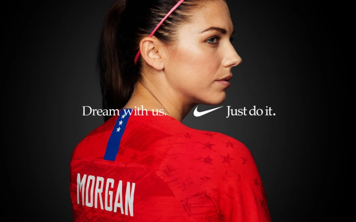
‘Later, marketing campaigns of Nike brand made us associate it not with the performance gear but the idea of athletic achievement itself’, says Michael.
Also, that is how religious symbols work. There is nothing in the shapes of these logos but in what has come to minds when we look at them.
And the one that goes beyond all of these three types is Logo System
It is a framework that compiles the wordmark, pictorial logo, and abstract iconography. It has different permutations. MTV was the first representative of the logo system. Nowadays, Google’s doodles are a great example of it as well. That is where technological progress leads.
Many years ago, logos were put everywhere with the spray and it was impossible to change. It is one of the reasons why they became boring with time. With the digitalization era, you may apply iterations at any moment that is pivotal when following trends. Or if some idea came up to your mind.
That happened to Michael when he was designing a logo for Hillary Clinton. He tried to imply different ideas of the electorate using not only colors but videos and pictures.

These depict what the priority is today. People loved it. Maybe it happened because the logo system allows the mind to find a conversation beyond the brand name and expand the borders of thinking.
Conclusion
Why have we written all of that? To explain why logos are overrated and mention the only thing that makes a logo great. It is meaning. The logo is an empty glass and only something inside will make you drink it. Drawing is nothing without the meaning and idea you imply. Want to be able to make sure your mockup follows this rule?
Michael says, ‘They think they judge logos as if it is a diving competition. But actually, all these logo wars are about swimming at long distances. It is not about the splash you make reaching the water but how long you keep your head above it’
P.S. Twelve years after the birth of Nike, the company came to the Carolyn and presented her a ring with the swoosh and showed the current revenue. In 1973, in the year it was designed, her payment was $35.
