 TEAM SOLUTIONS
 WORKFLOW SOLUTIONS


 REVIEW TOOL
 PROJECT MANAGEMENT
 TOOLS & INTEGRATIONS
 CLIENT INTERVIEWS


Post is also avalible in:
![]()
![]()
![]()
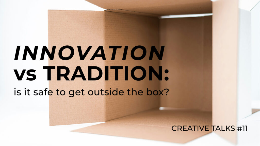
One of the most prominent qualities of a good graphic designer? Creativity. No surprise there. As an artist trying to get noticed, you’ve got to bring something fresh to the industry’s oversaturated “we’ve-seen-this-before” table. The question is… how far can you go before your audience has no idea what they’re looking at? While you’re chasing that fresh, head-turning idea… your client just wants something that’s “clean, modern, and easy to understand.” (You know the vibe).
It seems sometimes you need to choose between your heart and the client’s brief. Do you stick with what you know works? Or do you follow your instincts and take a creative risk? That is the topic of our 11th Creative Talks, where we’ve summoned four amazing creatives to share their thoughts on the following questions:
- Can you share a time when you tried a new, bold design? How did your audience or client react?
- How do you decide whether to try something new or stick with what works?
- What advice would you give new designers on balancing creative ideas with clear communication?
If you’re new here, Creative Talks is a series where we, Approval Studio, feature creatives and share their real-life experiences with our readers. So, let’s stop dilly-dallying and switch right to the most intriguing part – creatives’ answers.
Kateryna Bilak – Freelance graphic designer
Kateryna’s Behance and Instagram
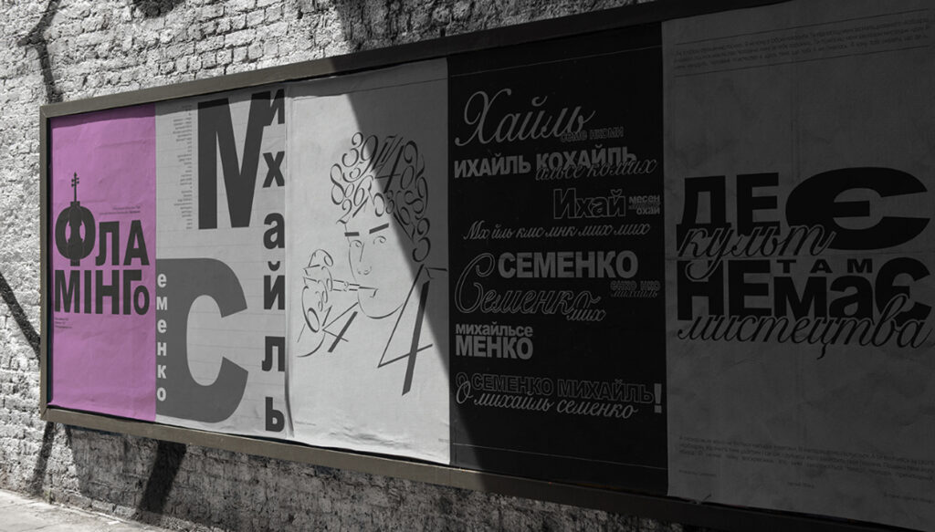
Once I was assigned to create a new introductory brochure for the Faculty of Graphic Design, where I was studying. I was determined to put all of my acquired skills and knowledge into it, but also to bring something fresh, new, and unusual — something not boring but engaging and expressive, you know?
The main solution I used to bring this idea to life was creating illustrations in my own dynamic yet simple style for almost all the content in the brochure — with the only exception being a few photos. I also chose to use only three colors: basic black and white, and bright orange. All of this made the brochure look very graphic, minimalistic, and cartoonish — kind of the result I was aiming for.
At first, the faculty staff didn’t like the idea of the brochure being so performative and loud. They thought it might distract readers from its main purpose. But later, when compared to other students’ suggested designs, my work really stood out. The thing was, while the other works were well-made, they ended up being quite uninteresting, conventional, and overloaded with text — not exactly the kind of thing you’d expect from a design department.
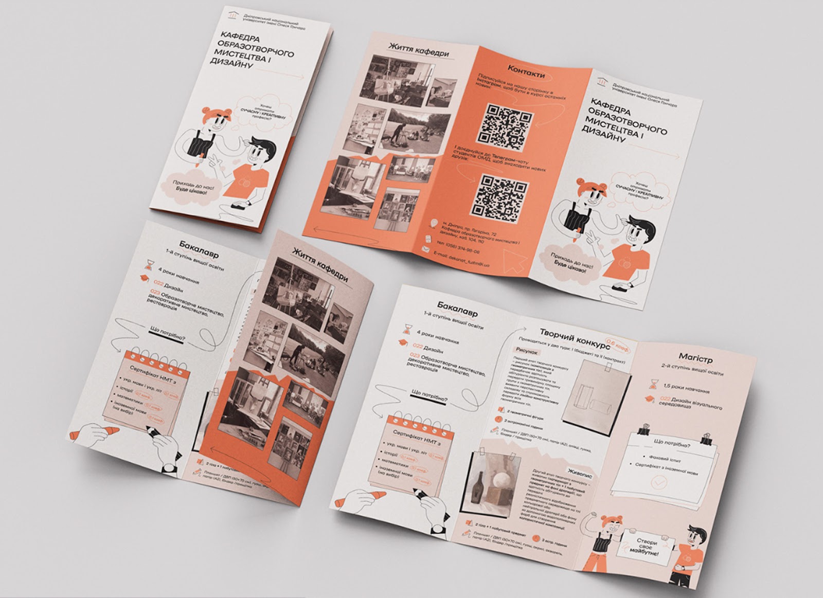
That’s when the university staff realized that my work offered not only a practical solution, but also expressed an idea — a vision of what design can be and what it can do for those entering the program. What they can be and do.
My brochure design was used for the Open Doors event, and I truly hope I managed to inspire some new students to explore their potential.
[When deciding between something new and something that works], I always strive to create something unique yet understandable in my work. I like to make art that people can actually use. Essentially, that’s what design is about. This brings us to the question: “How exactly will my work be used?”Designing always has a reason, and based on that reason, you can decide whether to try something new and bold, or whether it’s better not to go overboard. Your clients can provide you with all the necessary information to help you understand the purpose of your design. But they’re not always open to experimentation, even if it could play a crucial role in improving their project. In such cases, it’s your job to show them the opportunities your work can offer.
It’s important to understand whether your ideas are appropriate or not. You can do this by analyzing the project’s audience, its goals, and how much the client trusts your decisions. That works for me!
My advice to [new designers] would be not to forget that everything you do in your design should make sense. The visuals and the message should correlate in all aspects of your work — that ensures clear communication.
If you can amplify the message in new, interesting, and creative ways, why not try it out?
But if those bold ideas do not convey the message and are embodied just for the sake of it, they can actually stand in the way of creating meaningful design.
Yuliia Kotsar – Graphic designer
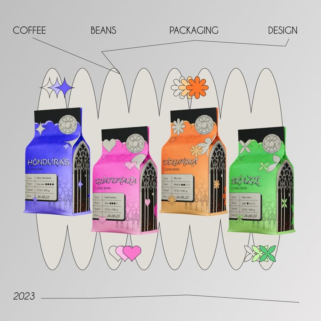
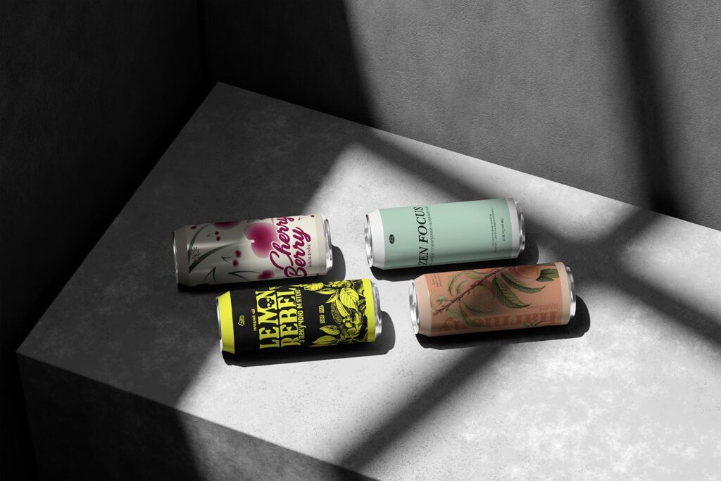
Probably, the best fit for these questions is my recent project for the ArteFrost brand. It’s a cold tea brand with a really interesting concept — each drink corresponds to a specific type of consumer. I created four labels for them, each representing groups like the careerist, rebel, hedonist, and activist.
The coolest part was that the client gave me complete freedom. No restrictions at all — “do it as you feel.” And I went all in: bright colors, slightly quirky imagery – each label has its own character. The reaction was very positive. The client was thrilled, said that the labels seemed to “come alive” and really conveyed the brand’s idea. The audience’s feedback was great — many people wrote things like “this is totally me.” It was a risk, but it paid off.
I also consider the client’s reaction: if they’re open to new ideas, it gives more freedom. But even when there are certain limitations, you can find a balance by adding something fresh within a familiar structure. The key is that it’s not just “beautiful” but that it works.
My main advice is to always remember the function of design. Creativity is great, but if the design doesn’t serve the communication, it loses its meaning. So, before adding something new, it’s important to ask yourself: “Does this help convey the idea better?”
Another important thing is studying references. Research how other designers integrate innovative solutions into clear concepts. And don’t be afraid to test things: sometimes the best way to find the balance is to try a few options and see which one works best.
Speaking of integrating innovative solutions, here’s one to simplify your design approval process. That’s Approval Studio online proofing tool. It lets you share designs, leave annotations right on the visuals, compare versions in 4 different modes, and keep the whole team on the same page (and in the same timeline). No more “Is this the final-final version?” chaos. Just smoother approvals, faster turnarounds, and fewer passive-aggressive emails.
Whether you’re designing with your heart, your brief, or a wild combo of both – Approval Studio’s got your back.
Daniela Barrio de Mendoza – Art Director
It was a very interesting project from the master’s program, part of a course taught by the founder of Intertype Studio. Although it wasn’t a real client or brief, we designed something completely out of the ordinary for the alcoholic beverages category. It was a challenging and fun project, as we had to rebrand and design the packaging for a Mexican tequila brand… and the catch was that it had to be done in just 3 days, based on a completely new process from the studio!
Both the people who saw it and the professor himself were blown away. They couldn’t believe that something like that had been achieved in such a short amount of time – let alone with such an unconventional idea and design. And a lovely outcome was that it ended up as a finalist at the Pentawards 2024!
It was incredibly motivating and only made us want to keep designing projects with that kind of potential and creative freedom! So refreshing for any creative.
As we go through the entire design process—briefing, kickoff, market research, audits, etc.—we begin to better understand the audience and can extract insights and more clearly recognize their behaviors and purchasing decisions. That’s when we start making visual decisions, always expressing the brand concept and speaking the language of the target audience.
It’s neither functional nor strategic to create a highly disruptive design that breaks category codes if the audience won’t understand it.
But then there’s the other side: if we, as designers, don’t start taking risks… then who will? This might sound a bit cliché, but I encourage you to follow your designer’s intuition. We all have it! But sometimes it takes practice to learn how to listen to it, to understand it, and not to be afraid when it leads us down a path that’s opposite to what we originally thought.
Let’s be honest, though—there are also clients who come to us with a very fixed idea in mind, with strong references and established concepts. As long as we have the creative freedom and are willing to persuade and often educate the client using the designer’s language, then let’s dive in. If that’s not the case, it’s also okay to take the more traditional and safe route. The more distinctive, free-spirited projects will come in time.
[As for the advice,] I totally understand how confusing it can be for any designer—especially those who think in images and communicate through visual methods—not to lose sight of the original message in favor of aesthetics or experimentation.But we need to train our designer’s judgment and learn to find the balance between “what we do and what we say.” I know, it might sound a bit psychological, right? But what I mean is that our visual language and design techniques must always align with the core message behind them. Design goes beyond aesthetics—it needs to be functional and serve a purpose. (Of course, I’m talking here about client-based projects, because design can also be a form of expression.)

A beautiful design won’t do much for your client if the message isn’t clear or gets lost. And let’s be honest—there’s so much subjectivity in design that we constantly need to ask ourselves: Do I understand this just because I made it? Would my audience get it too? Would my mom understand it? Maybe these aren’t questions we ask ourselves often, especially when our beloved creative ego wants to take the lead. Sometimes, that ego won’t let us see that the message isn’t coming through clearly, or that the design—even if it feels one-of-a-kind to us—might not be doing the job it needs to.
But that’s probably a whole other conversation…
Back to the main point: let’s not lose sight of the core message just for the sake of aesthetics. That’s our job (and I’d even say it’s a daily challenge): finding the balance between beauty, function, and commercial value.
How can we do that? By seeing tons of references! And not just on Pinterest—watch movies, go to concerts, and observe how people react emotionally. Pay attention to how they feel and respond. That connection helps us understand our projects on a deeper level.
In the end, branding and packaging are emotional—they create memorable experiences. And to design them well, we need to understand those emotions in order to communicate them in the best possible way.
Violetta Derlemenko – Graphic designer and Illustrator
Violetta’s Behance and Dribble
Over the years, my art style has evolved into something uniquely my own. It’s been shaped naturally by my experiences, my inspirations, and the countless hours I’ve spent creating. I’ve always been fascinated by bold, expressive, and memorable characters – those kinds of visuals that catch your eye and hold your attention, making you want to look closer and explore every detail.
I still remember taking my very first graphic design course. The instructor said something that stuck with me: no matter how different my works were in theme or style, he could always recognize my signature touch. That comment stayed with me, and over time, I started to understand what he meant. My style isn’t about sticking to one aesthetic – it’s about how I see and interpret the world.
But as any creative knows, doing the same thing over and over again-even if it’s your passion-can start to feel repetitive. There came a point when I realized that sticking too closely to my “usual” approach was limiting me. So I made a conscious decision to experiment more. I started trying out minimalist designs, then pushed myself in the other direction with highly detailed compositions. I stepped out of my comfort zone, even when I wasn’t sure how it would be received.
To my surprise, my audience responded positively. People appreciated the variety and the risk-taking. But honestly, even if they hadn’t, I still would have done it. Because at the end of the day, I create not just to please others, but to challenge myself, to grow, and to stay connected with the joy of the process. Art, for me, is about constant evolution.
One of the most important lessons I’ve learned is this: don’t be afraid to try something new. Whether it’s a style you’ve never attempted before, a tool you’re unfamiliar with, or a completely different design direction-it’s all part of your journey. Every experiment, every failure, every small success becomes a building block.
Creative growth doesn’t happen in a straight line. Sometimes the projects that scare you the most are the ones that will take your work to the next level. If you want to thrive in design, you need to be flexible. You need to explore different approaches – not just for professional development, but for your own inspiration. Otherwise, it’s easy to burn out or feel creatively stuck.
If I could share a few pieces of advice that helped me personally, they would be:
Keep a sketchbook and use it daily.
Sketch everything: your surroundings, your emotions, the things that spark your curiosity. The sketchbook is your creative playground. Don’t aim for perfection. Let it be messy, imperfect, raw. The freedom to make mistakes is essential. Over time, this daily habit becomes a treasure trove of inspiration-you’ll find yourself going back to old pages and pulling ideas from them for your future designs.
Think strategically when building your portfolio.
Before creating new pieces, ask yourself: Who do I want to work with? What kind of clients or industries excite me? Then create designs that speak directly to them. It’s better to have 3 highly detailed, thoughtful projects than 10 generic ones. Make every piece count. If you don’t have real client work yet, look for design briefs online-there are plenty of Instagram pages and platforms that post weekly challenges. These are a great way to build your skills and get your work seen by others.
Start taking client projects even if you’re nervous.
Everyone starts somewhere. Don’t be afraid of your first commissions. Be professional, but also honest. It’s okay to ask a client lots of questions, it shows that you care about getting it right. If something isn’t clear, ask again. Clear communication is everything. Clients will appreciate your attention to detail and your willingness to understand their vision.
Final Thoughts
So… is it better to be innovative or understood?
Well, it turns out the best way around is the golden mean – you’ve got to maneuver creativity with clarity. As our featured designers shared, the key is understanding the audience and staying connected to the core message. Boldness is great, but it only works if the design communicates effectively. And remember: design isn’t just about creating something beautiful – it’s about making something work. The client brief and your creative gut? They don’t have to be enemies. The secret is knowing when to push boundaries and when to reel them in.
Huge shoutout to our awesome creatives for keeping it real and sharing their wisdom with us. Their journeys remind us that while creativity is the soul of design, clarity is what makes it truly resonate.
Feel like sharing your experience? Our doors are wide open to all creatives who’d like to be featured in the following Creative Talks! Just hit us up via [email protected].
Until next time, and let the odds be ever in your favor!
