Some time ago, an Oklahoma company of enthusiasts produced an exciting collaboration tool called Cage, and we will pay it a visit — again. It’s a 2022 update of our previous review where we’re about to see if any interesting updates were developed. Let’s check!
What is CageApp?
So, if Capterra is right, Cage was established in 2011. That kinda surprised me, to be honest, because I thought this app was among the recently launched ones. The reason for such my prejudice was that it does not have all the basic features I’m used to seeing in other proofing apps… but let’s not jump to any conclusions beforehand and start from the very beginning.
CageApp Features
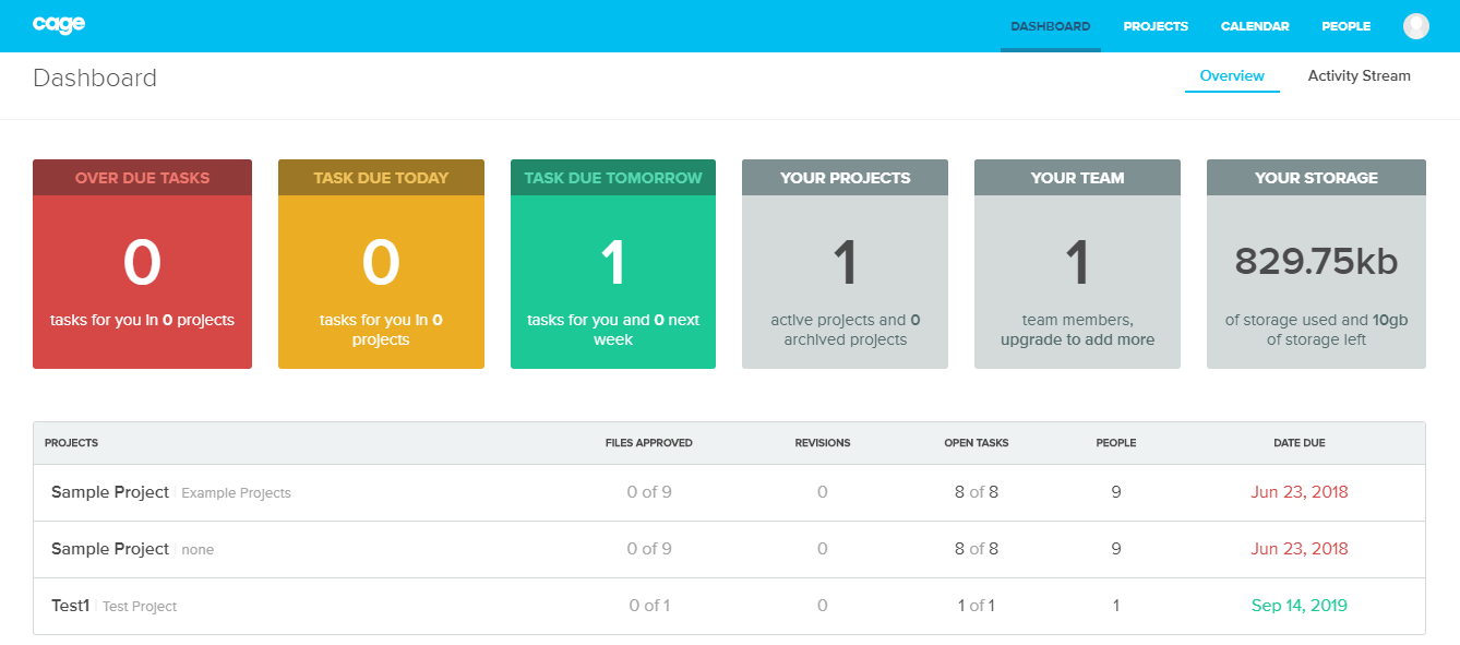
- When you log in, the first thing you’re about to see is a pretty dashboard with your general work statistics and information. You do not have any gallery right here because projects are in a separate tab.
- We are now using the free version with no pricing applied. As long as you have one user and only one project except for the test one, you can stay on the free plan as long as you like. Definitely a favorable cost for all freelance creatives.
- Video and animation proofing is supported.
- The mark-up tools range is decent. It includes Marker, Highlight (which is a square shape, basically), Circle, and Sketch tool for drawing. Should be enough to annotate pretty much anything; you can also change annotation colors.
- The proofing tool does not support real-time communication in comments, and you have to refresh the page to see what the other person has written. Not good for the teamwork in 2022. The good thing is that there is Slack integration.
- To assign an external reviewer for feedback, you must go to the People tab and send an email invitation. It is somewhat inconvenient that you cannot do it from the review tool immediately.
- It seems that you can assign an external reviewer only if you make your project public, which means you allow sharing. Private settings ensure a higher level of security, though technically, it only means that none except your registered teams will have access to the project.
- When your external reviewer opens the link in the email, they have to confirm their identity and enter a password, which technically is some sort of registration. Takes a minute or two, but still a registration. Also, there’s a possibility to set a profile picture.
- There is a heart-like button for approval, but no request changes button. Instead, you can assign tasks right in the review tool.
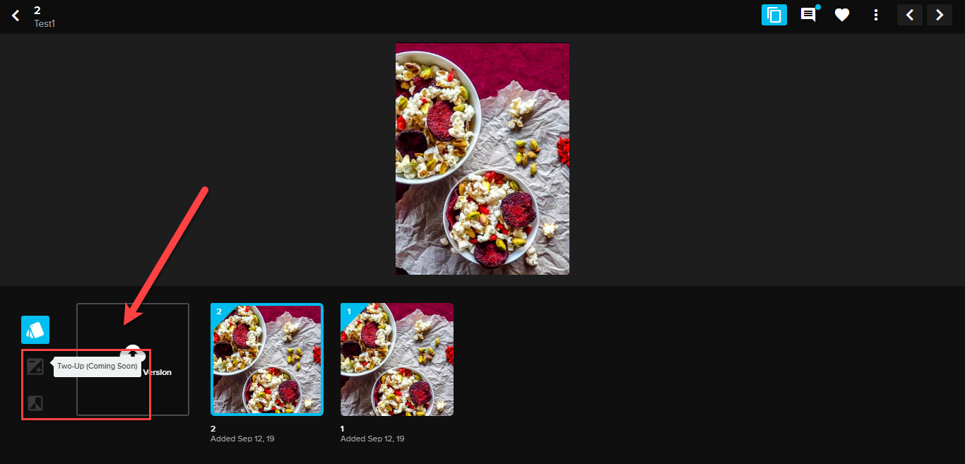
- Everything was great until I uploaded the second version of the picture I’ve chosen and started looking for some tool to compare them. Well, the thing is that there is none! Check the screenshot above. When you switch to versioning mode in the review tool, a version panel slides from the downside screen showing the versions you already have. Except for the upload button, there are two greyed-out buttons to the left – Two-Up and Overlay with “coming soon” marks in brackets. Apparently, these are the compare regimes to be, but it is weird that there has been none yet. That was the reason I thought the tool must be very young. The “Coming soon” thing has been there since 2019 at least and still is there in 2022, so and don’t think the project is getting any development since their blog and release notes were not updated since 2020.
- The app provides Activity Stream service if you need auditing, but it can only show the order in which all the actions were taken, not even their exact time and date. There’s no kind of report you can generate for your client, I didn’t find any at the very least. If you happen to know where it’s hidden, please tell us in the comments.
The Pros and Cons of CageApp
- Pros: nice interface, lifetime free offer for freelancers.
- Cons: registration of external reviewers, no compare modes, weak auditing functions, no additional review tool instruments, the development stalled back in 2020.
CageApp vs Approval Studio: comparison table
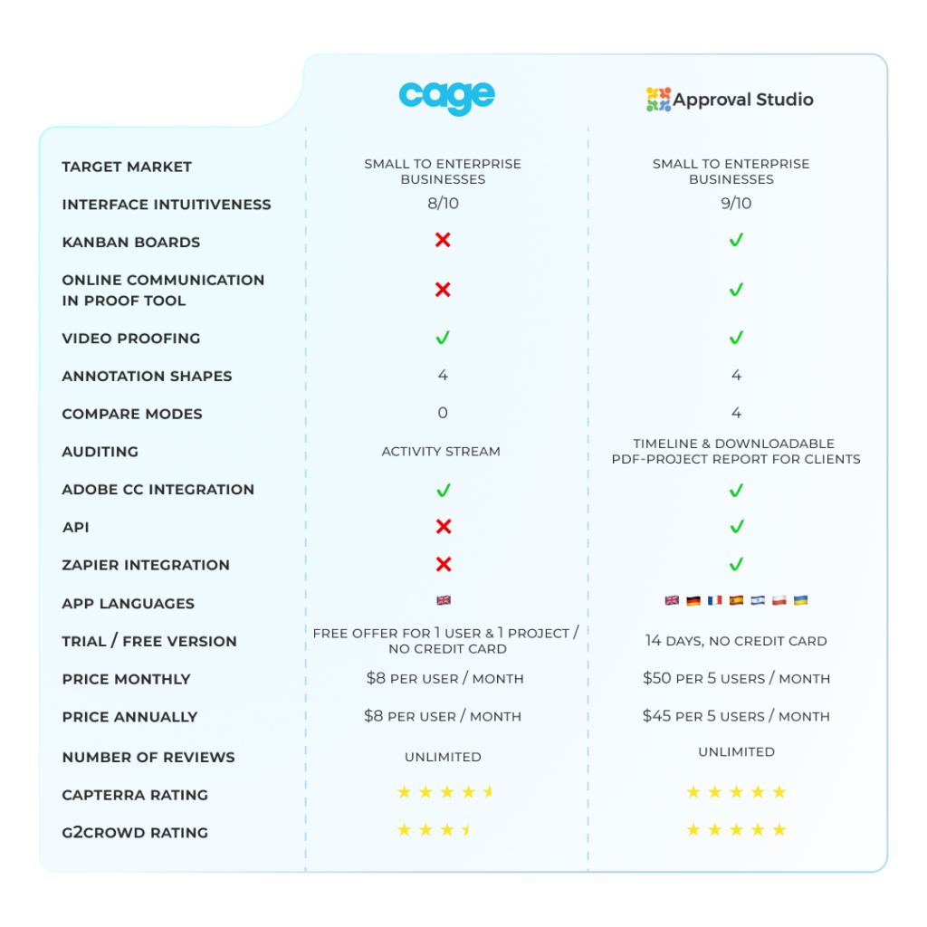
Why choose Approval Studio?
Approval Studio is much younger than Cage, but has certain features that might make a significant improvement in your collaborative workflow. Let’s go to a short Approval Studio app review.
- First of all, Approval Studio keeps the progress very much active and constantly adds new features and updates. Check our latest release notes in our blog to see them!
- The program greets you with Kanban dashboard. Its features are a bit easier to find since they are not that “scattered” all around in the interface – for example, you can share the artwork right in the Review tool.
- External reviewers do not have to create an account and can be invited not only via email, but also via the link. Cage also has a link-sharing option, but it works for registered users only.
- Approval Studio enables online chat-a-like discussions in the proofing tool, and we also have a Slack integration.
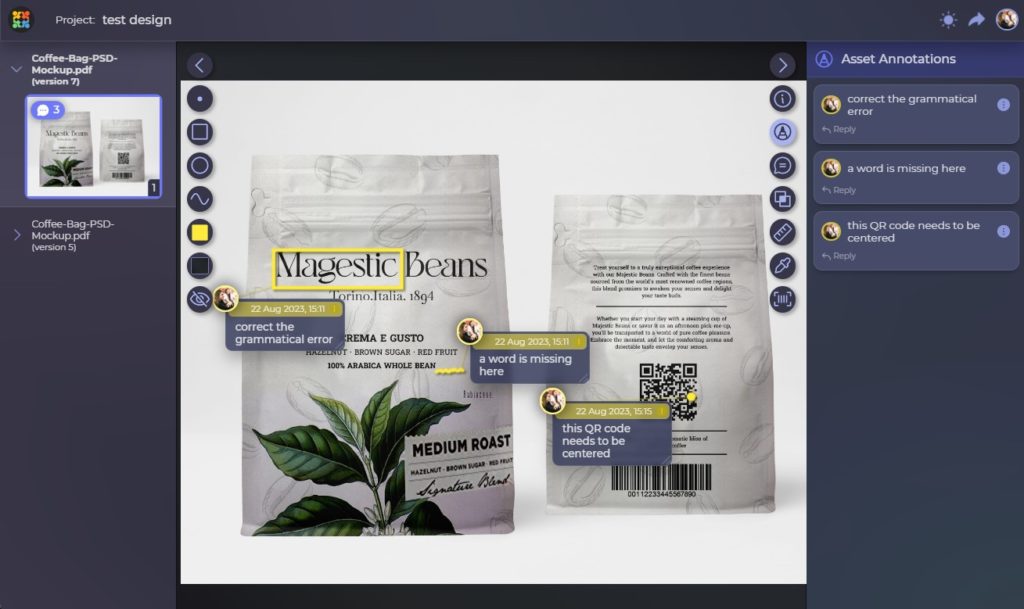
- We offer 4 different annotation shapes – point, circle, square, and a free form, which is basically similar to Cage’s mark-up possibilities. But apart from that, in Approval, you can attach one annotation to two or more similar issues in different places of the images. Comments can be hidden from external reviewers if necessary.
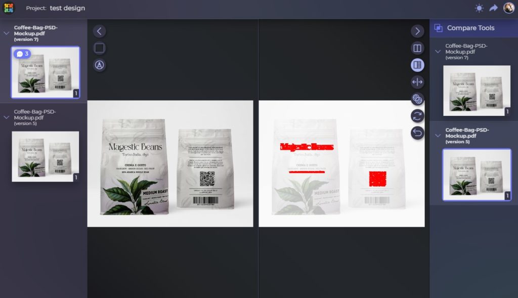
- When you work with graphic designs, it is hard to achieve perfection from the very first iteration, and you have to see the differences and be able to track the image’s progress. We tried to stick to that concept when we developed Compare mode you can see above. It has 4 regimes: “Side by side” with two panels for each iteration and the ability to highlight the changes, “Fader” for versions overlay, “Difference” that will show only the edits applied, and “Toggle” that switches from one iteration to another. Not a single change will go unspotted. There are no alternatives on the market. Slam-dunk!
- Approval Studio offers Timeline with the exact time for each change and also a downloadable Full report on the project or a separate Proof report for each document within it for a customer. It’s a three-pointer, I guess!
- Apart from all the mentioned benefits, Approval Studio has a wide set of additional tools like eyedropper, ruler, barcode scanner, spell checker, and many others.
Final Thoughts
That game was fun, but who’s the winner? Approval Studio offers more possibilities for efficient project management and proofing if I can have a say in this. And what are your thoughts? Who’s better? Let us know and get a chance to become an influencer and get our tool for free for the next six months! If you want a meeting with our PM Andrew, drop us a line, and we will schedule a free personal demo for you.
Cheers!

 TEAM SOLUTIONS
 WORKFLOW SOLUTIONS


 REVIEW TOOL
 PROJECT MANAGEMENT
 TOOLS & INTEGRATIONS
 CLIENT INTERVIEWS


