Skip to content
Logo
  • Product
  • Features
  • Resources
  • Pricing
LOG IN
SIGN UP

team solutionsTEAM SOLUTIONS

  • Branding
  • Graphic Design
  • Medical & Pharma
  • Packaging Design
  • Marketing & Advertising
  • Retail & Manufacturing
  • Architecture
  • Online Media

use casesWORKFLOW SOLUTIONS

  • Client Collaboration
  • Team Collaboration
  • Review Process
  • Project Management

See All Solutions→

system statusSYSTEM STATUS

project VISIONPROJECT & VISION

product updatesPRODUCT UPDATES

book demo for approval studio review and approval tool

Discover all our features in a free personal demo!

Book a Demo →

REVIEW TOOLREVIEW TOOL

  • Annotations
  • External Reviews
  • Online review Sessions
  • Compare Modes
  • Barcode Reader
  • AI Assistant

See All Features→

PROJECT MANAGEMENTPROJECT MANAGEMENT

  • Workflows
  • Task Assignment
  • Reporting
  • Project Timeline
  • Dashboard & Search
  • Notification System
  • Reference Files

TOOLS & INTEGRATIONSTOOLS & INTEGRATIONS

  • API
  • Adobe Extension
  • Zapier Integration
  • Shopify Integration
  • PDF to JPG converter

See All Tools→

book demo for approval studio review and approval tool

Discover all our features in a free personal demo!

Book a Demo →

CLIENT INTERVIEWSCLIENT INTERVIEWS

  • CSS Industries
  • NV Magazine

Read All Interviews→

TESTIMONIALSTESTIMONIALS

OUR BLOGOUR BLOG

VIDEO TUTORIALSVIDEO TUTORIALS

Demo toolDEMO REVIEW TOOL

GLOSSARYGLOSSARY

TRUST & SECURITYTRUST & SECURITY

AFFILIATE PROGRAMAFFILIATE PROGRAM

 CONTACT USCONTACT US

book demo for approval studio review and approval tool

Discover all our features in a free personal demo!

Book a Demo →

alt=""
PRODUCT

team solutionsTEAM SOLUTIONS

    • Branding
    • Graphic Design
  • Medical & Pharma
    • Packaging Design
    • Marketing & Advertising
  • Retail & Manufacturing
  • Architecture
  • Online Media

project VISIONPROJECT & VISION

use casesWORKFLOW SOLUTIONS

    • Team Collaboration
    • Client Collaboration
    • Review Process
    • Project Management

See All Solutions→

product updatesPRODUCT UPDATES

system statusSYSTEM STATUS

FEATURES

REVIEW TOOLREVIEW TOOL

  • Annotations
  • External Reviews
  • Online review Sessions
  • Compare Modes
  • Barcode Reader
  • Ai Assistant

See All Features→

PROJECT MANAGEMENTPROJECT MANAGEMENT

  • Workflows
  • Task Assignment
  • Reporting
  • Project Timeline
  • Dashboard & Search
  • Notification System
  • Reference Files
  •  

TOOLS & INTEGRATIONSTOOLS & INTEGRATIONS

    • API
    • Adobe Extension
    • Zapier Integration
    • Shopify Integration
    • PDF to JPG converter

See All Tools→

RESOURCES

CLIENT INTERVIEWSCLIENT INTERVIEWS

  • CSS Industries
  • NV Magazine

Read All Interviews→

TESTIMONIALSTESTIMONIALS

OUR BLOGOUR BLOG

VIDEO TUTORIALSVIDEO TUTORIALS

Demo toolDEMO REVIEW TOOL

GLOSSARYGLOSSARY

TRUST & SECURITYTRUST & SECURITY

AFFILIATE PROGRAMAFFILIATE PROGRAM

CONTACT USCONTACT US

Pricing

Log in

Sign Up

ikea logo changes
ikea logo changes

IKEA Logo Changes

  • Taras Talimonchuk
  • April 13, 2019
  • 1:00 pm

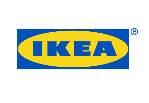
While reading yesterday’s news I bumped into a short article about Swedish giant IKEA changing its logo. It’s not the first redesign for IKEA, but what caught my eye was… I didn’t notice any changes at first glance. Take a look at the old logo:

Old IKEA logo

Now let’s check the new one.

New IKEA logo

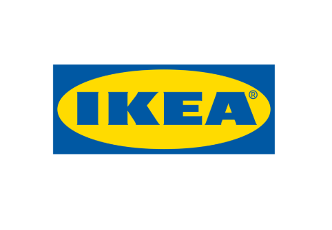
The difference isn’t obvious at all – except for, maybe, a trademark symbol. The thing is that the bosses decided to keep the old design but make subtle edits. Indeed, the new logo doesn’t really alter the characteristics of the original but rather modifies them a bit. In general, we have the same yellow oval with blue background and letters. The website I found the news on had to make a GIF to show the changes, saying that the changes are hard to catch without the AI comparison.

In Approval Studio, we have 4 different comparison modes to find the difference between the design variants, and the GIF that was on the website can be easily substituted with the Toggle mode. Here’s how it looks in our system.

The reason that we have 4 comparison modes, and we spent a lot of time developing those, is very simple – the first sketches, mock-ups, design versions may differ a lot, and you can easily see what has been changed in there. But the final and pre-final versions can seem almost identical, and you need to make a wise choice to have the best variant chosen. Comparison tools allow seeing those changes with your own eyes. Plus, as we have it in Approval Studio, the system can highlight them for you, so you would definitely know that you are fully aware of those changes – subtle yet impactful.

Try Approval Studio!

More examples of seamless design changes.

After reading the news about IKEA I recalled a story I read on the Internet a few years ago about another logo update.
Back in 2014, the local government of Moscow (Russia) decided to change its subway logo. The original logo was the M button – for Metro (which is a subway in Russian).

After spending more than 5 million dollars on the new logo design, they released the following thing.

Russian subway logo before and after

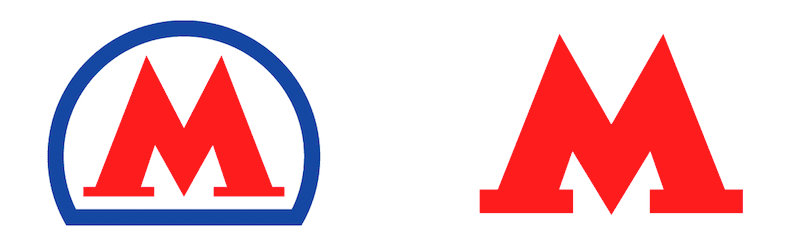
The most obvious change here is removing this blue outline. However, the designers have also redrawn the M latter, making it (according to them) “expressive, modern and universal.” Now, try to find the differences here without the proof tool. I’m not asking was it worth $5 million.

Find 10 differences with a review tool.

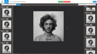
I would end this story here, but while browsing Facebook, I read about Dan Vojtech – a Czech photographer, who made a photoshoot of one and the same person, but with different focal lenses, showing how it affects the portrait.

Comparison of the person's look with different photo lenses

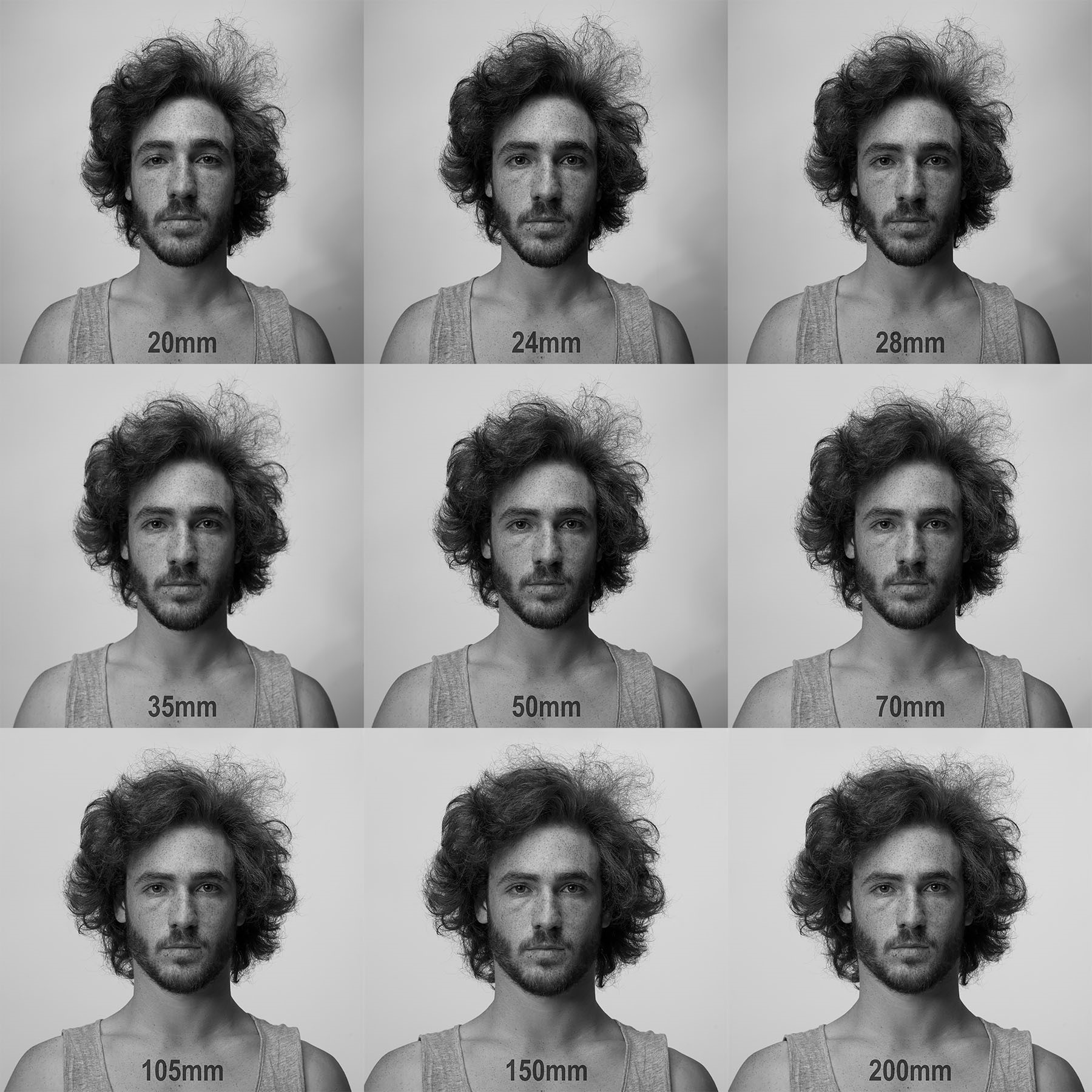
And again, I wasn’t able to find the difference just like that, until I uploaded the pictures in Approval Studio and ran the comparison modes. The changes became so surprisingly obvious, I couldn’t believe that I didn’t see those with my bare eyes.

Comparing all of the versions with Approval Studio

And what about you? How do you compare the file versions? What tools do you use to highlight the design changes?

Picture of Taras Talimonchuk

Taras Talimonchuk

Growth marketing Jedi at Approval Studio.
Picture of Taras Talimonchuk

Taras Talimonchuk

Growth marketing Jedi at Approval Studio.
PrevPreviousFirst Helvetica Font Redesign in 35 Years
NextCreative Talks: Before You Accept Client’s BriefNext

Leave a Reply Cancel reply

Your email address will not be published. Required fields are marked *

alt=""

900 Foulk Road,
Wilmington, DE,
USA, 19803

+1 302 574 6501

Facebook-f Twitter Youtube Linkedin-in

COMPANY

Project and Vision
Product Timeline
Terms of service
Privacy policy
Cookie policy
Trust & Security
Contact us
Login


RESOURCES

Our Blog
Video Tutorials
Features
Pricing
Customers’ Reviews
System Status
Glossary
Clients’ stories
Affiliate Program 

TOOLS

API
Adobe Extension
Zapier Integration
Shopify Integration
PDF to JPG Converter

COMPARE

GoVisually
Ziflow
CageApp
QuickReviewer
Review Studio
GoProof
Adobe Workfront\ProofHQ 
PageProof
Quickreviewer


COMPANY

Project and Vision
Product Timeline
Terms of service
Privacy policy
Cookie policy
Trust & Security
Contact us
Login

COMPARE

GoVisually
Ziflow
CageApp
QuickReviewer
Review Studio
GoProof
Adobe Workfront\ProofHQ
PageProof

RESOURCES

Our Blog
Video Tutorials
Features
Pricing
Customers’ Reviews
System Status
Glossary
Clients’ Stories 
Affiliate Program 

TOOLS

API
Adobe Extension
PDF to JPG Converter
Zapier Integration
Shopify Integration

alt=""

900 Foulk Road,
Wilmington, DE,
USA, 19803

+1 302 574 6501

Facebook-f Twitter Youtube Linkedin-in
Copyright © 2025