 TEAM SOLUTIONS
 WORKFLOW SOLUTIONS


 REVIEW TOOL
 PROJECT MANAGEMENT
 TOOLS & INTEGRATIONS
 CLIENT INTERVIEWS


Not so much time ago, I was walking around my block and noticed that there were many Apple retailers and small shops selling products of guys from Cupertino. And sudden thought came to my mind: “I do know Steve Jobs and Tim Cook, but I do not know who made the brand identity so recognizable. I doubt that Steve or Tim took the pencils and started drawing”. When I came home, I did some quick research and found out I was right.
So, I decided to create this piece of writing about famous logos and their creators. What is more, I am not talking about the big company itself, but those who actually stay behind all hype around big brands – people who were responsible for the branding process. We would like to tell you how people or creative agencies created logos, branding identity, history, etc. I think that such people are undeservedly staying in the shadows, so let’s take a look at them!
Apple
Hmm, where to begin…let’s start with the very first Apple logo by Ronald Wayne – Apple computer Co-Founder. Here is the logo:
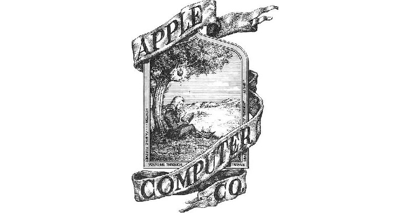
Can you imagine this one to be placed on your phone today?
‘Is rebranding a good idea?’ – that was the question that had been disturbing founders. In this situation – for sure! After Steve Jobs said that the logo is arcane, Apple hired a new designer – Rob Janoff.

This guy gave birth to the identity we see today. Although the logo consisted of rainbow colors, it was already based on a bitten apple design. Take a look:
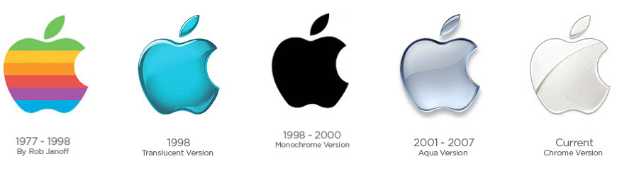
As you can see, Rob created an iconic shape that only changed its color palette over the years. Logotypes are really curious things – some of them change drastically, some – almost not at all, and Apple is the perfect example of both cases. Anyhow, every good logo needs a dozen approvals from the stakeholders, regardless of how much it changes. We can help you with that – Approval Studio is a great tool for design review, so be welcome to check it if you’re interested.
Since Google had many logos before the official launch, it’s hard to find all people involved. Thus, let’s take the first logo and the first officially redesigned one.
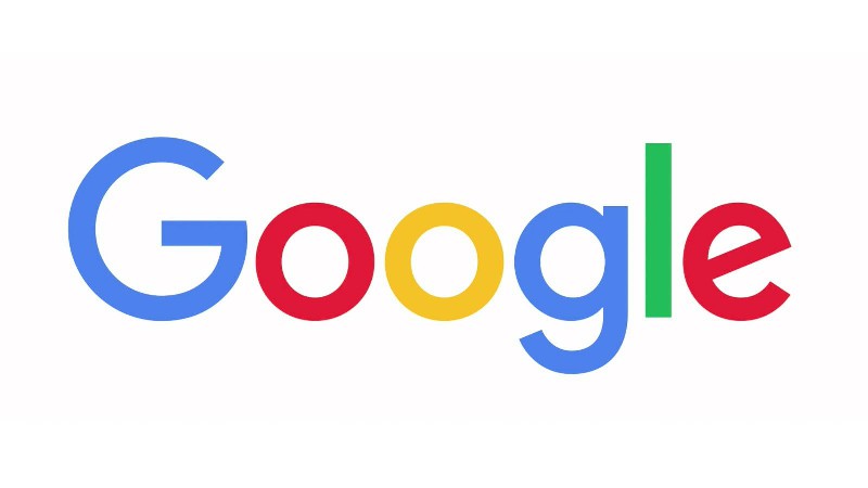
Here is the first logo from 1997:
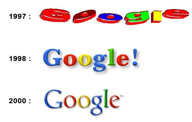
As you can see, the improvement in graphic design quality is immense compared to 1997. However, even the first versions were hits of their time!
The idea came to Larry Page and Sergey Brin – two friends and students at Stanford University – after they accidentally misspelled the word ‘Googol’. The author of the graphic logo version was Larry – CEO and Co-Founder of the brand. Since the logo was not good enough and the guys aimed at perfection, they have asked their professor for help.
Ruth Kedar is the person who is responsible for the logo that we all know and see every day.

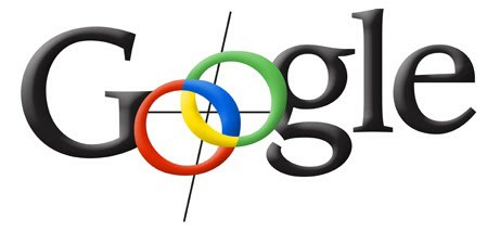
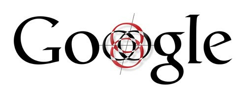
She was instructed to draw multiple versions of a logo for Google. Let’s take a look at those that were rejected:

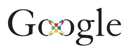
After many attempts, the idea stroke Ruth’s mind – the professor suggested that guys should leave the set of colors and get rid of the magnifying glass. She said it must mean that Google is more than just a search engine. Thus, the final version was approved in 1999, and you all know this one well.
Target
The company logo was not always an iconic bullseye. Originally, Target’s logo was compiled out of 3 white and 3 red circles with the ‘Target’ signature over the logo.
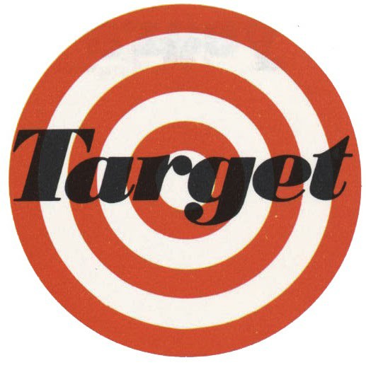
Stewart K. Widdess and his Dayton Dry Goods Company were the creators of this logo. Out of 200 hundred names, Stewart decided to stop on Target, and they could not create something else except the bullseye. That’s the best representation.
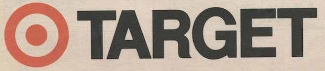
Later, the company moved to bold lettering and a target logo at the beginning. This happened in 1975.
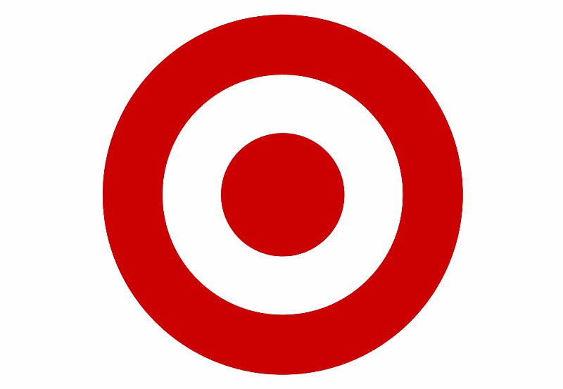
And the one you love and know today came in 2006.
Why is it so successful? I believe it’s due to striking simplicity and solid red color. Usually, minimalistic logos win the battle against time and trends and stay for a long time. Also, the choice of colors is crucial. Red creates trust and strength, while white color symbolizes patience and friendship.
Does a shop where the logo ensures to target what you need, with friendly and strong service sound convincing? It does!
Nike
Nike is one of the companies with this incredible story of the logo design price vs. modern revenue. I think you may have heard that the Nike logo costs almost nothing compared to the prices of the modern world. Its price was $35. According to the last numbers, Nike’s revenue is $37,403 million in 2020. Incredible!
Bill Bowerman and Phil Knight – founders of this strong brand – asked Oregon students to draw a logo for them. Carolyn Davidson was the person who is now responsible for Nike’s logo appearance.
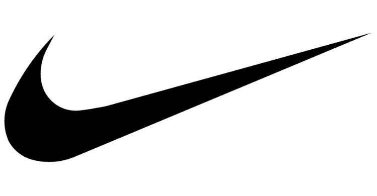
The very first design is the following:
Note: the full story of Nike’s branding you may find in our article here.
As you may see, the famous swoosh was designed by an ordinary student. What is the most important thing in the story – Nike said thank you to Carolyn. They presented her with chocolate swooshes, a Nike ring with gold and diamonds, and 500 shares (estimated to be worth $1,000,000 as of 2015). I’d bet she was glad!
Chupa Chups
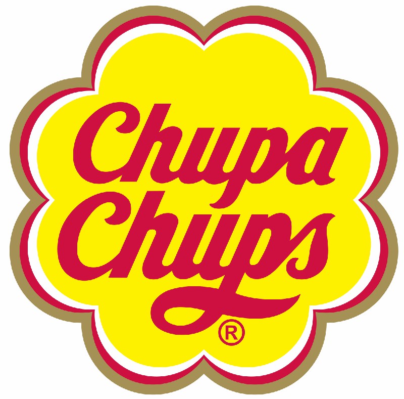
I can remember how fast I ran to the shop to buy this lollipop. It was so delicious and famous so no one could withstand the temptation to buy it. But besides the fact that Chupa Chups is the worldwide best lollipop, its logo was designed by one of the best artists. Boom!
This guy had a pointy mustache and was famous for painting melting clocks. Do you know him? Yep, it’s Salvador Dali! I was surprised the first time I heard this.
Enric Bernat – founder of the company – wanted his project to be unique and successful. Thus, he invited Salvador for a cup of coffee. Later, he said that Dali could not resist the amount of dinero offered to him and started working immediately. He drew several variants straight on the newspaper that was lying around.
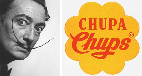
What is more, the artist insisted that the logo should be on the top of the product. This should create eye contact with the customer. And he was right, was he not?
Lego
Oh my God! How badly I wanted every new Lego box. This was so fascinating. Star Wars, Harry Potter, Old Trafford stadium – these were my favorites. And I do not know what was more irritating: having to beg my parents every day to buy the new set or the impossibility to buy it because the sold-out happened before the actual release.
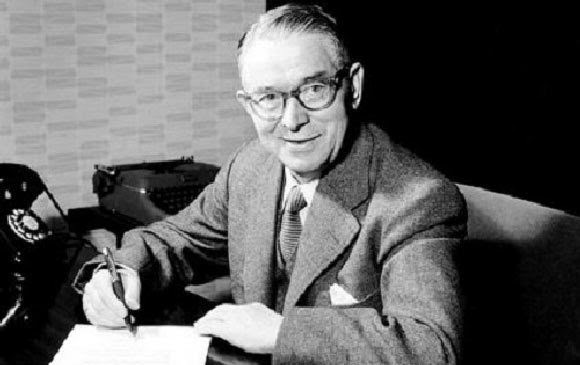
Anyway, is this the best logo out of all? No, it’s rather bad but badly iconic. The logo was created by the LEGO Group and its founder Ole Kirk Christiansen.
They have compiled two Danish words into a logo – Leg Godt. The phrase can be translated as ‘Play Well’ and ‘Put Together’.
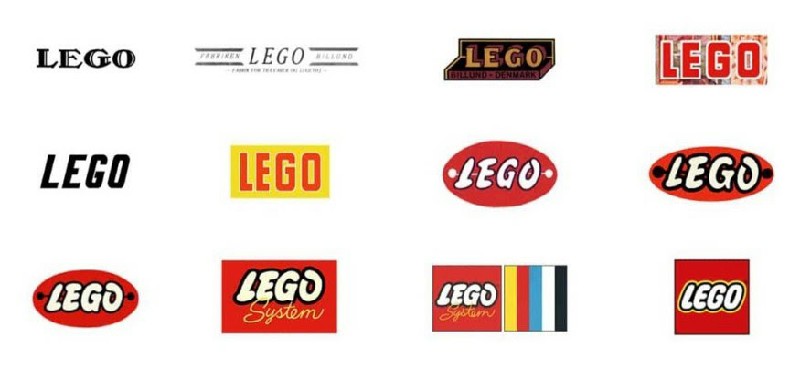
Of course, as any modern logotype, it has changed, improved, and did not have the appearance it has nowadays. This is an integral process of any company. You may take a look at all logos, starting from the very first – 1934’s version:
McDonald’s
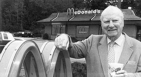
The McDonald’s logo owes its appearance to Richard McDonald, one of the founders.
During the construction of a restaurant in Phoenix, Arizona, architect Stanley Metson presented his project to the brothers. The new building was supposed to have a rectangular shape and a red roof.
But Richard did not like the project. In his opinion, the building was supposed to be revolutionary in the field of catering. Dick made adjustments to the project: he added two large golden arches on top of the building. The architect disapproved of such an idea. Thus, Richard MacDonald went to see George Dexter, a sign maker. This is how the prototype of the future McDonald’s logo was born.
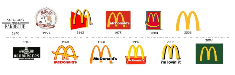
As for the modern and clean logo, we should thank Jim Schindler.

He was hired in 1962 to created a ‘corporate’ logo. He depicted the restaurant’s roof with golden M-shaped arches. In 1968 the logo roof lines disappeared, and the brand name was added.
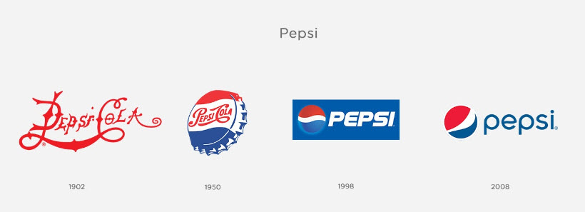
Pepsi
Even though Caleb Bradham – a pharmacist who invented and founded the company – tried to copy Coca-Cola, I love Pepsi more than Coke! Ah, the everlasting rivalry of two sodas…
By the way, you may read about the soda logo war in our research.
Now, let’s get back to less important info (joking, of course). As it usually happens with old companies, you may never find people connected to the brand many years ago. Or even people who at least still remember those. The same happened to Pepsi.
The memories are shadowy, but some of them reference Bayard Wootten.
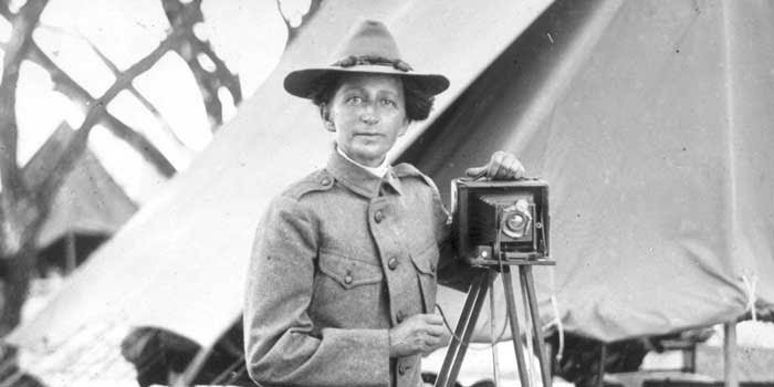
She was a great photographer and a neighbor of Caleb. Some people even say that it was her who invented the company’s name.
In 1950, the Pepsi symbol finally started looking like we get used to it today. In 1962, the company went away from the word ‘Cola’, and this was the year that changed everything.
Some kind of final thoughts
As you can see, the lion’s share of famous logos was created not by founders but by designers that are not remembered today. This is sad. Of course, those people are taken care of by the brand, but we should also pay attention to them.
It’s peculiar how people hired just to design something can create branding ideas that will be extremely successful in the future. I would like to step in their shoes to check how it feels. It must be fascinating and sad at the same time – you have created a great brand identity for a no-name company that becomes a corporation later, but it is not yours.
Anyway, share your thoughts in the comments below! Maybe you know some authors of famous logos – it would be interesting to read!
