Hello there, Jedi!
Proofing General Kenobi’s here, as you might have guessed. We are ready for another interesting journey, this time – to the lands of India.
The digital collaborative tool for creatives we are about to check is called QuickReviewer, one more of our competitors that seems to be a new one to the market. Without further ado, let’s jump right into it, and see what they have on the plate for managers and their teams.
What is QuickReviewer?
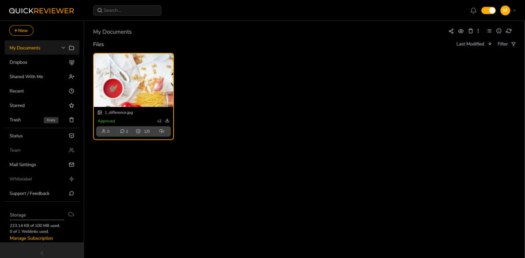
Capterra tells me that the app’s production started in 2011, and although I had a hard time believing it earlier, they improved the app’s design and features significantly in 2022. It used to look a bit too raw and unpolished, and there were no reviews on both Capterra and G2Crowd. Now it is very much different, although the team followed the same concept in modernizing the app’s design. Also, there’s a dark theme available, which is an instant plus from me.
QuickReviewer Features
- The dashboard is plain and simple. Important note: there are no projects here, only your artwork gallery. You can create folders instead of projects and rename your documents at any time, but I’m not sure it’s very practical. Directly on the asset, there’s some info available such as reviewers, comments, approvals, etc.
- We are using a forever free plan that offers unlimited reviewers, one user, and only 100 MB of storage. Not much, especially for video files, which QuickReviewer supports as well as PDFs, pictures, and HTML. Yet, a free plan is always something.
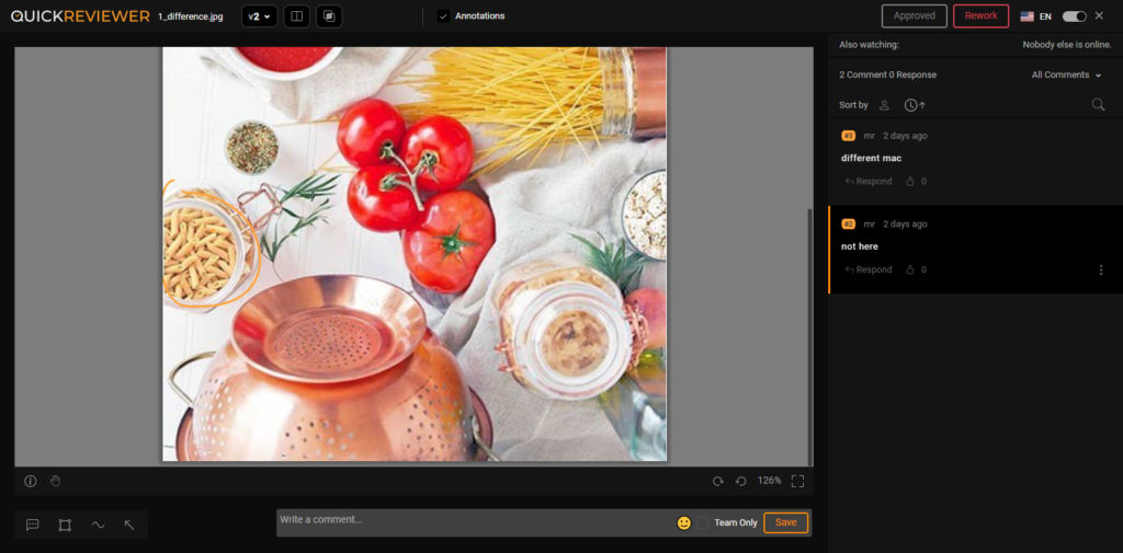
- There are 4 mark-up tools – Pin, Rectangle, Freehand, and Arrow. The colors cannot be changed, so differentiating reviewers becomes a bit difficult.
- By the way, the reviewers cannot be invited from the review tool itself – to do it, you have to get back to the dashboard, click on your asset, and choose the appropriate button on the control panel that emerges above. Sharing is available via email and link.
- Comments update in real-time, meaning online review sessions are possible. Good!
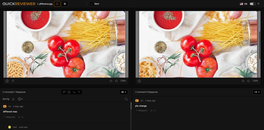
- Compare mode doesn’t become the coolest feature the app possesses as well. You can only compare your designs side-by-side or ask the app to highlight the changes. You cannot do it simultaneously, though, and with side-by-side comparison, the interface changes considerably, looking pretty clunky to me.
- Our last stop is reporting and auditing, which will be very brief. There’s a View Details button, which is tiny and hard to find unless you have a keen eye. It only allows you to see very basic activities with practically no details – there are no comments’ texts, for example. Also, it is not printable and not downloadable, so you cannot send it to the client. Won’t work for successful project management, not the Jedi way. It is a little weird because I can see the release notes from May 2022 that says that a downloadable Proof Report was added, but I can’t find it anywhere. Is it a paid feature or something?
The Pros and Cons of QuickReviewer
- Pros: forever free plan available, fast.
- Cons: inconvenient interface, weak auditing feature, clunky compare mode.
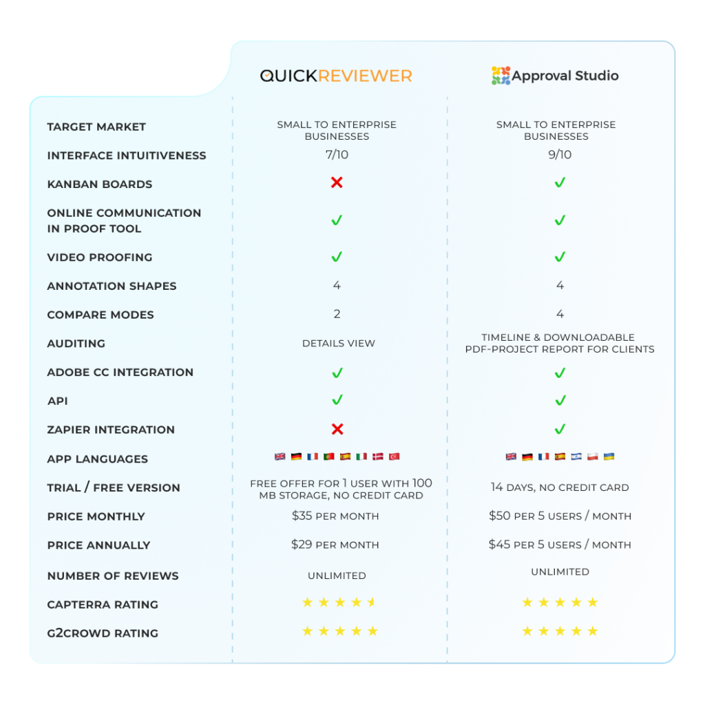
QuickReviewer vs. Approval Studio: comparison table
Why choose Approval Studio?
I will try to be as brief and clear as Master Yoda would be: many cool features that completely QuickReviewer outrun Approval Studio has.
- Approval is considerably more user-friendly and intuitive – it’s one of our main concepts. We have a Kanban dashboard with projects and all the buttons visible directly in the project menu. There are no problems with controls in the review tool, you can use the mouse wheel and keyboard.
- 6 GB of storage, unlimited reviews, and up to 5 accounts in our Lite version with a free trial for pretty moderate pricing.
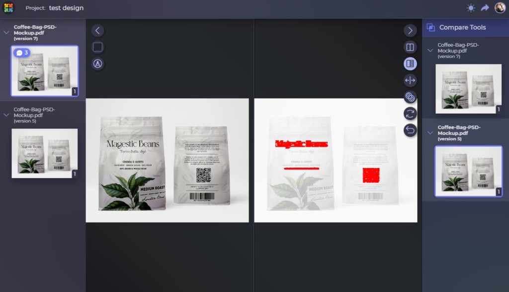
- Approval has 4 different mark-up possibilities – point, circle, square, and free form. You can switch colors to each of them to differentiate your reviewers for better teamwork and also change the position of a comment.
- External reviewers can be invited directly in the review tool, short link invite is available here as well. Easy to share!
- We offer 4 different Compare modes that are unique on the market and have no alternatives: “Side by side” with two panels for each iteration and simultaneous ability to highlight the changes, “Fader” for versions overlay, “Difference” that will show only the edits applied, and “Toggle” that switches from one iteration to another. No need to look at both versions trying to find changes until you can see twinkles all around you – have our software solution do it for you. Unlimited power!
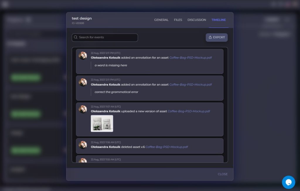
- Approval Studio provides a full Project History log with all actions completed within the project to the smallest details except for rotation and zooming. All project or asset info is available in downloadable Proof reports, which are easy to find! If your customer wants to see some audit records, there’s much to show.
- Although QuickReviewer has Adobe integration and Dropbox, they lack Zapier and Slack that can be crucial for your projects, especially when you want to work with countless other apps.
Final Thoughts
All things considered, the only feature of QuickReviewer that seems to beat Approval Studio is forever free plan. Although I am definitely biased, it is still a clean and objective win for Approval Studio, however I’d like to give my Indian colleagues more props for significant evolution that the tool went through in the last couple of years. Great job. Who knows, maybe in a year or two I would say that they are a better service than Approval Studio, but at this moment – not even close.
What do you think? Let us know in the comment section or contact us directly; we would love to hear your feedback or arrange a free demo for you!
And may the Force always be with you.

 TEAM SOLUTIONS
 WORKFLOW SOLUTIONS


 REVIEW TOOL
 PROJECT MANAGEMENT
 TOOLS & INTEGRATIONS
 CLIENT INTERVIEWS


