We all know that packaging is one of the driving forces of customers’ decision to buy or not to buy a specific item. But how impactful is it really? 72% of Americans agree that the product’s packaging design influences their buying choices (Source: Ipsos). That’s an impressive chunk of the market!
To make the best packaging design you can (and attract that 72%), I would suggest getting to know the packaging design aspects and the end-to-end process first. It starts from the preparation stage, goes through package design, artwork approval, prepress, and ends with final package printing. These five main stages might not look like much, but each of them covers a lot of ground, so let’s get to unraveling.
Packaging Design and Kinds of Packaging
Packaging design seems like a simple concept, but it certainly entangles more than just a “pretty box.” What is a product packaging design exactly? It is “the connection of form, structure, materials, color, imagery, typography, and regulatory information with ancillary design elements to make a product suitable for marketing” (Source: O’Reilly). In simple words, packaging design is a combination of materials and graphic elements that meet both marketing and product protection objectives.
We think that both objectives are crucial, and keeping them in mind would definitely enhance your packaging design skills. As no one would like to receive the damaged product inside the beautiful packaging, the protection objective comes first. However, without a thoughtful and captivating outer design, very few people would pick your product off the shelf, which defeats the purpose of creating the product in the first place (not all the time, but most of the time).
With that in mind, let’s talk about various kinds of packaging, namely the primary, secondary, and tertiary ones:
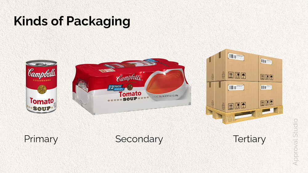
- Primary packaging – is the packaging that is the closest to the product itself. It’s also known as consumer or retail packaging. Think about a can of soup – the can and the label on it are the primary packaging of that product because it’s the main way to carry around the soup.
- Secondary packaging – is the packaging that contains multiple products with primary packaging. So, for example, the can of soup can be delivered into the shop in a 12 pack box, with the appropriate branding. The secondary packaging, in this case, helps with transportation and restocking; it’s also known as a stock-keeping unit (SKU), as it’s way easier to handle 12 cans of soup at a time.
- Tertiary packaging – is the most outer packaging of the product, also called bulk or transit packaging. Its primary purpose is to solely protect and deliver the goods from point A to point B. For example, a plain but sturdy cardboard box or a wooden palette that includes twenty 12 pack boxes (secondary packaging). The customer seldom sees tertiary packaging, and therefore it rarely includes any branding or design.
5 Stages of Packaging Design Process
Stage 1: Preparation
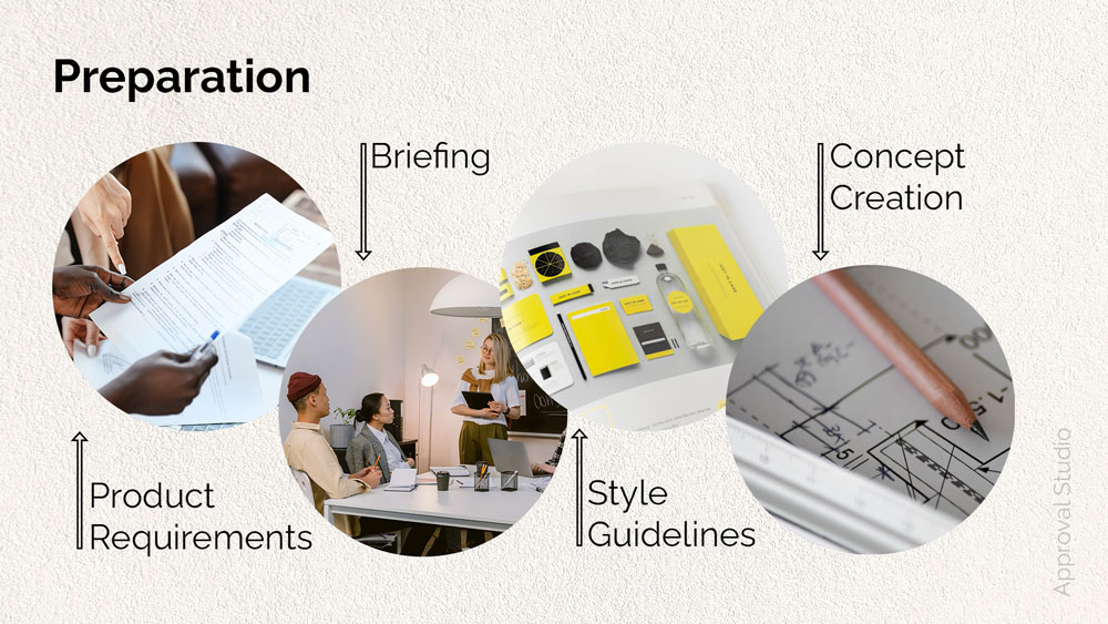
As with every thought-through project, packaging design should start with the preparation stage. This is a starting point where you get to know the project, discuss everything with the client and work on the concept. Planning the course of action influences how the whole project will evolve; thus, I wouldn’t advise skipping this stage.
The best is to break it into several smaller and more manageable steps:
- Getting all necessary info and elements of the product packaging.
What do I mean by necessary info and elements? Mainly a text copy and technical requirements (size, dimensions, manufacturing details, etc.). As the package designer, you should be presented with this information by the client beforehand, as it influences the design process. Still, it happens often that designers have to ask for it.
- Meeting with the client and working together on the brief.
I encourage you to talk through everything possible and plan the project in detail. It would be wise to also include all of the information gathered in the previous step as well as such essential aspects like budget, stakeholders, project goals, and milestones. We have a complete guide on how to write the perfect brief with examples and free templates.
- Getting to know the brand’s values, visual presence as well as brand book or style guides.
It’s essential to keep everything in the same style as the existing brand book and consider the values you will portray through the packaging design. If the brand has a solid online presence, researching the way they visually present information on other media could benefit you.
- Developing the concept.
With previous steps done, the vague, or quite opposingly, the vivid concept might already be on your mind. I would also add it’s better to decide on the suitable packaging materials and layers for the product at this stage before the actual packaging design process. This last step would ease your way into the design process as it could eliminate the possible brain fog of not knowing where to start.
Stage 2: Package Design
Now it’s time to do what you are best at – design! Of course, putting the copy, requirements, and all other technical elements together in an efficient way is not an easy task. However, I’m sure that a bit of dedication, creative thinking, and hard work will bring you the best result.
The unique aspect of packaging design is a dieline. What is a dieline? It’s a 2D representation of the 3D packaging structure that is used as a blueprint or a template for applying artwork and manufacturing. The dieline itself is not usually printed on the final product, it just shows the correct layout and guides for the manufacturing. For example, where to cut lines, place folds, or glue together your packaging.
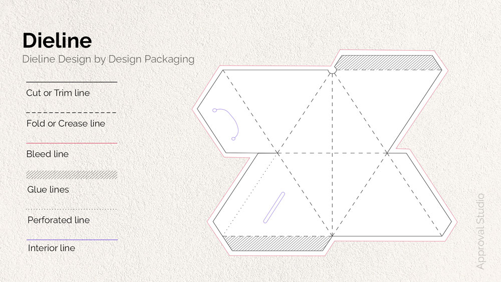
Some components of the dielines might include:
- Сut line or trim line – is the line that marks the place for the product to be trimmed to final size. Printing offices also use crop marks or trim marks on the corners of the file to show the printer exactly where to cut the paper.
- Bleed line – refers to the space outside the cut line, which creates the safe zone (also known as live zone) for the artwork and ensures that there are no unprinted edges in your final packaging.
- Crease line or fold line – is the line that marks the place where the future packaging should be folded, creating packaging inner and outer flaps and folds.
- Perforated lines or Perf lines – are the lines marking where to place small cut-off dots on the final product. These lines enable you to intentionally tear the packaging parts one from another along the dotted line.
- Interior lines – refers to the inner marks that show where to place openings, handles, holes, or windows.
- Glue lines – are the lines that should be covered in glue or any other adhesive to create the final shape or form.
A lot of printing offices can actually provide you with already prepared dielines for various packaging types. However, because it’s not 100% the case, here are some free resources that include the various kinds of dielines, ready to be used in your next packaging design project:
- The Designer’s Book Of Packaging Dielines, Part I
- Packaging & Dielines: The Designer’s Book Of Packaging Dielines, Part II
- Short-run & Digital Dielines For Projects
Some other things to keep in mind when creating packaging design:
- Correct Color Mode. Make sure to use either CMYK or Pantone (not RGB) as they are the pigment color modes explicitly used in printing.
- Information Hierarchy. Take into account the order in which the customer will receive the information and what is the first thing you want them to notice.
- Layer Organization. The dieline should be on a separate layer from the artwork.
- Orientation. Double-check if the images and text are facing the correct direction.
- Embed Images and Outlined Text. Every image used in the design should be embedded, and every test field should be outlined so as not to miss any of the assets and fonts while transferring the design to another computer.
Stage 3: Artwork Approval
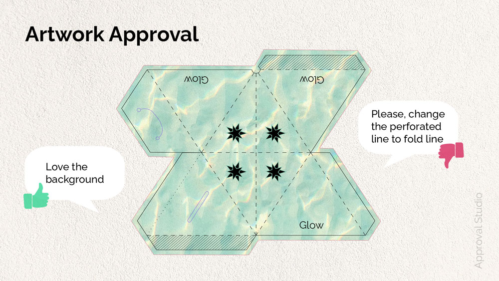
It goes without saying that the artwork approval process is one of the most tedious and stressful stages. Designers are worried that their design will be rejected, and clients are nervous about not noticing typos or errors and sending the faulty design to print. Therefore, to make all parties happy, I would advise you to take this stage as seriously as you can, not only in terms of worrying but also in terms of correct workflow.
If you are the lucky one that doesn’t suffer from extreme self-doubt, just go ahead and send the finished design for approval. However, for all of the other folks, I’ve got some self-assessment questions that might help you calm your nerves before sending the artwork for client review.
- Does your design meet all of the objectives set in the brief?
- Is your design functional and versatile?
- Is it clear from the first glance what the product is?
- Does your design follow the brand guidelines?
- How will it look in the store and next to the competition?
These self-evaluating questions could also bring a new perspective into your design decision-making process. Who knows, maybe some questions could remind you of the aspect that has slipped through, and now you would like to make those minor tweaks just before sending your artwork for review.
Now, when you’re ready to send the finished packaging design to your client, consider the ways and channels you want to receive feedback. The most popular way to go around design proofing is using messengers or emails, and, if you ask me, these are not the most efficient ways to collect comments and track the change requests. The better option would be to use specialized software created mainly to assist with accurate design approval.
No need to be scared of client approval
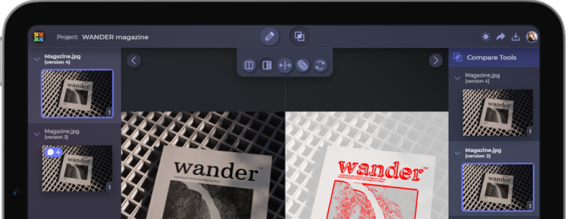
Approval Studio online proofing tool has your back
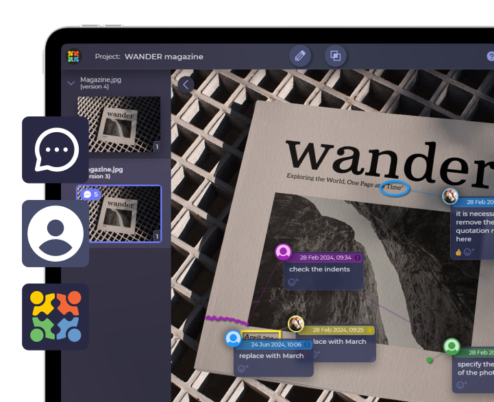
Start a Free TrialLet’s take a look at how Approval Studio can be useful with the packaging approval with this simple example. You are a fast-growing packaging company and you have multiple label approvers. When it comes to proofing the design, one person is communicating via email, another only via the Slack channel and some are even calling you on the phone. What a mess! With the help of Approval Studio, the artwork approval happens in one specially dedicated place with convenient on-screen annotations and a live-chat feature where reviewers can vividly mark and discuss the packaging design in real-time.
Stage 4: Prepress
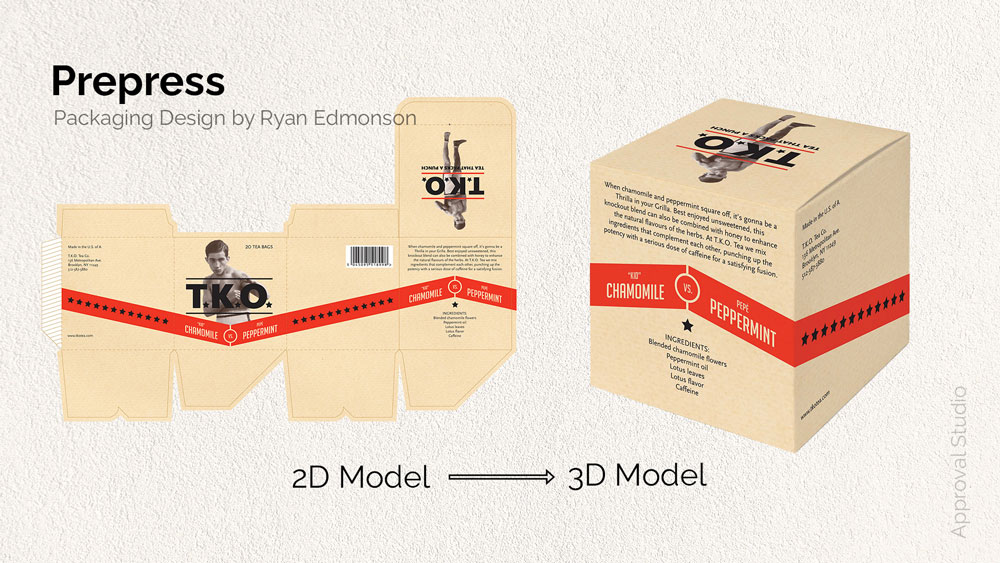
With successfully approved artwork, you are now ready for the next stage of the packaging design process – prepress. During the prepress, the 2D model of your design is printed on an actual packaging, creating the prototype, the final 3D model, and you can see if any further design changes should be made. This stage is a hybrid of the previous and next stages as it encompasses both packaging printing and artwork approval but on a smaller scale. Having said that, this in no way means that this stage is irrelevant. Let me model the reason why.
Imagine having created the packaging design that you are proud of. Your client absolutely loves it, the goals and deadlines are met, and you are ready to send it off to the printing office. You’ve checked everything several times: the file formats are correct, colors look amazing on the screen, the barcode is scanning properly. Basically, everything is in place. To save some time, you and the client decide to skip the prepress stage and send the design for mass production, and, oh no, the bleed is just two mm short, creating the white line on the side of your perfectly designed box. And now, you have hundreds of faulty boxes.
This isn’t an ideal development of such a great beginning, is it? But that’s why the prepress stage is so valuable, as it is the way for you to make sure that everything is precisely how you want it before the design goes to mass package production.
So, what are the things to keep in mind during prepress?
- Color Reproduction and Press Profiles (ICC)
- Alignment of the Dielines
- Size, Patterns, and any other elements that might influence the final packaging look.
Bear in mind, the position of a prepress technician exists in all of the printing offices. The prepress technician is a worker that checks print materials to ensure formatting, text, and color are correct before printing begins. They can guide you through the prepress process and assist you with any of the questions or problems along the way.
Stage 5: Package Printing
Even though this isn’t technically part of the design process as everything is now handled by the printing office, we decided to include this stage to conclude the packaging process from start to finish nicely.
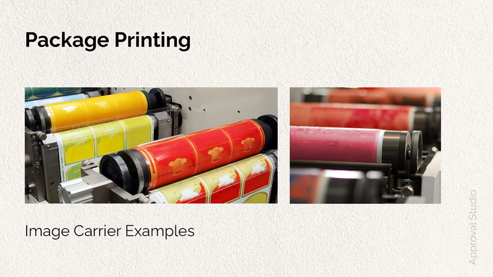
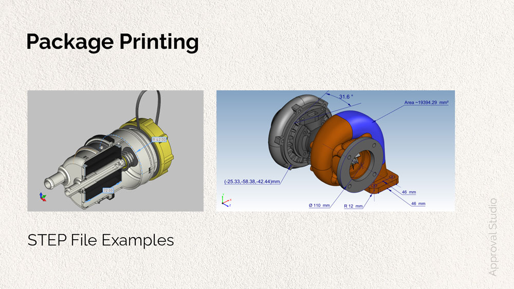
Once the printing office receives your final design (reviewed and proofed during the prepress), the process of creating an image carrier will begin. The image carrier is a plate, cylinder, or other surface used to transfer ink in the form of the image to the paper (or other materials). Usually, before the actual manufacturing of image carriers, the STEP file is created. The STEP file is a file format of highly precise 3D models that ensures that the dimensions are exactly correct for the printing press.
After everything is set, some final printing tests (like checking if the software reads the file properly, if the printer is set up correctly and doesn’t have a malfunction, etc.) are done to get all of the aspects exactly right on the day of printing. Once several samples are printed and approved, mass package printing begins.
Final Thoughts
Congratulations, you’ve got to the other side of the packaging design workflow!
This 5-stage packaging design process is by no means the most exhaustive guide in the packaging industry, but hopefully, it showed you what to expect from start to finish. Preparation, package design, artwork approval, prepress, and package printing are just a few of the project’s milestones. Given its complexity, take time to thoroughly go through each of the stages and modify along the way according to your needs and experience.
And as always, if you need an automated solution to your artwork approval process, give Approval Studio a try and let us know what you think!

 TEAM SOLUTIONS
 WORKFLOW SOLUTIONS


 REVIEW TOOL
 PROJECT MANAGEMENT
 TOOLS & INTEGRATIONS
 CLIENT INTERVIEWS


