 TEAM SOLUTIONS
 WORKFLOW SOLUTIONS


 REVIEW TOOL
 PROJECT MANAGEMENT
 TOOLS & INTEGRATIONS
 CLIENT INTERVIEWS


Post is also avalible in:
![]()
![]()
![]()
What is the difference between a folded piece of paper and a brochure? The answer is that the latter delivers a message. A specific message that informs the reader about your company, product, or service.
Even a five-year-old can fold paper. But creating something that actually communicates? A well-designed brochure works for your business 24/7. It introduces you to strangers, explains what you do, and convinces people to call, visit, or buy.
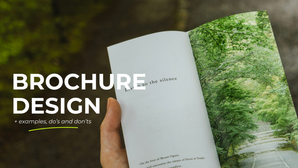
What is a Brochure, Exactly?
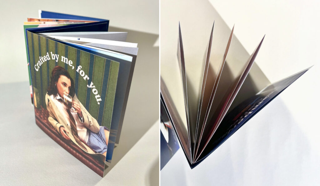
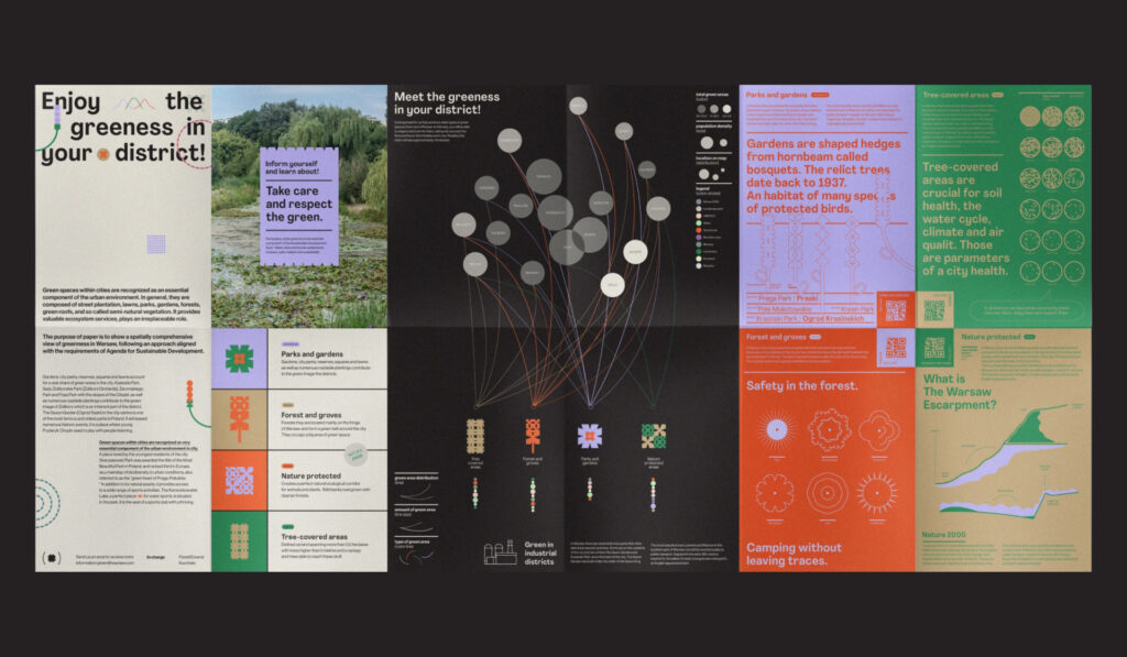
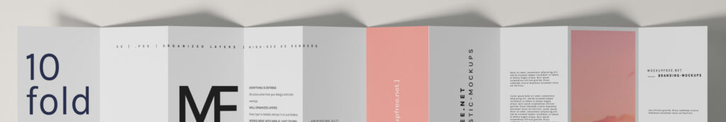
A brochure is a small booklet made of printed pages bound together with a cover. Unlike a single-page flyer, brochures have multiple pages (usually 6 to 20), which gives you room to tell a complete story about what you offer.
Typically, brochures are A4 or A5 size, which makes them both portable and big enough to include more detailed information. The pages are mostly folded, held together with staples or glued binding, depending on their number. Consequently, such a large amount of information requires a prepared reader.
Brochures are most effective when you have an engaged audience. Unlike flyers that work like hooks, brochures are for those who want to learn more. Therefore, they’re perfect for special occasions such as exhibitions, trade shows, and, why not, fairs.
Why Brochures Still Matter in the Digital Era
When someone picks up your brochure, you have their full attention. No pop-up ads or notification pings, but a tête-à-tête with your message. Plus, people tend to trust physical materials more. Research shows that 82% of consumers find print ads the most trustworthy when making a decision to buy something.
It was also found that print ads elicit a deeper emotional response and have a more significant, long-lasting effect. People simply spend more time examining physical materials and therefore connect better subconsciously.
Brochures are also useful in situations where digital access is limited or inappropriate – the earlier-mentioned trade shows, waiting rooms, or face-to-face client meetings.
Your brochure design needs approval?

Gather your team in Approval Studio to choose the best version together
Start a Free TrialWhat Makes a Brochure Worth Reading?
To set the right direction, it’s crucial to define the message of your future brochure and the audience you want to target. If you want your audience to be engaged throughout all the pages, I recommend you consider the following aspects.
Set expectations with a cover
The brochure’s cover is the first thing the reader sees. Therefore, a good cover includes your company name and gives readers a preview of what they’ll find inside. What you should avoid, though, is overcomplicating this part.
Given that we form a first impression in seconds, complex design and unclear messaging will lose the reader before they even understand what you’re offering. So instead of trying to tell everything at once, limit your cover page to:
- a strong heading
- a catchy line or a slogan
- your logo
Combine that with a relevant visual and you’re good to go! But “relevant” is the key word here. Your visual should reinforce your message, not distract from it. Avoid generic stock photos. These overused images actually harm credibility because they look like lazy marketing.
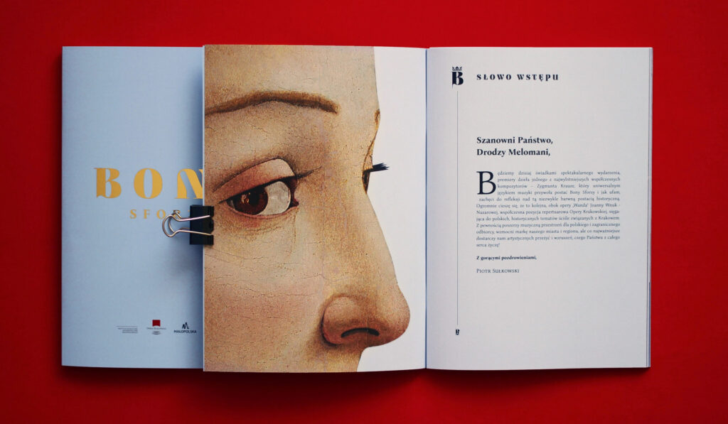
Organization and logical page flow
After the reader gets past the cover page, you begin the storytelling. Set the scene with an introduction, providing the context and relevance. Put together a few words about your business, your company’s values, and mission. You can also appeal to the customer by outlining the problems they might be facing. Thus, they can relate and smoothly move to the solutions you provide.
Having established the background, you can now offer the services you provide. It is the part where the reader gets a comprehensive overview of what your company sells. Go into details about how you can help them and what results await them. Then, the contact information follows. A great addition will be testimonials and a bullet list of benefits.
Basically, start with an attention-grabbing cover and headline, introduce the problem, present your solution, and end with a strong call-to-action. This framework works everywhere because it matches the natural thought process. People recognize a problem, seek solutions, and decide what to do next.
Detailed AND readable information
While maintaining a good explanation of your services, don’t accidentally turn “detailed” into “dense”. Walls of text will only turn into borders between your message and the reader. Better break them down into smaller paragraphs and, preferably, add subheadings. This way, the reader will have so-called checkpoints in case of any distraction.
If a painter dreads a white canvas, a designer might fear white space. But, hear me out! Clogging the layout with unnecessary elements can smother the design. And the white space would be equivalent to a fresh breeze and social distancing. Well-integrated margins enhance structure and shelter the reader’s tired eyes for a quick reset. That’s how you turn negative space into a positive effect. Quite a spin.
Among other things, check your design for contrast and make sure the colors look as good in print as they do in digital. Keep the formatting consistent and relevant. If possible, convert boring text into infographics, numbers, and bullet points.
Common Mistakes in Brochure Design
Safe area
You may agree that not everything in life goes as intended – and printing is not an exception. Some machines can crop your design during the process, resulting in ruined margins and chopped elements. To prevent that from happening, play safe and place all the important elements further from the edges. This way, extra-cropping won’t ruin the final product.
Microscopic text
Tiny text can only work as a nice idea if you’re endorsing a magnifying glass, which goes in addition to the brochure. Other than that, no one is going to narrow their eyes for the sole reason of appreciating your text. So let’s avoid the torture and keep the body text minimum font size at 10pt.
Pixelated visuals
Unless intended, pixelated photos give your design a careless, cheap look. Low-resolution photos are a huge faux pas in design, especially promotional, as they destroy credibility in the eyes of potential customers. Not a desirable effect for sure. That’s why it’s important to check if all the visuals are high resolution and God forbid any of them has a stock website watermark…
No proofreading
Not just visuals alone – everything needs to be checked. Unlike a digital post, a printed brochure cannot be edited after it’s produced. Perhaps only after destroying the whole circulation and printing a whole new, edited one. Totally non-wasteful, right? So, better check ten times before hitting CTRL+P.
Sometimes less is more
In this article, I’ve established a brochure as detail-oriented. However, more information doesn’t always equal more value. Don’t try to transfer the entire website’s contents into it, no matter how well-designed your website is. This will result in cramped pages, tiny fonts, and an overwhelmed reader. If there’s some additional info you really want to share, better integrate a QR code.
Final words
The best brochures don’t try to be everything to everyone. They respect readers’ time yet reward deeper reading with valuable details. Most importantly, they remember that design serves communication, not the other way around.
But that advantage only works if you design with your reader in mind. Keep it simple, make it clear, and always ask yourself: “What does my audience actually need to know right now?”
Your brochure might be the first impression someone has of your business. It could sit on their desk for weeks or get passed around to other decision-makers. Make sure it represents you well. Your goal isn’t to win design awards. It’s to help people make decisions. Keep that in mind, and your brochure will do its job.
