TEAM SOLUTIONS
 WORKFLOW SOLUTIONS


 REVIEW TOOL
 PROJECT MANAGEMENT
 TOOLS & INTEGRATIONS
 CLIENT INTERVIEWS


")
Post is also avalible in:
![]()
![]()
![]()
It is an understatement to say that colors are an important part of each person’s life. Color defines everything. I can remember multiple occasions of buying a sweet treat with the tastiest pastels on the packaging, only to discover how disgusting it was. Or how, among many soaps, my hand reached for the one with the best color combination, without having the slightest idea of how it smells.
But it wouldn’t be an understatement that more than half of our life decisions are made based on color: what to wear, accessorize, buy for the kitchen, or hang on the fridge. And a good designer understands that simple, but necessary truth. However, it doesn’t mean that working with it gets much easier. It may feel like every single color combo has already been used, and nothing works like you want it to. However, every day you see new websites or packaging that make you go “whoa!” Today, we will talk a little more about how they do that and where to take inspiration from.
Stuff you know (why is it important?)
If put simply, colors trigger feelings, those positive or negative ones. That’s why our brain pays so much attention to hues. It thinks it protects you from dangers or leads you to happiness. For example, I associate yellow with joy. And you got scared of the screaming of a certain yellow character in your childhood. We will perceive yellow differently because our brain “knows” (or thinks it knows) the reaction we are going to have.
A designer should know the most spread reactions (most people weren’t traumatized by yellow in their childhood) and use them to spread messages. However, you cannot use one color throughout the design. Here’s where understanding color theory comes into play. Even the prettiest and most joyful color loses its appeal in a distasteful palette, while the weirdest color can be well integrated into a design when it has a function.
Feeling stuck with colors?

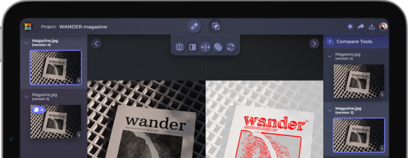
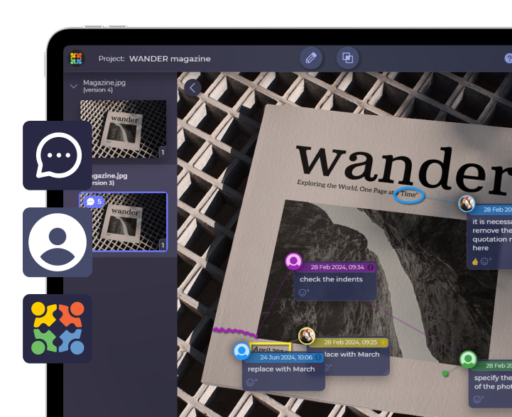
Compare different artwork versions in Approval Studio to see what works better for your design
Start a Free TrialStuff you don’t know (how are they doing that?)
Now that we know how important it is to find the right color for every aspect of design, be it packaging, web design, or even fashion, you may feel the existential dread creeping. With more than a billion websites and god knows how many packaging designs, is it really possible to be new, cool, and great at your colors? The answer is yes, and it’s easier than you think.
Let’s do some math here. Imagine you are a web designer who wants to create a website that has never been done before. You have an idea, now you need colors. A computer can display around 16.8 million colors (from 000000 black to FFFFFF white). A typical color palette for a website usually contains six different colors. To calculate the number of all combinations, we have to multiply 6 by 16.8 million. That is more than 100 million different color combinations. However, people don’t use their colors in the same way. One color palette can create many drastically different artworks, simply based on what color is primary, accent, background, etc.
If to put it simply, there is an infinite number of ways you can create with the colors at our disposal. All you have to do is know how to use them. So, here are five tools to help you with that.
Color palette tools for you to try
Coolors
I had to start with Coolors, as it is the most iconic color palette generator out there. Sure, some of it is hidden behind a paywall; however, it is definitely not an issue for creating palettes.
You all know how coolors work: you press space, and the whole world around you changes with its mood, vibe, and appearance. Then, you start customizing: shades, replacing some of the colors, and creating what works best for you. All the while having a specific task in mind. No attachments.
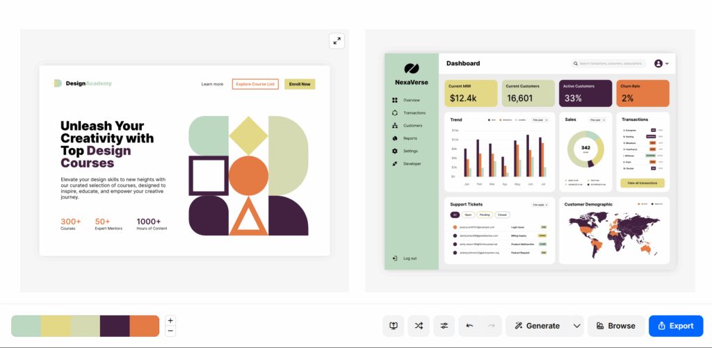
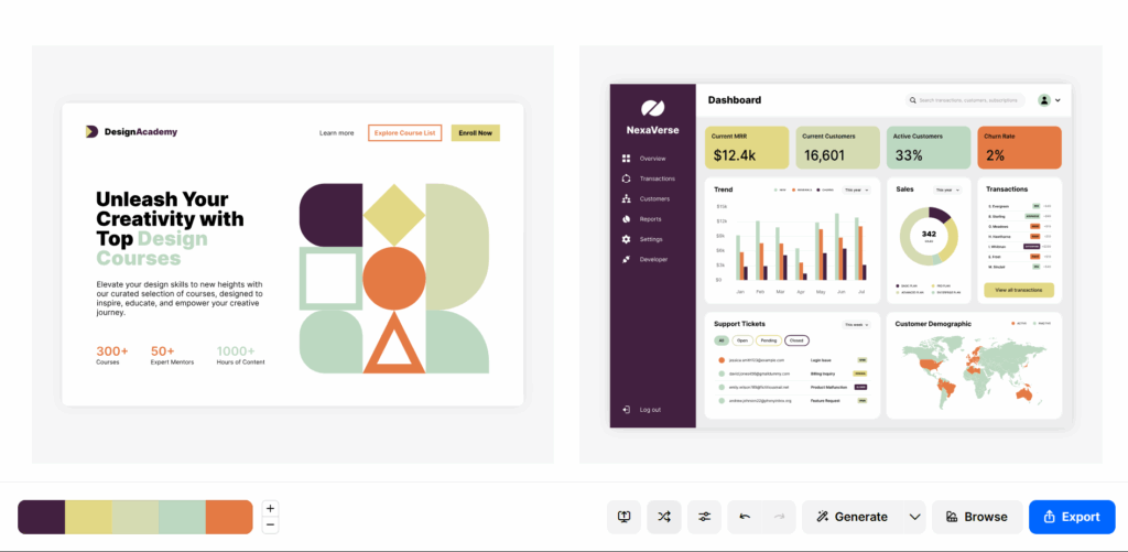
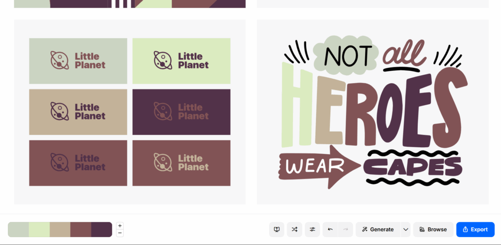
However, recently, developers added a new, more exciting feature people have been asking for ages. This feature is, of course, a mock-up generator (you saw it before in this article). You create a palette, click a button, and get a visual representation of what it can be. Then, you can shift around with the colors to look for better combinations. Again, the paywall can be felt here, too. However, it is not a problem, and basic mock-ups are usually more than enough to get a feeling of a palette.
Color Hunt
Color Hunt is a very similar tool to coolors; however, it values community more than anything, and prioritizes it in every aspect of the work.
It focuses more on “searching” than “creating”. This makes it more useful for people looking for quick solutions, rather than a creativity burst for their project. Neatly organized categories and so, so many available options, both new and loved by many, create a feeling of community.
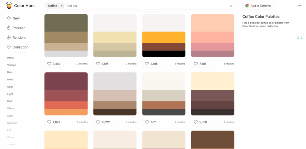
The best feature of Color Hunt is its Chrome extension, which inspires you without you even noticing. After installing it, you will get a random color palette every time a new tab opens. To me, it seems like a nice way to start a day and subconsciously get more understanding of how color combinations work together.
Paletton
This entry was the biggest and greatest discovery for me when working on the article. As much as I would love to gatekeep it from you, meet Paletton, a free, professional website that will change how you work with colors.
It looks simple: a color wheel with a few dots that help you control the color and the shade of your palette. And a few presets for creating monochromatic, adjacent, triad, and tetrad palettes. And you are free to play around, creating better palettes every time, using basic color correction and your own imagination!
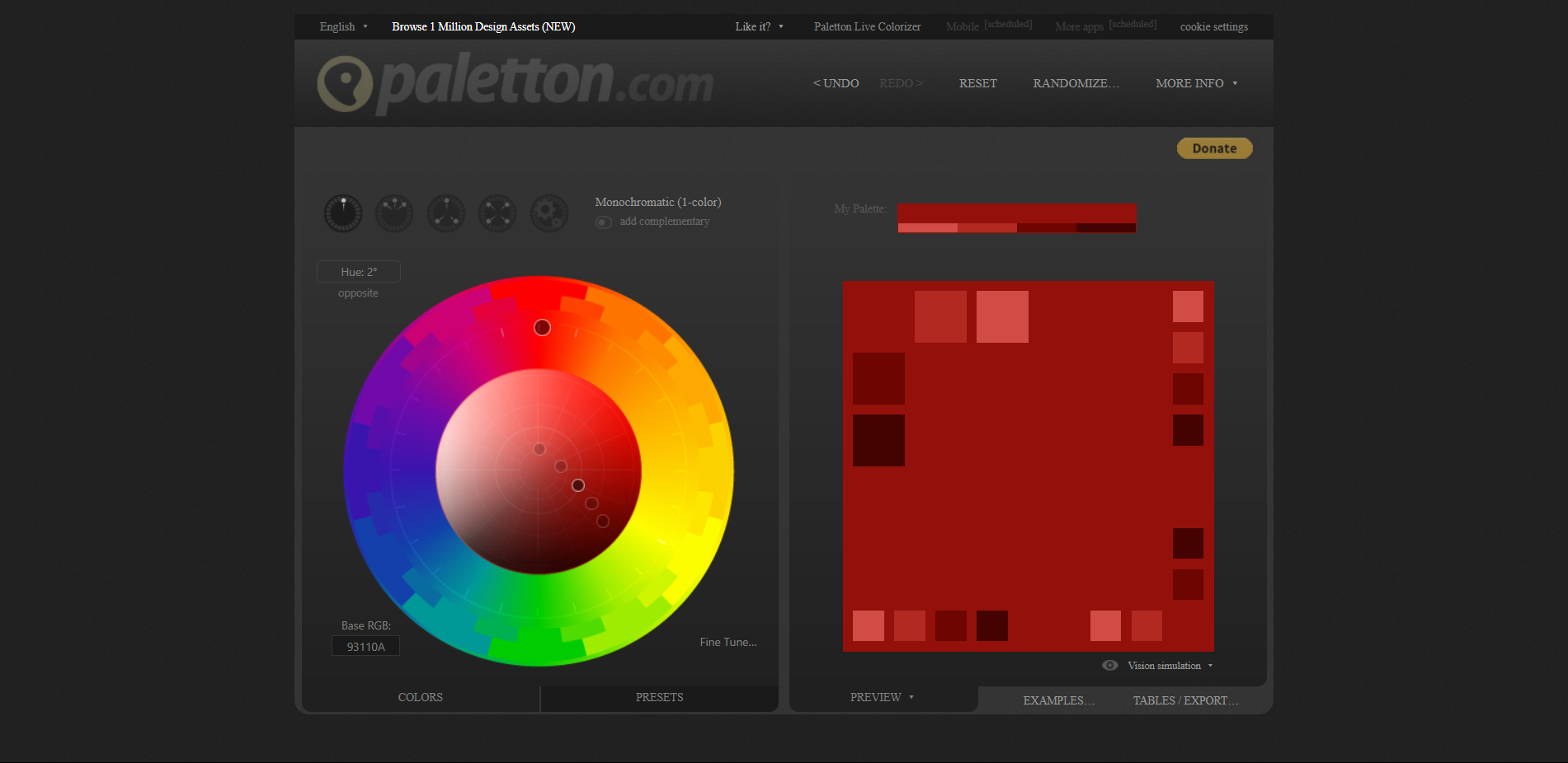
The best features are, of course, the color presets that allow you to skip playing around with shades if that is something you don’t particularly enjoy, and change them with a click. Another cool feature is “freehanding” your palette by creating a harmony not included in a preset. And a little sweet treat at the end is a preview of a palette in one of the available mockups. There aren’t many, sure, but do you really need 20 different website mockups to tell if the colors you chose are not great?
Happy Hues
Let’s bring some joy in here with those little happy hues and a smiling sun, representing them. So, what are those Happy Hues, and how are they useful for designers?
Happy Hues is a side project made by Mackenzie Child that helps show colors in context. This may be a tool more suitable for those who are just training to become web designers, as it helps understand how colors work in a website. Mackenzie created 17 different color palettes with different main, accent, background, highlight, etc. While they are fun to look at, they are also a great source of inspiration and learning about how to really 6 colors into one, coherent page.
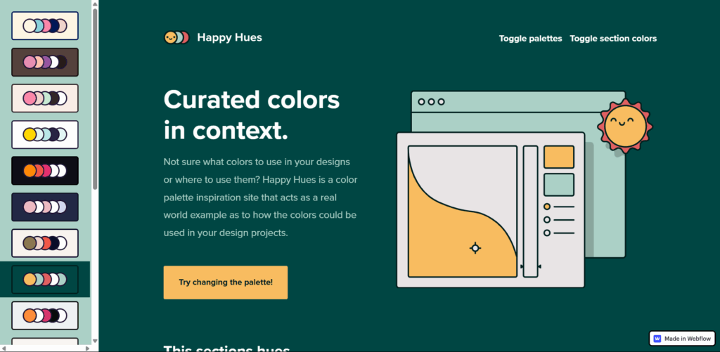
The biggest (and only) disadvantage of the website is that it’s not made for creating and trying out your own palettes like Paletton or Coolors. However, if you take it as a reference, this website can take you far in your newest projects.
Khroma
You cannot really avoid AI now, can you? So let it help your work! Khroma is exactly the tool you would consider when choosing AI that does well today. Upon entering, you have to get through a little survey, choosing the colors you like (or colors that fit the “vibe” of your new project). And voila! Khroma gives you a tailored collection of color palettes and combinations for different projects. I can tell you it definitely worked for me, as most color combinations were something I would use in a design.
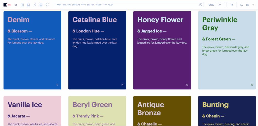
Among the coolest features I can name is a “Never fail WCAG” toggle. It combines colors in a way that complies with the Web Content Accessibility Guidelines, saving you some work. Another cool thing is the bias option that basically allows you to choose how adventurous you will be today. The lower the bias, the more different and unexpected colors you will see.
Khroma is free and in a beta stage, showing that the free status may change very soon. However, this is definitely a tool worth checking out, and one I will carry with me for personal and work projects for sure.
Final words
Whatever you might need the color palettes for, it’s important to understand that they are the most crucial part of every project. There can not be too much thinking on it, or double-checking the accessibility. Colors are an integral part of almost every person’s life, and you, as a designer, should pay attention to them accordingly. And if you are ever unsure, just ask someone to check out your design and leave a few comments in Approval Studio on how it feels and whether you have to come back to polishing the color palette.