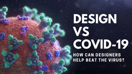
With a COVID-19 pandemic bursting out in the world, people have accommodated various means of fighting it. Social distancing, remote work and remote collaboration, quarantine measures, and so on and so forth.
Naturally, the most effective way would be a vaccine, but since scientists are currently working on it (UPD from future Matt: thank you guys for developing it so quickly!), the information front is our main battlefield right now, even in design community. As you probably know, Approval Studio online review tool joined the battle as well, providing free licenses for NGO’s and medical organizations – for more details, please contact us or check this post.
Recently, while scrolling through my news feed, I realized an interesting thing: with all of its information spreading potential, the design industry is actually the most effective weapon in this fight that can help stop the spread of COVID-19. I’ve decided to analyze how it happens and why we should pay more attention to all the designers and artists out there spreading important news and messages about the best practices like social distancing and staying at home.
Design is absolutely ubiquitous
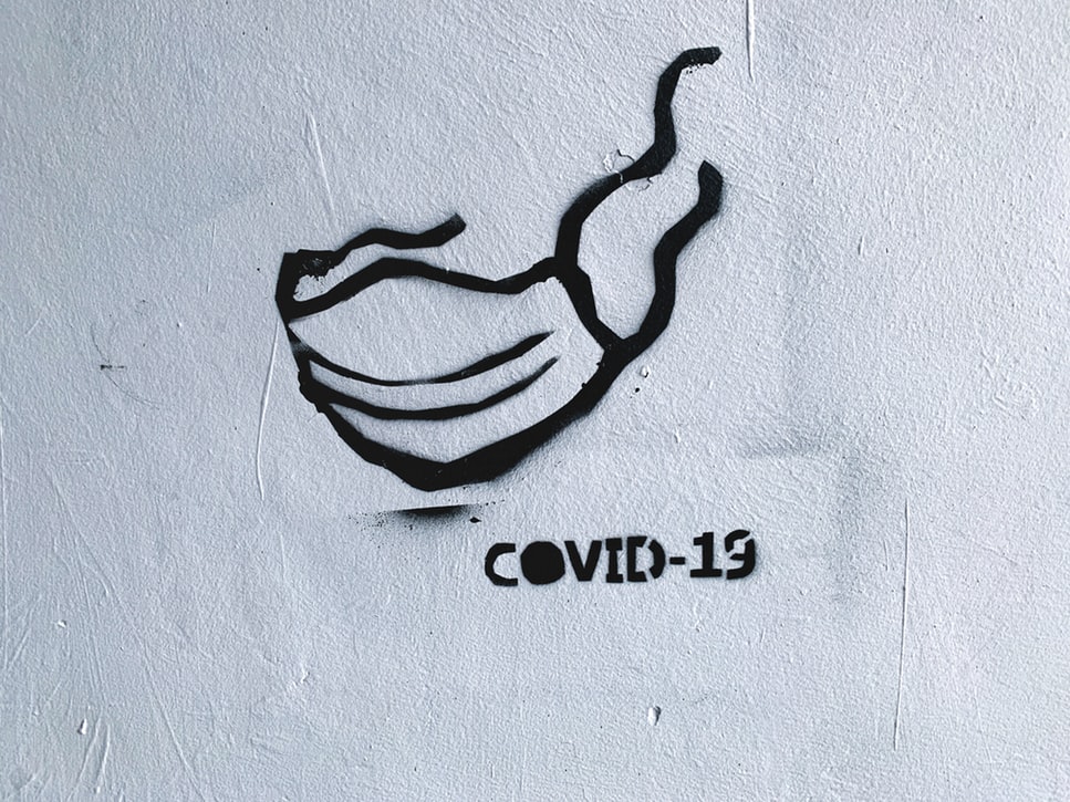
Take a look around you. Whatever catches your eye right now is a product of someone’s design. Your phone, your favorite book’s cover, a postcard from your last year’s trip to Norway (cuz why not?), the cards to the board game you’ve been playing with your family yesterday, any online platform you scroll through every day, and a logo on your sneakers as well as sneakers themselves. Yeah, I know I’ve taken a bit of a broad stretch, but you can’t disagree that it’s true. Design is literally everywhere.
Let’s now follow the topic this way: we narrow down the spectrum of designs to graphic imagery and broaden our surroundings to the streets and the Internet. Graphs, charts, ads, posters, billboards, memes – whatever comes to your mind has been designed at some point, and you’re always surrounded by these visuals. Without them, everything would seem black and white only, and you’d feel colorblind. But all these cool things that we see every day and which we are so used to can also convey tons of useful information wrapped into a cool and shiny package we call design.
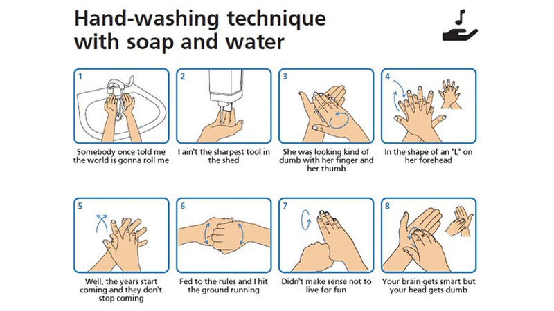
Since the beginning of the pandemic, most of the info I can see everywhere is dedicated to beating the spread of COVID-19. Updates, tips, jokes, national quarantines and personal preventive measures – and all of them are surrounding us in a pretty tight circle that is rather hard to escape unless you are Jared Leto who goes to meditate to the middle of a dessert and comes back to find a completely new world with some infectious disease in it.
It is a huge part of social media
Why is Instagram so popular?
It takes your visual information and translates it into likes and followers. People think of the whole concepts for their accounts, picking colors, filters, or placing their posts like a puzzle. Others just post memes, which is totally fine by me too (in fact, I personally prefer memes on any online platform. Memes are life).
I would say that within social media, where information equals money, visual content is one of the strongest currencies used by literally everyone. Next time you scroll through your feed, pay attention: how many accounts you follow have used design to give you a message that you need to stay at home or reminded you to wash your hands? Have you checked them all? Maybe not, but at least you did check some of such posts from the accounts that you are interested in the most. The more reminders we get about the situation around us – the better.
Meanwhile, if you want to create such reminders yourself and make sure the info on them is accurate, here is a… reminder… to check our cloud-based collaborative software for graphic designers that will help you communicate, share files, and assign tasks within your design projects.
Catching attention with artworks is easier
Would you be so interested in the plain texts bloggers insert under their posts if there wasn’t some kind of an interesting picture? Honestly, you might just not even notice it. Imagine if all the advertisements contained plain black Comic Sans font on a white background – how does that feel? Brands don’t differ from each other, there’s practically nothing you can distinguish them by. Even the article you’re reading right now looks like text in Google Sheets with no pictures, buttons, and other things that make it much more readable and prettier.
Creating artworks, the main challenge that designers put on the front is making them fit the purpose. I’ve told it numerous times, every design has one, and that’s its main difference from fine art. However, whatever this purpose might be, it becomes absolutely useless if it doesn’t grab people’s attention. Have you ever thought that you add a great deal of new music you discover on your streaming platforms to your library partially because of the cover? Our eyes are our most remarkable information dealer, and the chances that more people will hear new facts about COVID-19 grow exponentially when this info is arranged into a smart-looking graphics. Or posters. Or a comic. Or whatever else the designer’s mind can think of – the more unusual and topical, the better.
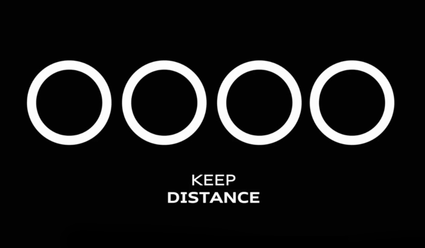
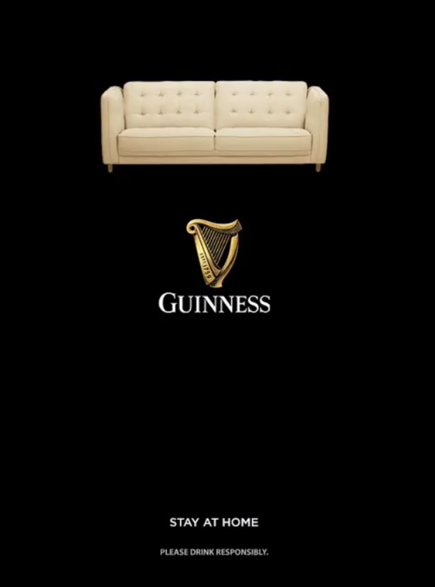
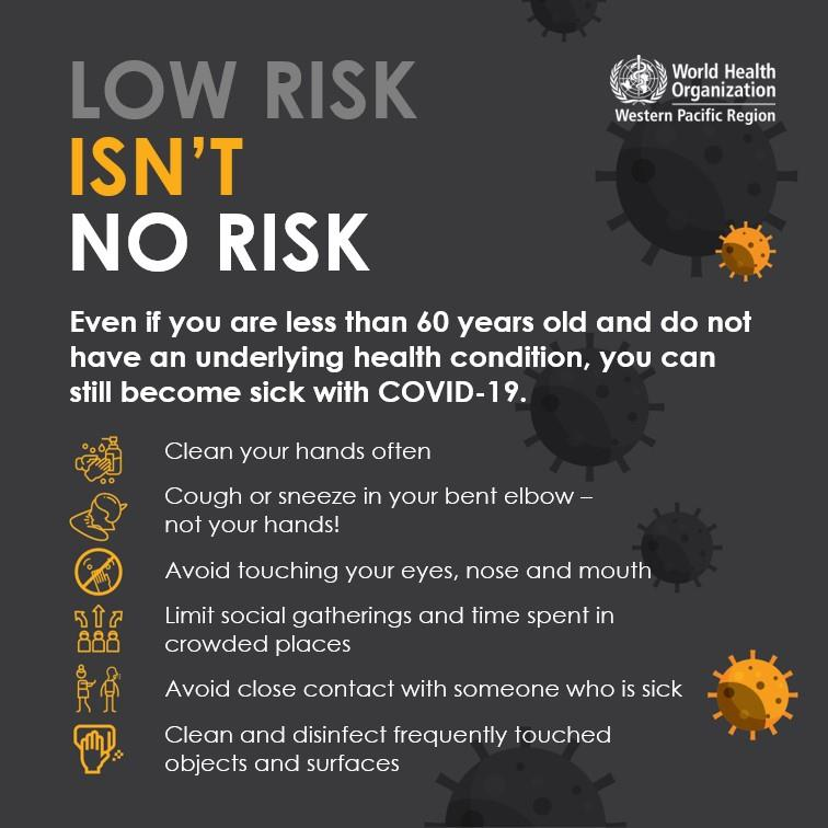
People share infographics from the World Health Organization, brands adjust their logos to fit them into the topic of social distancing. Self-marketing, you say? Might be, but it also helps spread an important message, and if it works – it’s great.
There’s the other part of the coin, though. A dire need to catch the audience’s attention creates too much of a competition. If everyone played fair and square, that wouldn’t be much of a problem, but since your internet feed is faster than Bugatti, taking a break and concentrating on something would demand a lot of effort. To boost it, many use clickbaits – and it refers to the design as well. Approval Studio encourages you to sort out all information, the visual one including, and to always verify its trustworthiness.
People tend to memorize visuals better than text
That’s a tough one. I still remember many ads I saw quite a long time ago, all of them for different reasons. Some of them I don’t really want to remember, like this infobesity thing where the designer replaced human faces with obese bodies. Some of them seem interesting even now, like McDonald’s free wifi sign made with fries on a famous red background. The main point is, shoutout to the creative teams behind them since not only did they catch people’s attention – they made them remember their creation.
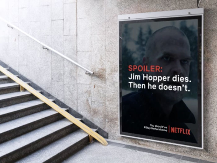
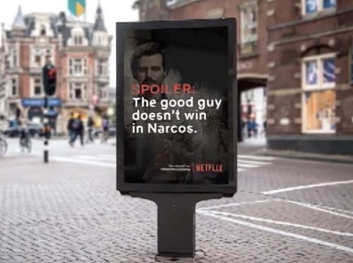
With memorable designs that will stay in people’s minds, it’s much easier to spread useful info. For example, I am totally fascinated by a spoiler alert campaign to the Netflix shows created by two students called Seine Kongruangkit and Brave. I wish Netflix would pick this up and continue doing the same as it is probably the most memorable thing you can do right now – spoil someone’s favorite show to make them stay home during the COVID-19 outbreak. Although it being posted on the Internet kinda defeats the initial purpose, the idea’s still brilliant, and now I’m trying to add a couple of these billboard pictures to this article not looking at them. Wish me luck and mind you: spoiler alert.
Final Thoughts
Spreading information about Coronavirus is the main means of fighting it right now. All the designers and artists who currently help with sharing important news and messages help overcome the disease immensely. We at Approval Studio realize how significant it is right now, and that is why we currently offer our design proofing tool for free to NGO’s and medical companies that help spread the info. Also, we are always happy to help with setting up your remote collaboration workflows and organize artwork approval processes for your creative team. For more information, check this post or contact us directly via chat or contact form.
Stay safe and wash your hands!

 TEAM SOLUTIONS
 WORKFLOW SOLUTIONS


 REVIEW TOOL
 PROJECT MANAGEMENT
 TOOLS & INTEGRATIONS
 CLIENT INTERVIEWS


