I like to think how literally everything that surrounds us is the product of someone’s design. I mean, isn’t it fascinating to buy a bottle of milk and a pack of very breakfasty crunchy cornflakes thinking that someone somewhere spent days and weeks making sure this exact moment will happen to as many people as possible? If it seems a bit odd, you still have to believe me — it surely did happen.
The magic behind every packaging consists of many different stepping stones, some of which we discussed in one of our recent blog entries. Yet, to unravel more of its mysteries, we certainly had to talk with design industry experts around the globe and see how they approach creating a package that will look great and be useful. Here are our questions:
- What are the most and the least favorite things about packaging design for you personally?
- Could you please share your packaging design process? What are some challenges that you might have encountered during this process?
- In your experience, what are some of the most common mistakes while designing packaging? Do you have any tips for beginners?
If you are new here – such Creative Talks articles are regular things on our blog, with topics like expert design collaboration and design approval taking a significant interest of our readers.
Oh, and also you are now reading the second part of the packaging entry. If you missed Part I, I encourage you to check it out for more opinions on packaging design.
Meanwhile, let’s rock! (and also roll)
Léo Tavares – Graphic Designer
Léo Tavares’ Behance and Website
I end up doing all kinds of projects, from digital apps to packaging. But what I like most about packaging design is being able to work with the tactile part of the design, you know? Being able to test textures, being able to touch the final result of what you created on the computer, and being able to see your creation in store windows is something wonderful. This is something that these other design categories unfortunately do not allow me to do.
What I like the least is maybe the finalization part of the files. That’s because each graphic company, each client, and each project has a different way of working. Amazingly, this ends up being the part of the project that takes the longest: getting the diecut, the finish, the right color tone right. But once we get it right, it’s just joy!
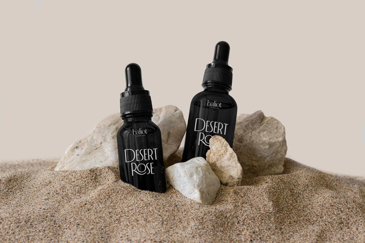
Our process consists of several steps. First, we seek to understand who we are creating with, the DNA of the brand we are representing in this project: its values, ideals, motivations, causes, missions, and what are their intentions with this product. We call this step Brand Positioning. Next, we seek to understand who we are creating for: where do they live, how old, what are their needs, tastes, habits, what other brands they consume, with what they culturally identify with. We call it Market Positioning.
Ultimately, our job is basically to build a bridge between these two worlds. Do you know when you want to help your friend win the girl he likes and who is also your friend? If you get to know these two friends of yours well, it will be easier to find common interests between them and facilitate this connection. That’s the intention! The packaging often ends up being the main point of contact between the customer and the company, even more than the advertisements, so it needs to be really attractive in the eyes of that customer.
The packaging design process is more technical in a graphic sense. You really need to have contact with colors, textures, finishes so that you can create something viable. Including having a good relationship with the printing company that will produce this material helps 70% of the process because usually, the biggest challenge lies precisely in technical issues: each country has its own technical standards, tags, different rules for closing files, and different materials of production. It can be quite challenging.
A mistake that probably 99.9% of packaging designers have already made is to propose something that is not possible in real life, something that looks beautiful on a computer screen but is impossible to reproduce, like overly saturated colors, embossing, and effects that don’t look so good or that make the final product so expensive that it’s not worth it.
The tip here is to hire a finalist and don’t have this headache 😂😂😂… But now seriously, it is very interesting to make technical visits to printing companies to have contact with materials, color samples, papers, and finishes. This will greatly enrich your repertoire!
Different approaches to design from every client may become a problem in itself because of communication chaos. Add numerous technicalities of packaging design to the mix, and the whole process may become pretty tedious. If you are in search of a solution to this problem, you might be interested in Approval Studio design review software that helps designers communicate with clients, accept annotations, and compare versions all in one place.
Teppei Yuyama at P.K.G.Tokyo – Creative Director
P.K.G.Tokyo’s Website & Teppei Yuyama’s Website
I believe that package design is one of the major pillars sustaining a brand. Regardless of country or region, people who love a brand are drawn in by the design, and that is the role and appeal of packaging. The amazing thing about package design is that this great power can be created through personal creativity. What I don’t like is when something is “shelved”, meaning it remains unreleased and unpublished. It is very sad to think that our ideas and endeavors will not reach the consumers.
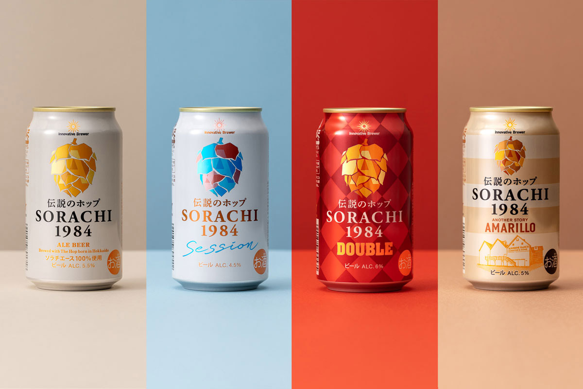
Our process depends on the background of the product, but instead of working on the design at once, we often start with strategy development. We define in detail what kind of person will buy a product and for what reasons, or what kind of value can be provided by the product, and only then the outline of the design will come into work and production can begin.
The challenge of this process is “how can we come up with a realistic story?”. For this, I believe that we need to understand how various different people think. If we can meet the “request” in the beginning, I believe it is possible to create a package that can bring out an empathetic response.
You should also understand that what you like might not always be suitable for the package design of the product. I believe the most suitable answer is the package design that is best for those who want to purchase the product. Therefore, I hope that people who want to do package design will learn to “understand others”. If you can find common ground with others, this can become a gateway into the design industry.
To me, a good designer is “someone with knowledge”. It is someone who is aware of the ideas of our predecessors and people from different generations and learns about the cultures of other countries. Of course, they must also have the techniques and skills required for creating work. I also believe that developing as a person and developing as a designer are closely related. Technique and refined sensibility are certainly needed to make a good design, but the most important thing is to define the core idea of the purpose of your designs and to never lose sight of this. Designs that invoke a strong response to this purpose are the ones that will continue to be beloved for a long time.
Meng Zhang – Brand Strategist & Graphic Designer
Meng Zhang’s Website and Behance
My favorite process of designing packs is ideation. Based on the brief and reality (including the client’s budget and the printing limitations), it’s fun to come up with effective and smart solutions. The least favorite part would be final art working — finding the balance between the digital and physical outcome is always tricky.
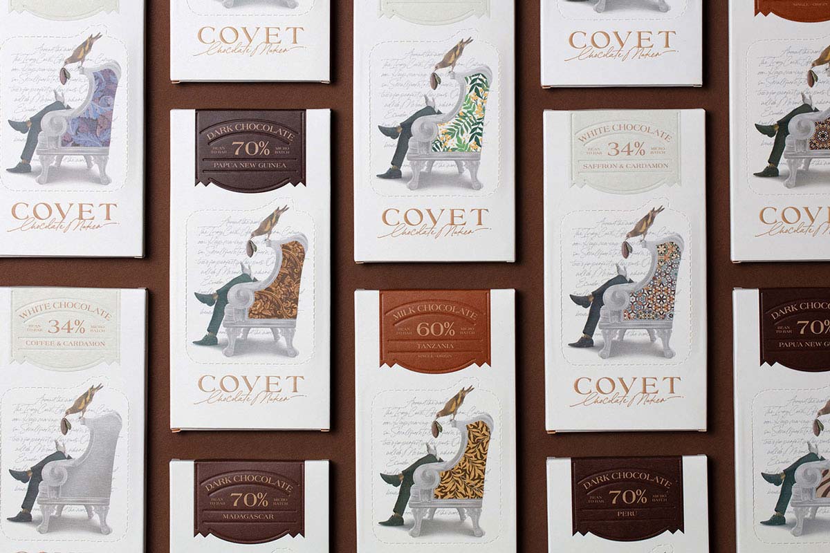
Our packaging process is probably the same as others. Taking the brief, then researching and finding some preferred references to work with, adding more original thoughts to your own work.
I reckon the challenge would be how to reflect the brief and make both the client and myself happy. Sometimes it’s hard, especially for FMCG products, there is so much info that needs to be included in a small package. Making it visually appealing as well is a challenge. The most common mistake is the file setup, I reckon. Better to set them up in the actual size. The tip is to look at a lot of references before creating, it helps a lot.
Larry Nguyen at Outfit Branding & Design – Creative Director
Outfit’s Website & Behance
Probably our most favorite thing about packaging design is seeing the actual completed packaging in the flesh. Seeing a design realized in a physical form is always such a thrill because it concretizes something that came from our very brains! Every project is a collaboration, and to see a design we’ve put so much thought, sweat, and blood into just makes the entire process so worth it.
Our least favorite thing about packaging design is maybe having to harmoniously integrate all the small print — barcodes, SKU numbers, certifications, copyright, etc — into the design. Of course, these aspects of the layout and visual hierarchy are extremely important, but it’s a little less fun than the creative, graphic aspects of designing packaging.
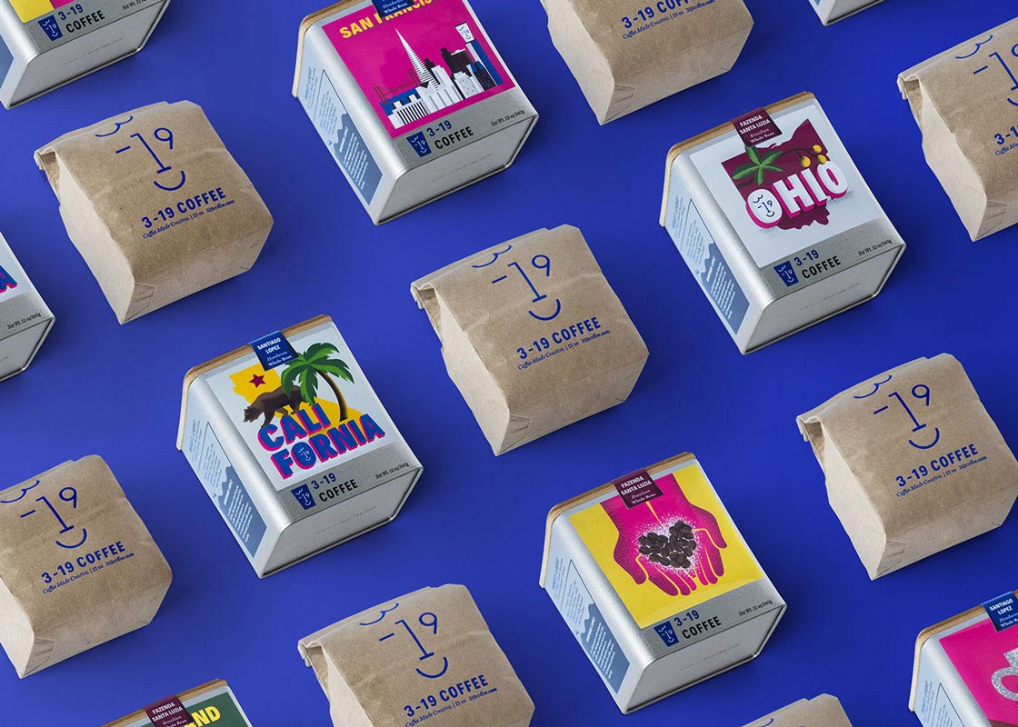
As we are primarily a branding studio, packaging design is usually preceded by a process of creating the brand identity through a strategy phase, ideation of logo and visual identity, and then establishing a clear, cohesive visual brand system. As packaging is often a primary touchpoint in communicating and representing the brand, this initial process is crucial.
Once the identity is set, we usually start with a discussion with the client about the project’s objectives and needs: for instance, where the product is going to be sold, what budgetary and manufacturing limitations there are, and what product categories will be included. Next, we go into a conceptualization phase, where we explore different ways to represent the product and brand. We look at graphics, materials, categorization systems, and form factors that may work. We then present usually two to three different concepts to the client. From the chosen concept, we flesh out the actual render of the packaging including the integration of all the necessary content like a copy, product titles, photography, barcodes, etc. When these renders are signed off, we then prepare the packaging for manufacturing, coordinating with any vendors to ensure everything is prepared according to their specifications.
It can vary for each specific project, but we work on very expansive product lines, it can often be quite challenging to create an effective categorization system in a way that is simple and easy to understand for the consumer yet also represents each category well and still works as a cohesive product line. This is where packaging design can be very interesting creatively because there are so many solutions that might work. Maybe you’re creating a system of colors that distinguish each product or category; maybe it’s a pattern, or a graphic element, or the shape of the packaging. It can be very difficult to find the right solution, but also very fun and exciting.
We’ve found that the most common mistake is trying to do too much with the packaging. We’ve been guilty of this as well when we first started out, where we felt a bit insecure and overcompensated by doing a “more is more” approach to the design, adding tons of illustrative aspects, many colors, and type to try and make the design “punch”. What we’ve discovered as we’ve gotten much more experienced is that the best designs that really stand out are the ones that are simple, clear, and don’t try too hard. They find a central “big idea” and visualize it in a thoughtful, curated way.
Lastly, focus on not only the product but also on the brand. Packaging often is not really about the product itself but about what the product does for the consumer and the story the brand is trying to tell. People have an emotional response to packaging, whether it’s calling out to them from a shelf or eliciting a sense of excitement and ceremony when opening a box. When we as visual communicators design to augment and clarify this story, it makes the product experience richer and more compelling.
Brada – Design Studio
The best thing about packaging design is that you can use shapes, materials, and finishes to communicate the right message. There are different ways to make a package for the same product and you can play with these possibilities so that the public perceives the product in a certain way, reflecting the attributes of the brand. The less fun side comes with the limits, for example, when the client’s budget does not meet the attributes that the packaging should have and you have to look for alternatives or materials that may not reflect the attributes of the brand as well.
When what you have in mind is very complex and difficult to reproduce, you have to run a lot of tests, consider materials you are going to use and how they affect the final measurements so everything fits perfectly and the packaging fulfills its function.
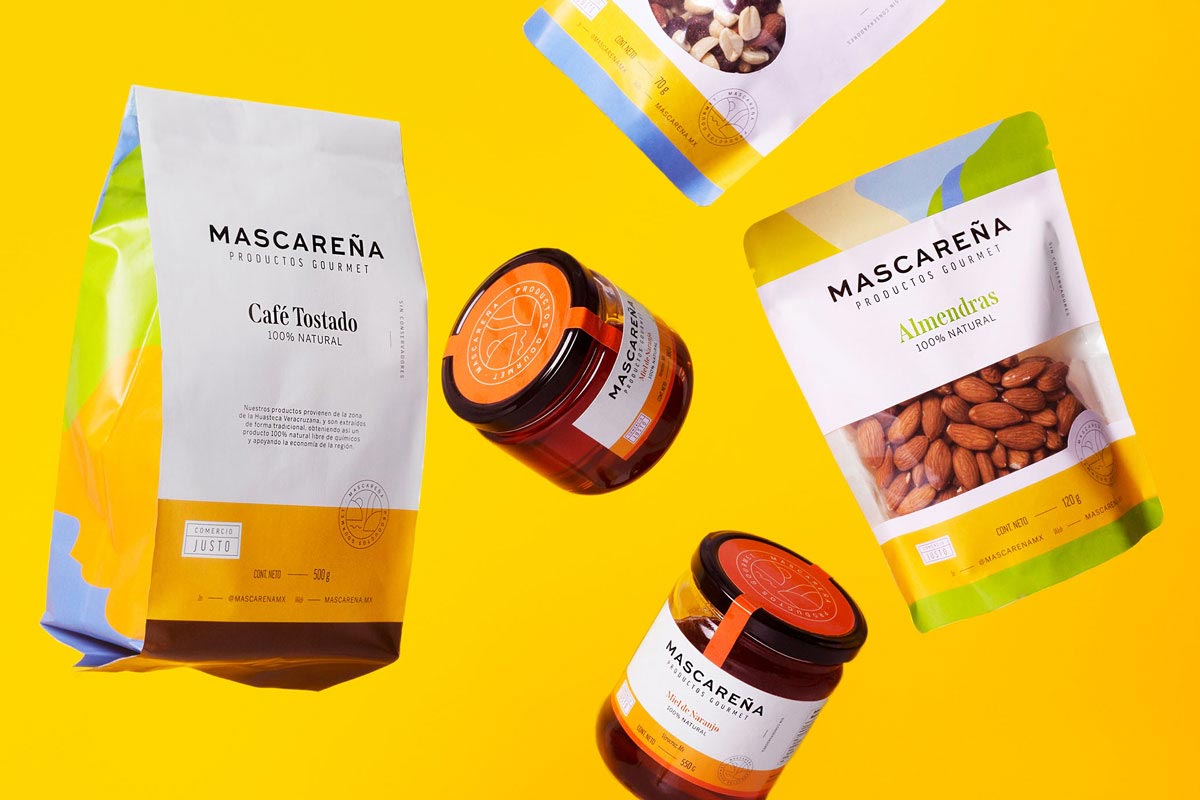
We start our process with a mood board with references of other projects that can give us an idea of what we want, from the shape of the packaging to materials and finishes. Then we run tests with the arrangement of the elements, sizes, materials and put everything together as a mockup to be able to have a closer to reality idea of what it would look like.
When this design is approved by the client, the last step is to make the blueprints and put them through tests to see that everything fits correctly and meets the characteristics that the product requires. These final tests are critical because we have the responsibility to make sure that everything works. Sometimes we do not have access to the final materials with which the packaging will be produced, so we need to make our best considering materials and then wait for the printing tests to be sure that everything is in order.
Many times we imagine complex packages that require many tests or adjustments, and sometimes we realize that they are not the best option for the functionality of the product. The simpler the solution, the easier it will be to produce. Before any sketch or idea, first, you need to think: What is this packaging for? What should we communicate? What will it contain? All these questions as a result will give you the path you need to follow in order to achieve the objectives of the project.
DAVYD Team – Design Studio
What we like most is to make an interesting design that is different. Create something special. We love it when we have the opportunity to develop the entire brand identity from the logo to the packaging. This way, we create a stylistically integral fully-fledged project. We do not appreciate very commercial solutions and for sure we don’t like restrictions on implementation in production as not everything that is invented can be implemented at a reasonable price.
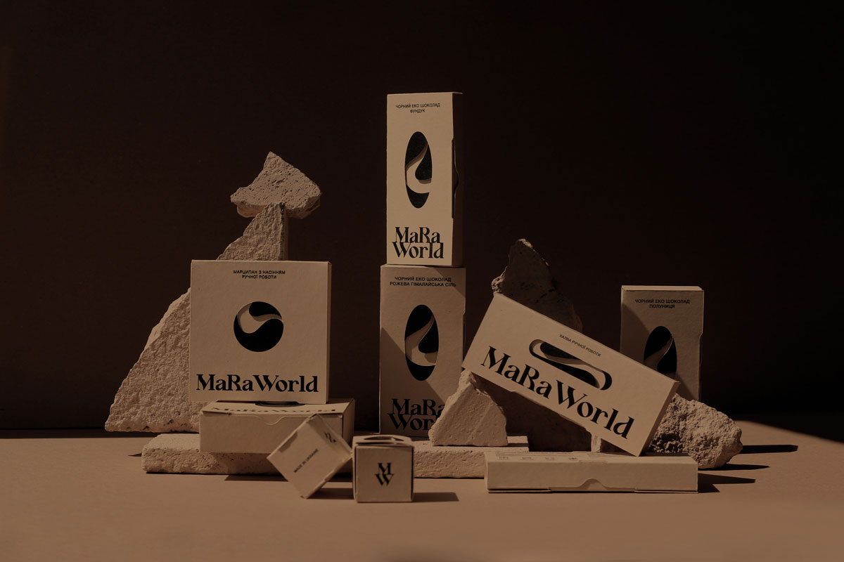
Mainly, our packaging design development process starts with a Packaging Design Brief and samples searching or processing of selected samples from the customer. We always look for real examples of what we will pack, checking out similar products or ones from the same sector. We look around, check what we use or see in the market, try to test and analyze it. If a package will have a cutting layout, we make paper layouts to find the best solution. Then we make a 2d visualization in Adobe Illustrator for the presentation of a general concept. Then we have to discuss the possibilities of technical implementation of this proposal. We agree on all the nuances with the customer and the manufacturer. At the final stage, we prepare layouts for production and final 3d visualizations. The hardest moment is coordination of opportunities with production and design editing, finding a compromise between an interesting unique solution and what can be made by the contractor. The biggest problem is always the collision of the “desired picture” with the “reality”: manufacturing capabilities and budget of the customer.
Usually, the difficulty arises when the customer at the beginning of the development of the packaging does not provide the final textual information and full requirements. During the final preparation of layouts, there can be difficulties that influence the whole concept like having to rework the design, looking for a place for barcodes or markings, and so on. One of the mistakes can be an inaccurate or not very detailed brief. A clear task at the beginning greatly simplifies the whole process of creating a packaging design.
The main advice for beginners can be about testing your package design by all possible methods — look for similar samples of packaging, analyze what is convenient and where the innovations are. If there is a possibility — create prototypes, work with the materials. This facilitates your work and gives a positive result.
Jo Cutri – Art Director
Jo Cutri’s Website and Behance
My favorite thing about packaging design is how it becomes the face of a product and how we recognize it. We identify products by their packaging more so than what’s inside them and it’s a joy to work with brands to develop these designs and bring their products to life. My least favorite is the manufacturing opportunities and logistics for many brands that we work with. New brands want unique packaging designs and product vessels, often these concepts can lead to requiring custom designs and working with multiple manufacturers who are often located overseas. The cost for many clients becomes too exuberant and will often lead to selecting more generic style packaging.
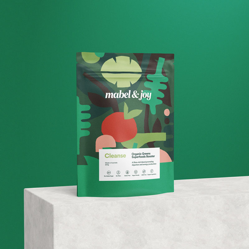
After liaising with a client about a new product design through the briefing stage, I will begin to develop concept designs. By this stage, we have usually developed some sort of direction and work on a range of concepts to present to the client. As we progress through each round of revisions, concepts are eliminated until we have settled on a final design. From there, the designs are applied to the packaging templates and set up for printing. As simple as what a final packaging design may be in your hand, there can be many challenges throughout the process to get a product to that stage. For brands with multiple products, especially with different vessels, there is a challenge to apply the brand themes across each product whilst dealing with the difficulties each unique vessel brings and balancing this so the final strategy is effective across the entire range and for future products.
Whilst these are not quite mistakes, they are simple things that other designers can often miss and things I would encourage new designers to always consider. I find some designers can often focus too much on the singular product design and not pay enough consideration to how the packaging looks like as a range on the shelf together. There is a stronger impact that can be made and can help you stand out against your competitors. I also find that a lot of product packaging will have a great front design, but there has not been the same consideration applied to the sides or back.
Final thoughts
For starters, I couldn’t be more grateful for these great responses to people who shared them with us. You are amazing, thank you so much for that! I definitely encourage you to go check out their work. And, if you have not read Part I yet, give it a shot. You’ll like it, I promise — I very much enjoyed working on it myself.
In conclusion, there is no more rewarding and awesome feeling for a professional than being able to see their work perform and be appreciated. It has its own charm in the packaging industry — a thing that only exists in your mind or in a computer as a draft becomes so very real that it gets in front of thousands of people’s eyes, and you can actually see how they react to it and interact with it. Bearing this in mind can create both great inspiration and focus on the client’s needs that are so very crucial in a designer’s work. I hope this is what our article helps you to achieve.
Of course, we would also like to know your opinions, so if you feel like sharing you can contact us here or via [email protected]. Now I wish you a very creative day or night. Or just a good one if you are now taking a break from your work!
Till the next time!

 TEAM SOLUTIONS
 WORKFLOW SOLUTIONS


 REVIEW TOOL
 PROJECT MANAGEMENT
 TOOLS & INTEGRATIONS
 CLIENT INTERVIEWS


