Hi there! How are you doing? I know you are getting more and more tired of coronavirus, quarantine, pandemic, and blah-blah-blah. Let’s wind down a little bit and continue on a somewhat forgotten category on our blog – the identity of famous brands. In this article, it’s going to be Nike.
The very first sneakers I bought for my first earned money were a pair of Nike shoes. Oh God, how ugly they appear to be now, jeez. However, since then, Nike has been one of my favorite brands that I love, respect, and…well, I have something warm in my heart reminding myself of that pair of acid-green 90’s Air Max sneakers. Furthermore, I tried to draw the swoosh everywhere on my things so they could be branded. Soapy, isn’t it?
Nike company is one of the most successful brands globally, and every ad, campaign, and even small move is always heartedly discussed. Why? They are successful and catchy; they know how to have people involved and excited. But still, talking about this road from rags to riches, we always miss one detail – Nike brand strategy. The Nike Swoosh and slogan ‘Just do it’ are some of the best in the history of sports and marketing, but how did they come to life?
Brand Story of Nike
‘64-’79: Asics is Nike!
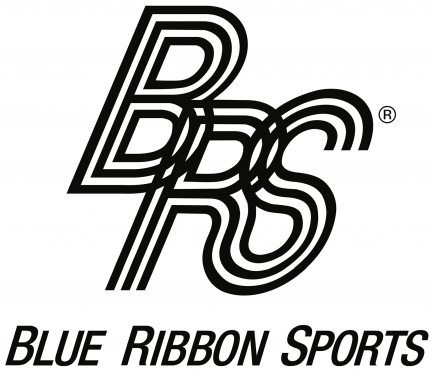
Have you heard about ASICS shoes and sportswear? Phil Knight and his coach Bill Bowerman first started their company as distributors of ASICS brand items. It happened in 1964, and the company name was Blue Ribbon Sports. By the way, here is their logo:
In 1971, the upcoming Nike company had outgrown Asics and that year was a year of rebranding: official swoosh and brand were established. The very first officially accepted logo looked like that:
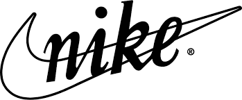
The logo was drawn by Carolyn Davidson – the University of Oregon student where both Phill and Bill studied. At first, guys did not like the idea of using such a swoosh. Why? Just because. There was no particular reason, which is a good reminder that sometimes you should leave your personal taste out of design matters. And that is, fortunately, exactly what Phill and Bill did later.
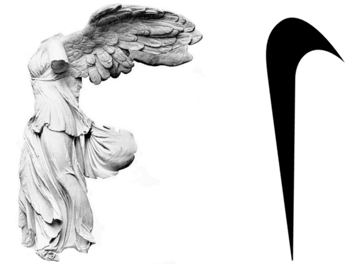
Interesting fact: None of the founders were designers, and thus, they asked students to come up with a logo idea. Try to guess how much they paid for the Nike logo – just take several seconds to choose some number. Figured it out? Okay, sooooooo here’s the drum roll… $35 only! Yep, the company with a revenue of $39.1 billion (in 2019) bought the identity, which is now famous all around the globe only for $35. The author was paid $2 hourly. If to interpret these 17.5 hours to modern prices, the logo price would be approximately $200. This is still extremely cheap!
Talking about substance, what does this branding mean? It originated from Greece’s god of victory – Nike. Since they wanted to produce sports clothing and shoes, this story felt inspiring and sat well with company owners in the end. As you can see, the swoosh reminds me of the goddess’ wing. With the logo ready, the only thing to figure out was the process of building a strong brand identity.
Could they have spent less time working on the logo?

Yes, by using Approval Studio, they could
Start a Free Trial’78-’85: Futura Bold Condensed Oblique
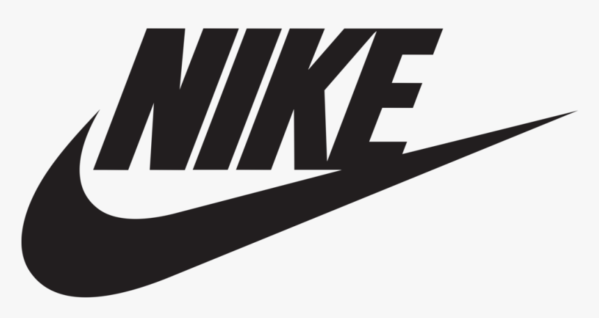
After 7 years of raising brand awareness, Nike decided to implement some changes. First of all, they have made the logo more modern and gave it a better proportion. Nike designers changed the font to Futura Bold Condensed Oblique with minor other alterations. Why did Phill and Bill change the identity of a brand taking 50% of all sports goods and clothing of those times? Just to make more!
Since the naming and logo were mixed, the founders decided to modify the identity and make it more memorable and comprehensive. They put the naming above the swoosh to be easily readable and united the last letter with the tail. Also, big letters were used to make it more ‘shouting’ so the brand design could be easily noticeable.
‘85-’95: The Red Square and ‘Just Do It’
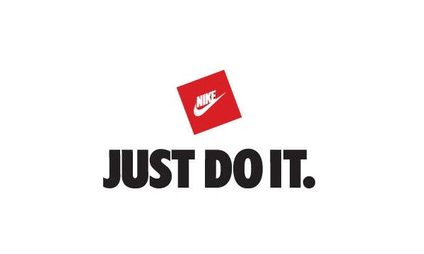
In those years, the only change the company made was the square. Yep, an extremely well-known logo appeared in a red rectangular shape for the first time.
At the time of those changes, Nike started a huge advertising campaign signing big sports celebrities, and one of them was a basketball player Michael Jordan (who later became the founder of the Air Jordan brand). Some people rumored that Michael and his team Chicago Bulls influenced this ‘square’ change since the star was Nike’s priority.
Also, the new branding idea was announced in 1987. The ‘Just Do It’ slogan was a history breaker since Nike had tough times trying to win the war against Reebok. Spoiler alert, they obviously won!
‘Just Do It’: the murderer and first lady who inspired Nike
Why have we decided to choose this slogan to discuss? Well, this is the most legendary and famous one that Nike has made, and it has a peculiar history of its creation. And I bet that you have a friend who wore a t-shirt with the slogan or you had it yourself.
The slogan was introduced in 1987, but the idea had come ten years before this. Have you ever heard of Gary Gilmore? He was a person who killed 2 people and became the first person in the US who was sentenced to death in a 10-year period (1977). His last words before execution were ‘Let’s do it’.
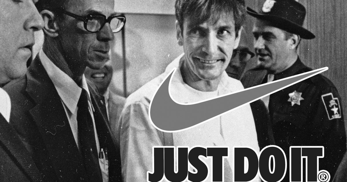
However, no one paid real attention to that. Ten years later, even though Nike had already signed Michael Jordan, they had some tough times. As we have mentioned before, Reebok was the main competitor and a serious threat to Nike’s sports brand crown. Thus, Nike needed something new to win all the attention in this marketing war.
Coming back to the murderer, Dan Wieden – Nike’s advertising executive – could not forget this event since his company was based in the same area where the sentenced man lived. Brainstorming ideas for the new slogan, he noticed the campaign run by Nancy Reagan – ‘Just Say No.’ He made up those two phrases and… boom! You already know what happened and who developed one of the coolest marketing catchphrases of all time.
After the slogan’s creation, the executives had to choose the person to lead the new campaign. Despite Michael Jordan being a superstar and seemed an obvious choice, he was not the first to become the face of the ‘Just Do It’ campaign. It was an 80-year-old marathoner, Walt Stack. Nike has made a funny commercial with Walt that went viral. After the video went on TV, the company started to receive tons of emails every day with similar stories from people worldwide. Let’s take a look at the original ad:
‘95 – today: The Swoosh
In 1995 the logo was finally redesigned, and today we can see only the swoosh:

Do I need to explain the importance of brand image? Talking classics, ‘I’m loving it’ (I wish McDonald’s paid me for this, haha). I really love this variant of the swoosh the most. It’s simple, clear, and, what is the most crucial, extremely memorable. Also, it allows you to make tons of customizations and manipulate it however you want. For instance, you can look at what rap star Travis Scott and Nike made together. Reverse swoosh is a simple but extremely successful decision:
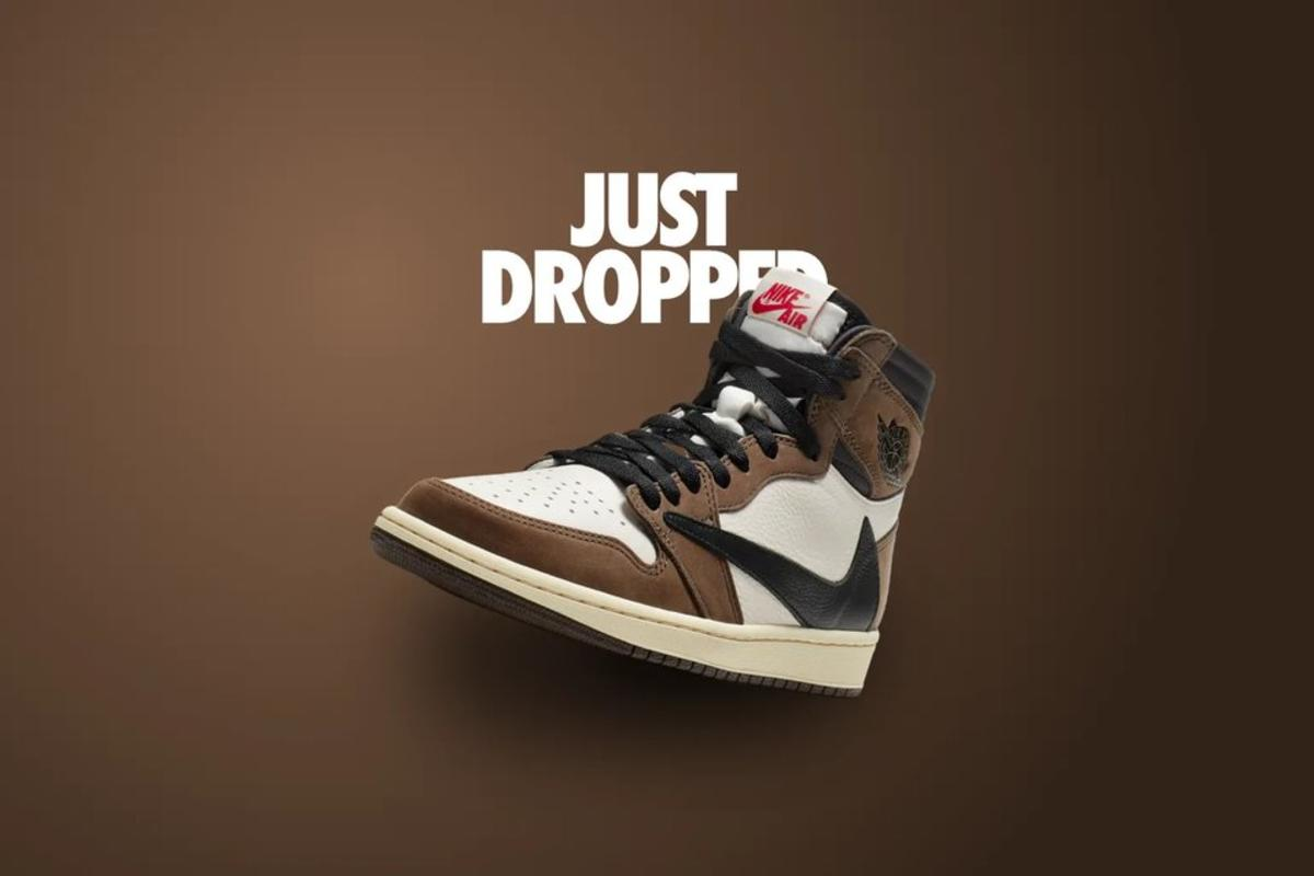
To my mind, the red square could make it troublesome to come up with variations that may work out for modern customers. However, Nike left the red color and still implements it in many of its designs. Generally speaking, Nike brand positioning now is the minimalistic logo that means victory and speed, athleticism, and apparel quality.
Best Nike Advertisements
Digitalization and the demand for something beautiful force every single company to be as creative as possible. Nike is not an exception. They are among the leaders and trendsetters in marketing strategy nowadays who developed great digital marketing campaigns and managed to base them on the coolest ads ever. Let’s check some of those which impressed their target audience.
Bo Knows (1989)
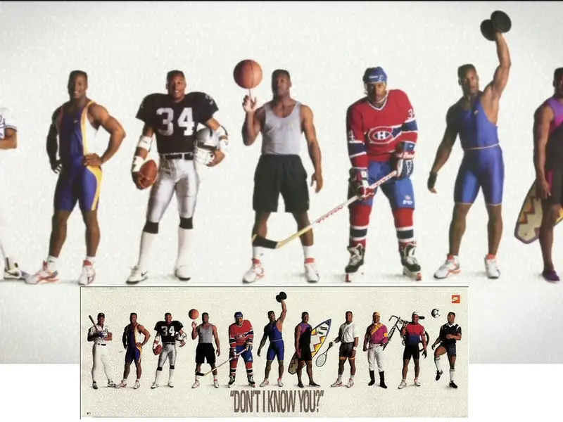
Do you know Bo Jackson? Bo knows! The commercial came out in 1989 and became extremely viral. Bo Jackson was an athlete who could play both baseball and American football professionally. Having such a person, Nike decided to create a fun ad, emphasizing Bo’s versatility.
Phone Ads (1995-1997)
This one is among the best-printed ads Nike has ever created. It was so good that no other commercials were needed. The main idea was to create a set of sneaker posters with their number. When you call a specific number, the celebrity or athlete’s recorded voice tells you the details about the pair and its peculiarities. Simple, good-looking, and creative ad. Approved!
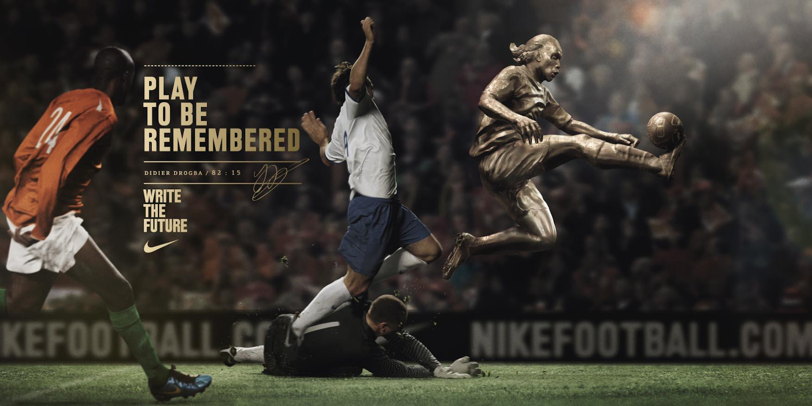
Nike Football: Write the Future! (2010)
This is one of the posters of the ‘Write the Future’ commercial in 2010 that truly shows brand identity. It was one of the commercials that I watched with my breath held every time. What is more, the posters are great, and I love the idea of depicting stars as statues that are moving. This shows us that every move of Nike athletes becomes legendary and memorable. Great commercial as a video ad and as a design creation.
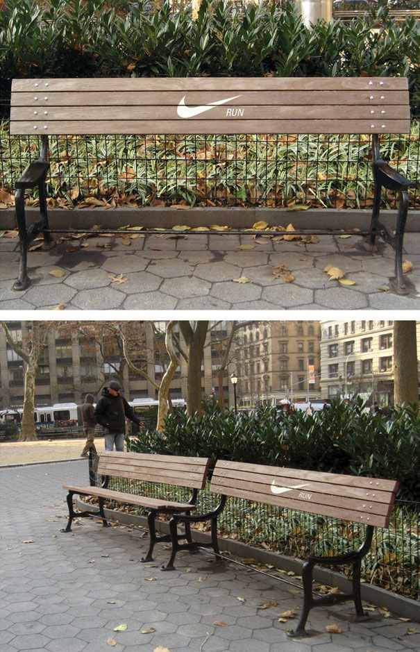
Nike Bench (2012)
How do you like this one? Modern problems require modern solutions! Creative piece of advertising that will stay in my mind till I die. Every time I am running and see benches, this ad straight appears in my head. A creative commercial that is memorable even with no celebrities starred.
The last few words
Nike products are essentials because it is a strong global brand that has remained the best one in the world for decades. They prove it in different ways and spheres. Starting from the r recognizable logo and ending with catchy commercials, the company proves its superiority and creative potential. Their revenue is almost $40 billion. Most star athletes have a contract with Nike: Lebron James, Michael Jordan, Cristiano Ronaldo, and many more. Nike has even a unique history: logo for $35, redesigns, tough times, murderer’s influence, and first lady who inspired the naming of the best Nike’s campaign. What does such a company need? You are right; perfect branding. Hmm…wait a minute…

 TEAM SOLUTIONS
 WORKFLOW SOLUTIONS


 REVIEW TOOL
 PROJECT MANAGEMENT
 TOOLS & INTEGRATIONS
 CLIENT INTERVIEWS


