Comment on any area of mockup using annotations

Use a precise and informative design feedback tool with 5 annotation shapes to avoid communication chaos in your design approval process.

Highlight the area that needs feedback

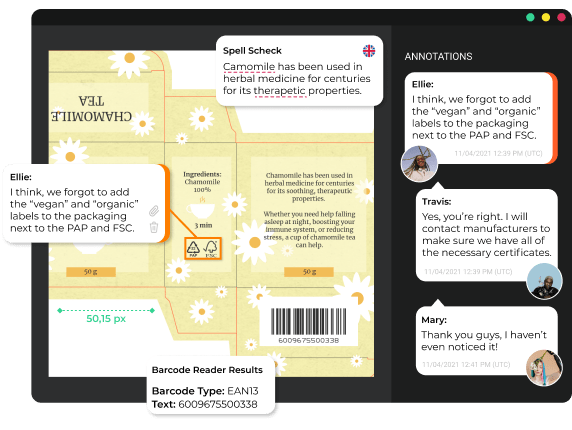
Approval Studio is an online design proofing software with 5 different annotation shapes that allow you to mark up a specific area of design. With this feature, giving design feedback will always be easy, without any miscommunication and unnecessary tedious clarifications via email.

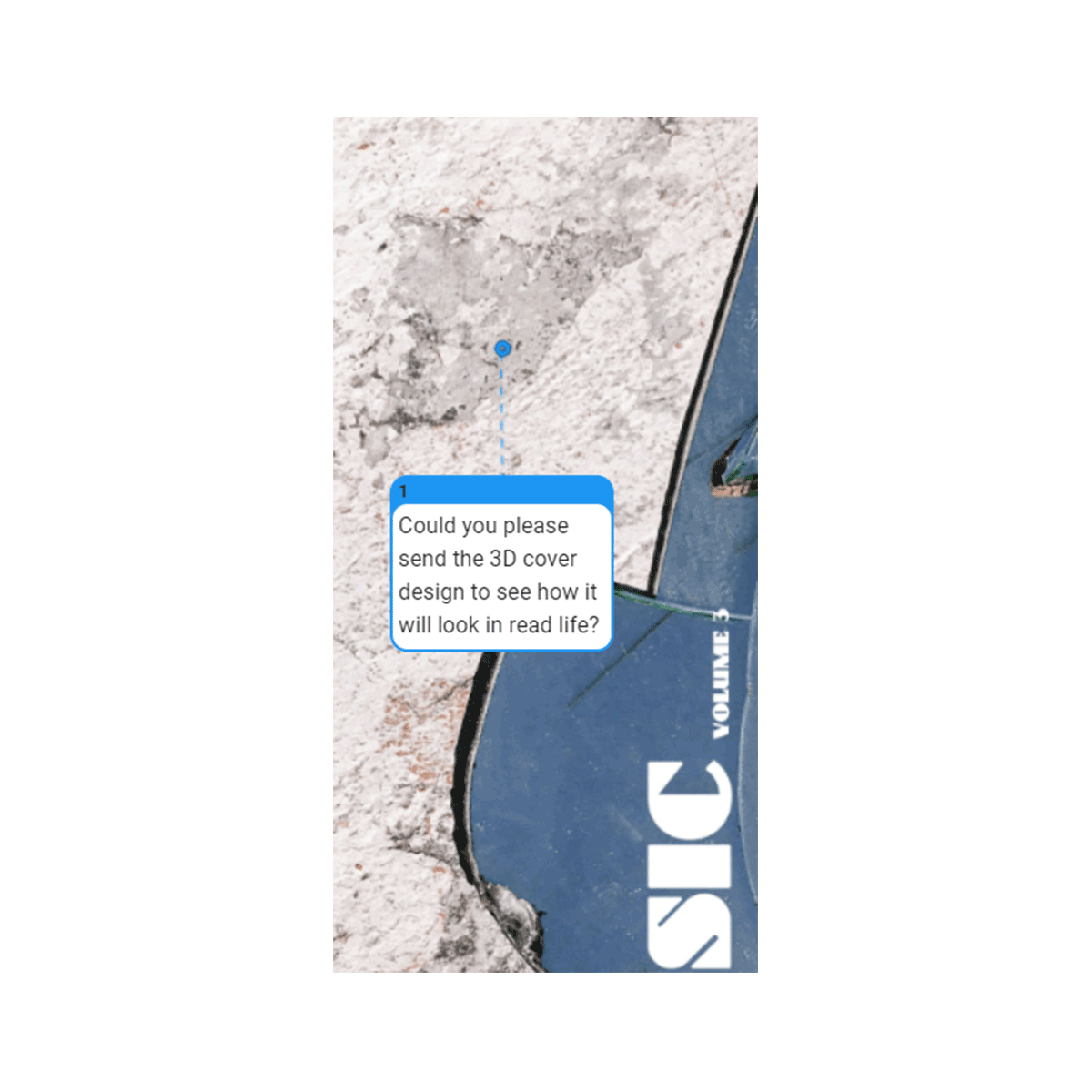
Point


Point is created for marking the smallest elements of the mockup to show the precise spot that needs to be fixed.

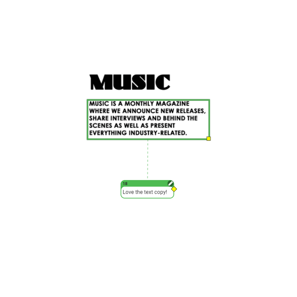
Square


Square is useful for rectangular-shaped elements that can often be seen in magazines, posters, ads, and text-filled layouts.

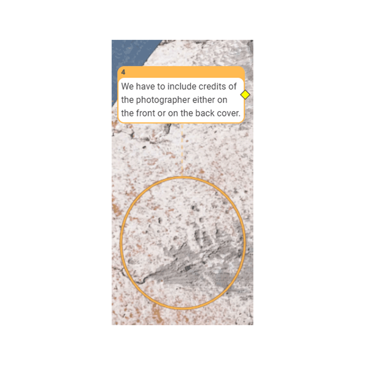
Circle


Circle might become handy with elements of design that have an oval shape.

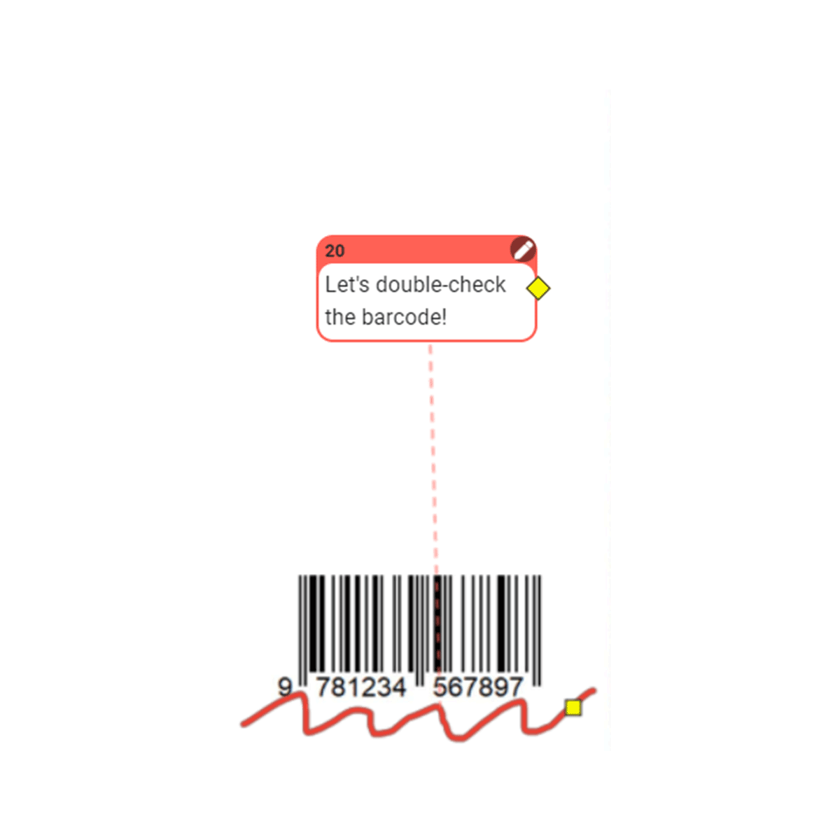
Free Form


With the help of the free form, you can become a bit more creative and do some drawing to highlight the area that has a specific uneven shape.

Arrow


Arrow will let you point to a certain direction right on the artwork, targeting a specific element that needs your  reviewer’s attention.

Point

Point is created for marking the smallest elements of the mockup to show the precise spot that needs to be fixed.

Square

Square is useful for rectangular-shaped elements that can often be seen in magazines, posters, ads, and text-filled layouts.

Circle

Circle might become handy with elements of design that have an oval shape.

Free Form

With the help of the free form, you can become a bit more creative and do some drawing to highlight the area that has a specific uneven shape.

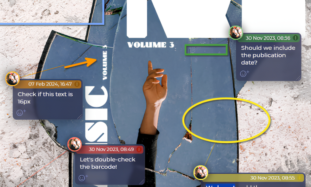
Commentary Panel

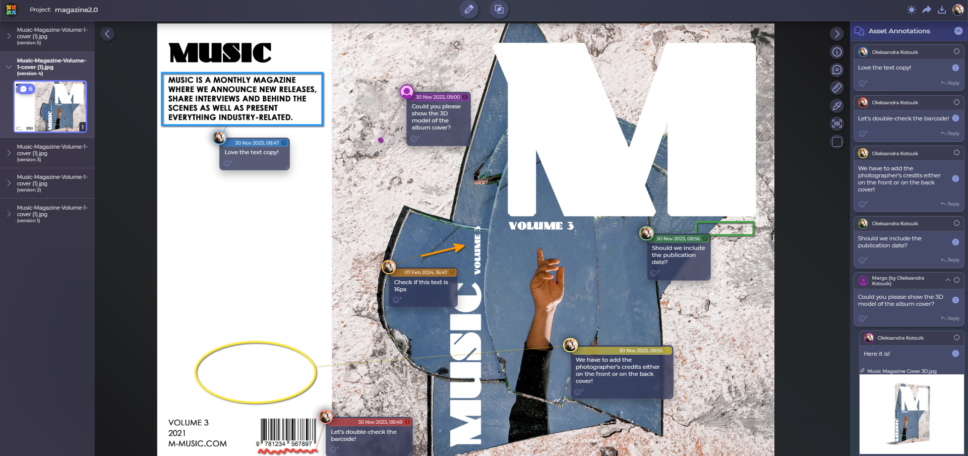
As soon as you add them, all your annotations are also visible in the comments panel to the right.

Review with Team

It is a tool with many new options and possibilities that can be very useful in your online review sessions. 

Mention Teammates

You can mention your colleagues in the comments to discuss some specific annotations in the artwork.

Make it stand out

In online design proofing, it is very useful to make your annotations differ from each other to highlight that they refer to different elements or are made by different reviewers. Each comment already has its number, but you can go even further and change its color.

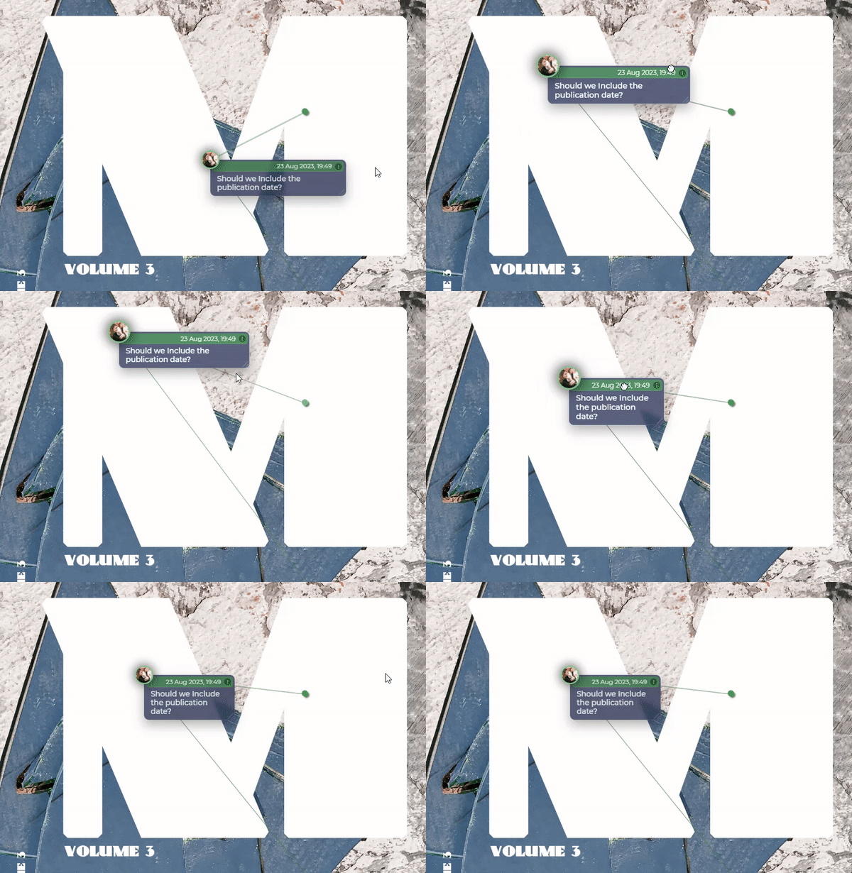
Move and resize

Each annotation shape can be moved around after it is added if you need to slightly fix its position. The size can also be adjusted — basically, you are working in a design review sandbox!

One comment to rule them all

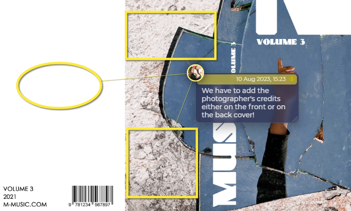
If the design layout has a similar mistake repeating itself several times, there is no need to add a separate annotation to each of them. It is enough to create one comment and then connect it to other areas that need your feedback.


Hide (but don’t seek again)

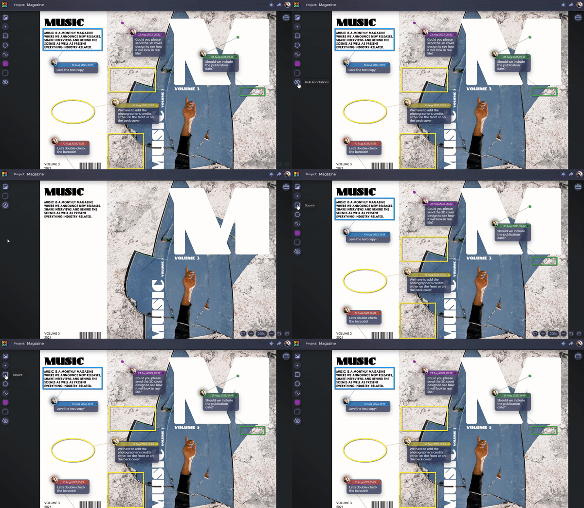
If you need to get back to the original look of the mockup to check if you haven’t missed anything else, having multiple design annotations on the layout can be a little distracting. Using one button, you can hide all annotations and then show them again when you want to come back to them.

5 flexible 

annotation shapes

Precise and clear design feedback

Full-power design review software

Attach 1 annotation to multiple areas

There’s no need to clarify
design feedback all the time.

Discuss designs freely and
Forget about the refresh button.