 TEAM SOLUTIONS
 WORKFLOW SOLUTIONS


 REVIEW TOOL
 PROJECT MANAGEMENT
 TOOLS & INTEGRATIONS
 CLIENT INTERVIEWS


Post is also avalible in:
![]()
![]()
![]()
Color is by far the most discussed topic in the creative industry. Yet, it’s also quite controversial and vague. There are so many various theories that try to explain how it works, its positive impact, color theory, how to use it, what the associations and perfect color combinations are.
A lot of artists believe that mastering the art of color is one of the top-level design skills, and I totally agree with it. Being under the influence of this topic, I am going to talk to you about some of the worst, in my opinion, color combinations and why they don’t work in most cases.
Yet, at first, let me get this straight: any vibrant color is beautiful, but it all comes down to a matter of how we perceive colors because not all people see the right colors the same way. Why do certain people like certain hues and others don’t? To my mind, it’s all about the associations that these colors evoke. Some people might associate light cyan with the color of the clear sky; equally, for some, it’s just a color of the hospital walls. Also, the important factor is how we use the colors and how we combine them, as some of the combinations might have an opposite effect.
Disclaimer: This article is just an opinion piece only, and it’s not intended to offend somebody’s taste or choice of color. The way you see colors might be different from the way we see them. Thank you for understanding!
Table of contents:
Single Color
Before we start talking about the worst color schemes, it’s worth mentioning that there is actually a “world’s ugliest color”. Pantone 448C (hex #4A412A) is also known as opaque couché or dark grayish olive.
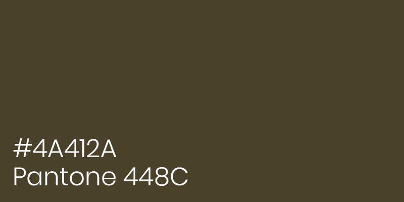
This name is not just somebody’s dislike of brown hues but rather a research-proven conclusion. The market research company Gfk Bluemoon was commissioned by the Australian government to conduct a survey and create the most unpleasant cigarette packaging that would prevent people from buying it. After some time, almost 1000 smokers stated that this color is associated with ‘tar’, ‘dirt’, and even ‘death’ (Source: Evening Standard). Not the most tempting associations, for sure.
As one of the researchers, Victoria Parr, said: ‘‘We didn’t want to create attractive, aspirational packaging designed to win customers … Instead our role was to help our client reduce demand, with the ultimate aim to minimize the use of the product.’’
(Source: The Sydney Morning Herald)
One would argue that this color is the ugliest, but this is just another proof that color is extremely subjective. However, the associations with cigarette packaging are hard to beat, especially for smokers that are used to seeing opaque couché alongside deadly warnings.
If you would like to avoid using the opaque couché or any other unsuccessful color combinations in your design, make sure to check out Approval Studio. With a high-resolution asset review and 4 compare modes, you can always compare two versions of the design in order to pick the best color combinations. Check Approval Studio now and get a 14-day free trial to see all the features by yourself!
Now, let’s move on to the worst color combinations and why you should avoid them in your design and art.
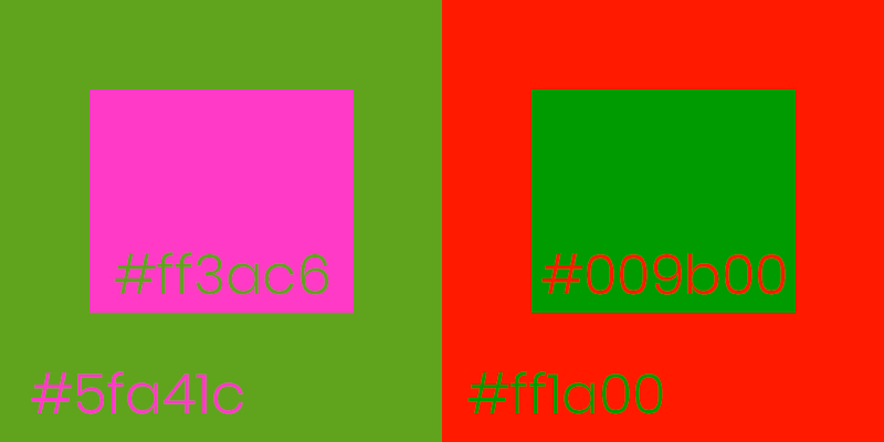
Neon and Neon
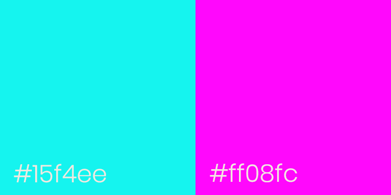
Neon colors are known for being eye-catching, bold, and daring. However, with such distinct qualities, they are also referred to as disturbing and reckless. Because of these two contradicting sides, having two or three neon colors alongside each other is not the best of options.
Usually, having two (or more) neon colors results in them fighting for your attention, meaning that, in the end, it’s just hard to concentrate on any of them. Also, it’s just painful for some people to look at a bunch of neon colors in one go because it hurts their eyes. Not the best way of transmitting information if you ask me.
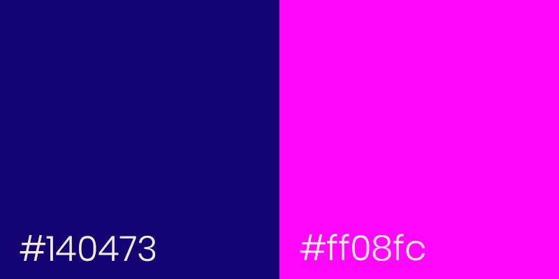
The best solution would be to use a toned-down right shade of one of the colors. As you can see in the picture, the neon cyan color was switched to dark indigo blue. In this way, you will be able to use neon pink as a statement color and don’t overstimulate the viewer. Moreover, in such vibrant color combinations, the neon would be powered by the lightness or, in our case, the darkness of other colors to make use of its best qualities.
So, unless you are Andy Warhol or any other pop-art representative, using only one neon color is a safe move.
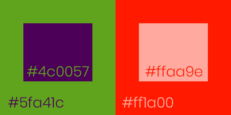
Dark and Dark
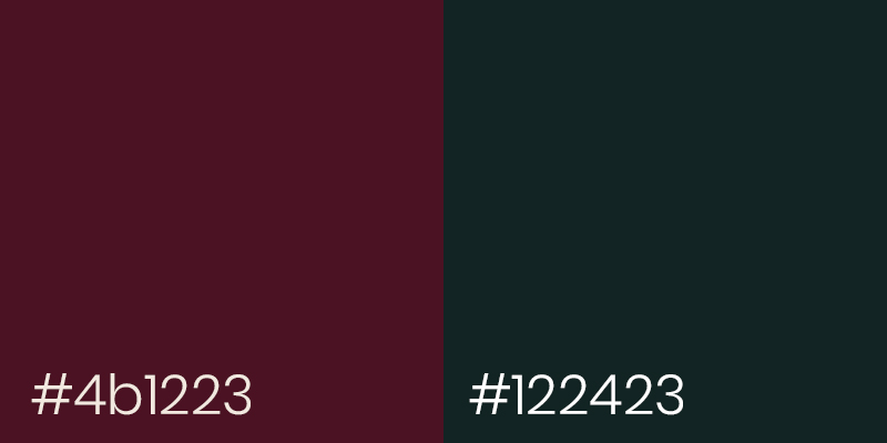
The exact opposite of the previous pair is dark with dark. This color combination is a friend to the ugliest color in the world (Pantone 448C) because it has a similar effect.
The effect of disturbance and disarrangement as if something is wrong, but you are not sure what exactly. On the one hand, it has no distinct mood, and it’s hard to notice something. On the other hand, when you do notice the colors, it has no point of visual interest. You would probably want to skim the piece and move on.
Let me explain: dark colors usually don’t have the most pleasant associations – death, depression, blood, you name it. So, a couple of them in one place emerges the viewer into the darkest feelings that they personally associate with these colors. And not just one, but all together as an unidentified heaviness. That’s why dark with dark color combinations are best avoided.
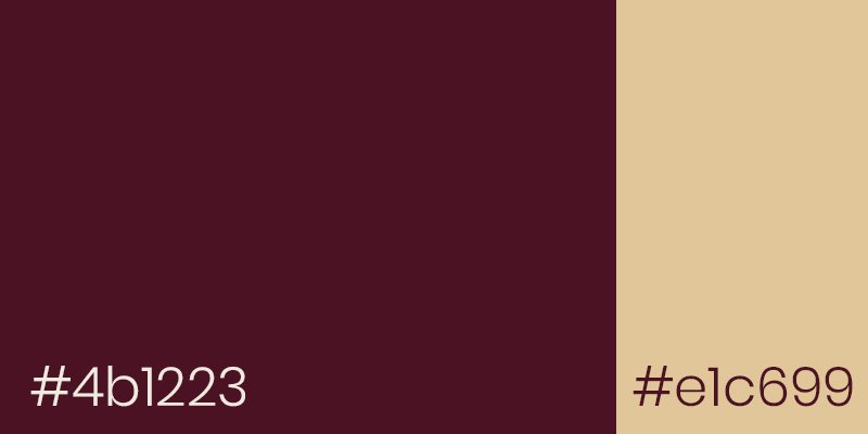
But what if I want to make my design dense and dark? If it’s something you are trying to achieve, use one dark color but in large quantities with a smaller amount of light and contrasting color. For example, a pairing of midnight black or dark burgundy with light beige in a 70 to 30 proportion should do the trick.
Cool and Warm
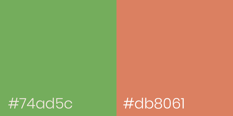
You might be wondering, how come cool and warm colors make a bad combination. We all know the rules of complementary colors and how they look good together. Green goes well with magenta and blue looks great with yellow. And I agree with that – complementary colors make a great base for color palettes if you know how to use them properly. However, let’s move to a more specific sphere – interior design and see how complementary colors react in the environment.
As we have already mentioned, colors have different moods and associations, and they influence us even more when we are placed in a room filled with certain hues. For example, a living room with marigold orange walls would bring a sense of coziness and playfulness. On the contrary, a bedroom with navy blue decor would create a refreshing and calm ambiance.
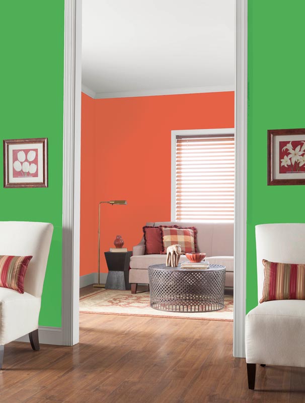
So what would happen if we were to mix the two polar opposite atmospheres? They will clash and look quite hideous. Needless to say that a person would also feel quite unsettled in such a space. Possible solutions would be to change one of the colors in the pair for a more appropriate counterpart – an analogous color or even white or black.
Before we move on, a slight reminder that you can avoid all kinds of problems with bad color combinations if you set up a straightforward design review and approval process. Approval Studio is just the tool for that that will also help you to find differences between the versions, track project history, and collaborate with clients quickly and seamlessly instead of mundane email back-and-forth that takes far too long.
Vibrating Color Combinations
Similar to the above-mentioned point about neon colors, we have another “fighting for your attention” unique combination — a huge design “no go” – vibrating colors. So-called vibration happens when two bold similar colors (usually with the same intensity) are placed next to each other. They create an impression of movement: some flow on top of each other, and others resemble a dent.
It goes without saying that reading the hex codes above in vibrating color combinations is impossible without getting watery eyes. Even so, people who have color blindness will have problems with reading the inscriptions because of the same color intensity. If we change the vibrating color combinations into the black and white mode, the inscriptions are hardly noticeable. That’s why these color combinations are so highly avoidable in any field of design.

Overall, it’s not only painful to look at these saturated color combos, but also the moving sensation might be very disorienting. Especially in web design, where convex shapes might signify a button or other system elements. More than that, legibility plays a pivotal role in navigation and overall understanding in any type of design, so having these bright colors that make you look away is not the way to go. Thus, I would suggest changing one of the colors completely if it’s impossible to omit the duo altogether.
Conclusion
On the whole, it’s not about the color itself; it’s about the things that are associated with this color and how it works in specific color combinations. As we have discussed, neon pairs and vibrating color combos are just too aggressive to the viewers’ eyes, so that instead of attracting their attention, these colors put them off. As for the only dark color combinations, the associations, and feelings that these colors evoke come into the play.
Also, it’s crucial to evaluate the environment in which the combinations are used. A warm and cool tone mixture doesn’t work well in the interior design, and vibrating colors are extremely deceiving in web design. Making sure that your chosen qualitative color scheme transmits the message you intend them to and in the most comfortable way possible for the viewer is the safe path for the designer.
Take care!

4 Responses
Red and green aren’t complimentary. Neither are yellow and purple. Yellow and blue, red and cyan, green and magenta are the major complimentary colour sets. To get red and green to be opposite each other on a colour wheel you have to use the incorrect pigment primary colours of red, yellow and blue rather than the actual primary pigment colours which are magenta, yellow and cyan.
Yes, you’re totally right. The correct subtractive color model includes cyan, magenta, and yellow. We’ve actually discussed this question in more detail in another blog post about color harmonies.
Thanks for pointing this out!
All really depends on what is being painted. Olive green is a great color.
Of course, context is vital here! I really didn’t want to blame any of the colors, just concentrate on the misuse.