TEAM SOLUTIONS
 WORKFLOW SOLUTIONS


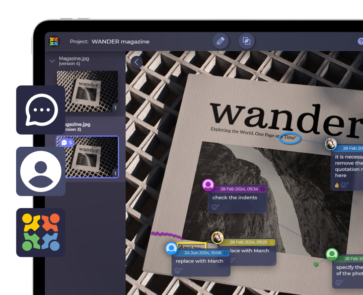
 REVIEW TOOL
 PROJECT MANAGEMENT
 TOOLS & INTEGRATIONS
 CLIENT INTERVIEWS


Post is also avalible in:
![]()
![]()
![]()
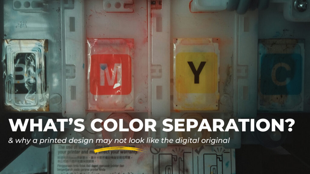
What you see on screen isn’t always what you get in print. And I had to learn that lesson the hard way. You see, my ignorance has once spoiled a gift to my dear friend.
For her birthday, I decided to turn our local joke into a custom print T-shirt. Having come up with a design, I ordered it from a printing agency. Being quite self-assured in my editing skills, I decided to uncheck the box suggesting some color correction. I mean, don’t you mess with my artistic vision! Result? Let’s just skip to the day before the party, when the T-shirt arrived and turned out to be off-color.
No need to say I had to reorder the printing and delay my gift, feeling like a lame friend. Or, perhaps, I need to reconsider my gift preparation time frames… Either way, in the end, the T-shirt did come out all right. Because the second time, I checked that box.
RGB vs CMYK
My custom T-shirt looked awesome on screen because the colors were depicted in RGB mode. RGB stands for Red, Green, and Blue. These are the three colors of light your monitor combines to create every other color you see on the screen. This is an additive color system that works with light. In contrast, printers work with ink that requires a subtractive color system, known as CMYK. Once Cyan, Magenta, Yellow, and Black (Key) meet white paper, they absorb certain wavelengths of light and reflect other colors.
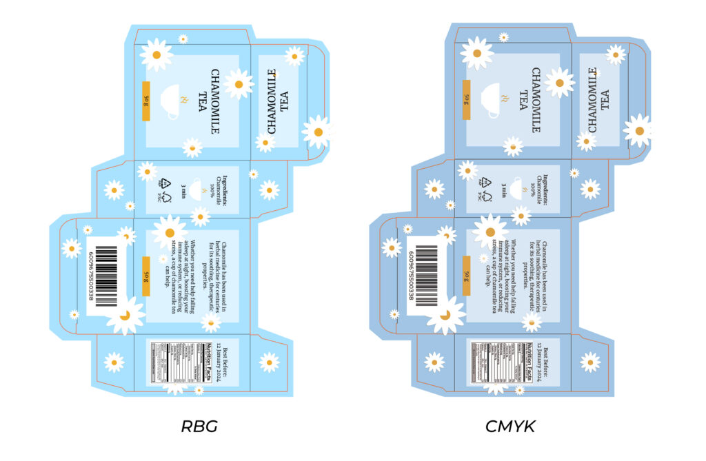
The catch I fell victim to is that RGB can display colors that CMYK simply can’t reproduce with ink. That’s how the neon green on my design turned into the color of dull grass once printed… Please, don’t be like me and translate RGB colors to physical ink ones before printing. How? The answer is color separation.
What is Color Separation?
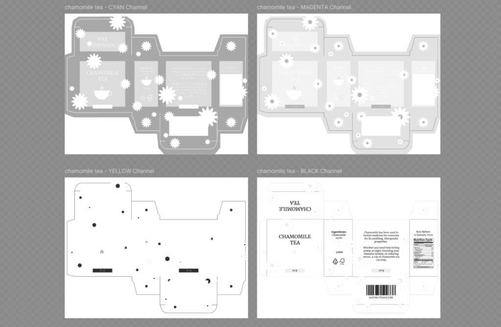
Fundamentally, color separation is a process of breaking down a full-color design into individual color components. That way, they can be printed separately and then layered to recreate the original image.
In traditional printing, color separation is crucial because most methods can’t reproduce colors simultaneously the way a computer monitor does. Instead, printers create colors by layering inks, one at a time. Each color in your design, therefore, needs its own separation. It tells the printer exactly where that specific color should go.
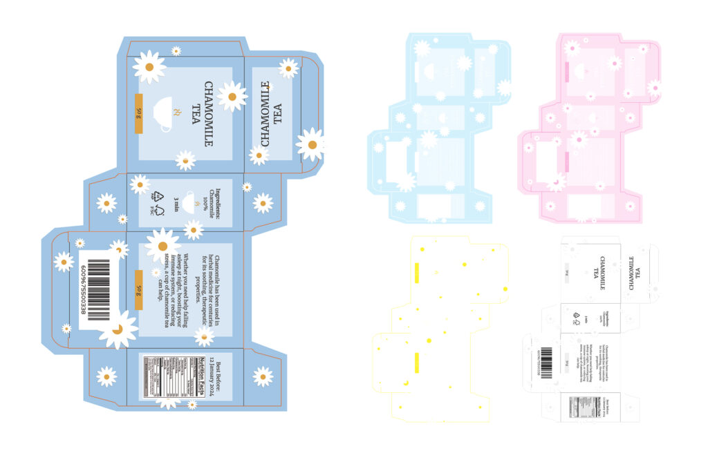
So, the CMYK system divides the design into four corresponding colors. When printed in sequence and properly aligned (a process called registration), these separate applications of ink combine into the required image. However, for more complicated designs, such as gradients and photographs, screen printing color separation uses halftone dots. Those are ink dots of various sizes that help create the illusion of different shades when printed.
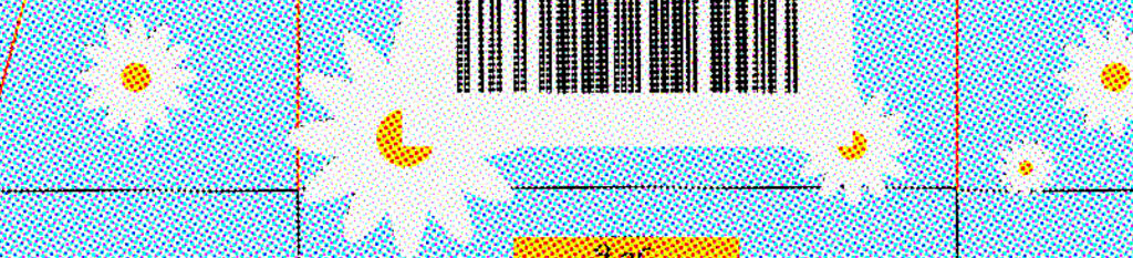
For instance, a lighter blue area would have smaller dots, while a darker shade requires larger, denser ones. And if you add some magenta dots around the cyan ones, you’ll get a purple shade. No magic, just color theory at work.
Who Needs Color Separation in Design?
If your field of work is connected to printing, then the answer is you. Generally speaking, this includes traditional printing agencies, graphic/brand designers, and small businesses.
Color separation for screen printing is an absolute necessity that impacts the quality, cost, and feasibility of your printed products. No matter how good the design looks on screen, without considering how it’ll separate the colors, you’re destined to flop. A complex gradient background, for example, may require three additional colors to match the original design. So, even if you’re not directly printing your designs, the knowledge of the process helps you make informed decisions and steer clear of disappointments and re-make costs.
Print your design confidently

Control how your design colors end up printed with Approval Studio’s Color Separation feature!
Start a Free TrialBeyond technical necessity, color separation enhances the printing by precise color matching, better ink opacity, and cleaner details. It helps create more consistent results across large print runs. In simple terms, color separation turns printing into a predictable, controllable process.
How to Do Color Separation?
Effective color separation can be achieved with the help of the right tools and techniques. Adobe Photoshop, for instance, lets you manually separate colors using layers and channels. Or, if you’re already working with a CMYK file, there’s a “Split Channels” feature that breaks such files into separate components. Similarly, another Adobe app, Illustrator, has a “Separations Preview” feature for vector-based files.
Naturally, there is also specifically color separation software. Apps like QuickSeps, Separation Studio, AccuRIP, and others often have features like overprint, spread controls, and various export options. Let’s talk about them in detail.
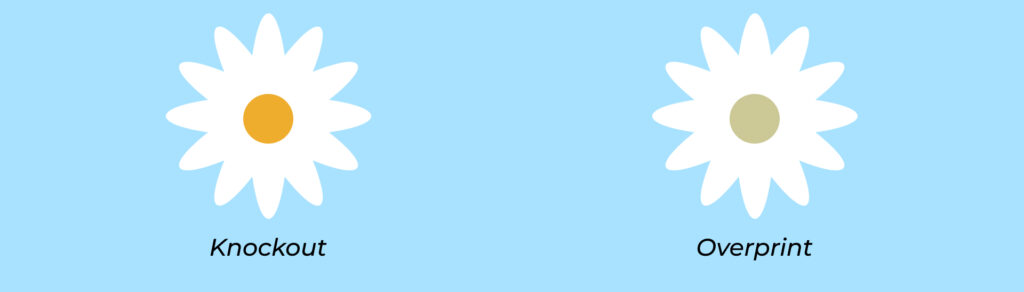
Overprint
Overprint allows you to print one color directly on top, rather than removing the color beneath it, like with knockout. This way, you can blend colors and create new shades. For example, if you place yellow over a blue background, a yellow overprint will create green. That’s how you can get colors out of your ink range.
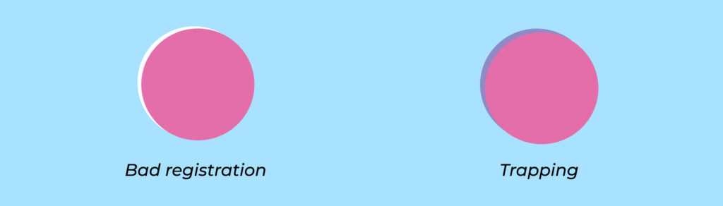
Trapping (a.k.a choking or spreading)
Trapping involves slightly overlapping colors that touch each other. It allows you to either expand the background color beyond its edge or shrink the foreground element, so they overlap by a tiny margin. This overlap between color separations compensates for minor registration issues that can happen during printing.
Underbase layers
A white underbase is usually used when printing on dark garments. The purpose here is to prevent the fabric from affecting the final colors of the print. To keep them clean, your color separation for a simple pink design on black fabric would actually include two separations: white underbase and the pink top.

Separations export
Wherever you export your files from, they usually end up as PDFs for color separation screen printing. Your separations will appear as black-and-white pages in a PDF file. Each of them will be named after the color whose area it represents. To avoid compression artifacts, keep your files high resolution.
Color Separation in Approval Studio
Now that we’ve established how color separation works, let’s try it out in practice with the help of Approval Studio.
First things first, we make sure our design is in PDF format. Then we upload it to the Asset Library and open it in the Review Tool. There, we find the Color Separation feature on the right Tool Panel.
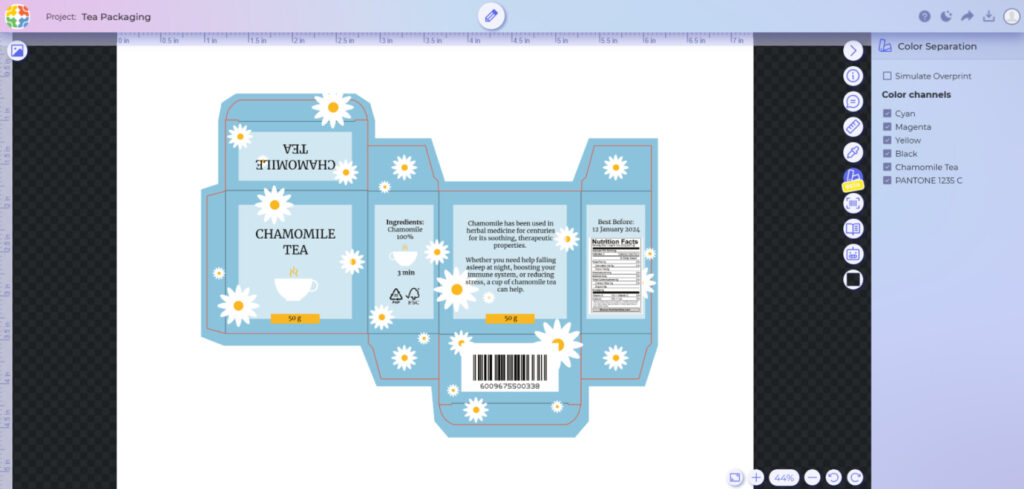
Once the system generates service files for color separation, both the internal and external users can view the settings in the right panel. This includes the CMYK channels and the spot/special colors that the system has extracted from your file. You can check and uncheck the boxes to see how each color screen will print either separately (in black and white) or layered with others.
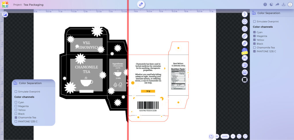
Apart from the color channels, it’s also possible to simulate an overprint if your design has one.
Conclusion
So, the bottom line is that if you don’t want your neon lime green turn out dull grass, make sure you use color separation before print. This small step will keep you from the panic of reordering prints the day before the deadline, save money, and raise your product quality.
Don’t be over-self-assured like me, and next time you’re working on a design destined for fabric or paper, take an extra moment to think through your color separations. Because why hope your print job turns out right when you can know for sure it will. Even a little technical knowledge goes a long way in making sure your creative vision transforms from screen to print accurately, intact, and just as you imagined it to.